EyeCare is expanding and they wanted to rebrand their business completely. Their business has grown and new products and services have been added. I am creating branding and new identity elements that reflect the diversity of their business.
Branding & Visuals| Spacebar

+ IN DEVELOPMENT +
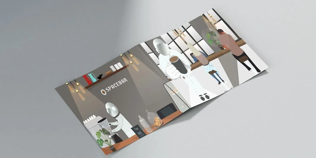
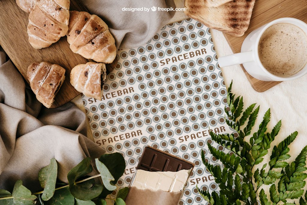
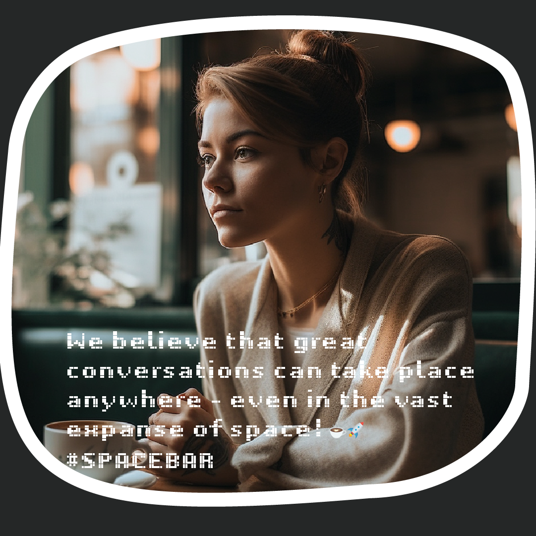
Spacebar is a place very popular amongst Artists and Musicians. I wanted to explore the idea of “space” in its literal sense; out of this world. I also wanted to play on the ideas of spaces between written words; a space of possibilities. Spaces are places that create new opportunities for interaction, innovation, and growth. I wanted the visuals to reflect this in-between place. A place that is real but fantastical at the same time.
Role:
Brand Development
Design and Illustrations
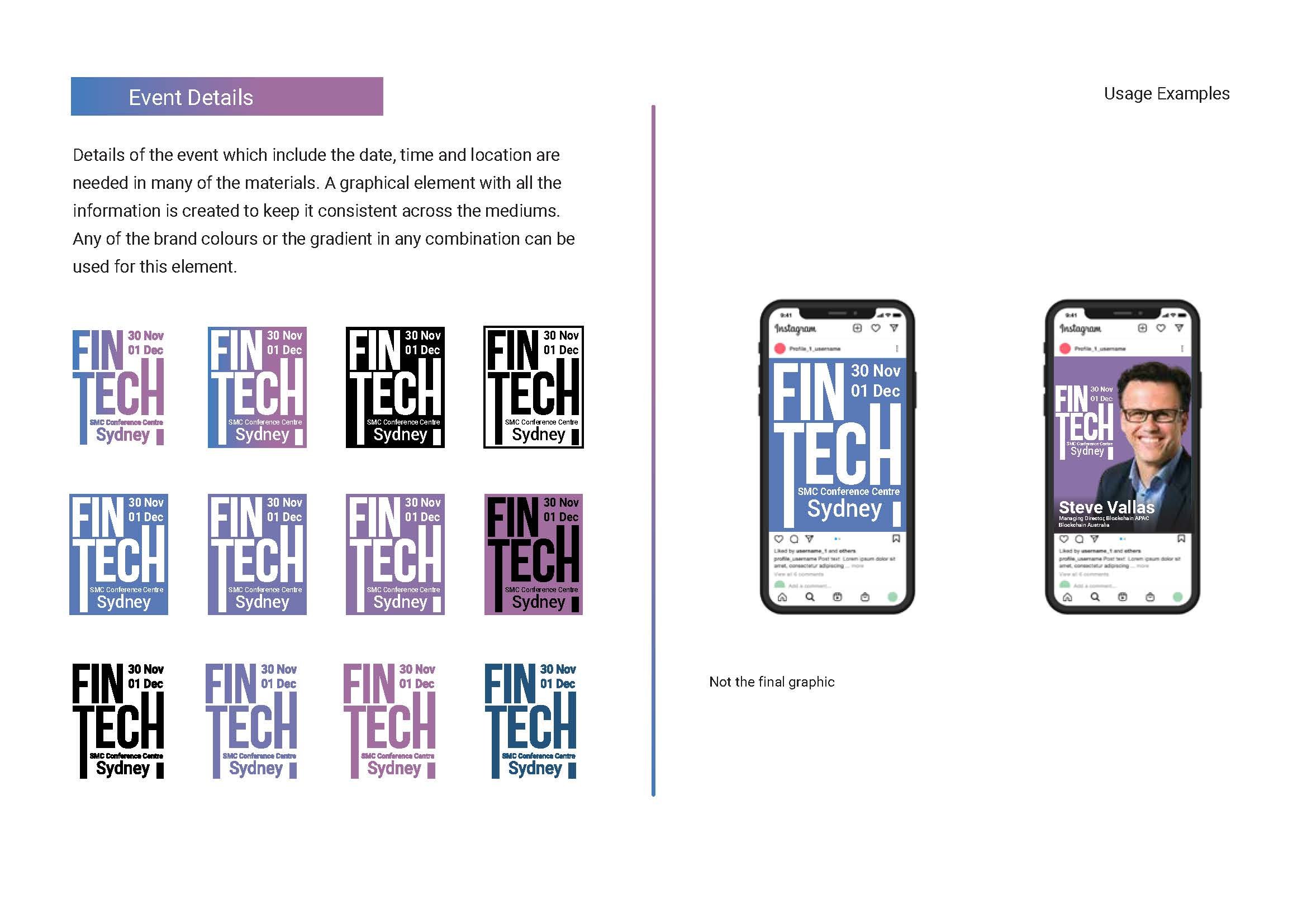
LOGO FORMATION
COLOUR PALETTE

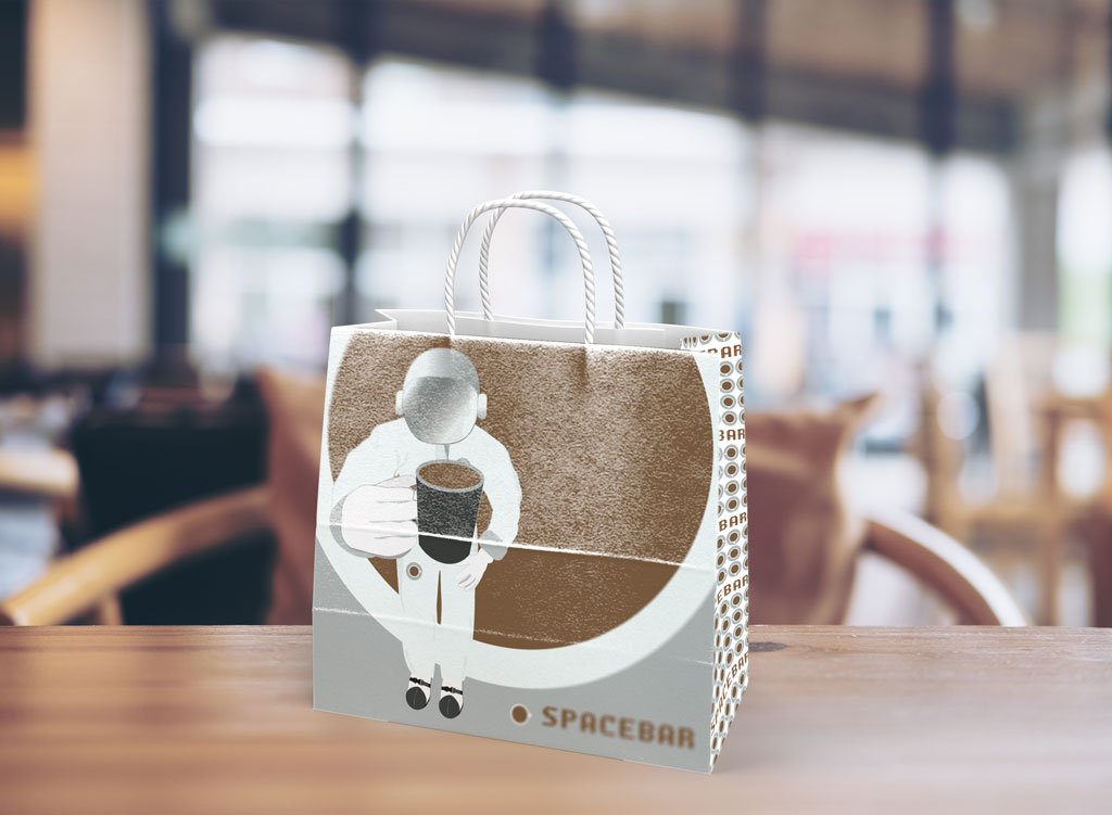
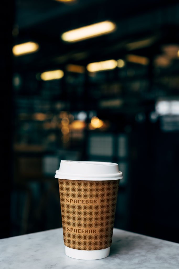
SOME ILLUSTRATED ASSETS


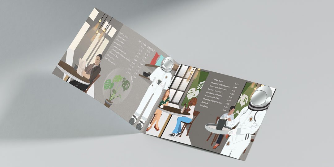
MENU
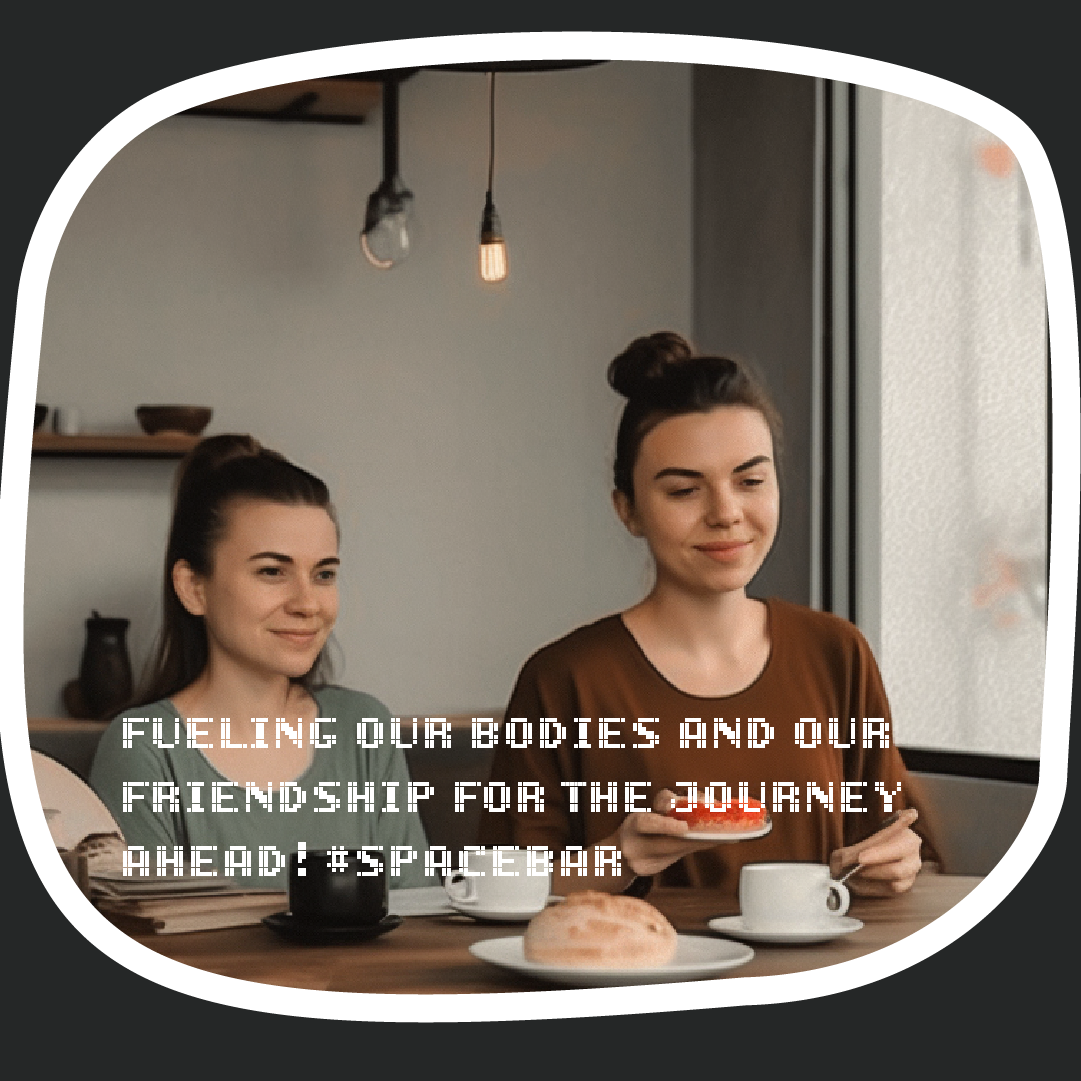
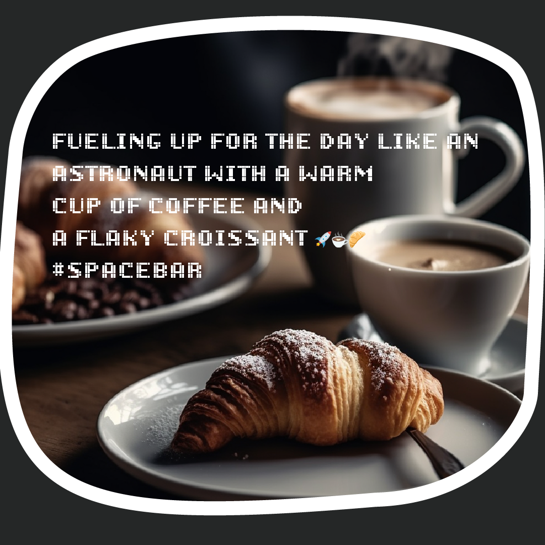
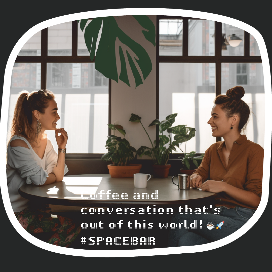
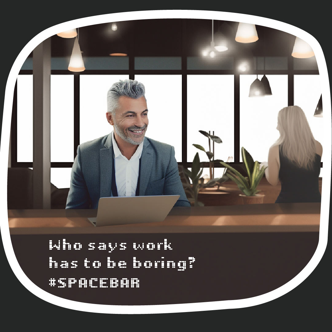
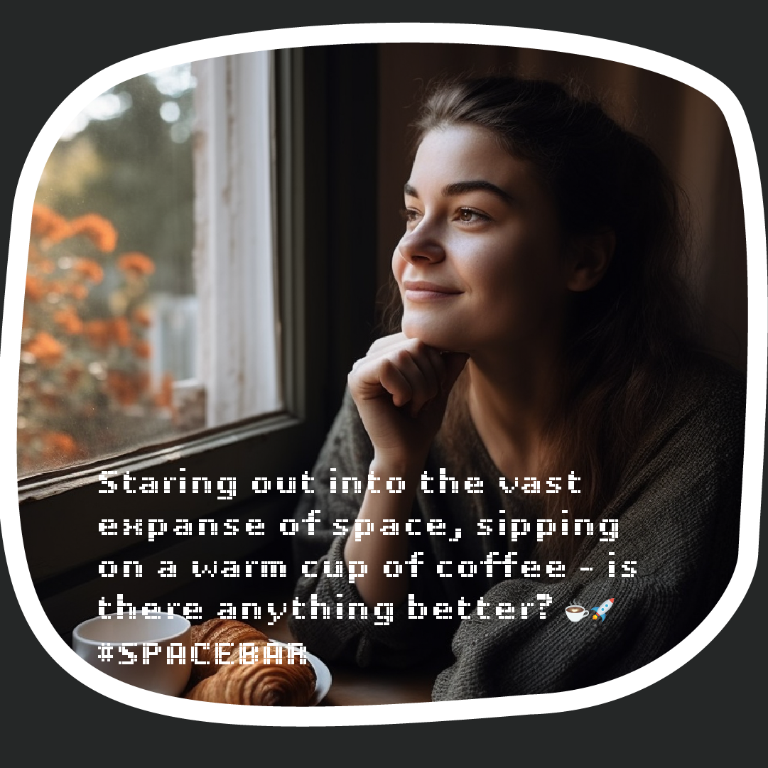
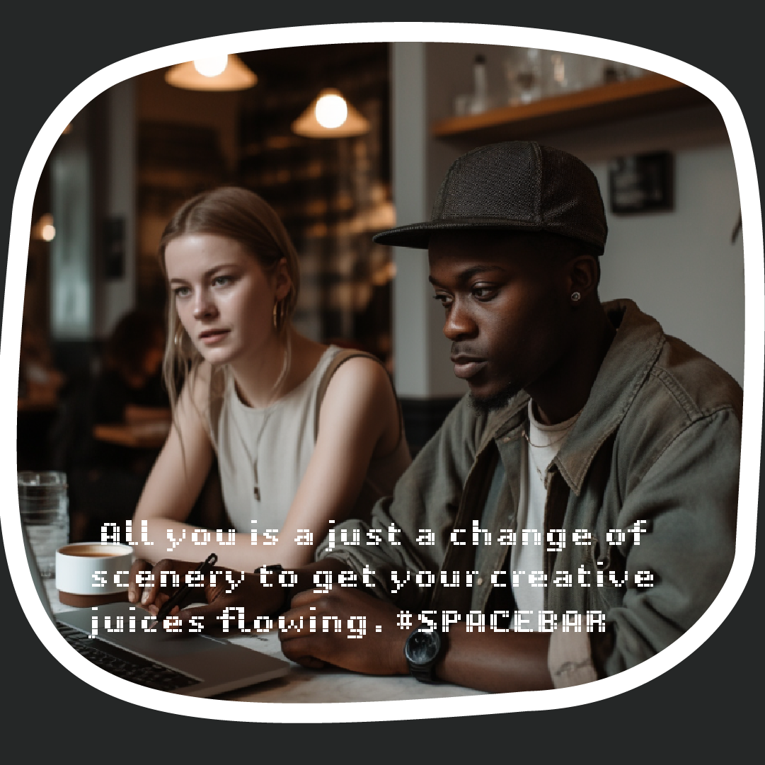
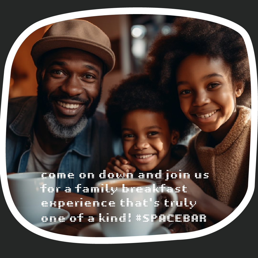
Social Media imagery and captions will be AI generated to align and reinforce the idea of technology and science of the brand. The imagery was generated through Midjourney with the illustrations fed as reference. The captions were generated with ChatGPT

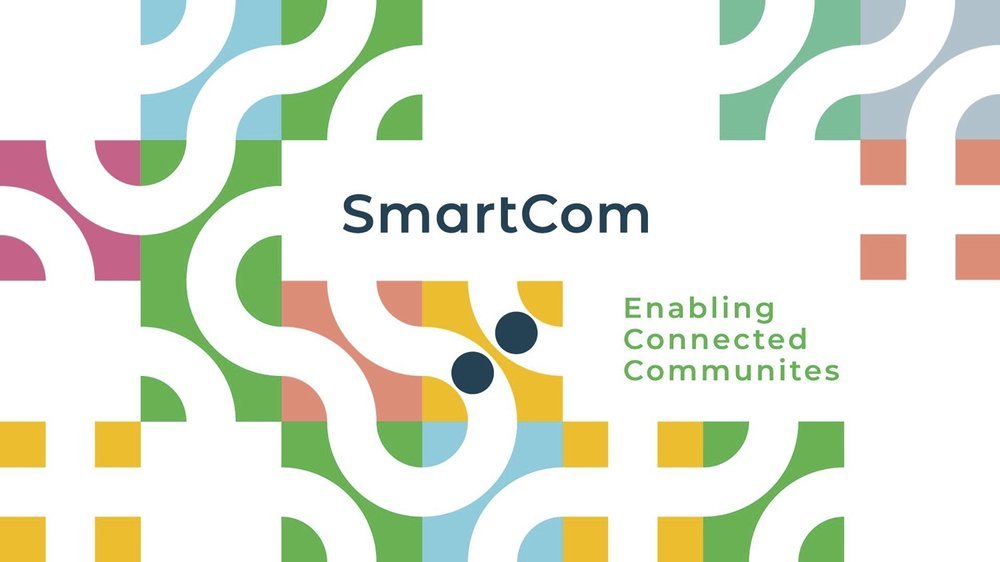
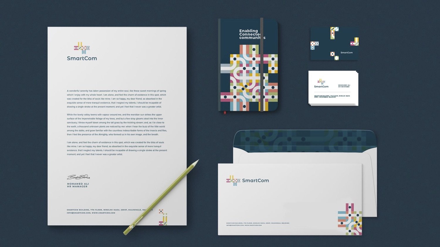
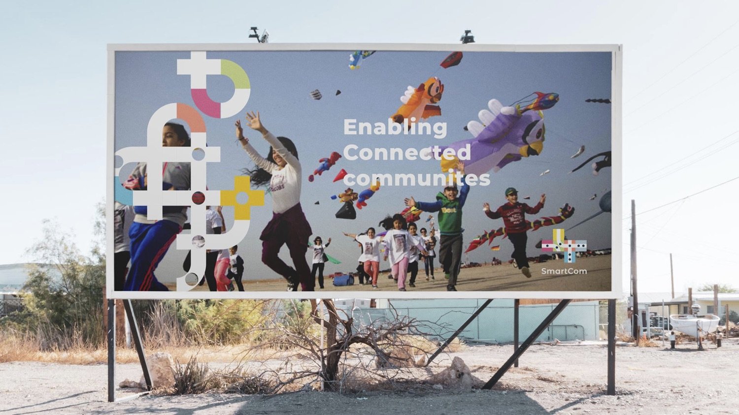
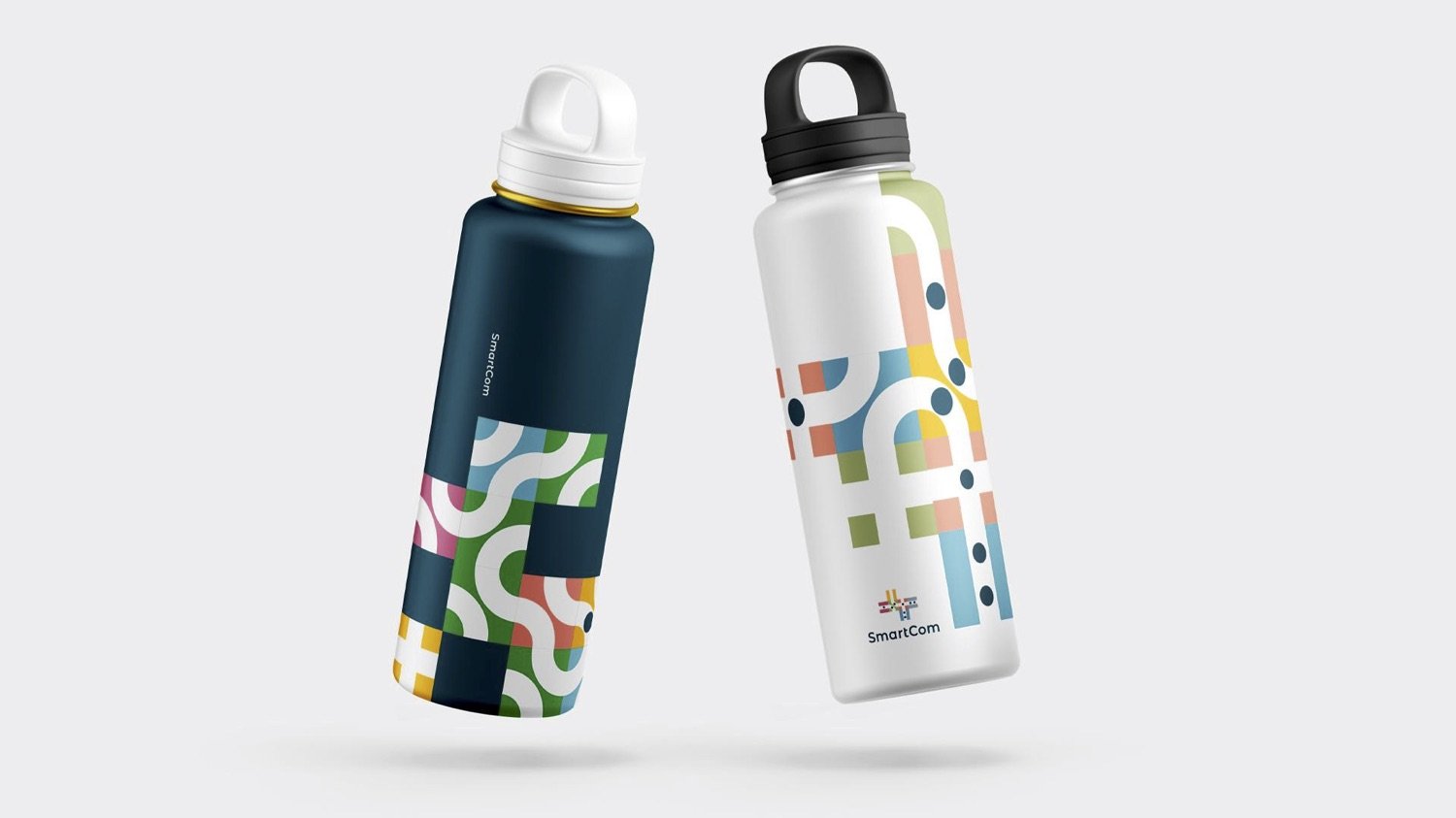
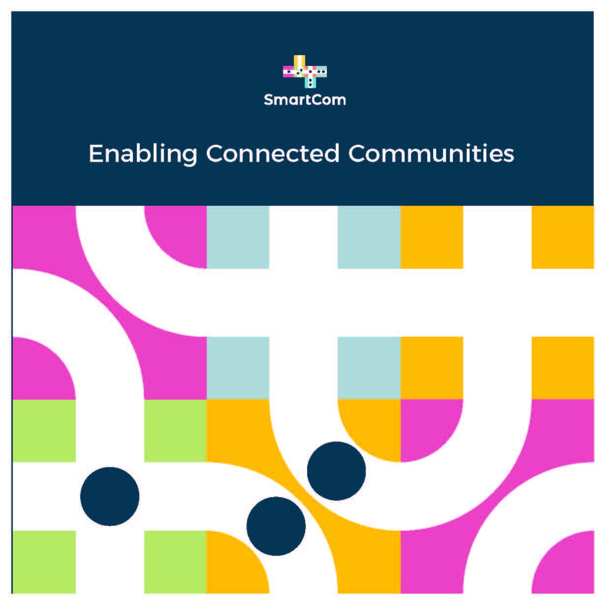
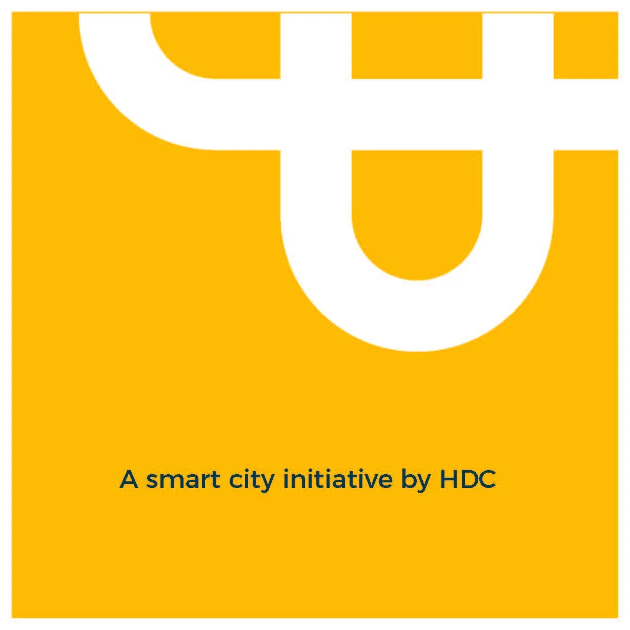
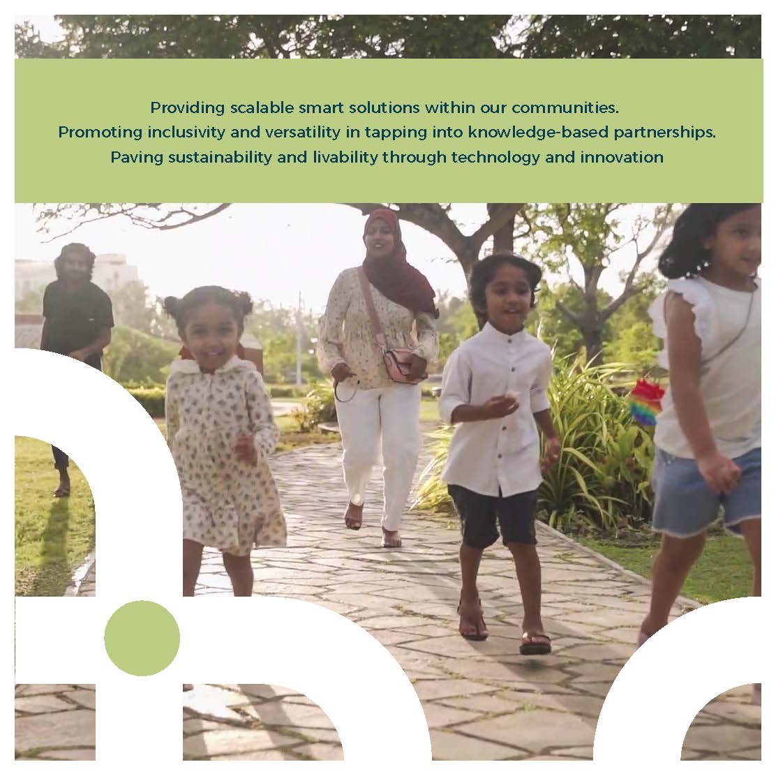
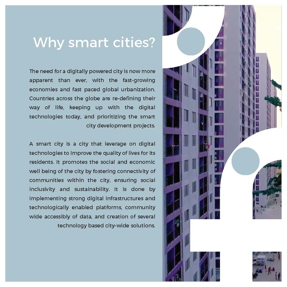
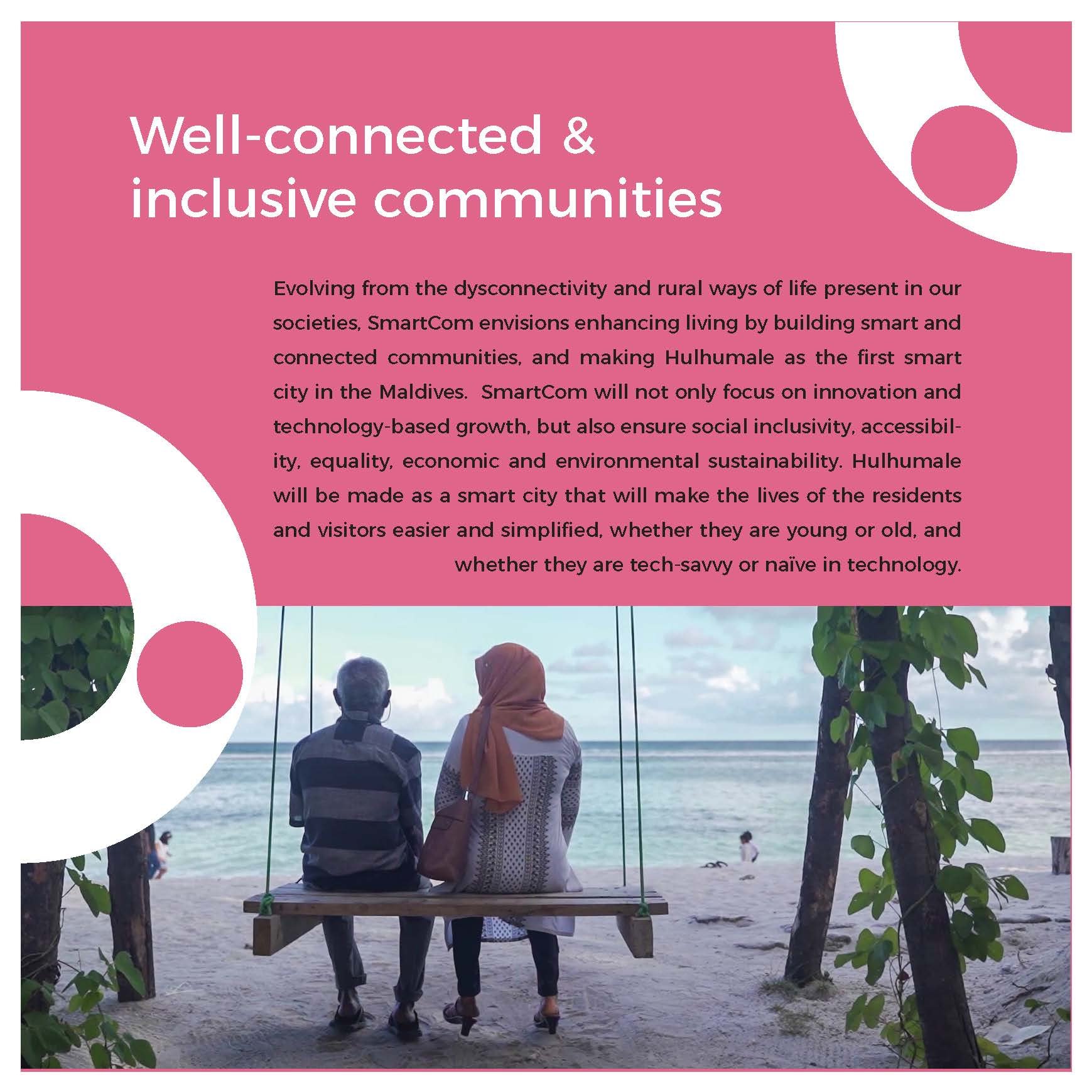
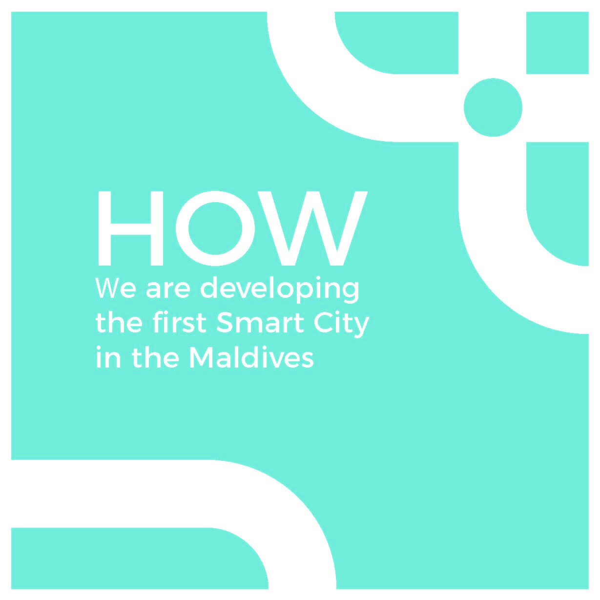
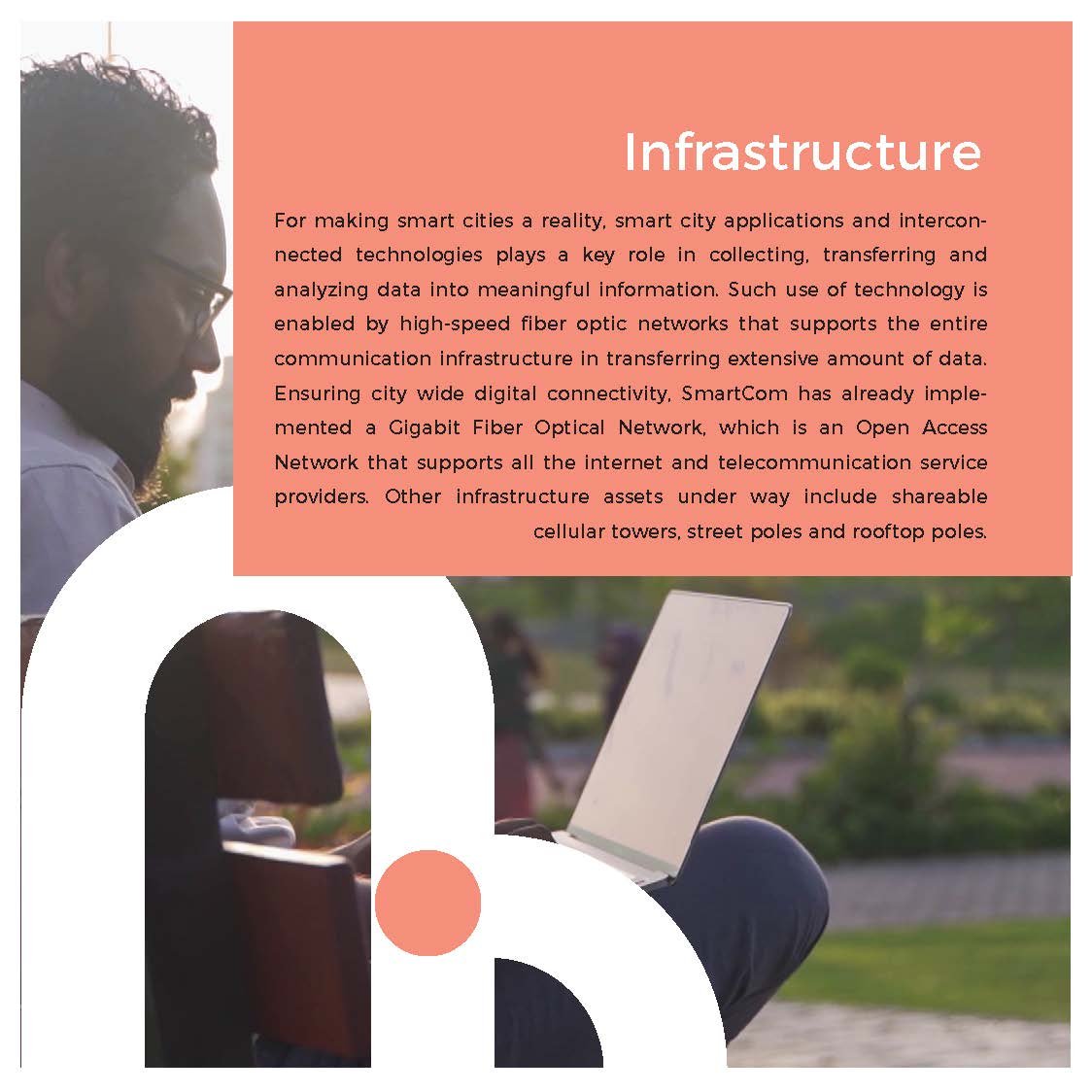
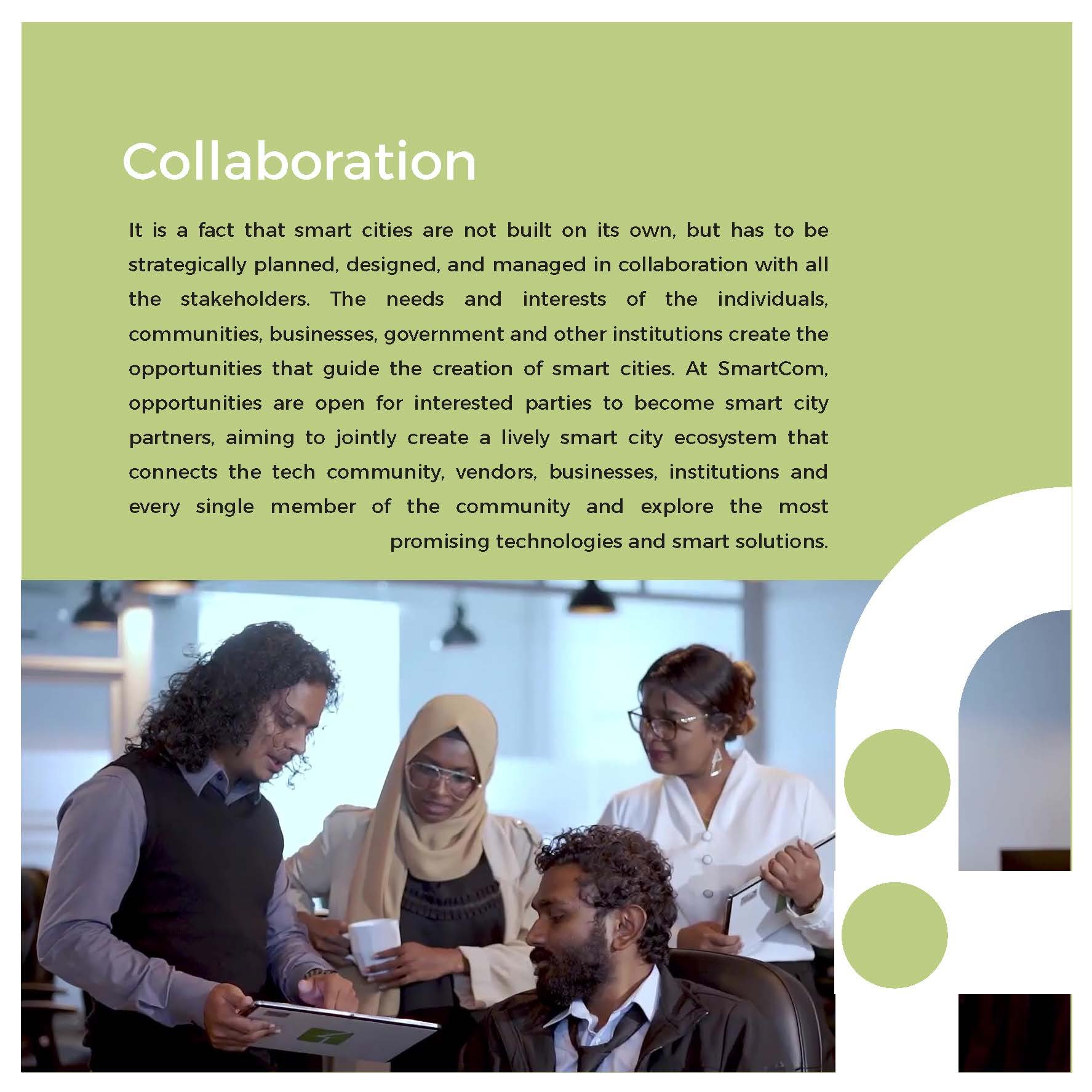
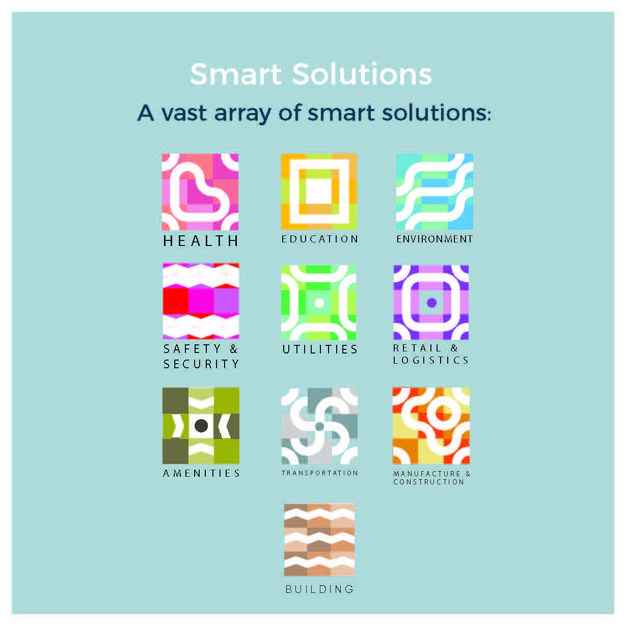
Branding & Communication | SmartCom

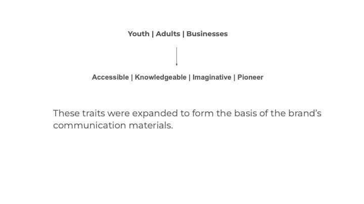
“SmartCom is an easily accessible, high-speed connected network that forms a city-wide community where youth, adults, and corporations can find sustainable solutions while also having the ability to develop and pursue innovative, scalable, and limitless solutions to challenges.”
I was tasked with creating the brand development for a smart city network service provider based in the Maldives. My responsibilities included conducting research, segmenting the audience, and leading a remote team to develop the final artwork.
My Role: Branding, Strategy & Creative Directing
Key Designer: Ashward
Designer: Sithna
Motiongraphics: Imad (Dami)
Agency: Marcomms
Excerpts from the brand development document
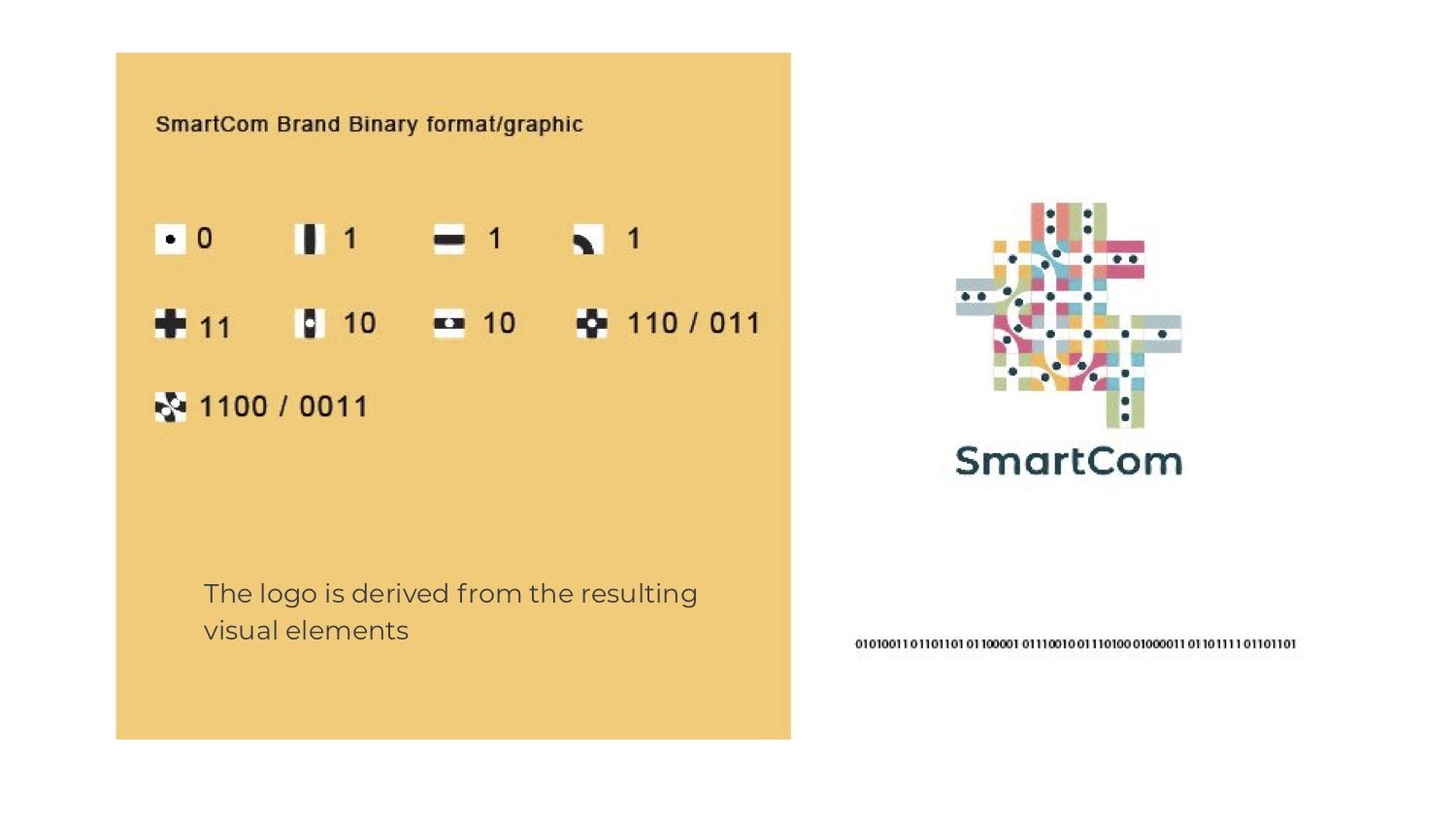
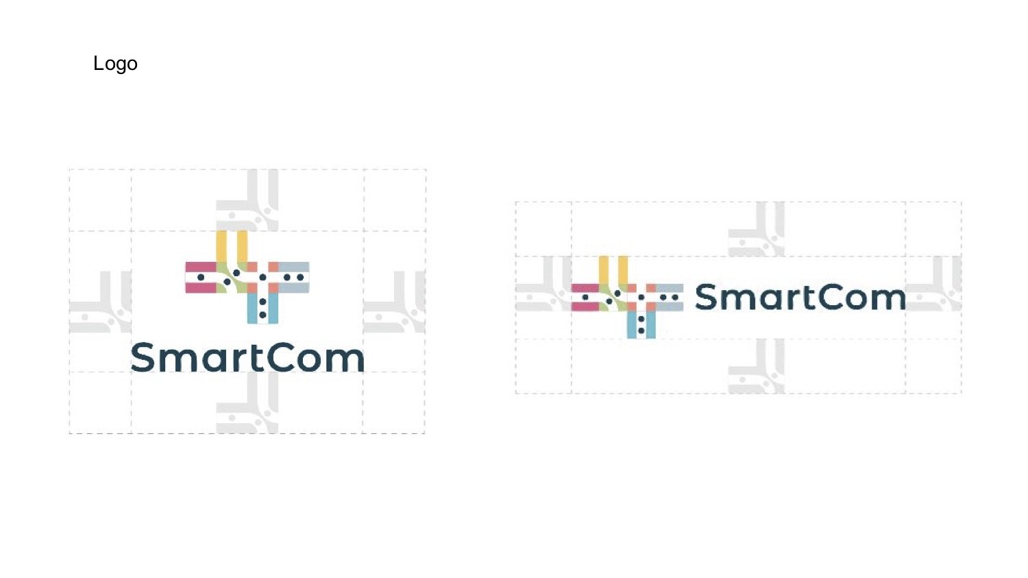
LOGO DERIVATION
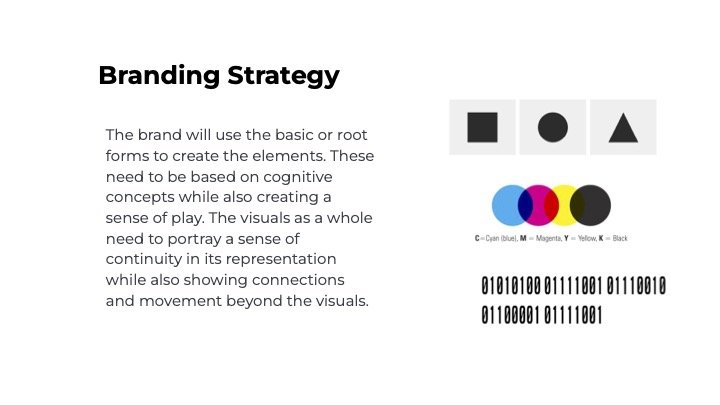
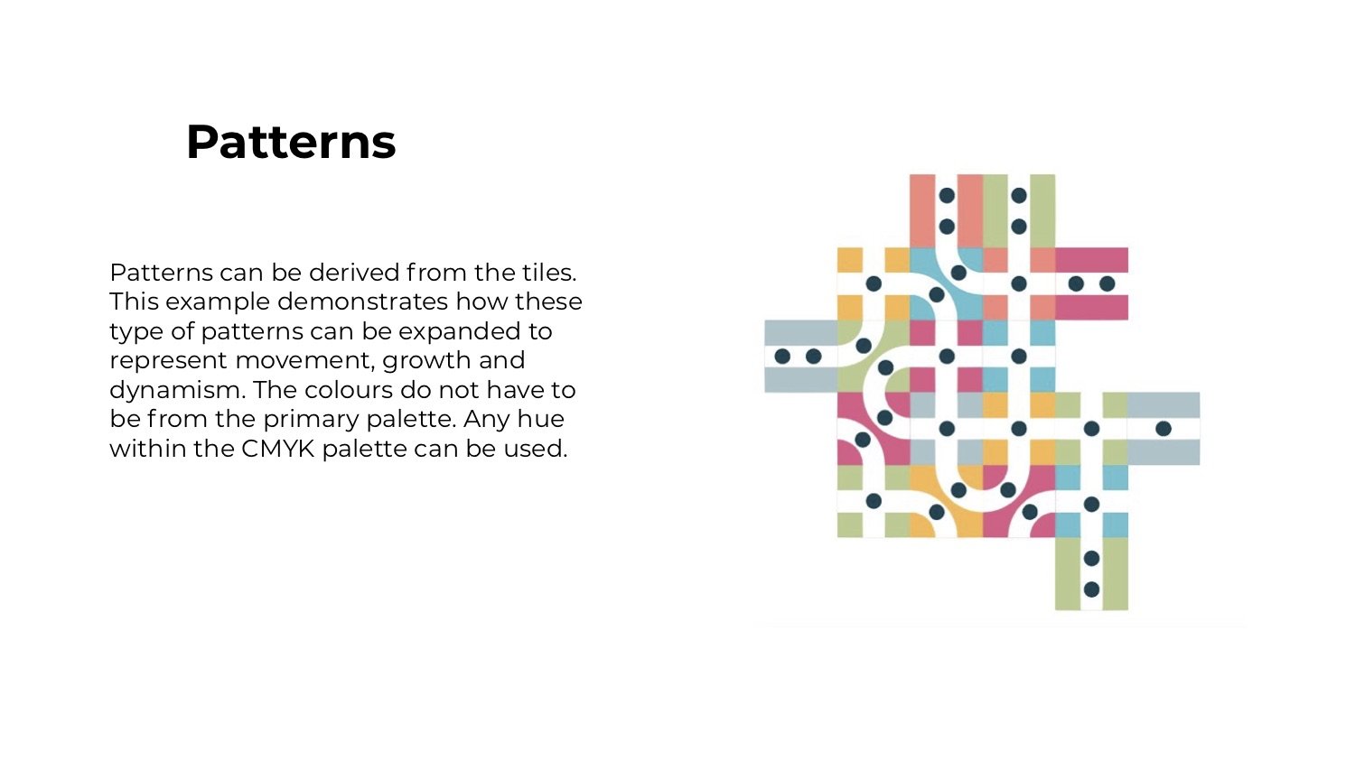
I wanted to highlight the connections; between the inhabitants of a place and their larger communities. I derived the logo by converting the name “SmartCom” to binary format and using the resulting 1’s and 0’s as a starting point. These 1’s and 0’s are represented by dots and pathways. Materials viewed from a distance are intended to give a sense of a city.
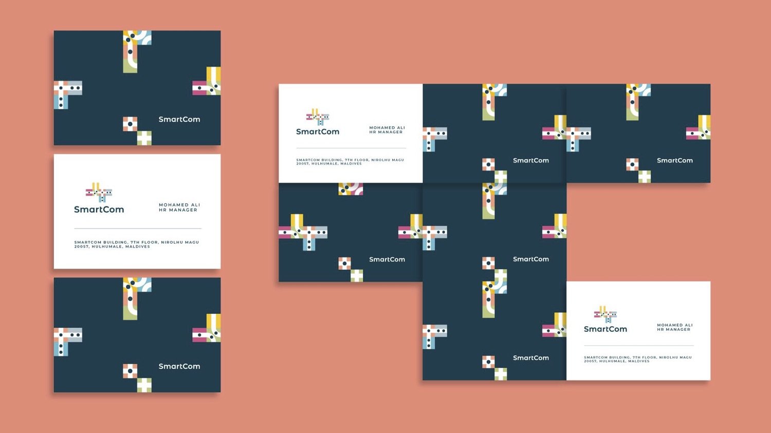
Excerpts from the brand guide.
NEWSLETTER


motion graphics: Ahmed Imad (Dami)
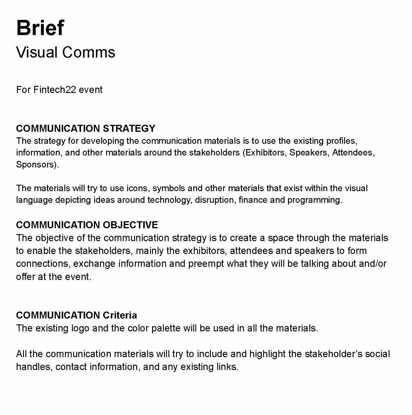
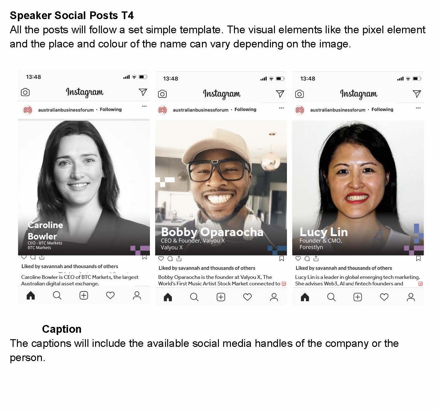
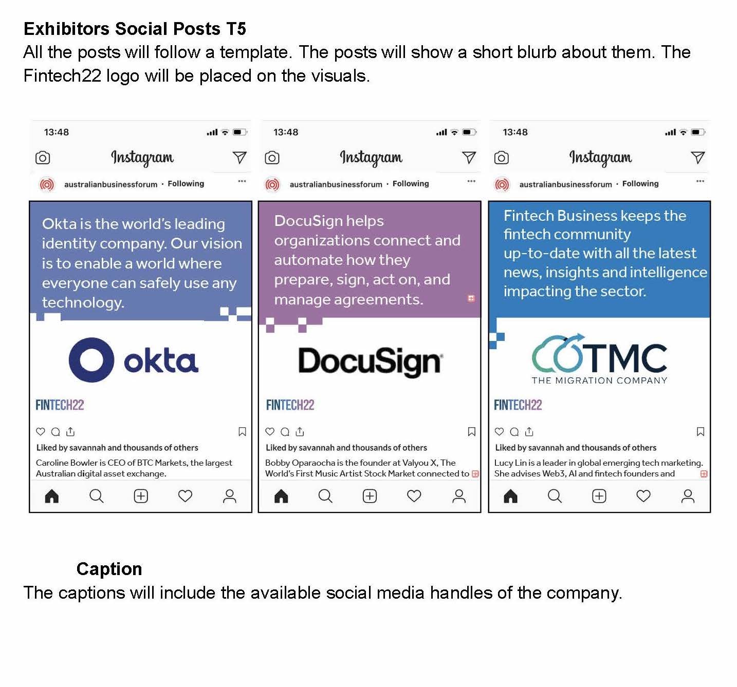
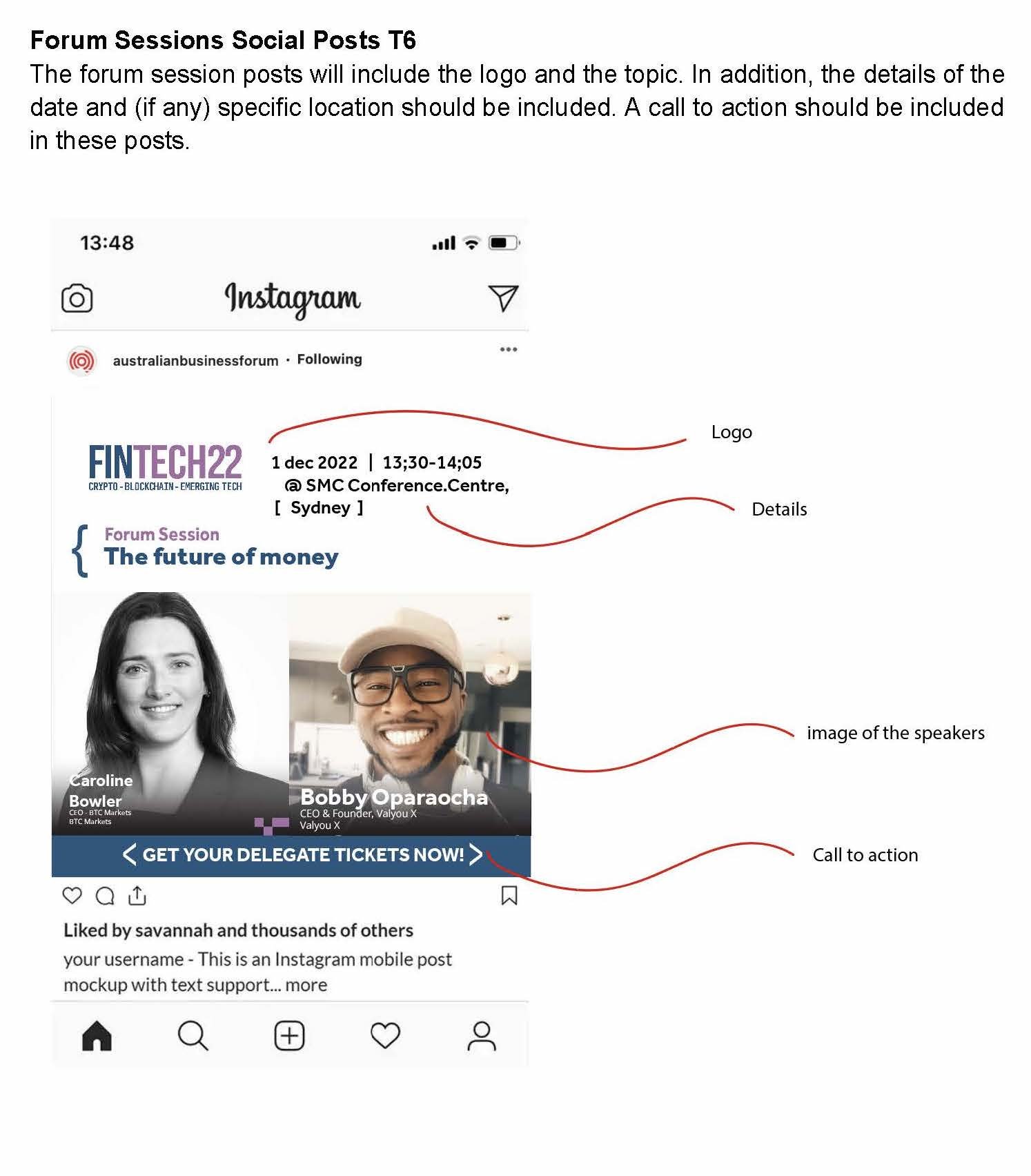
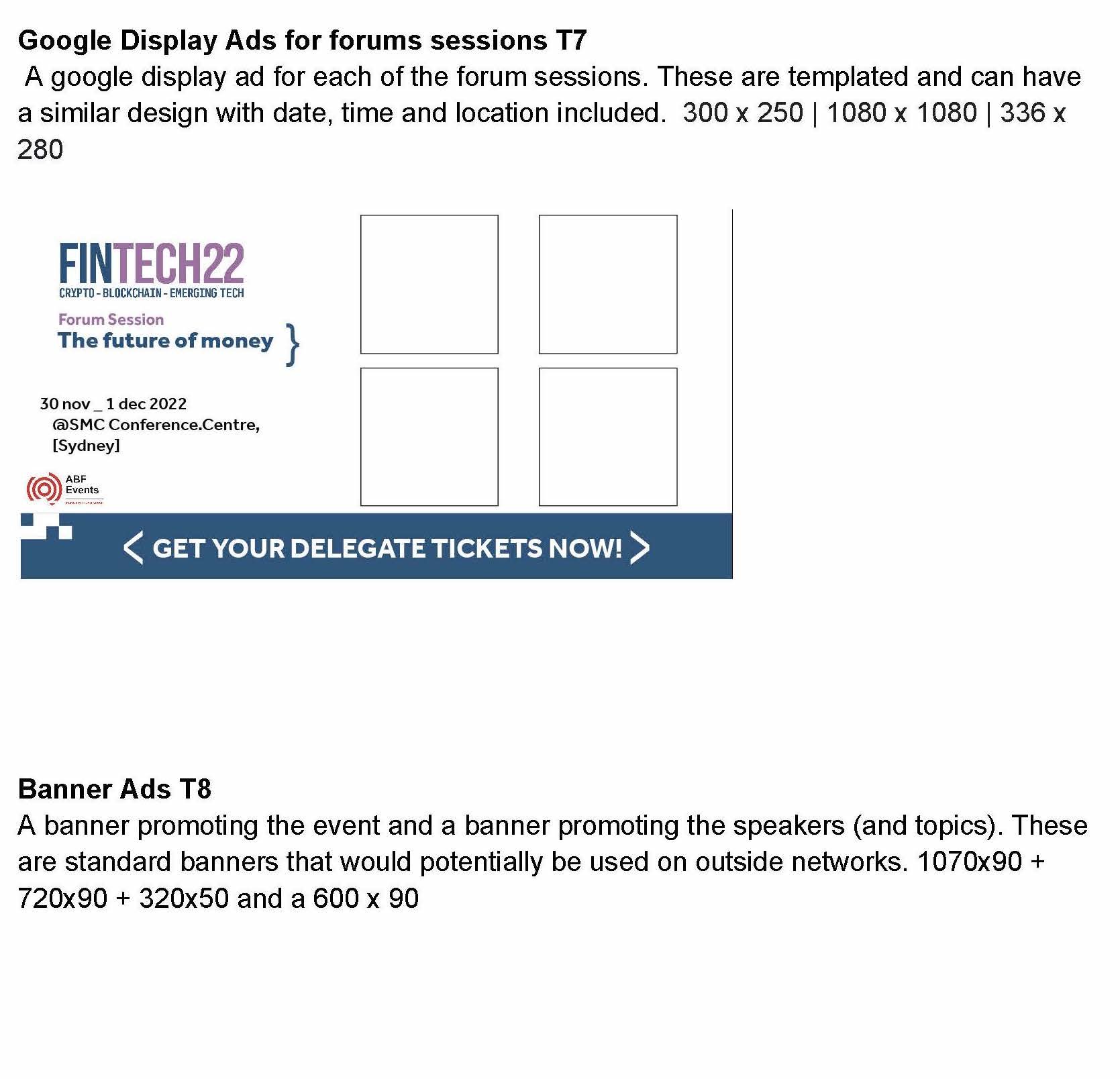
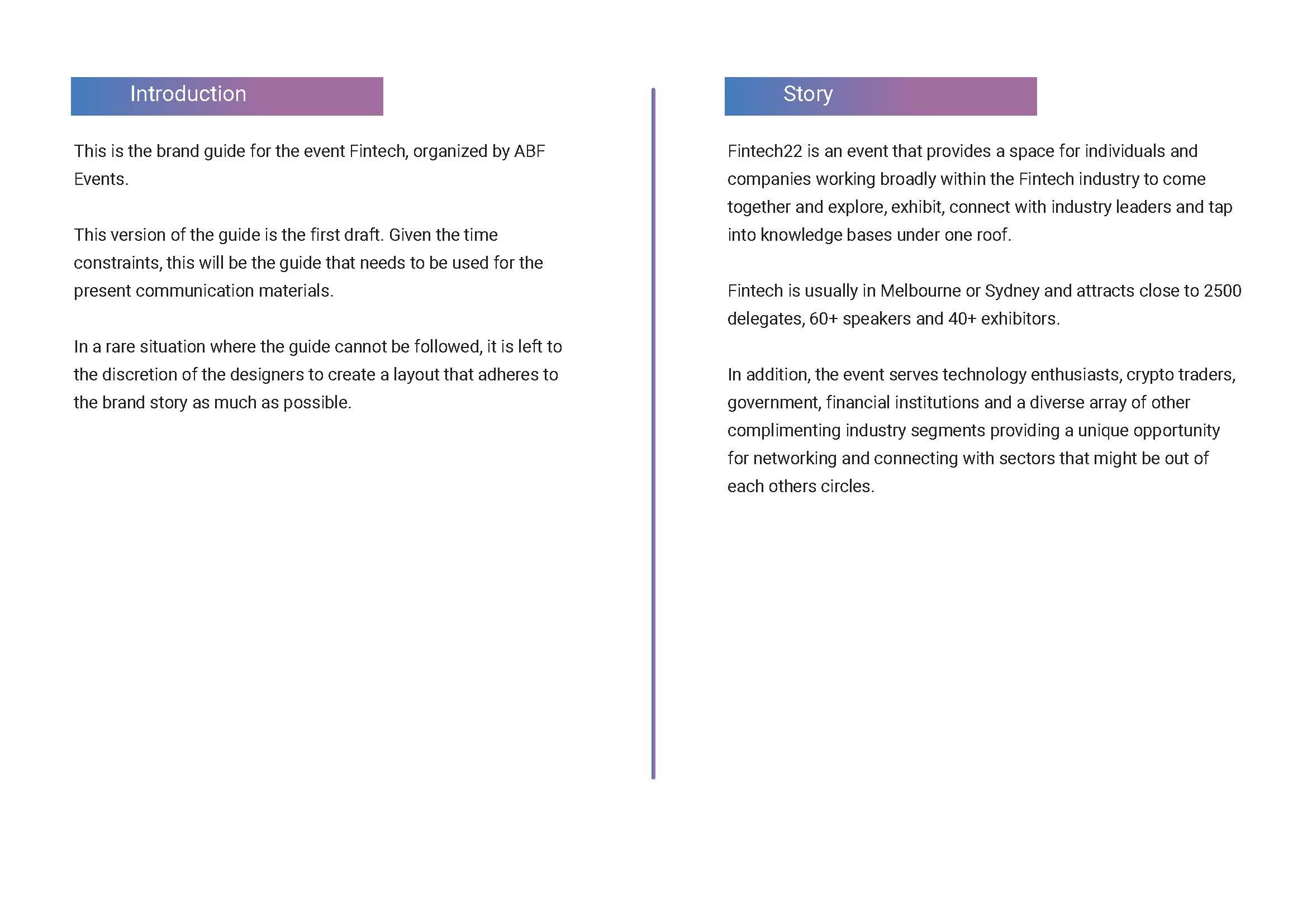
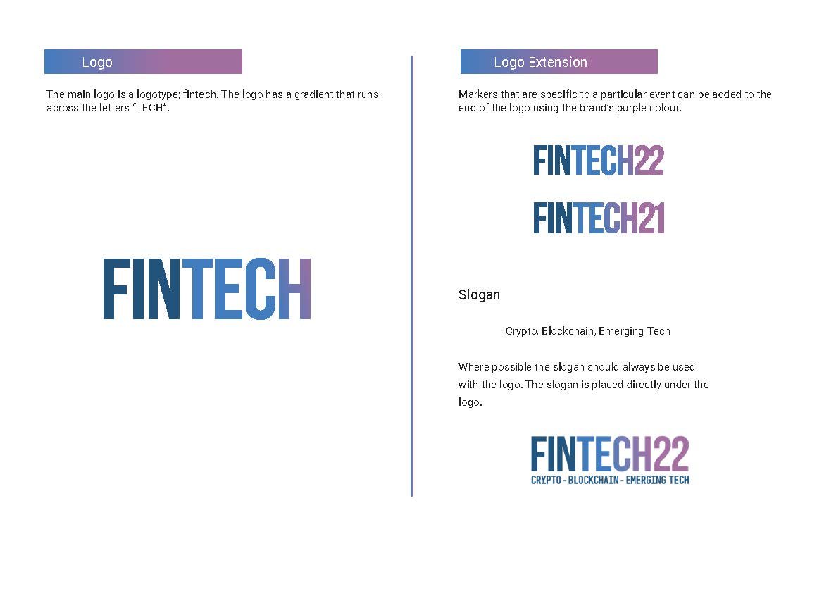
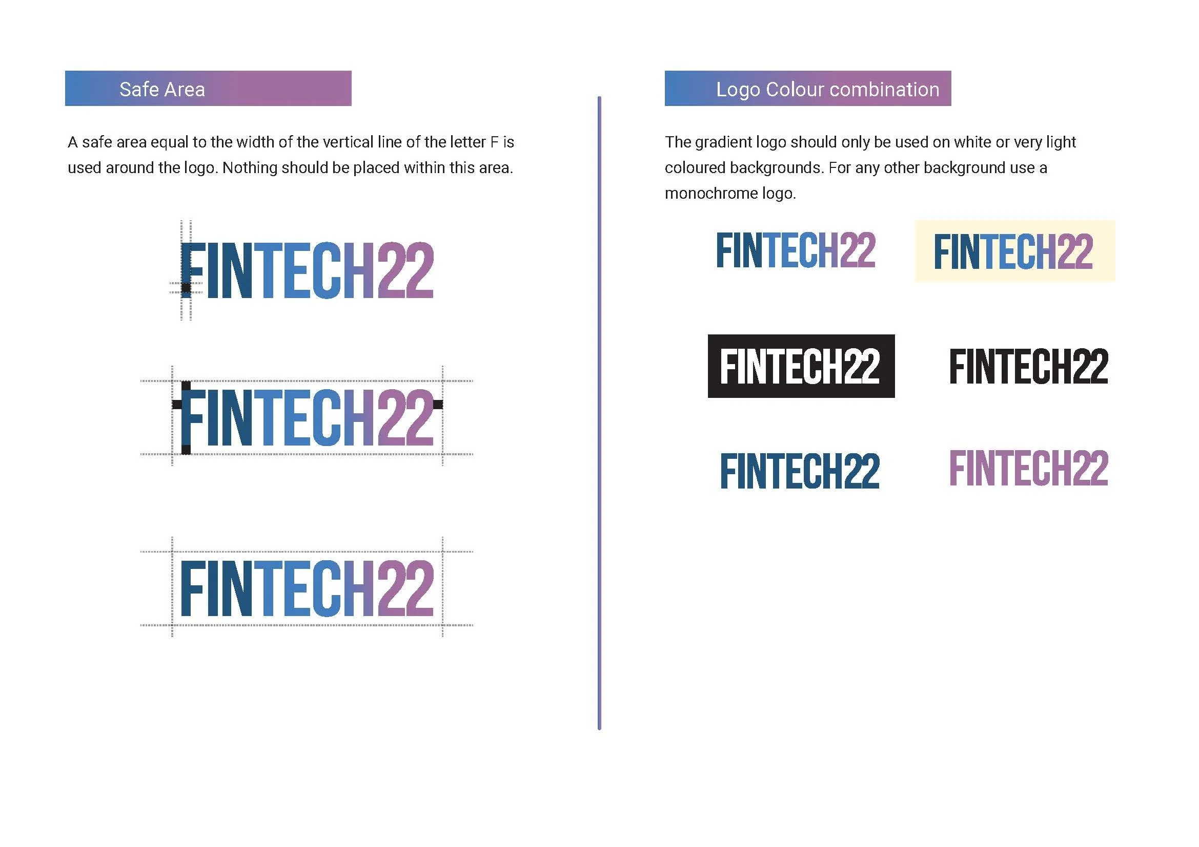
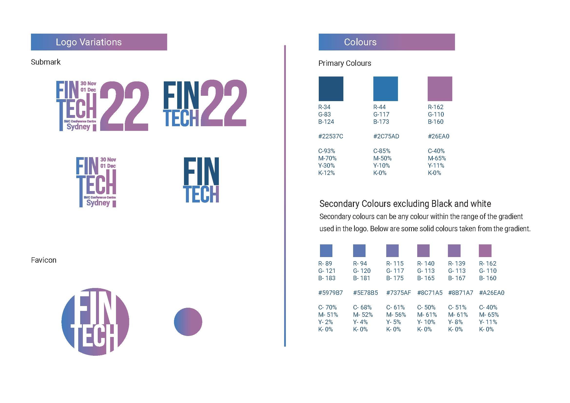
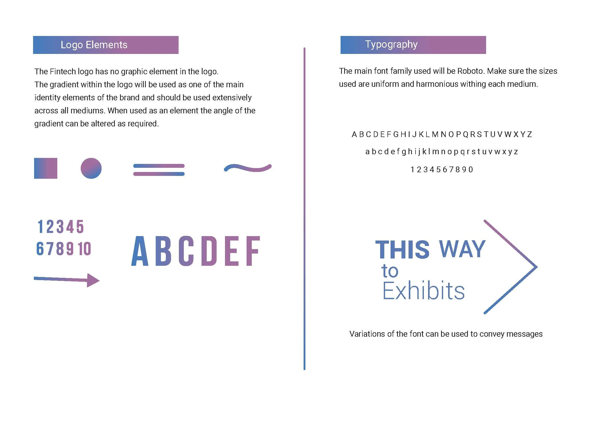
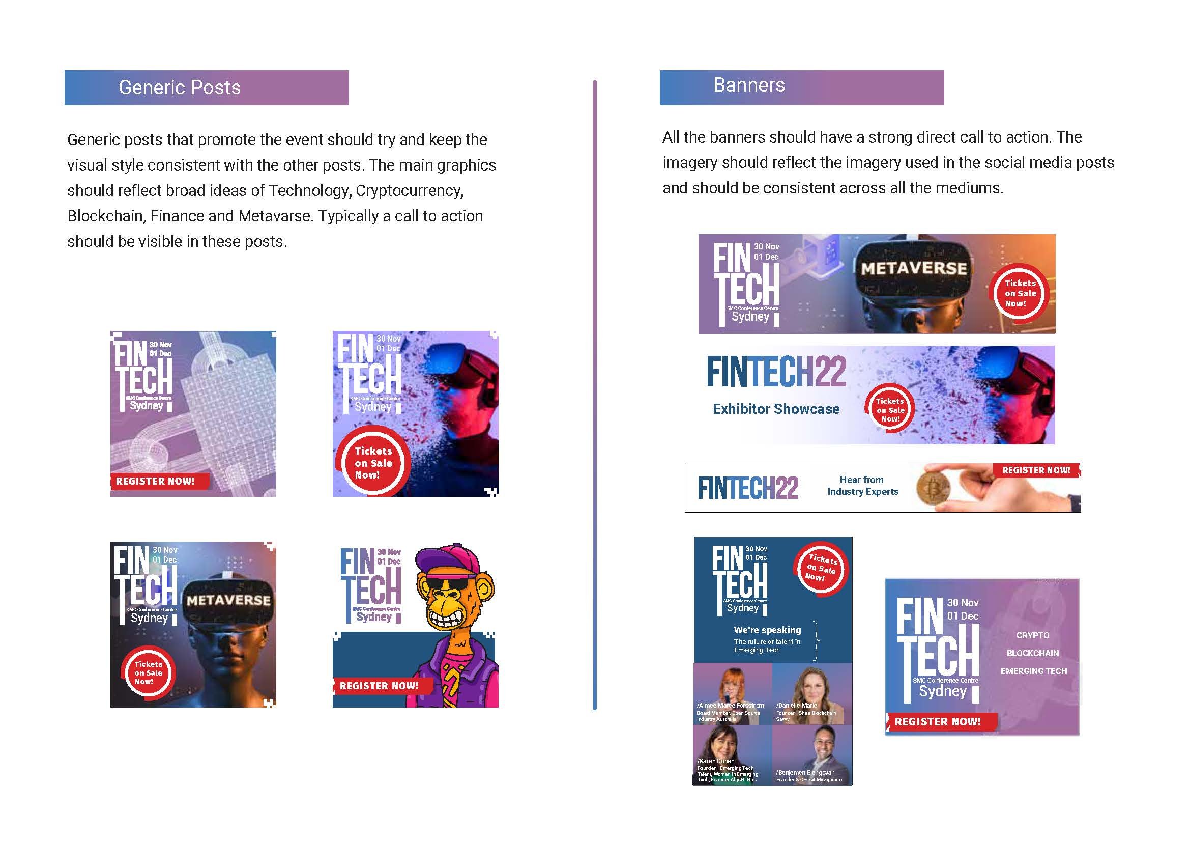
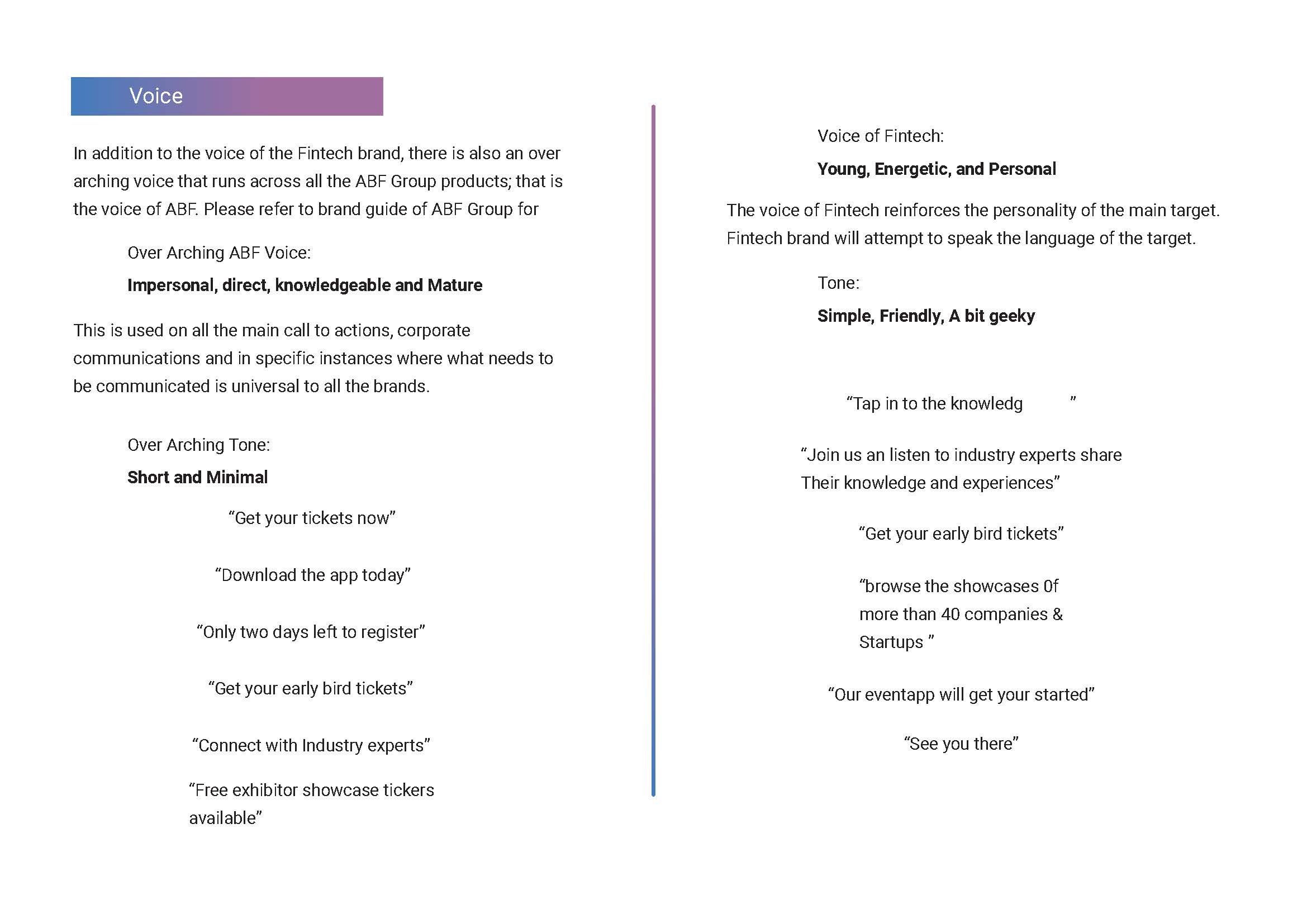
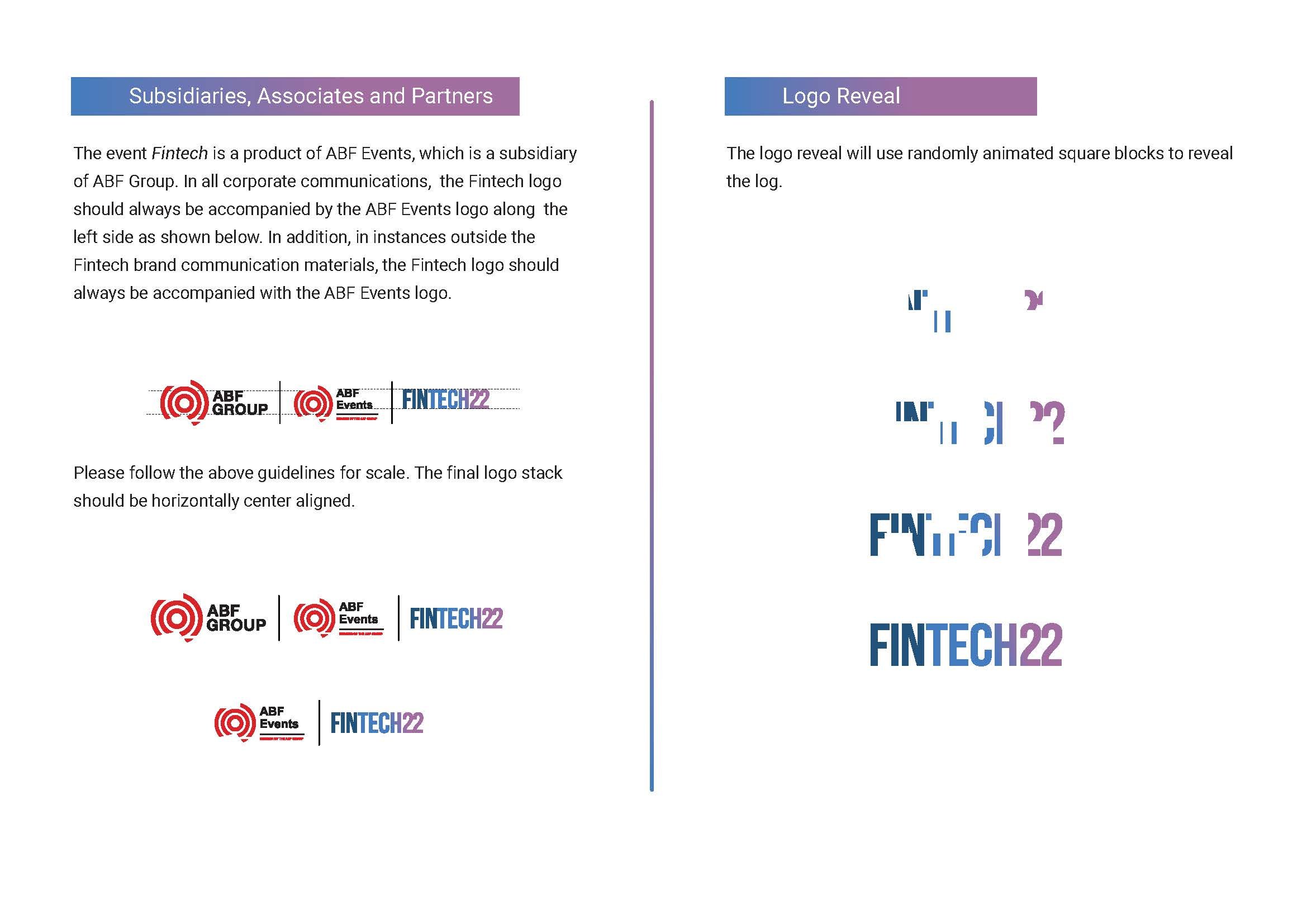
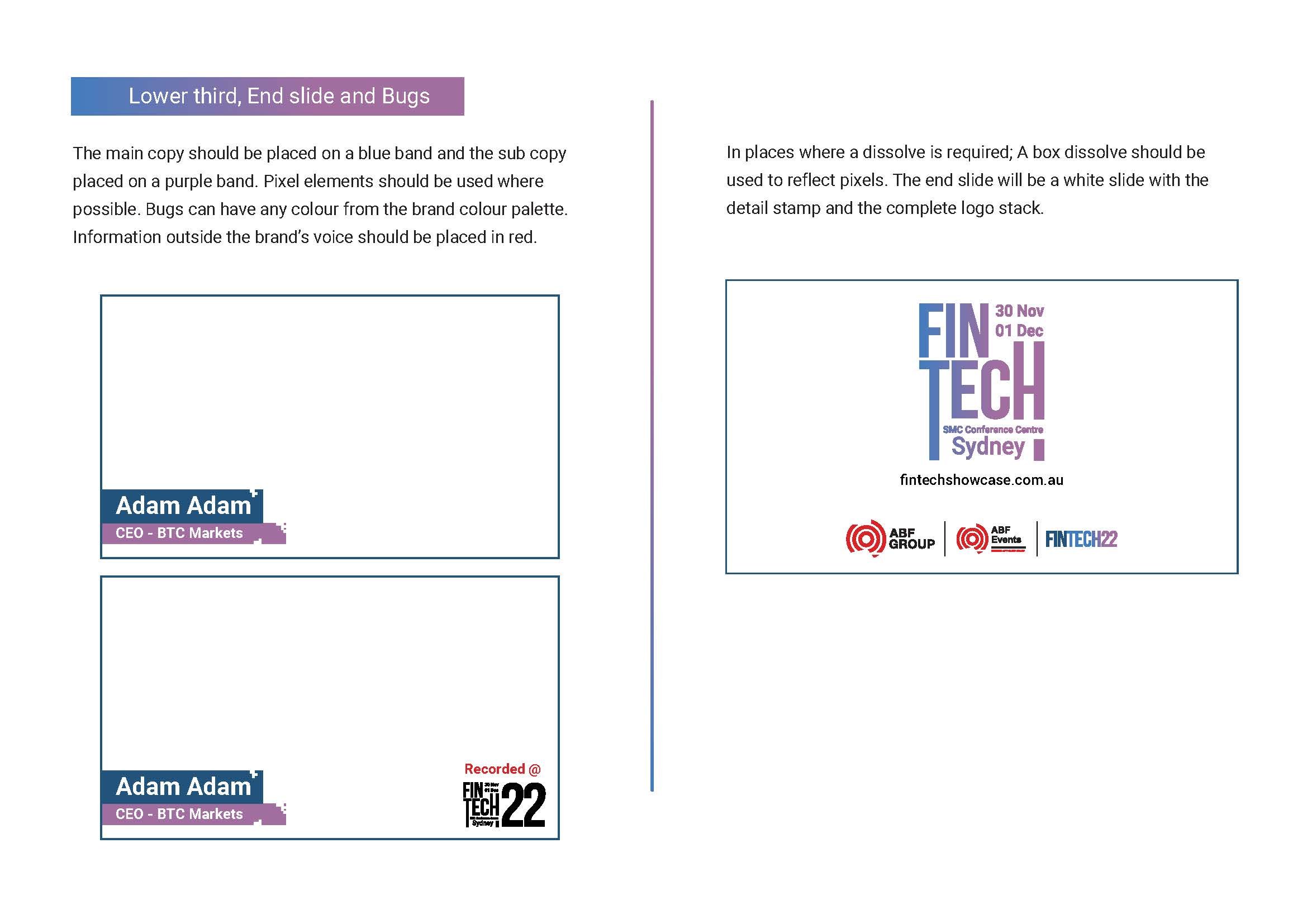
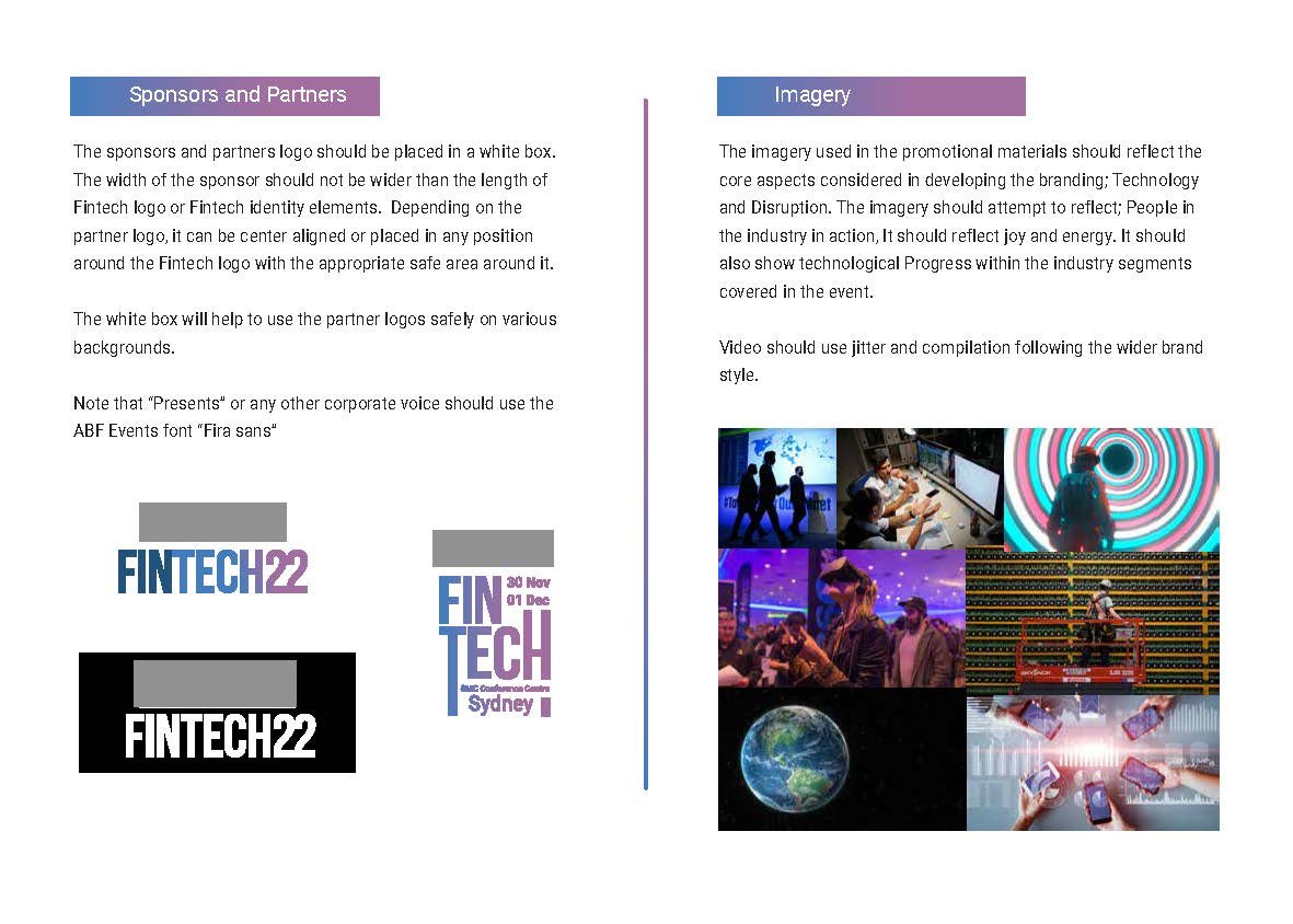
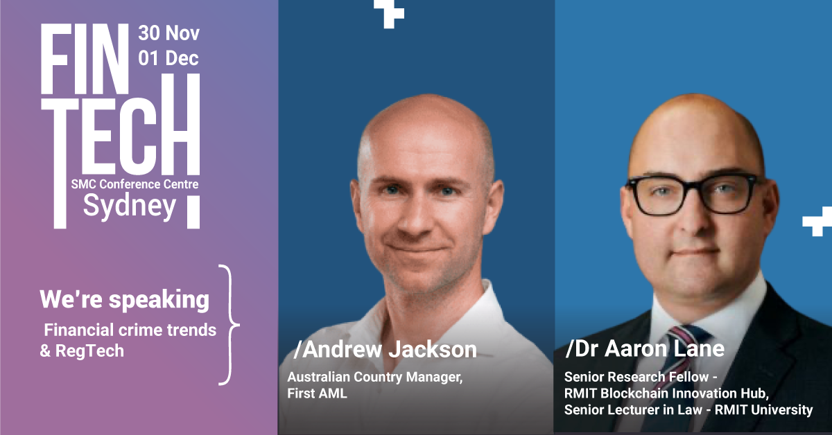
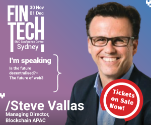
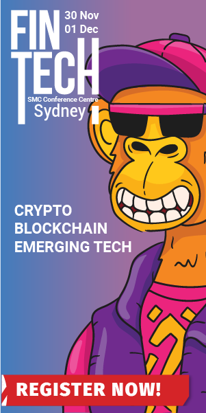
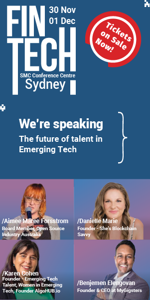
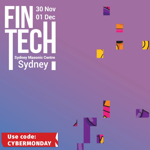
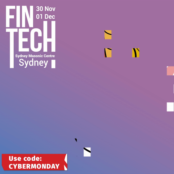
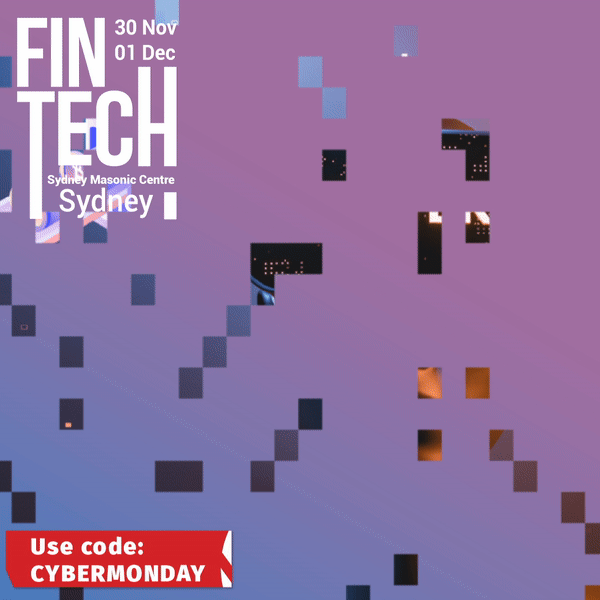
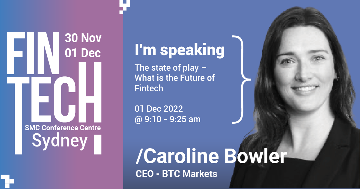
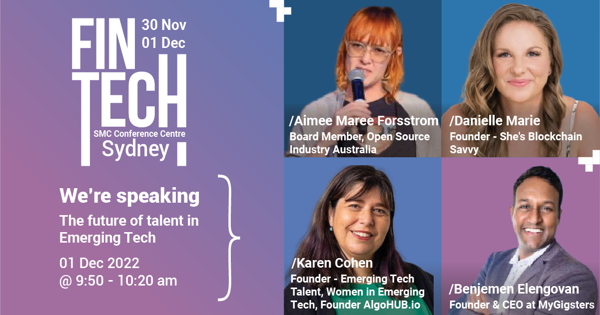
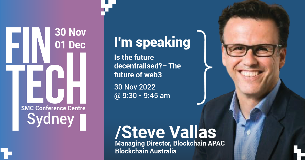
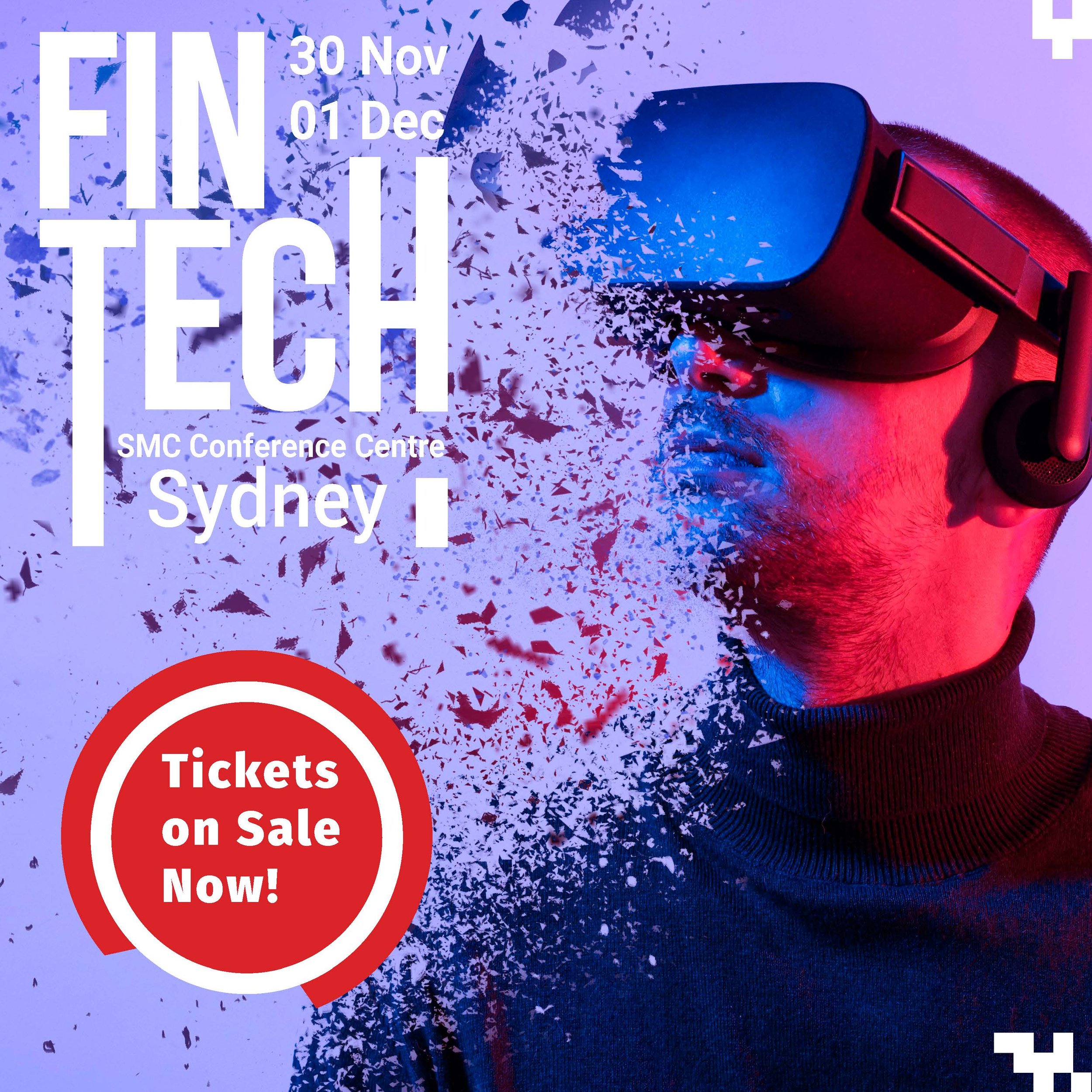
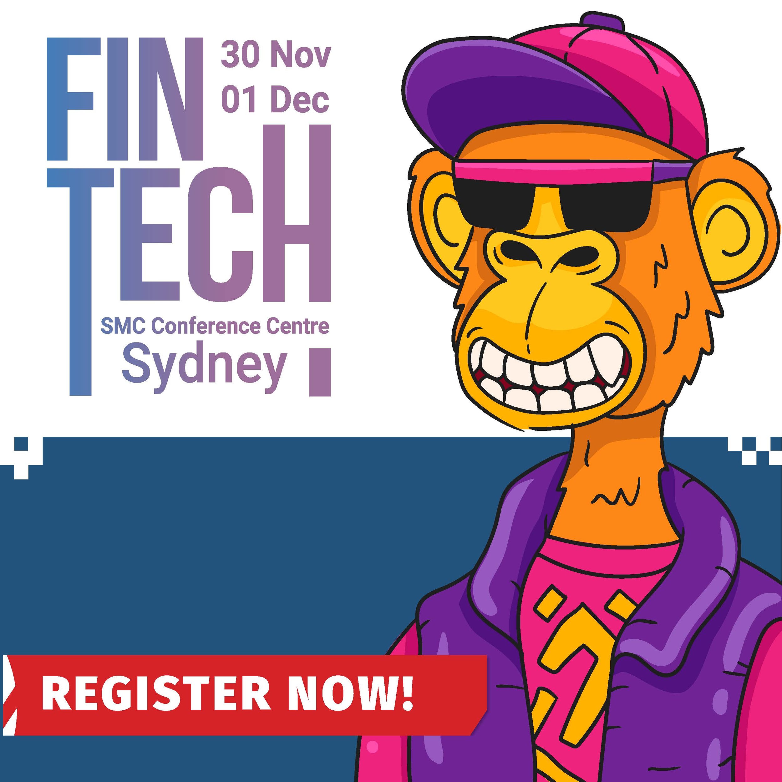
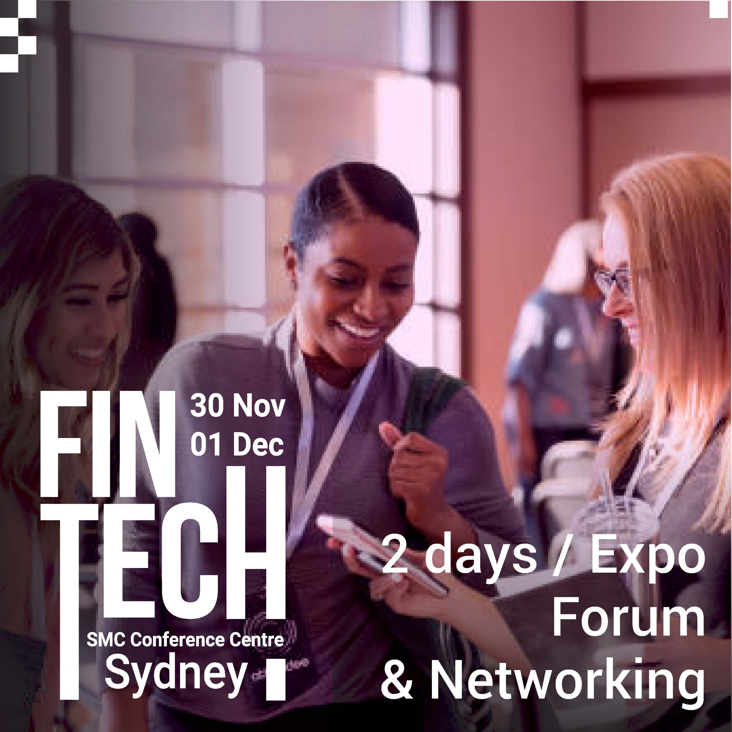
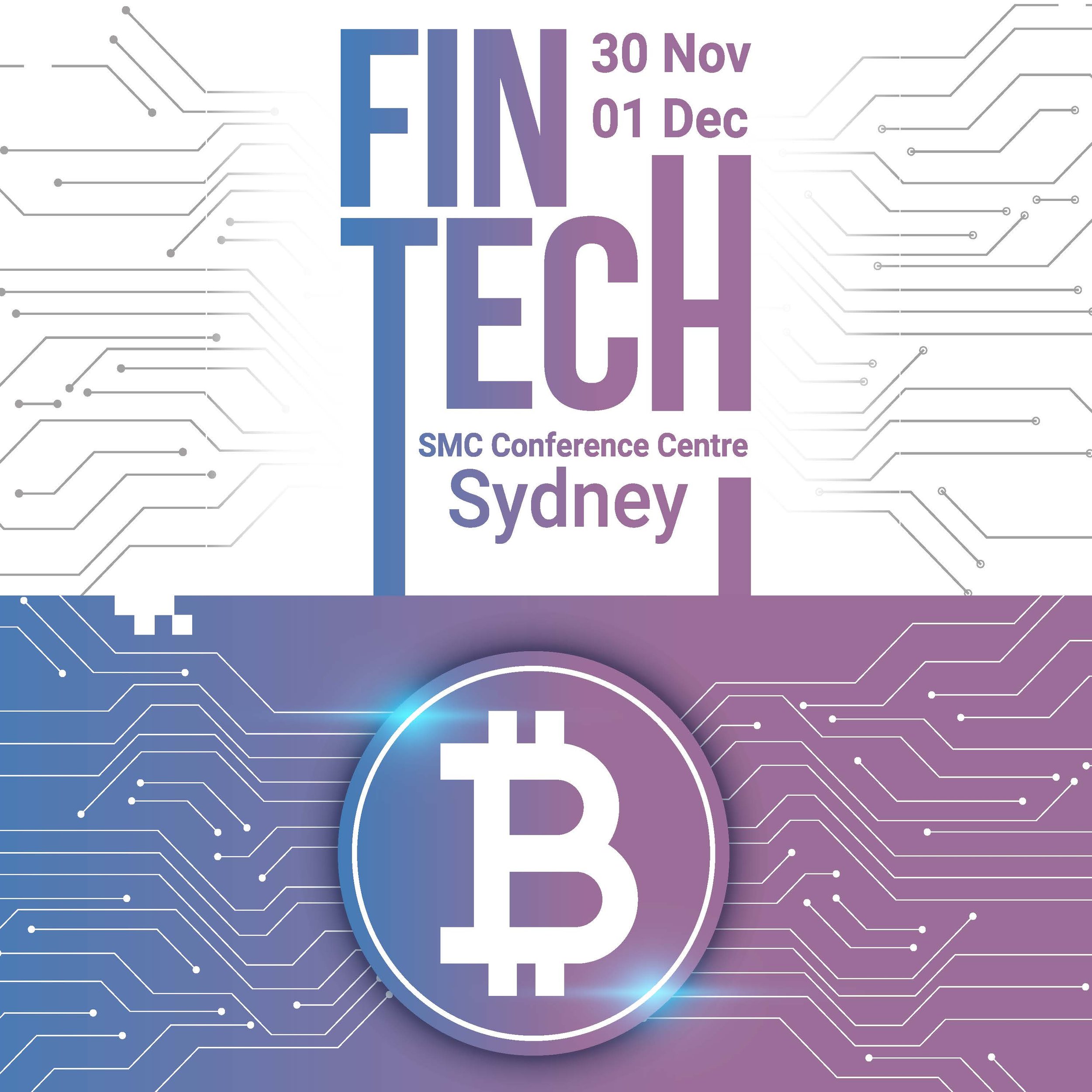
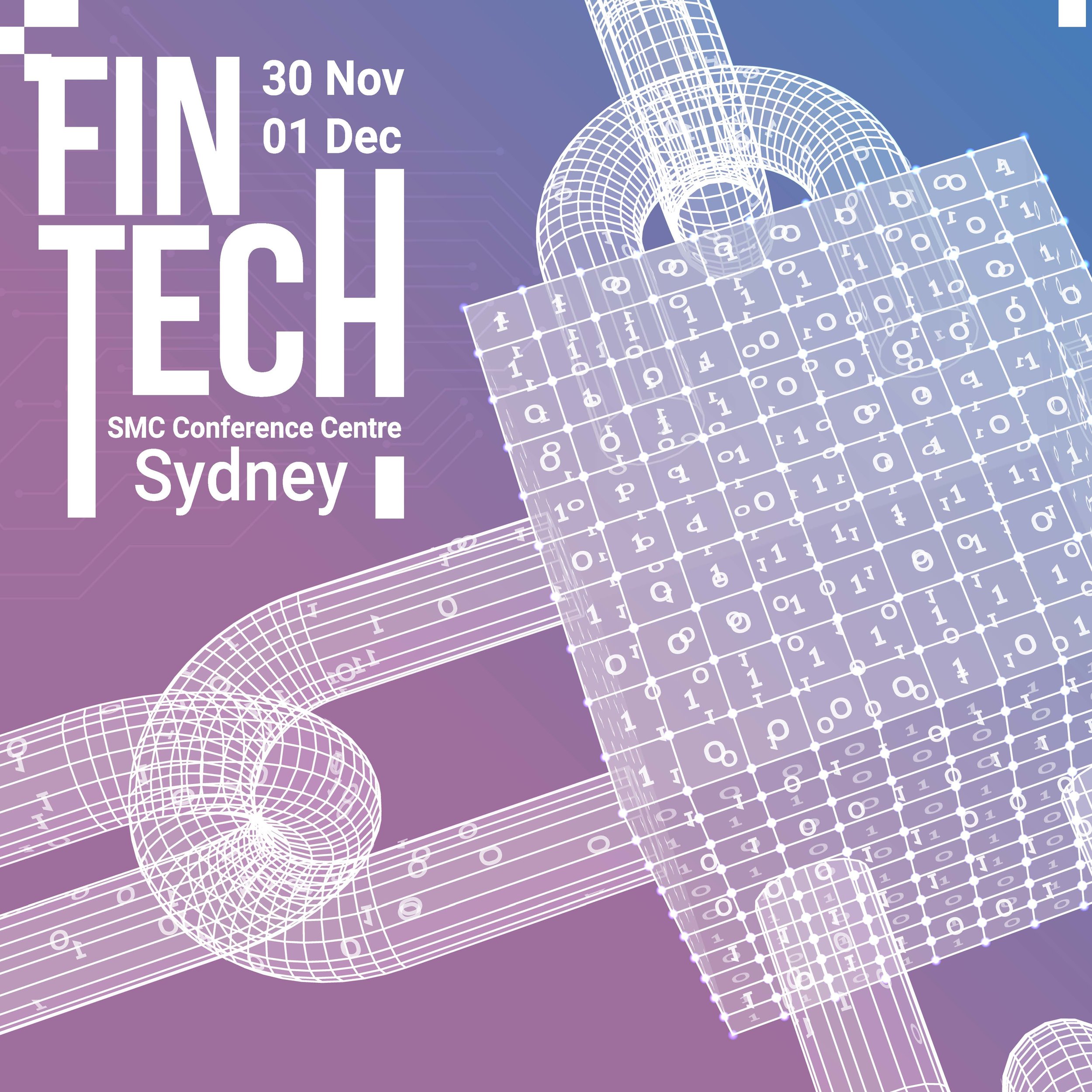
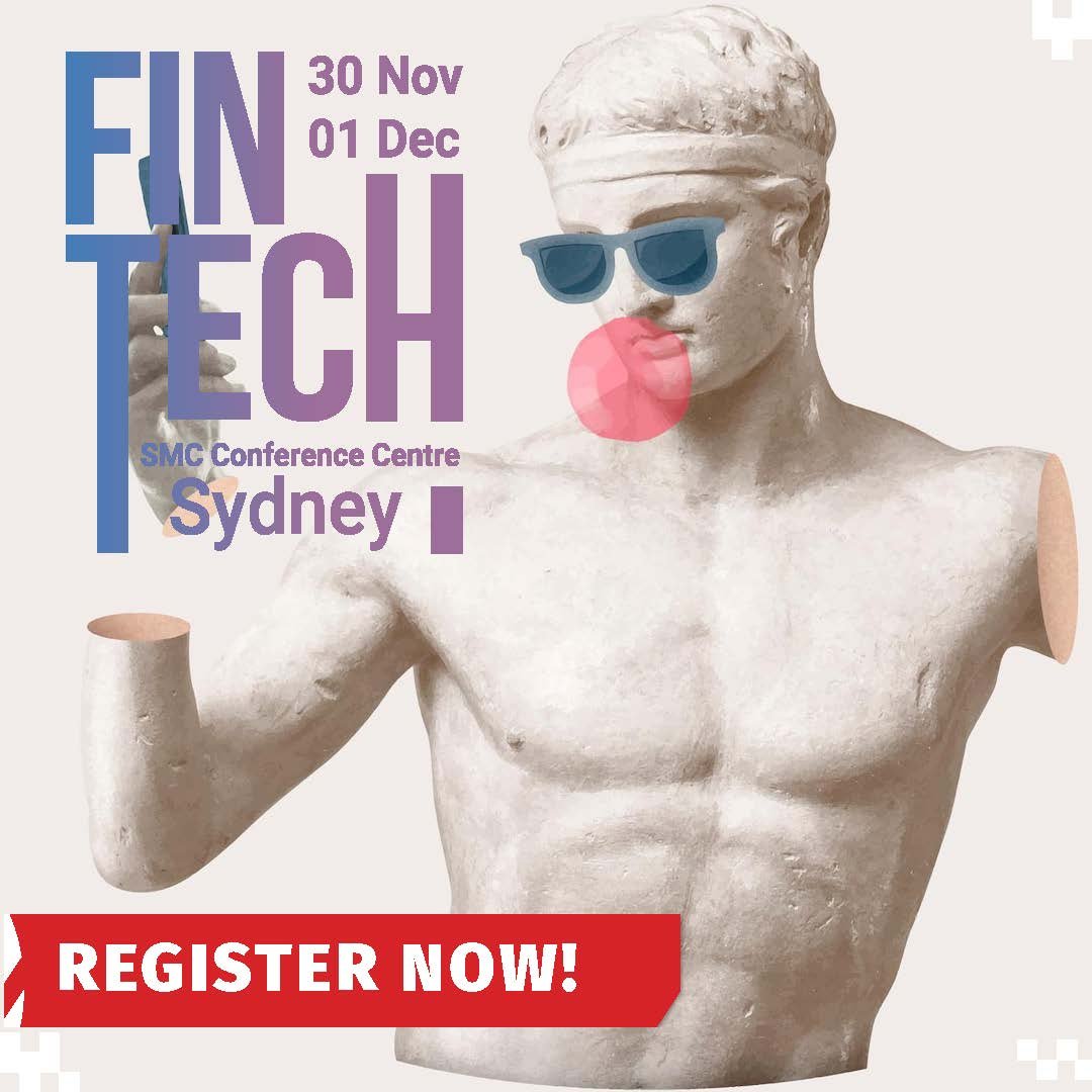
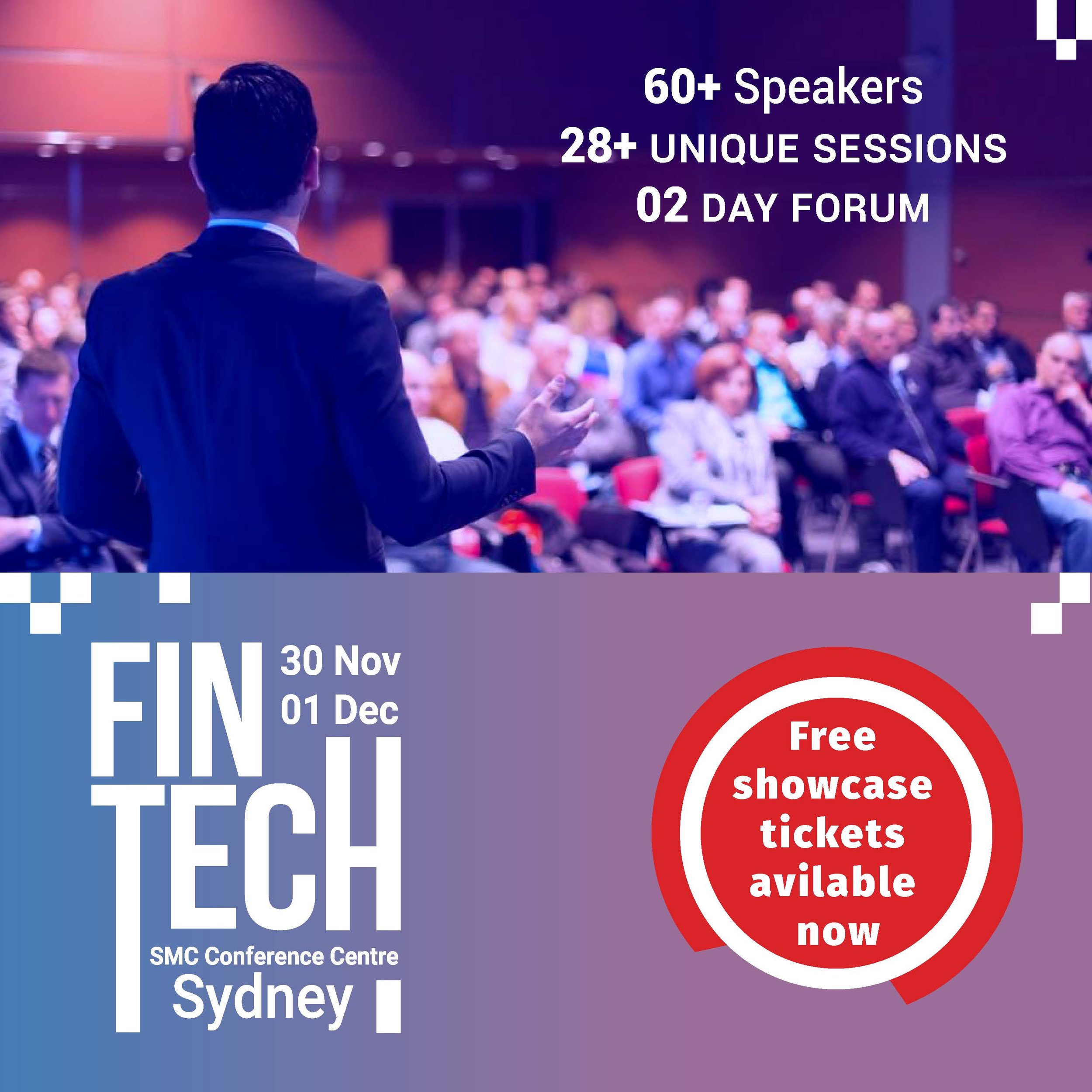
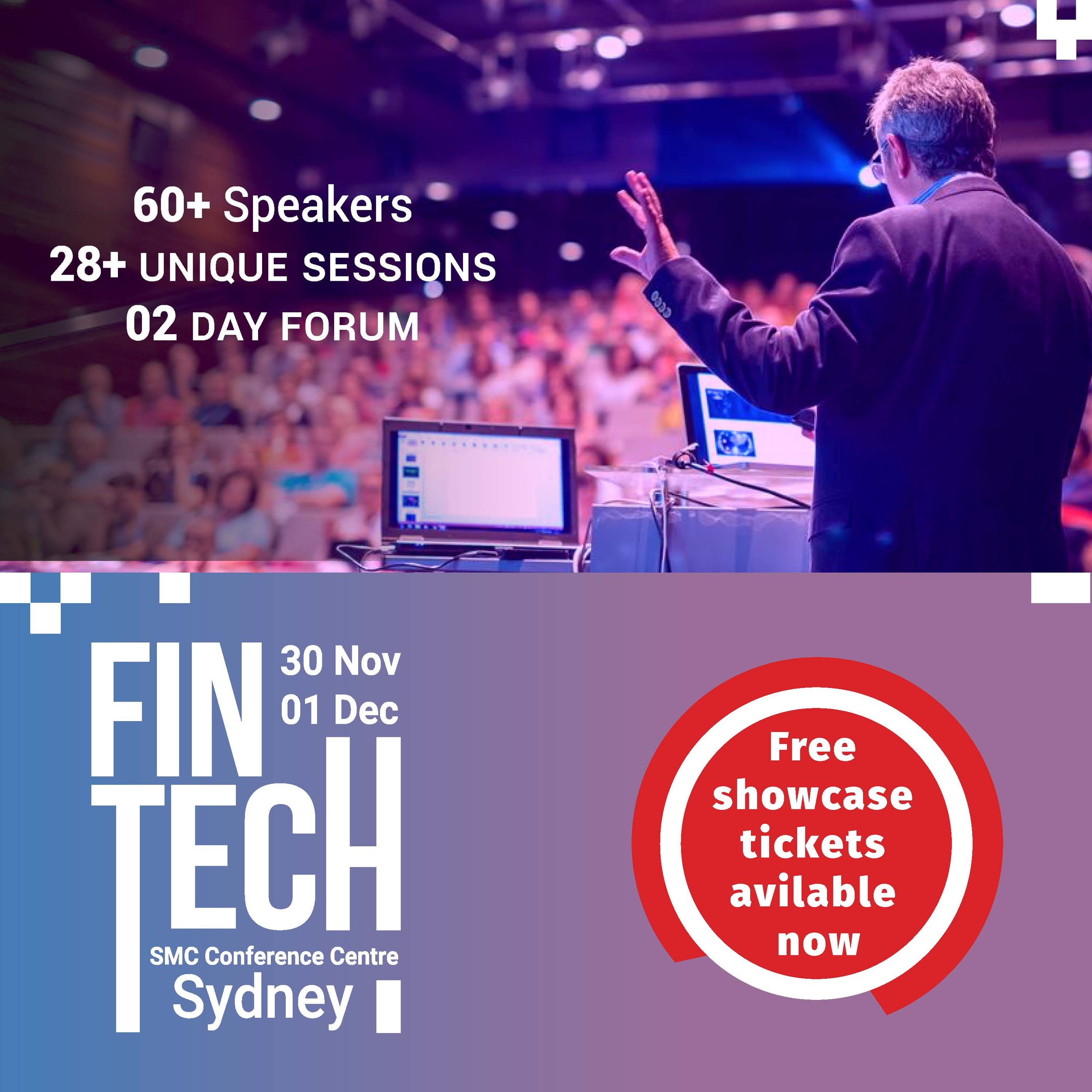
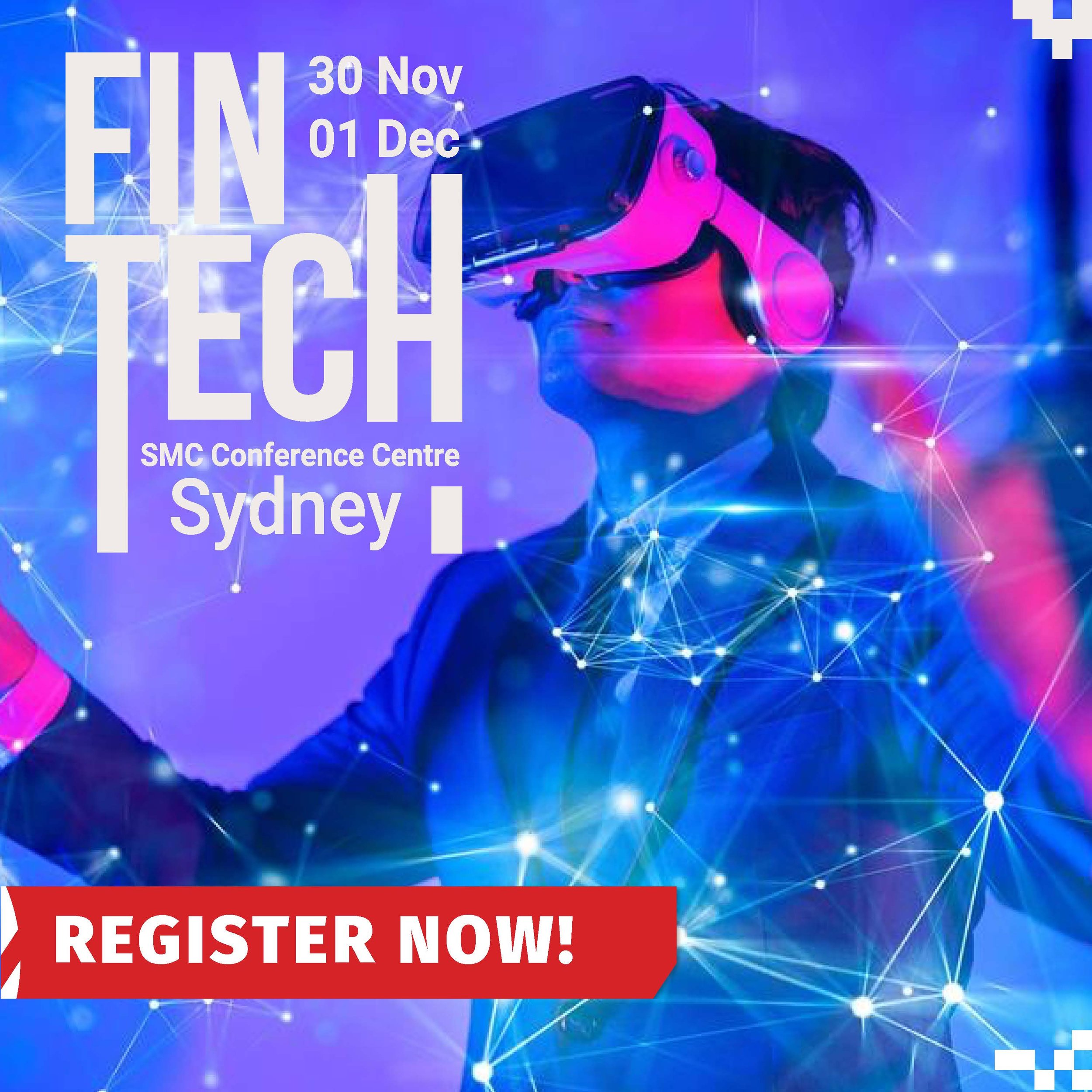
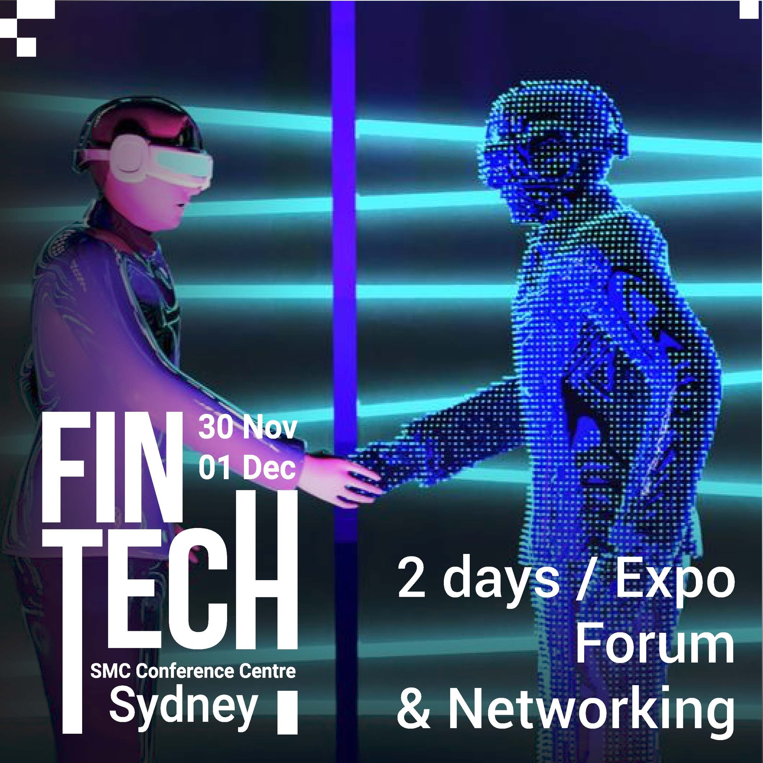
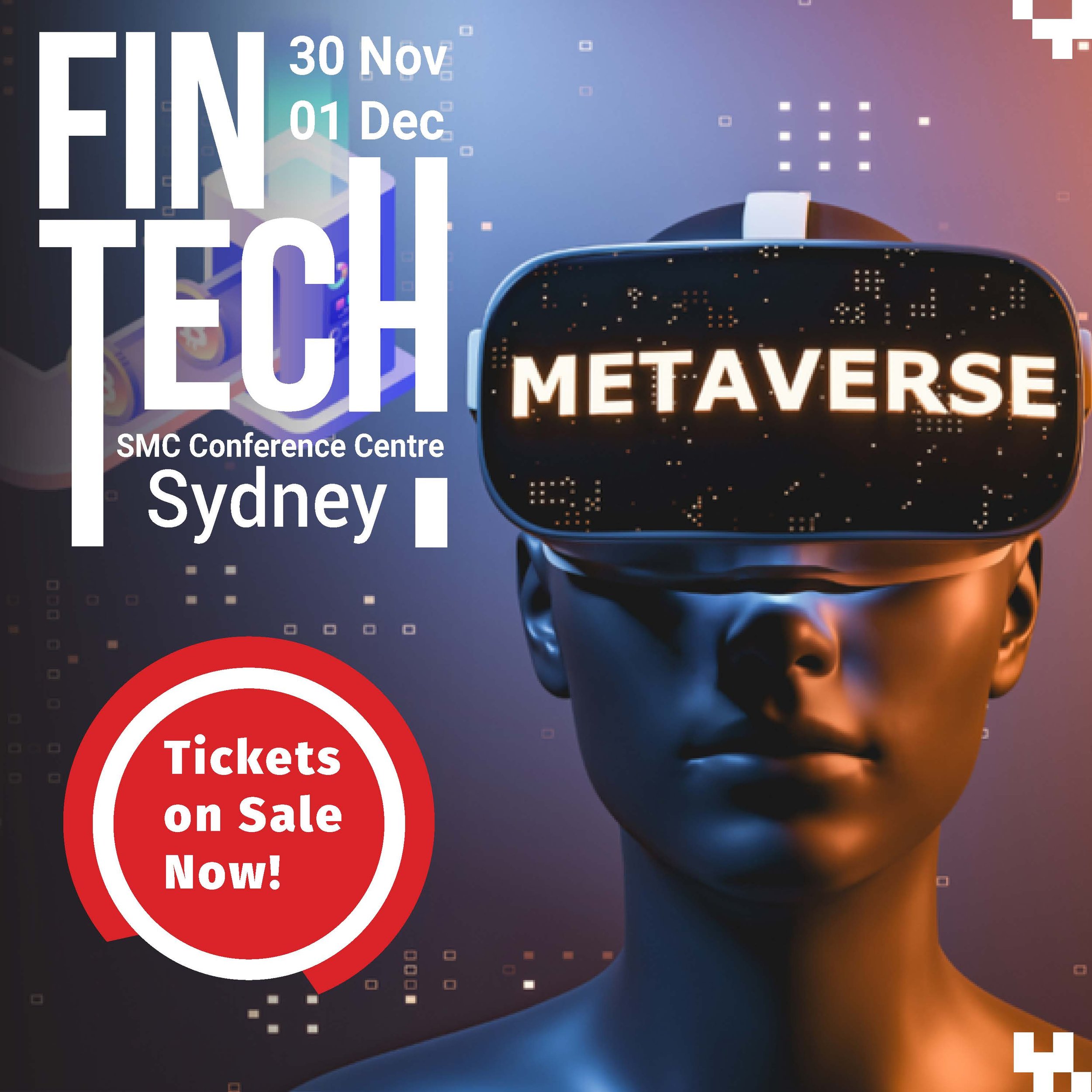
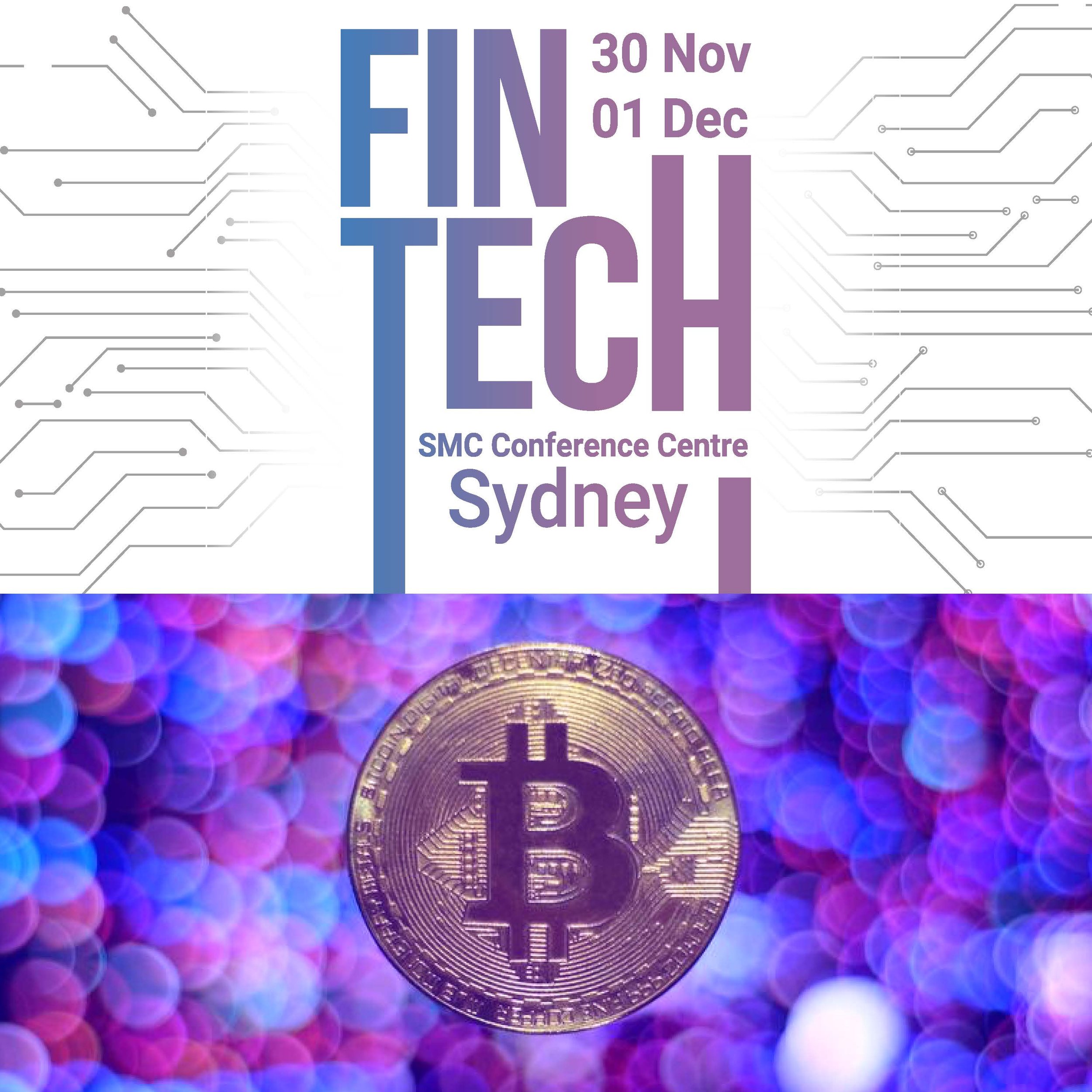
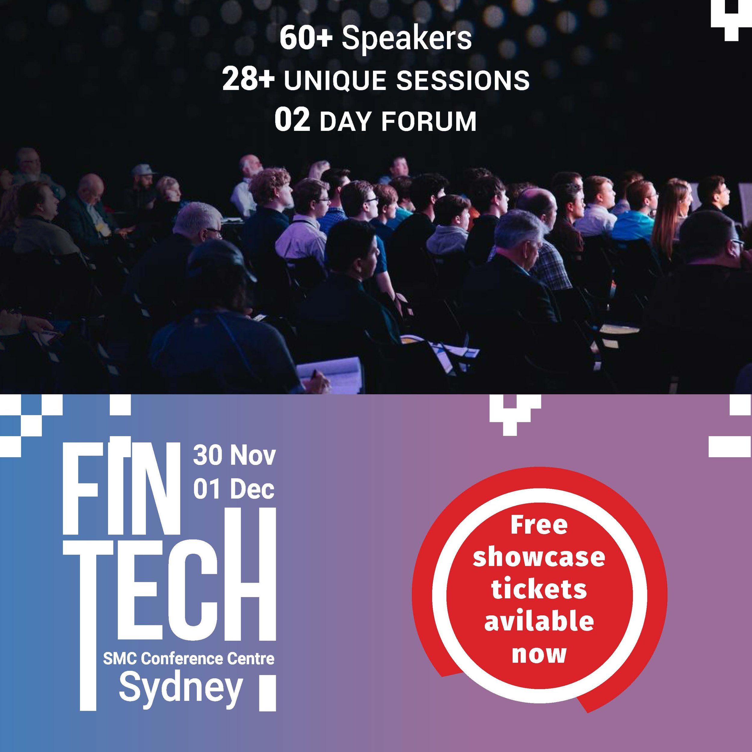
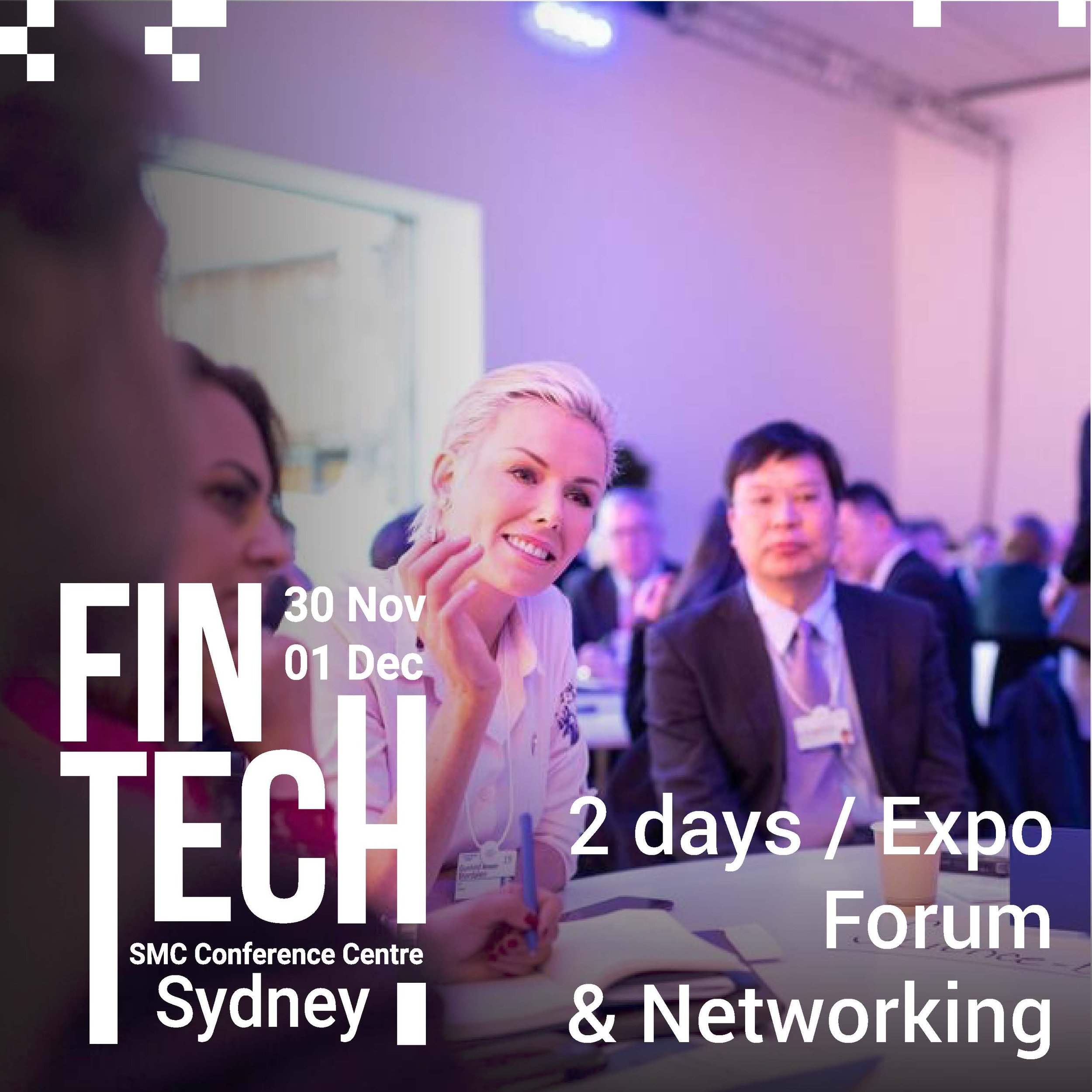
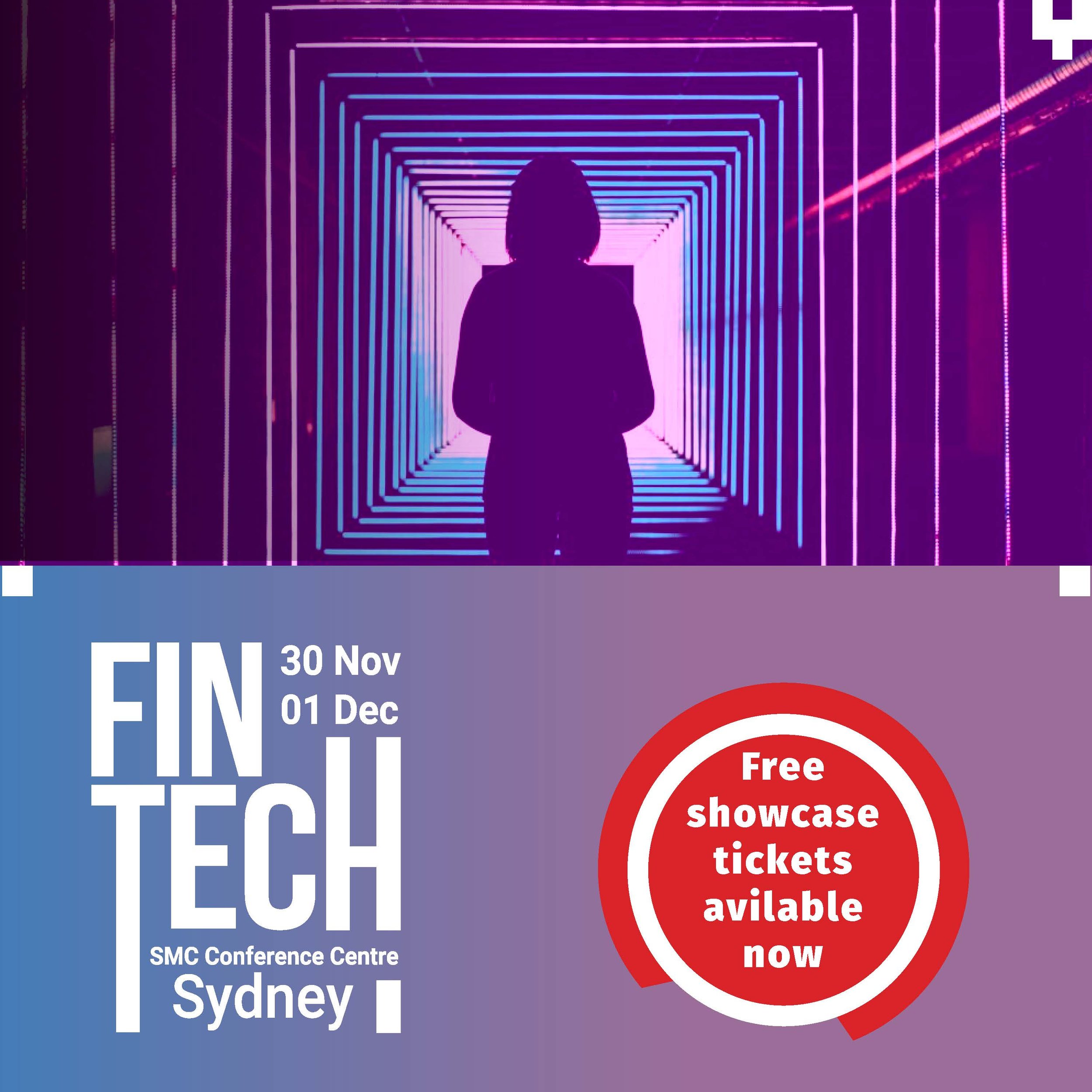
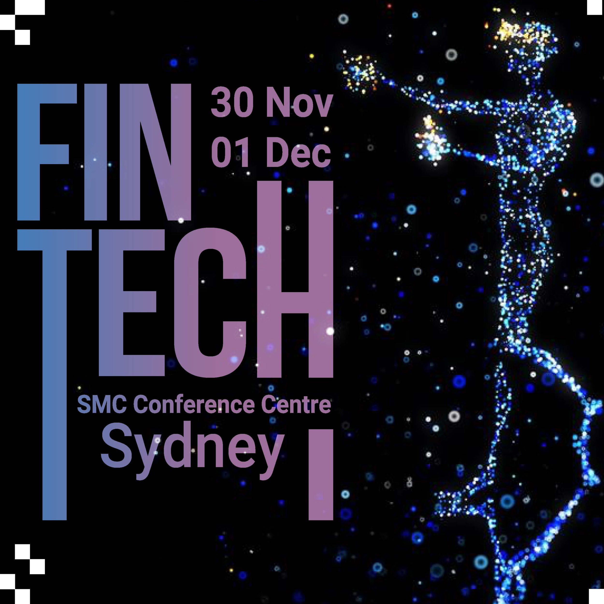
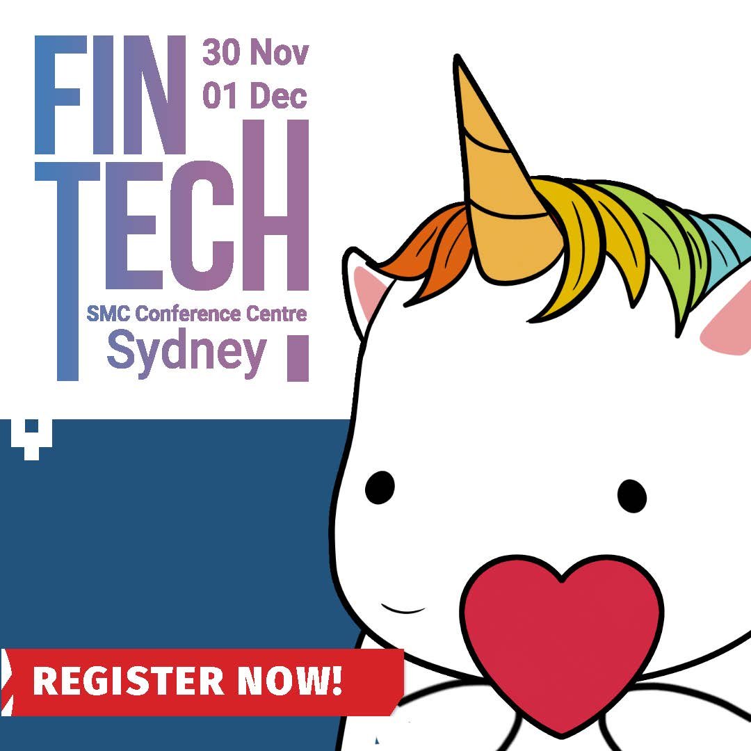
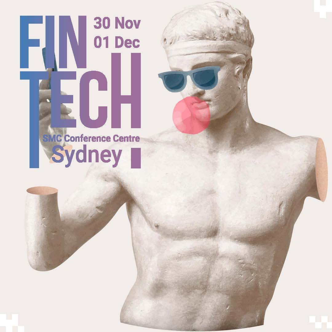
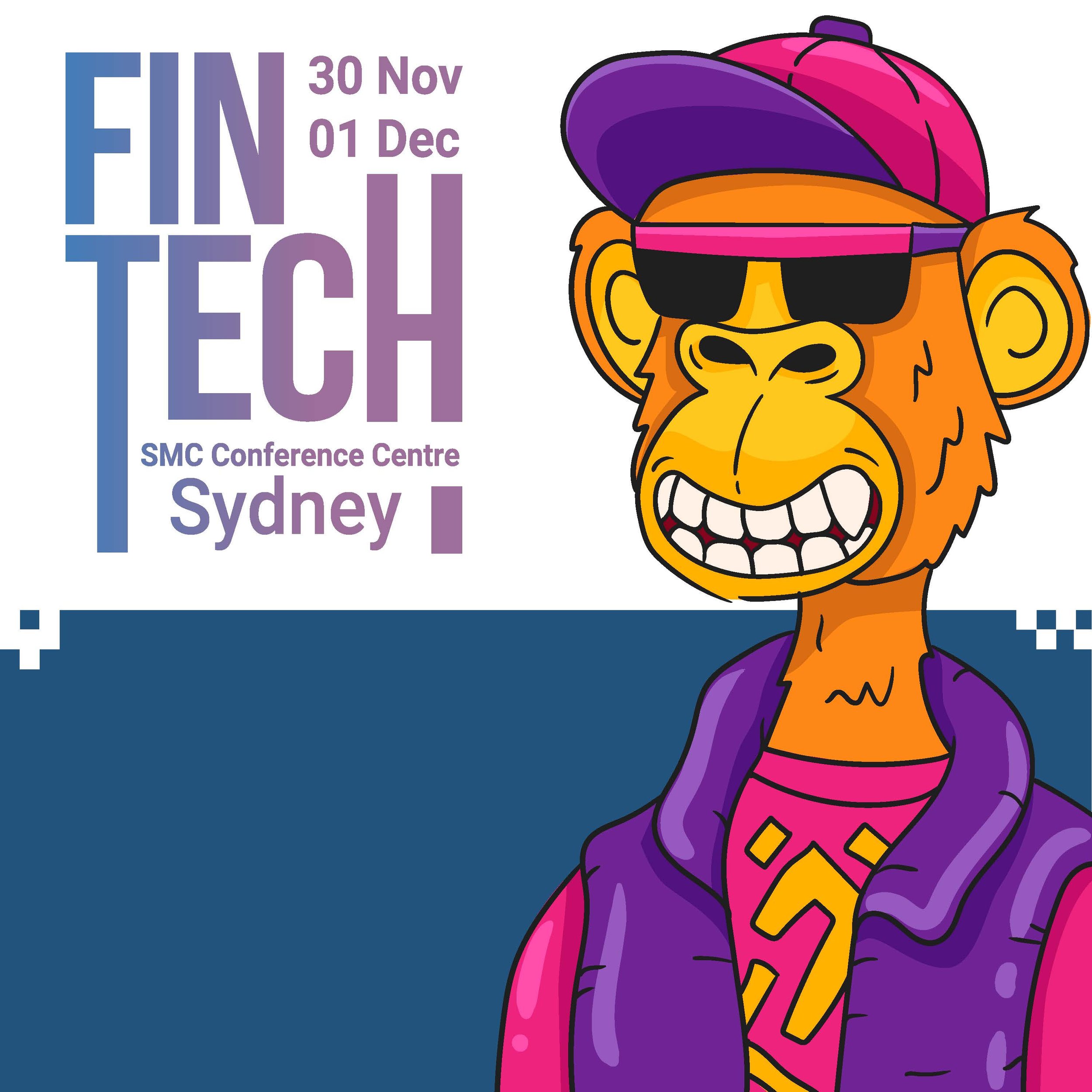
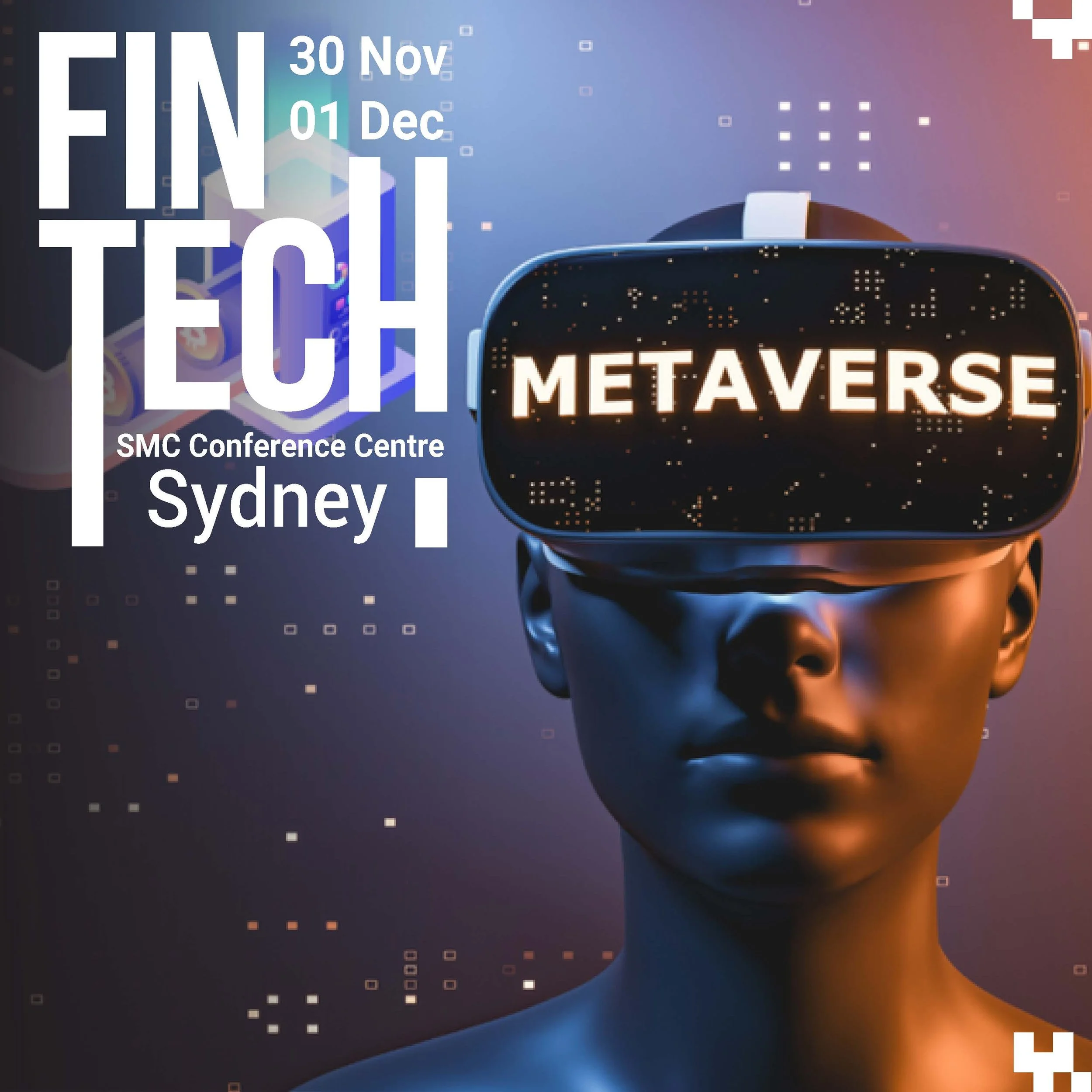
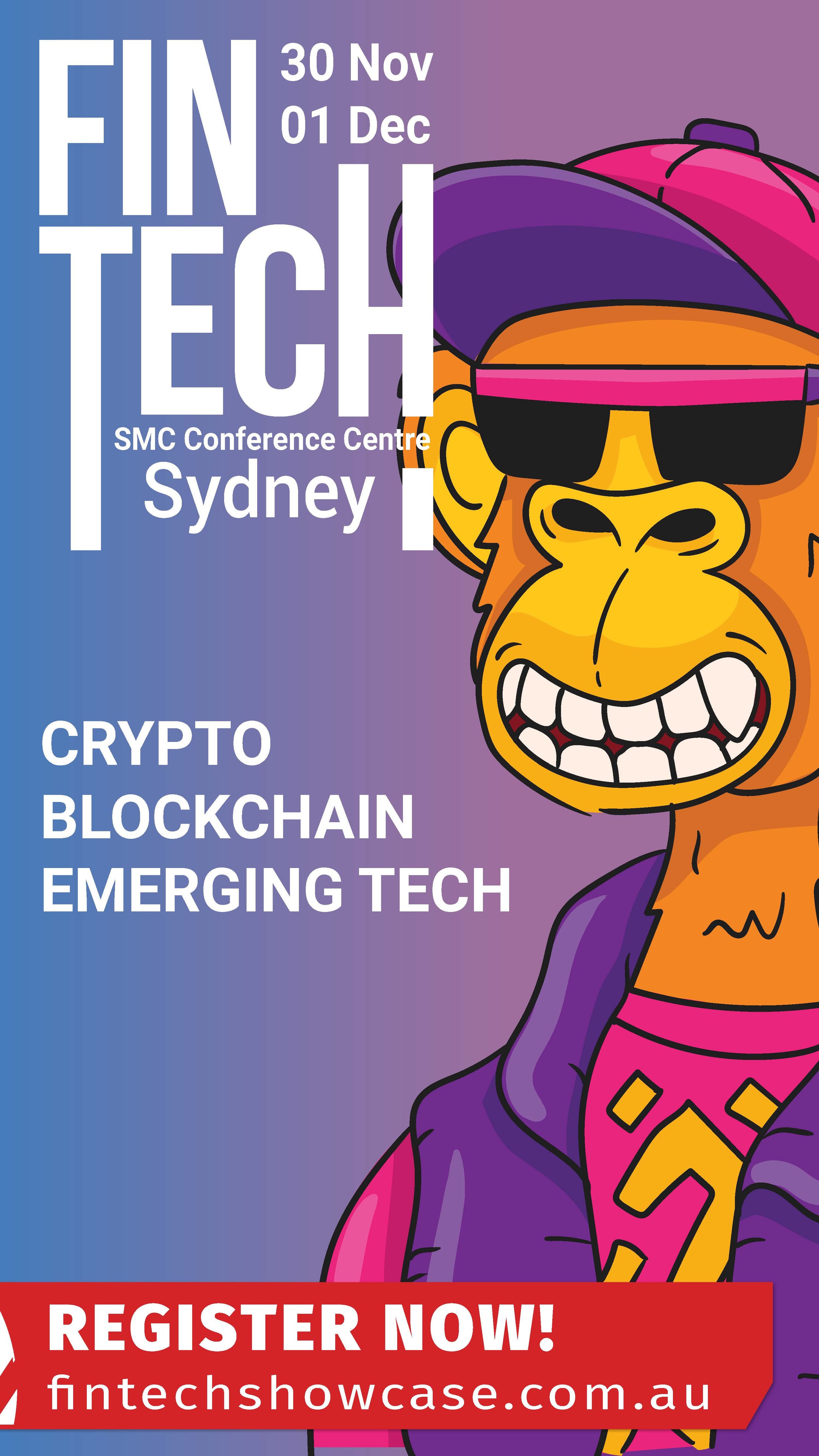
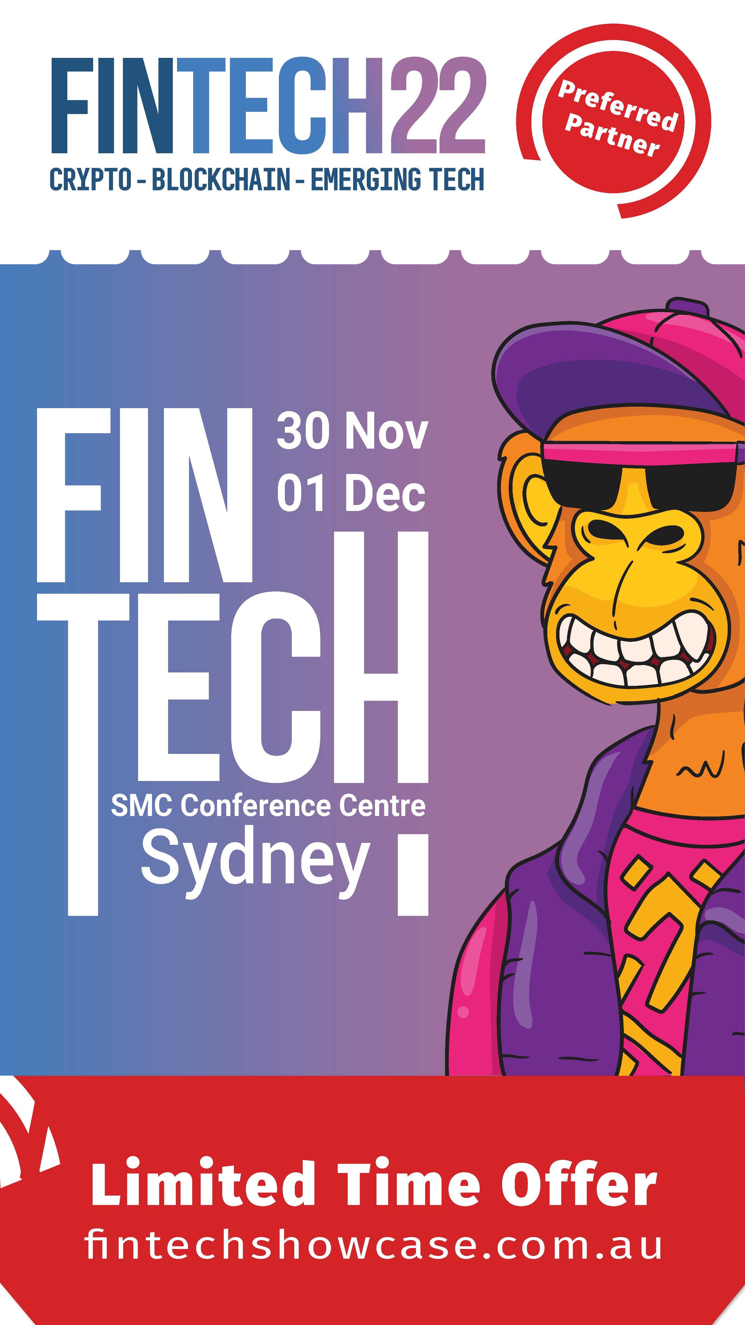
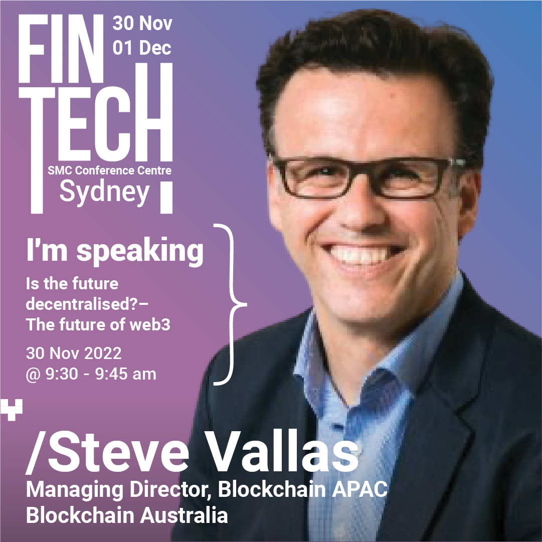
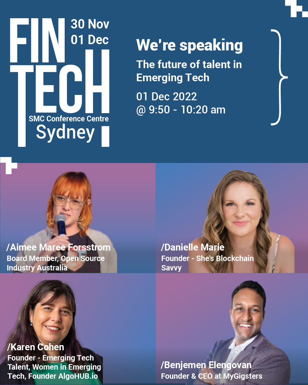
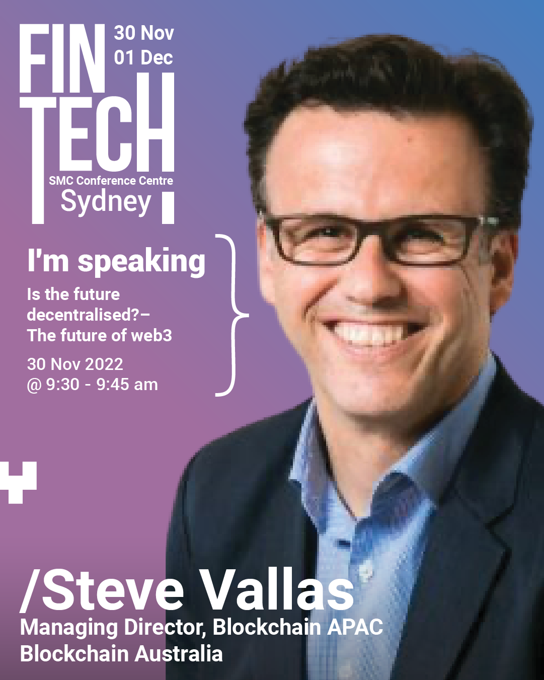
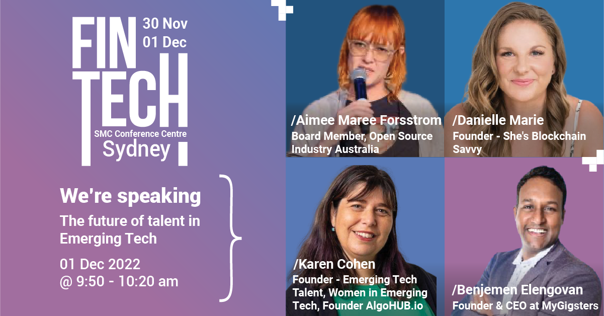
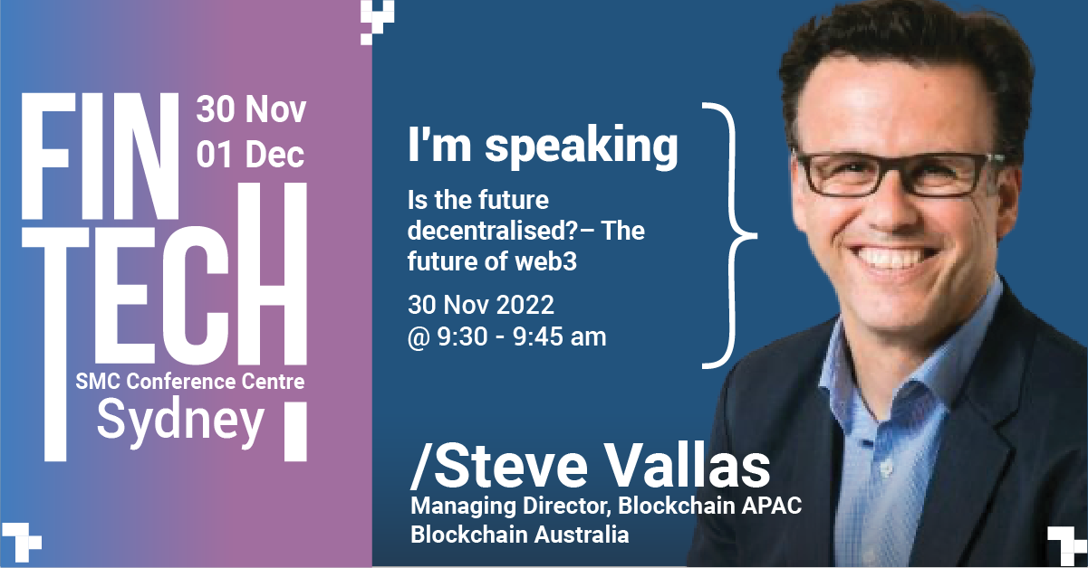
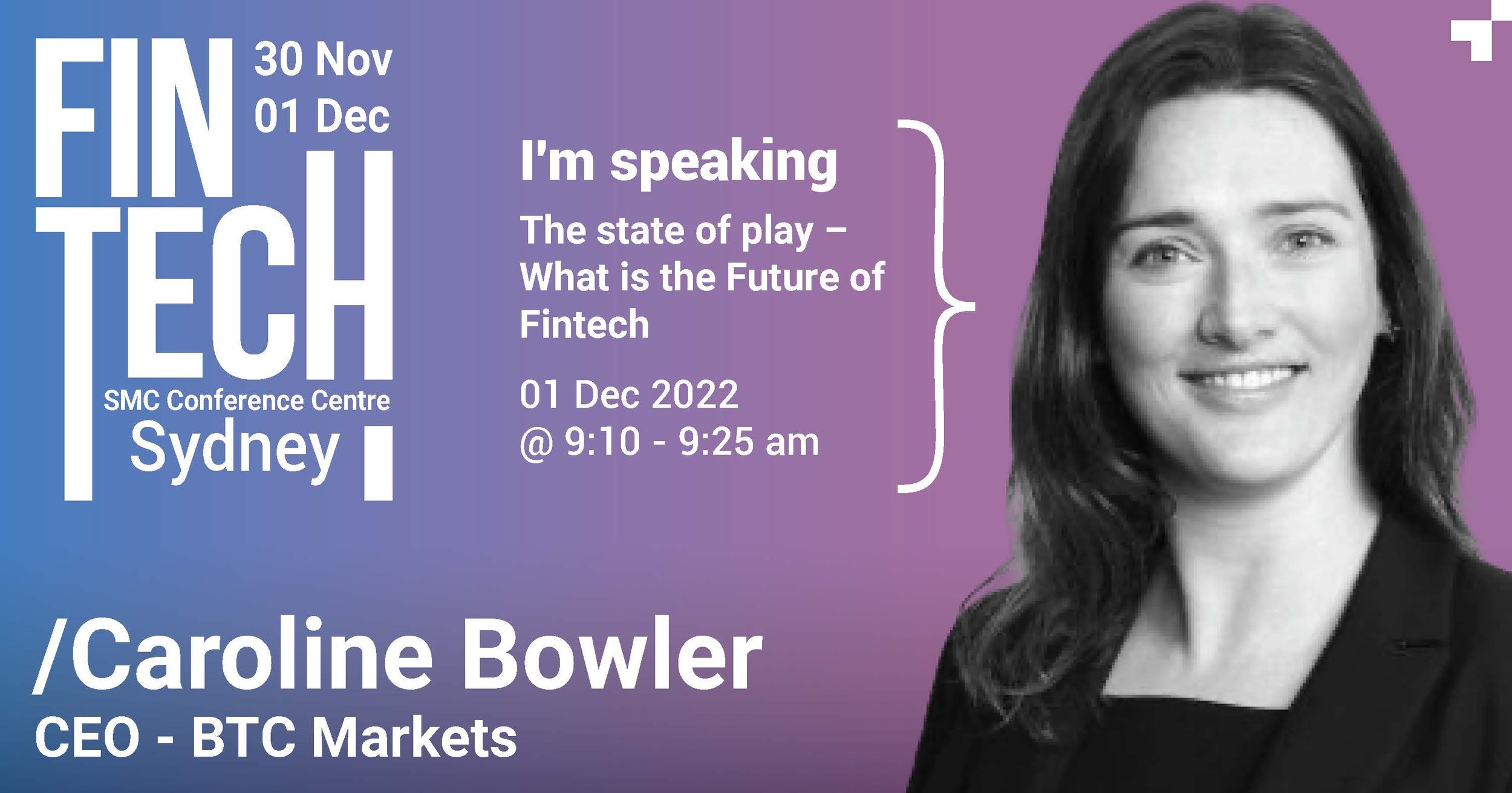
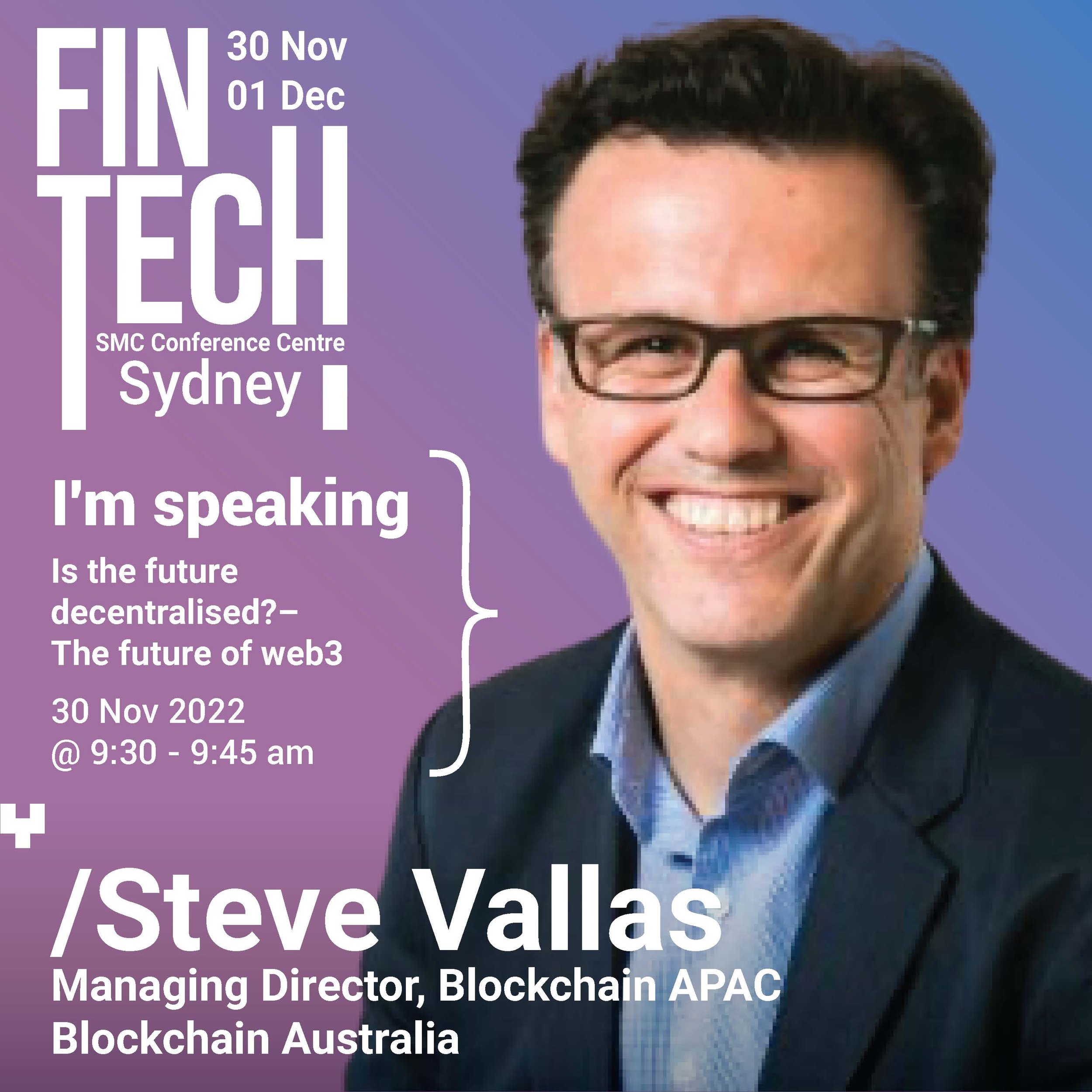
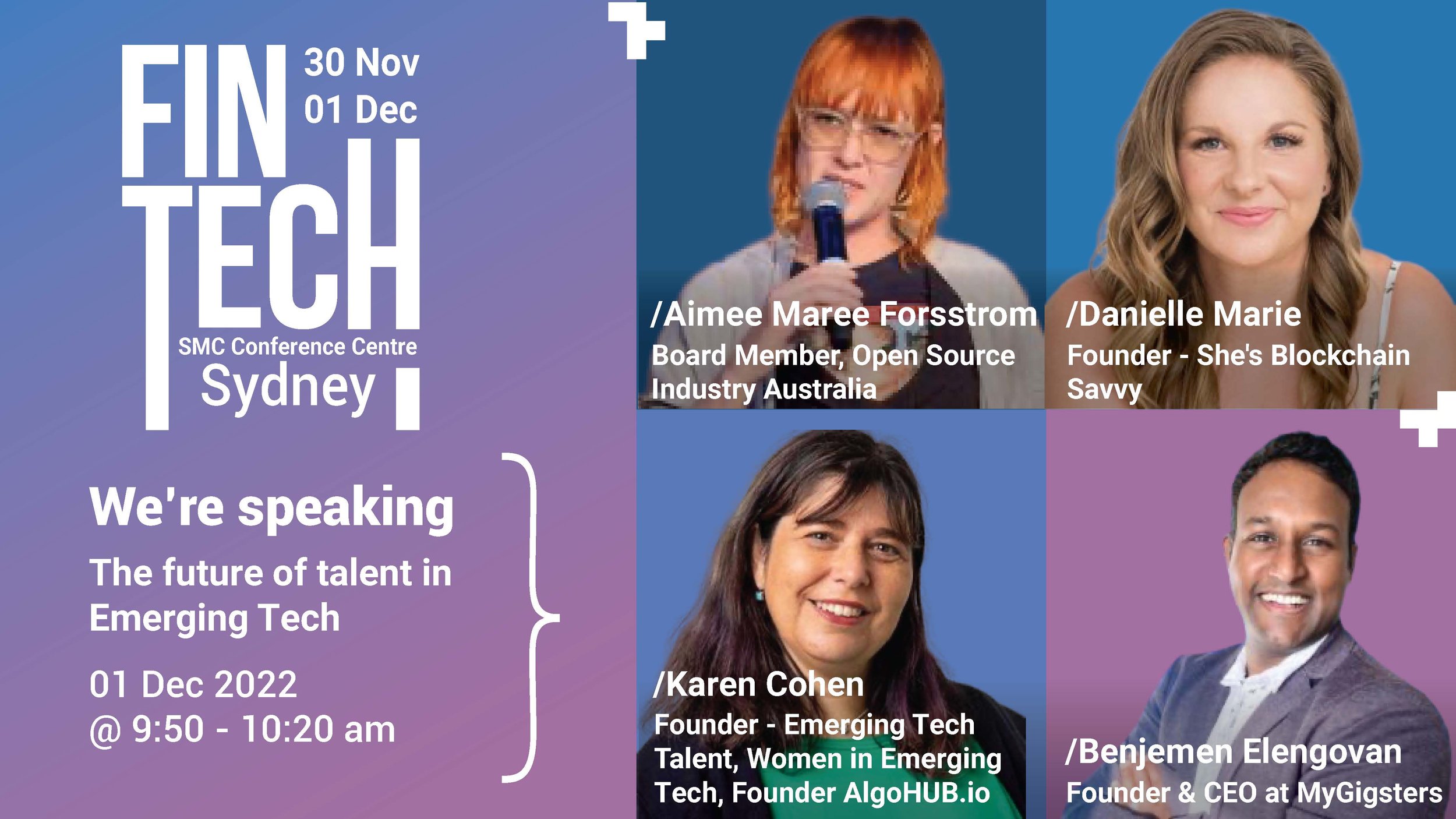
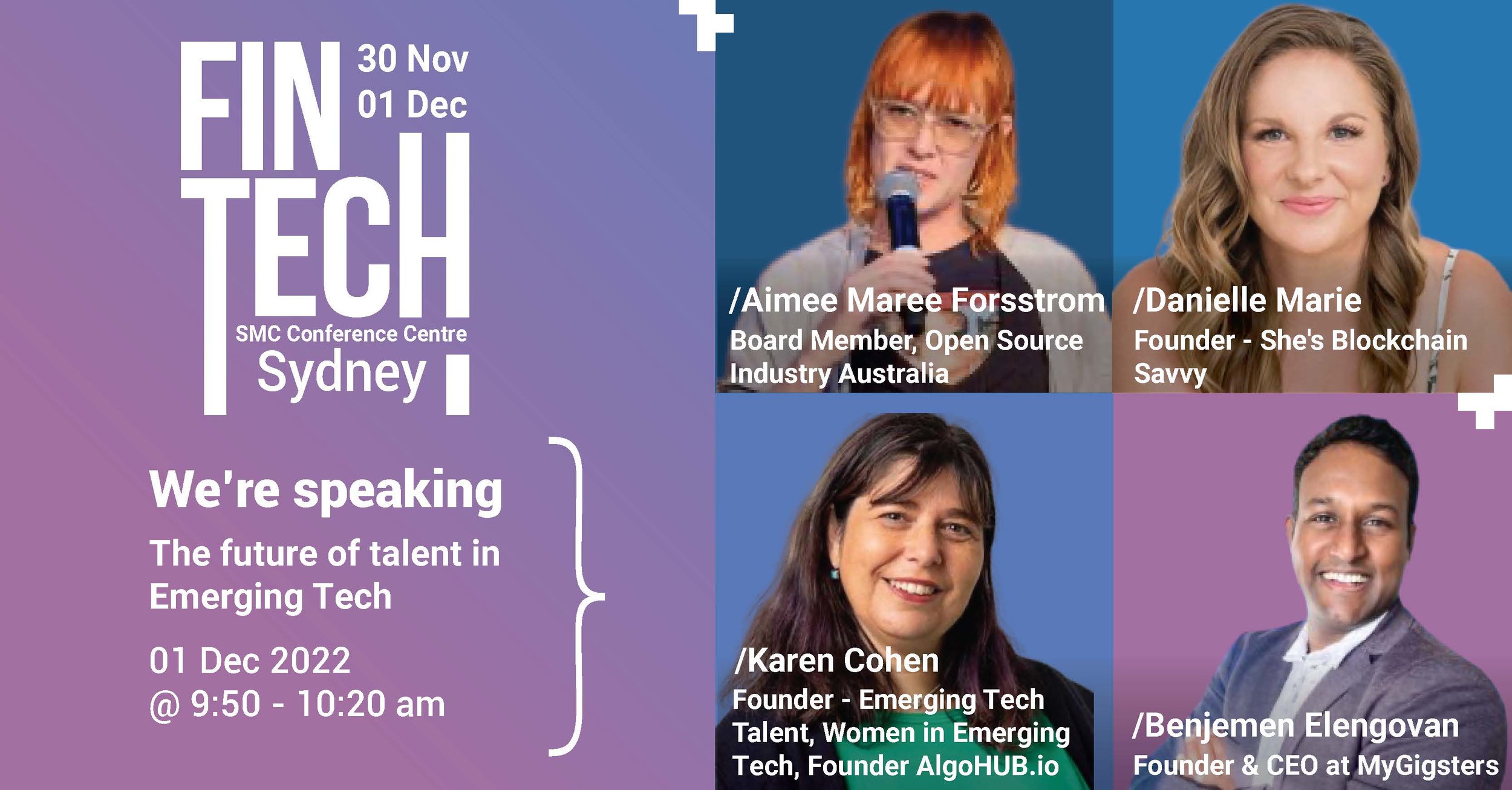
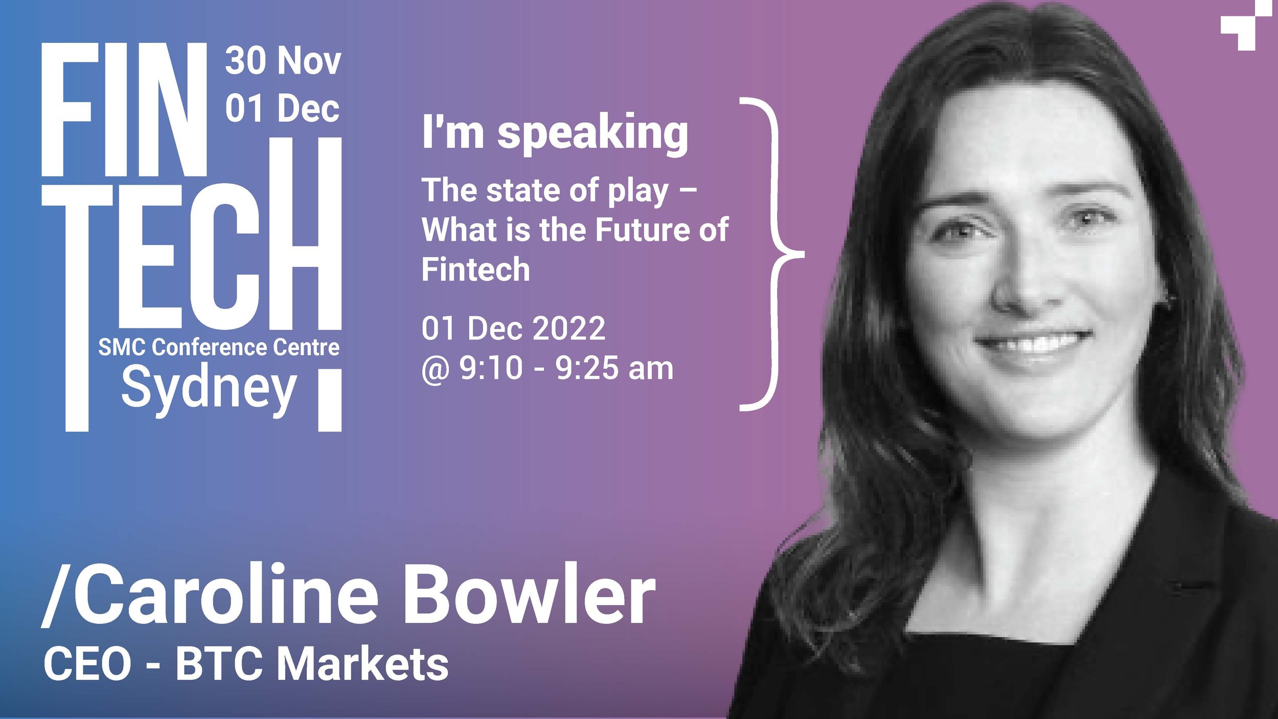
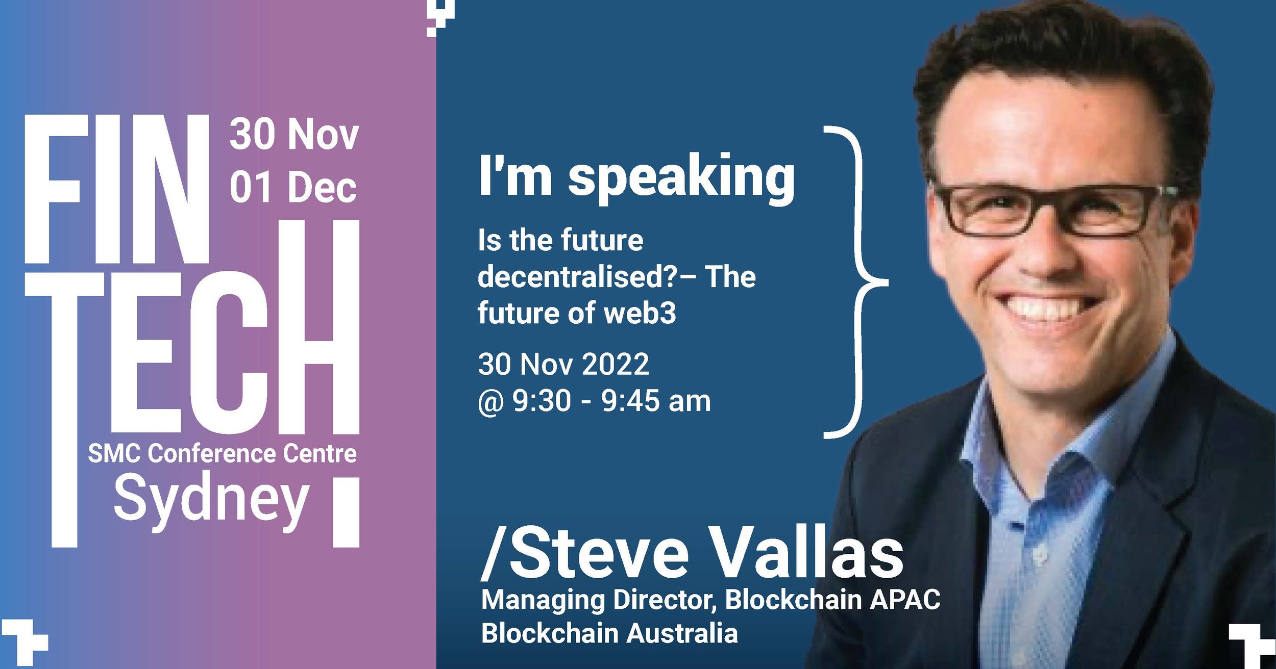
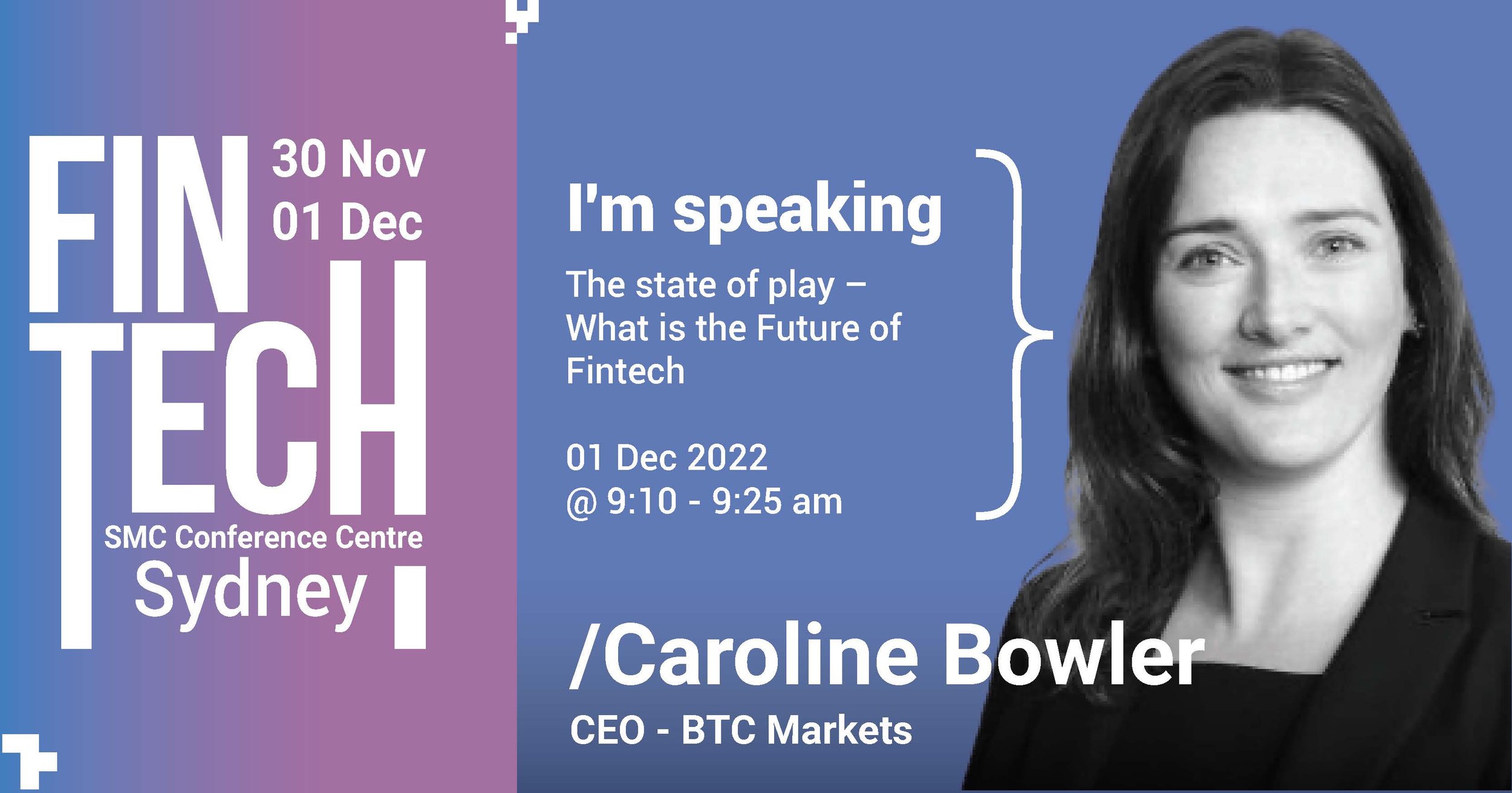
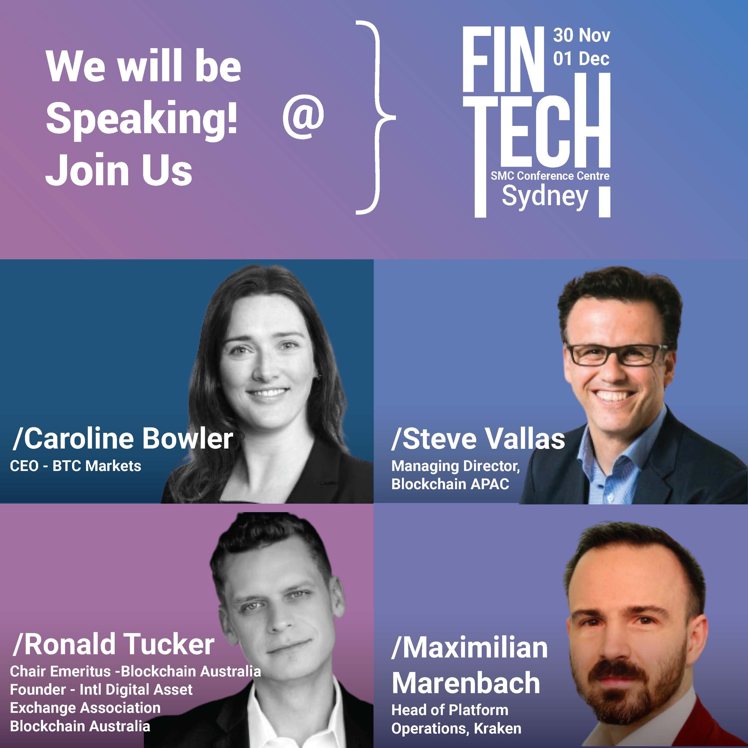
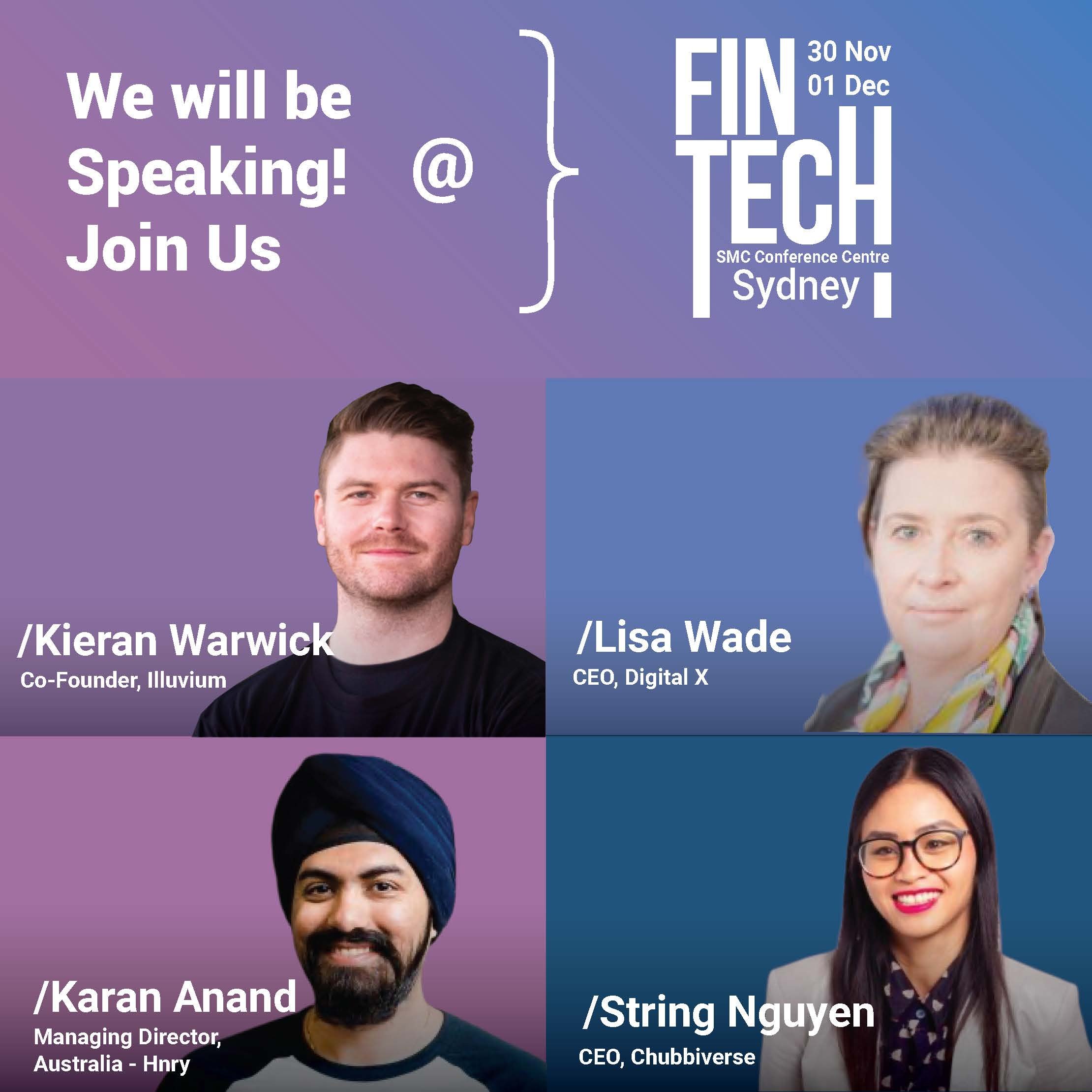
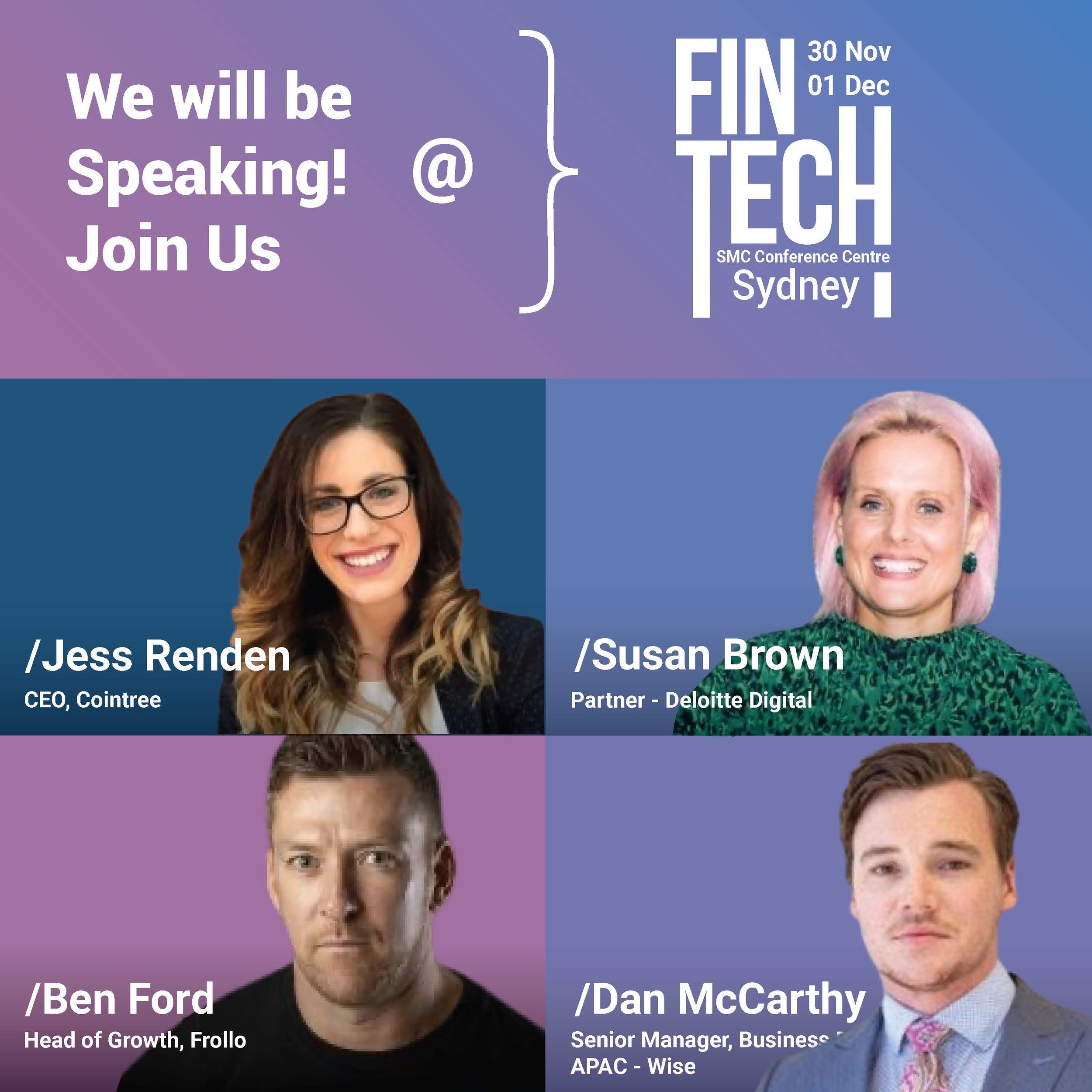
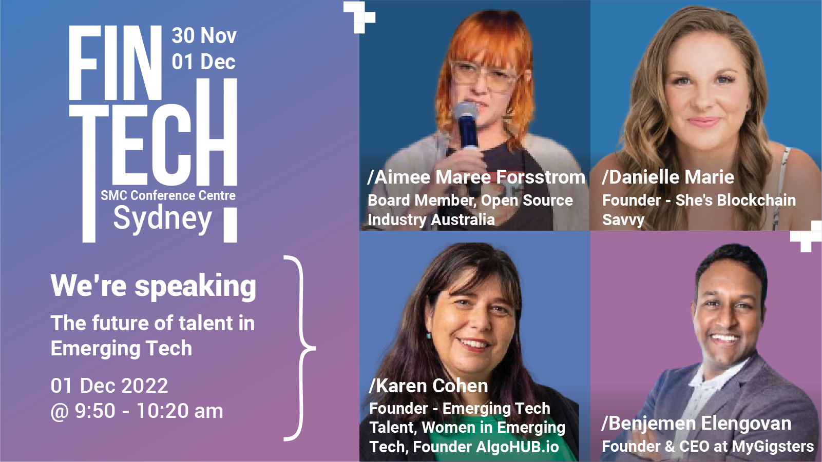
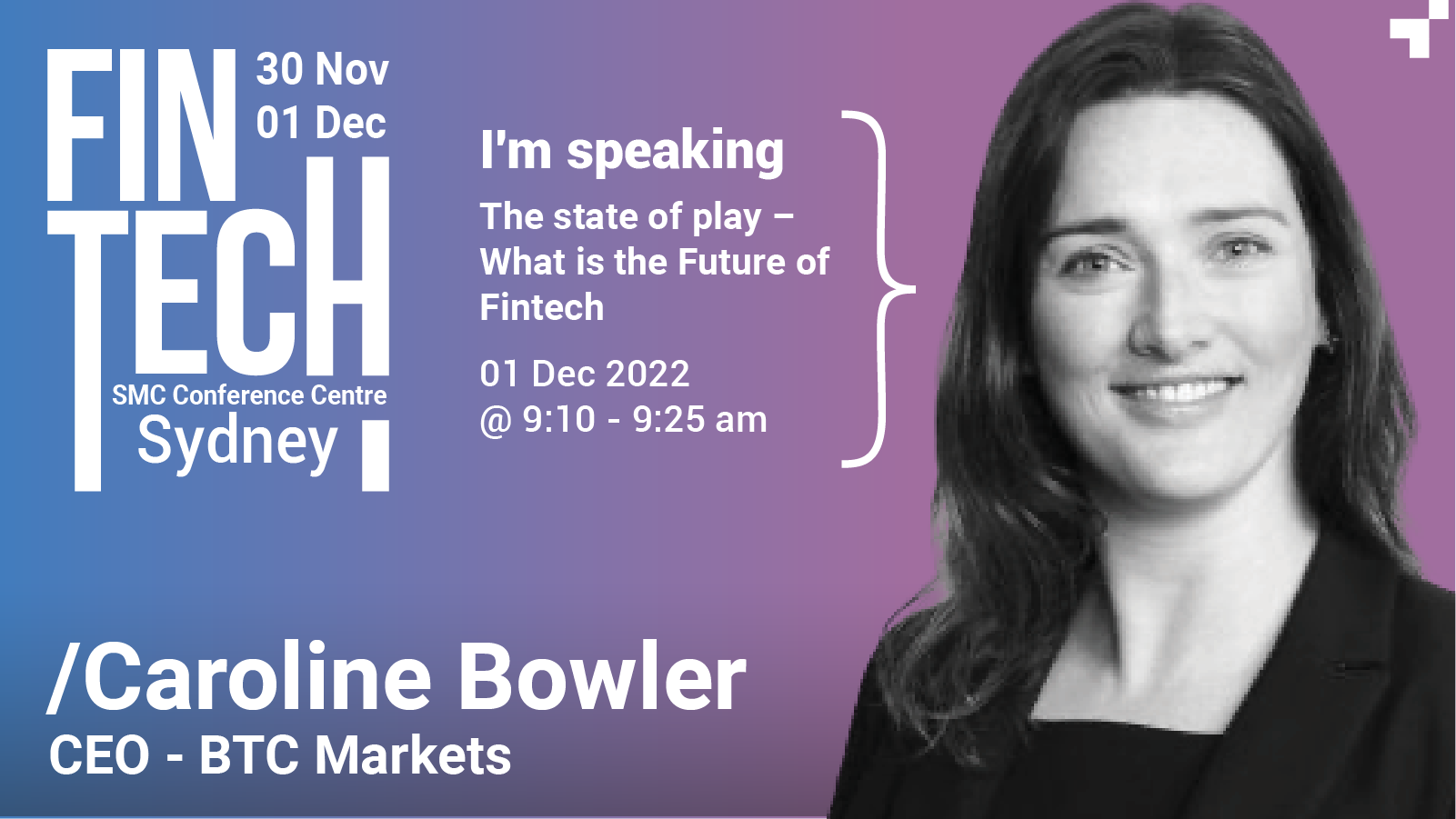
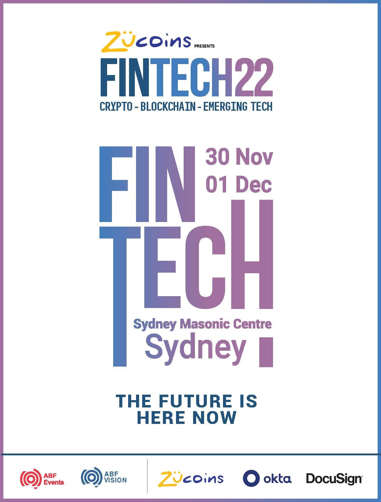
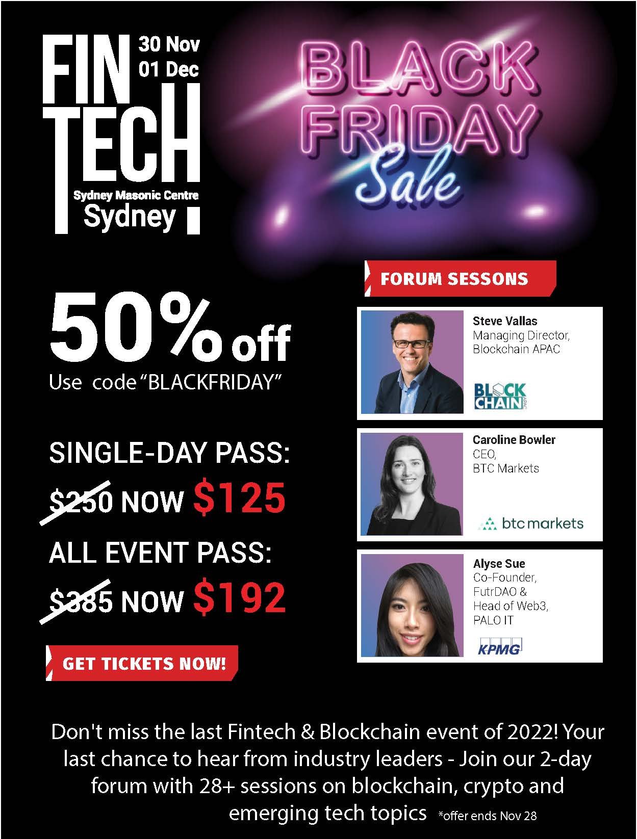
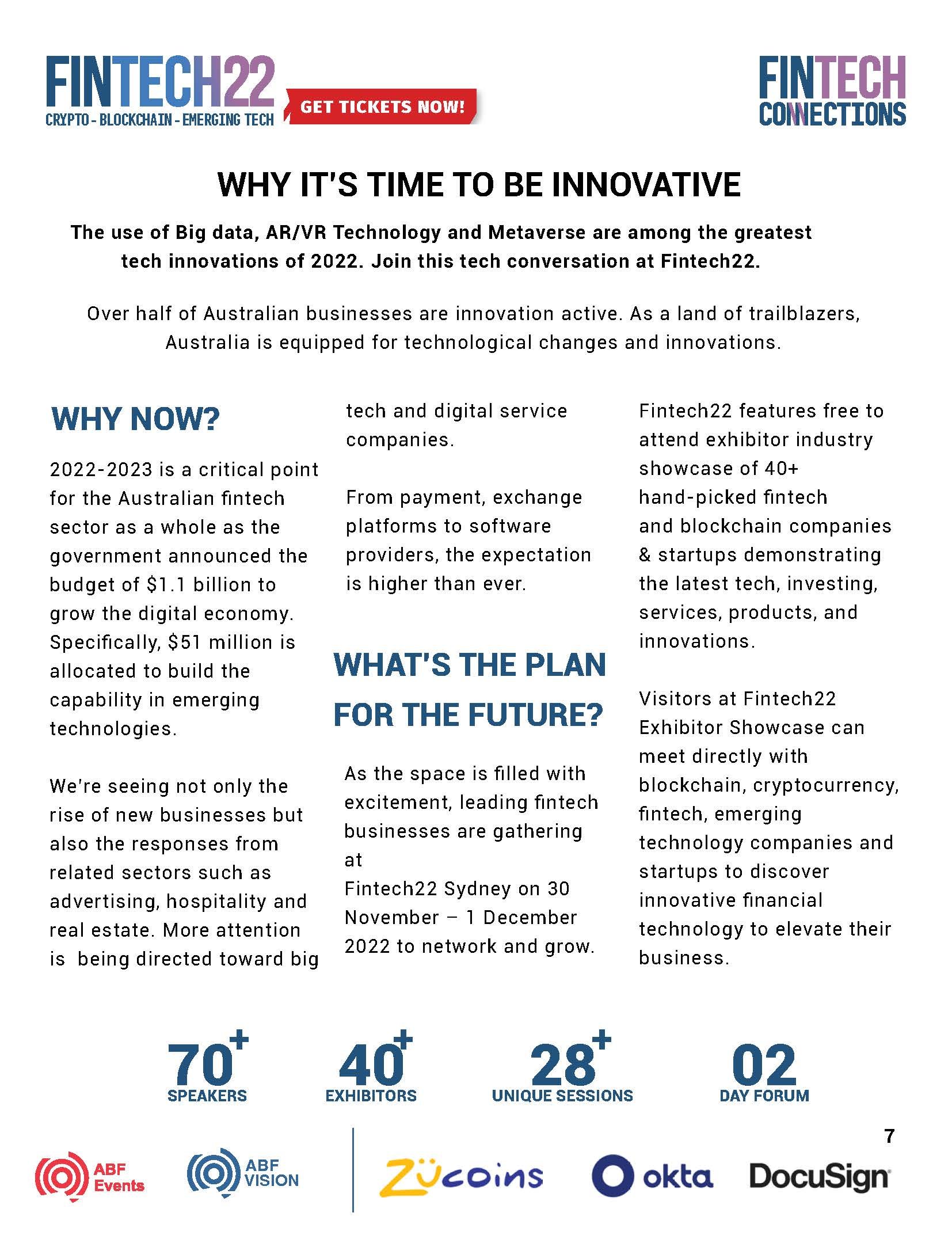
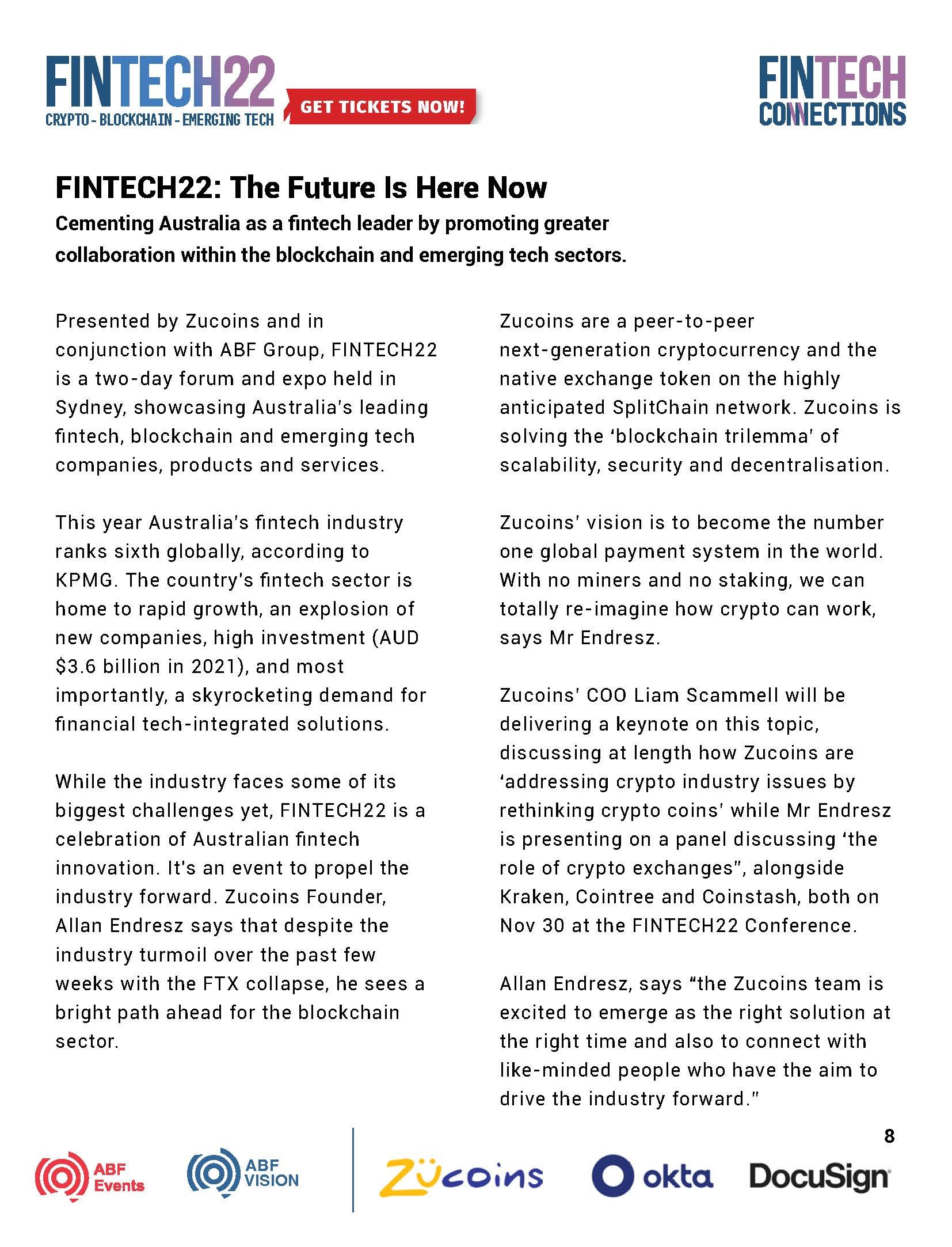
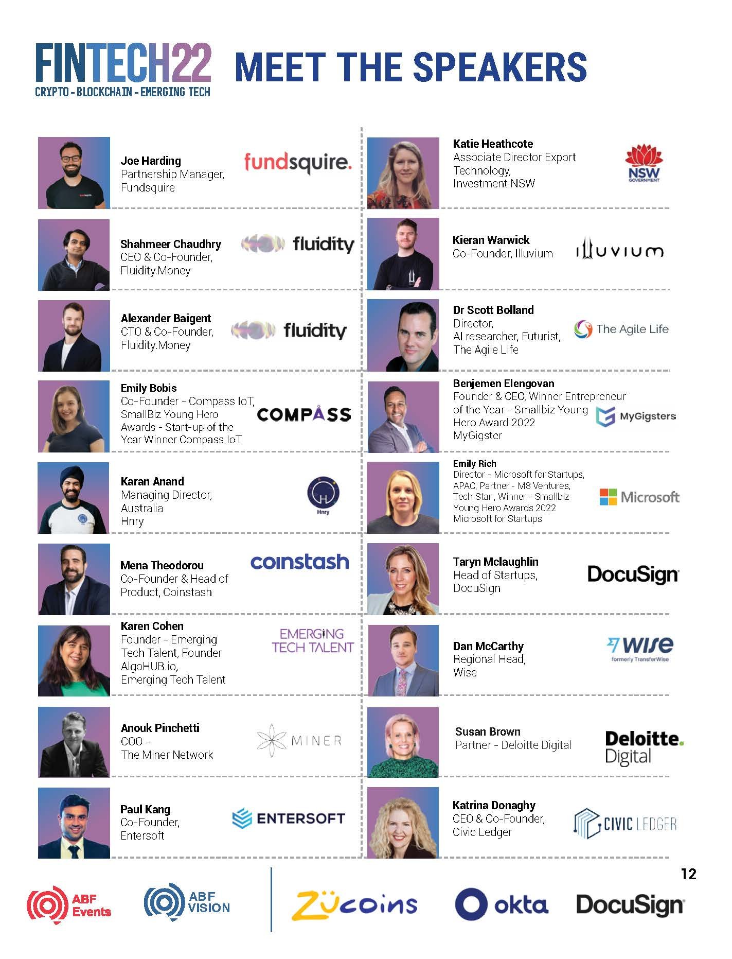
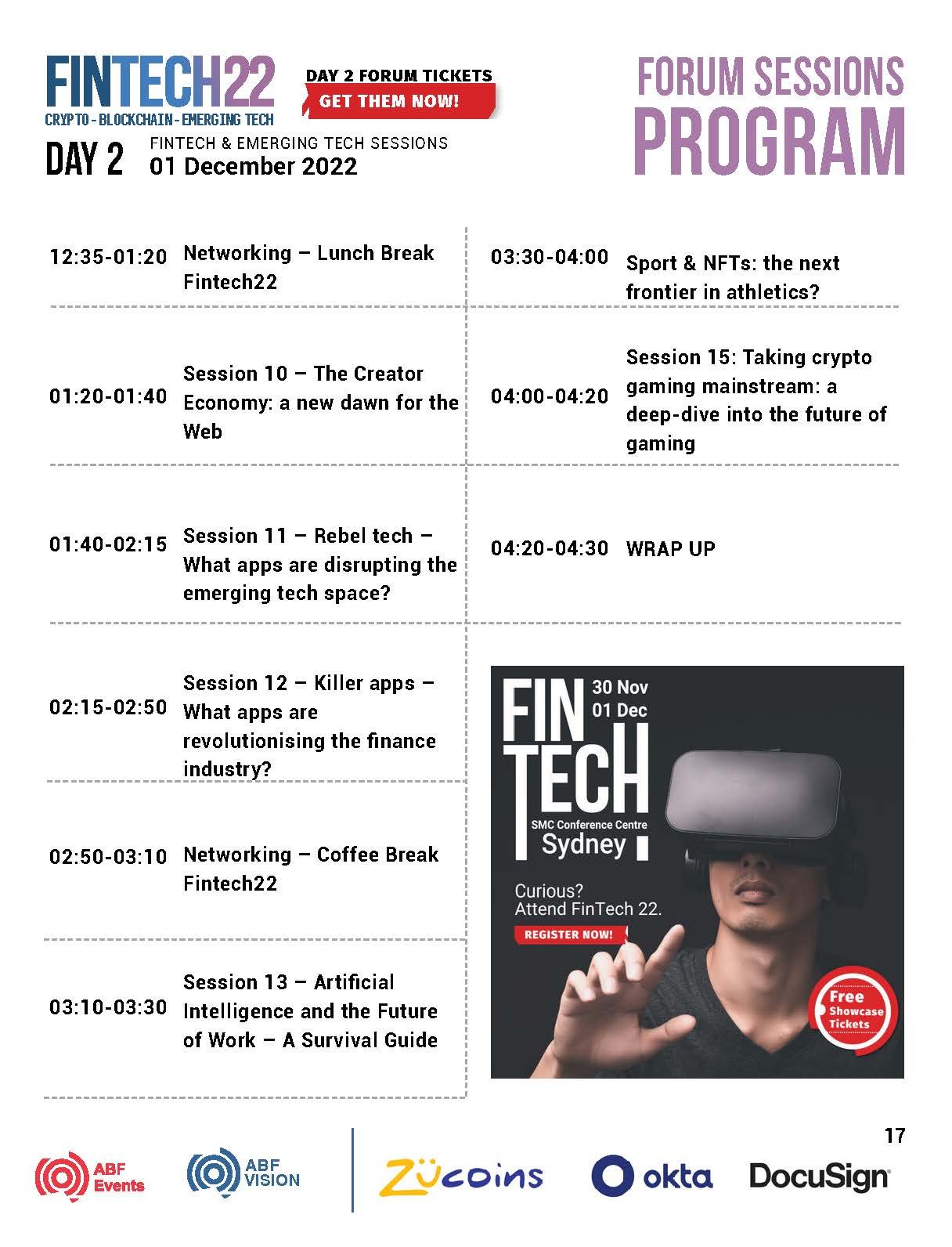
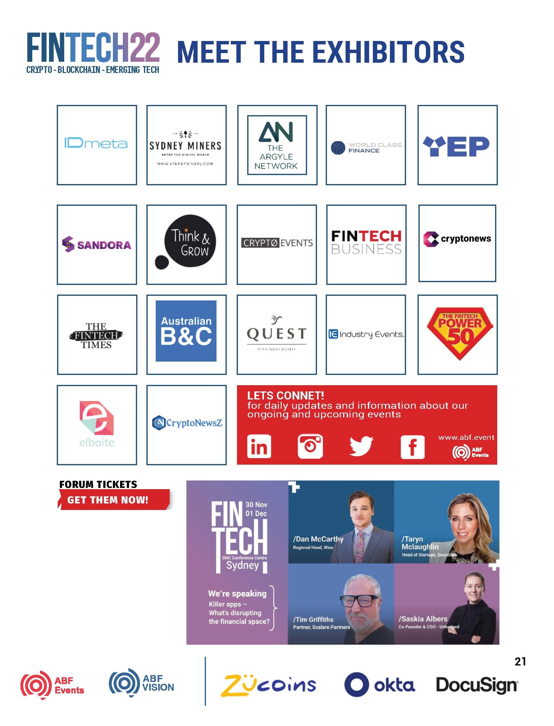
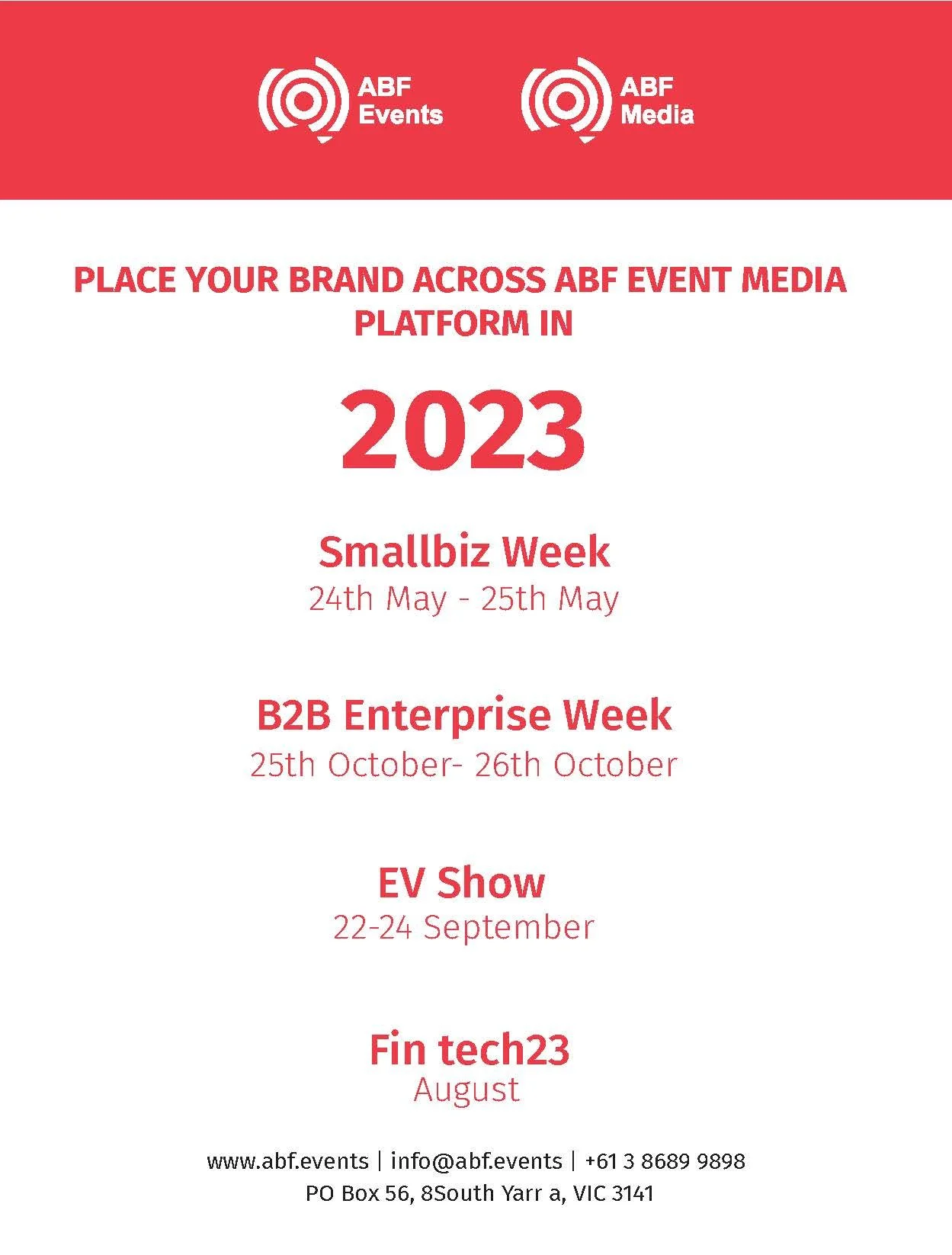
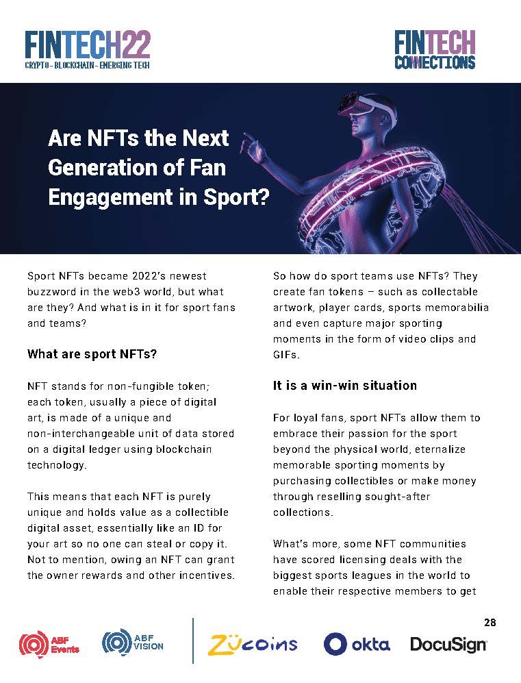
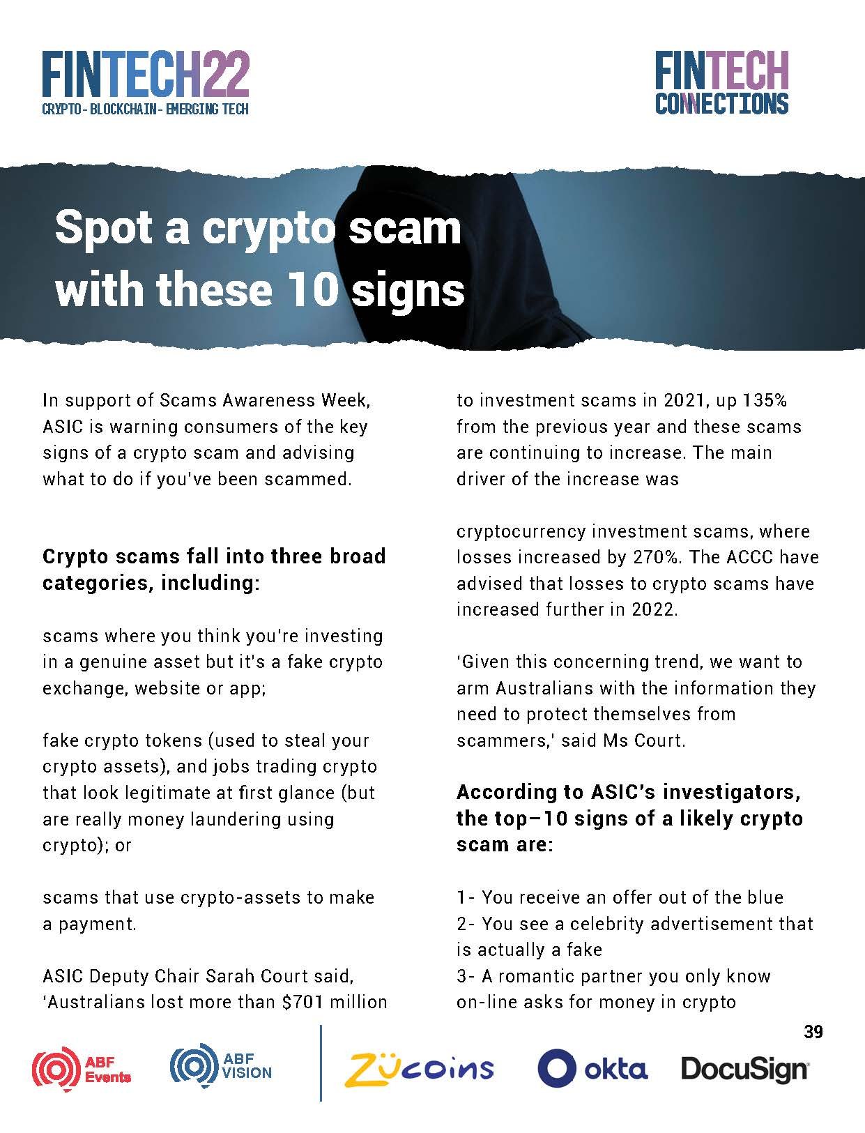
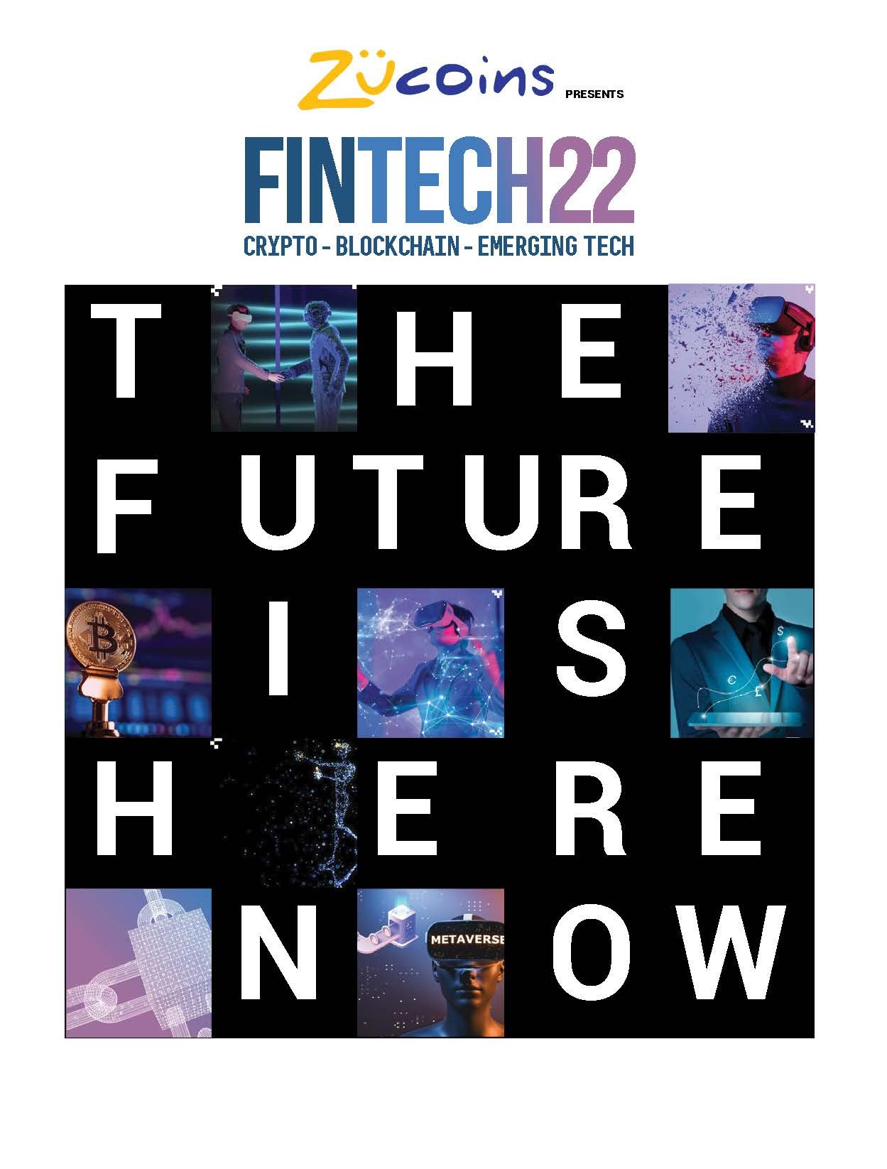
Visual Direction & Design | FINTECH22
Australia Business Forum is a company that organises events for the business community. One of their flagship events is a Fintech event held in Sydney and Melbourne. My task was to create a visual direction and develop the design materials for the 2023 event. The logo was already developed and had been used in previous years.
My Role: Visual Direction, Design, Video & Motion
Position & Company: Multimedia Specialist, ABF Events
——————————
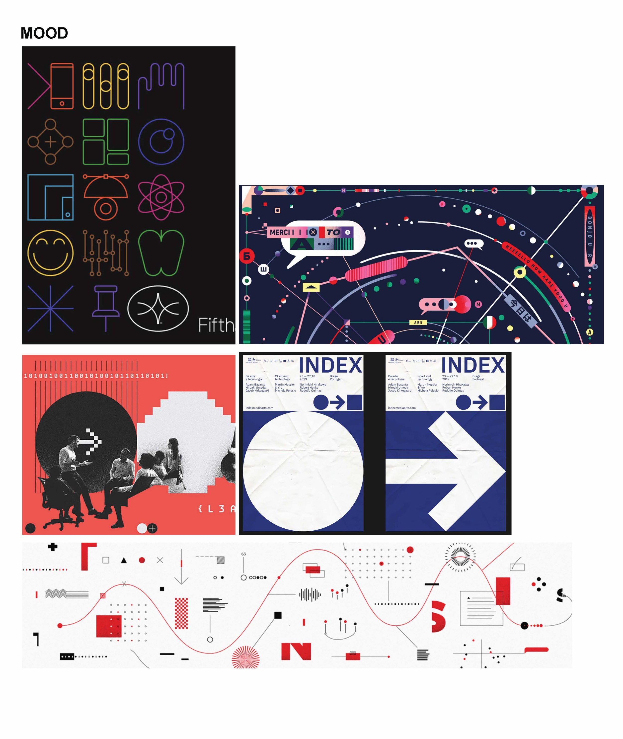
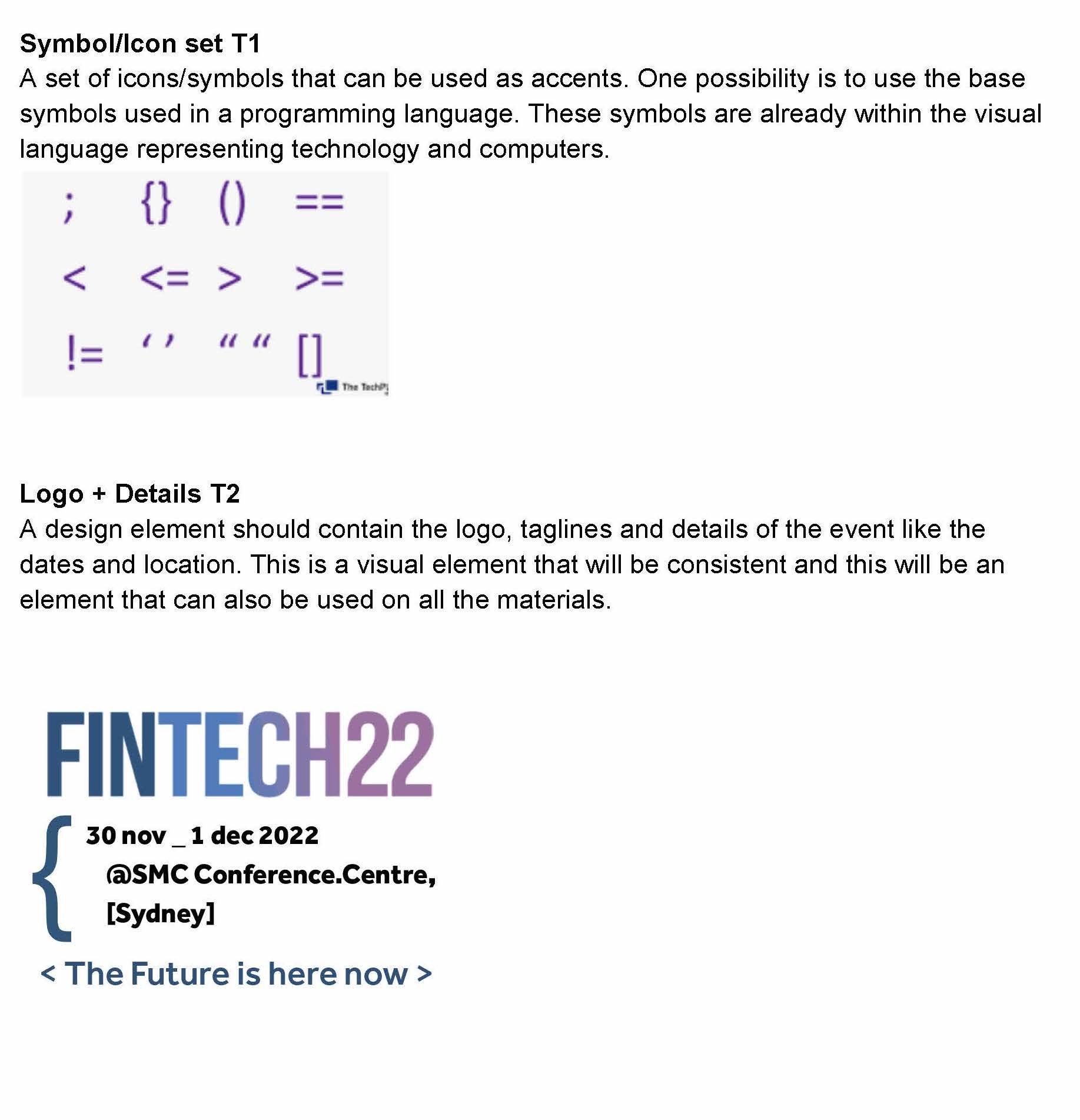
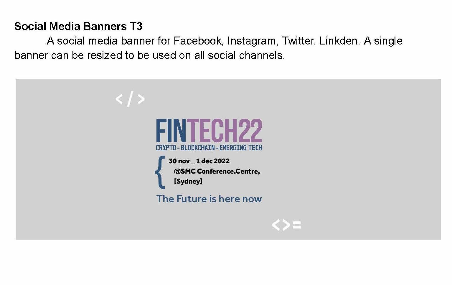
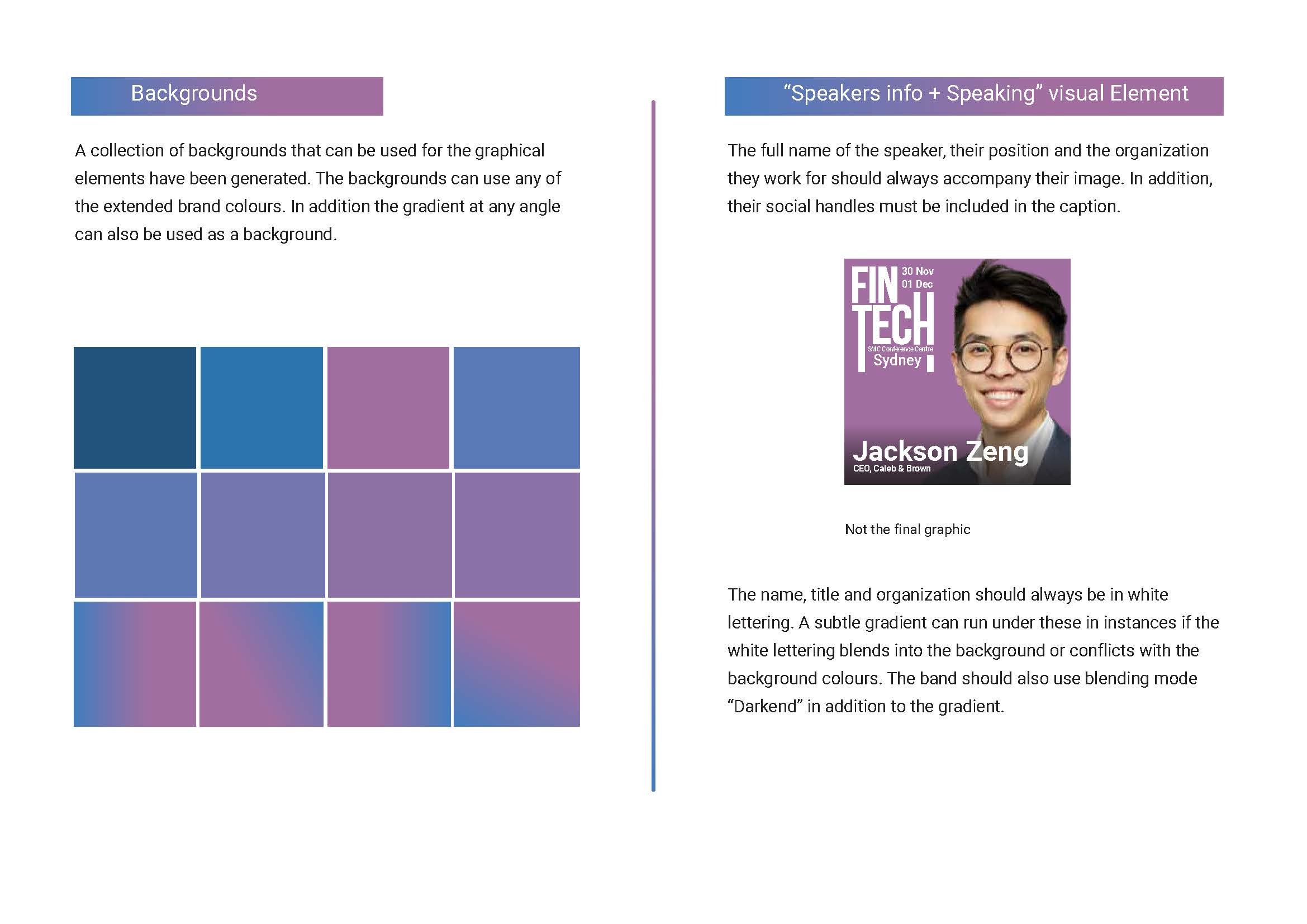
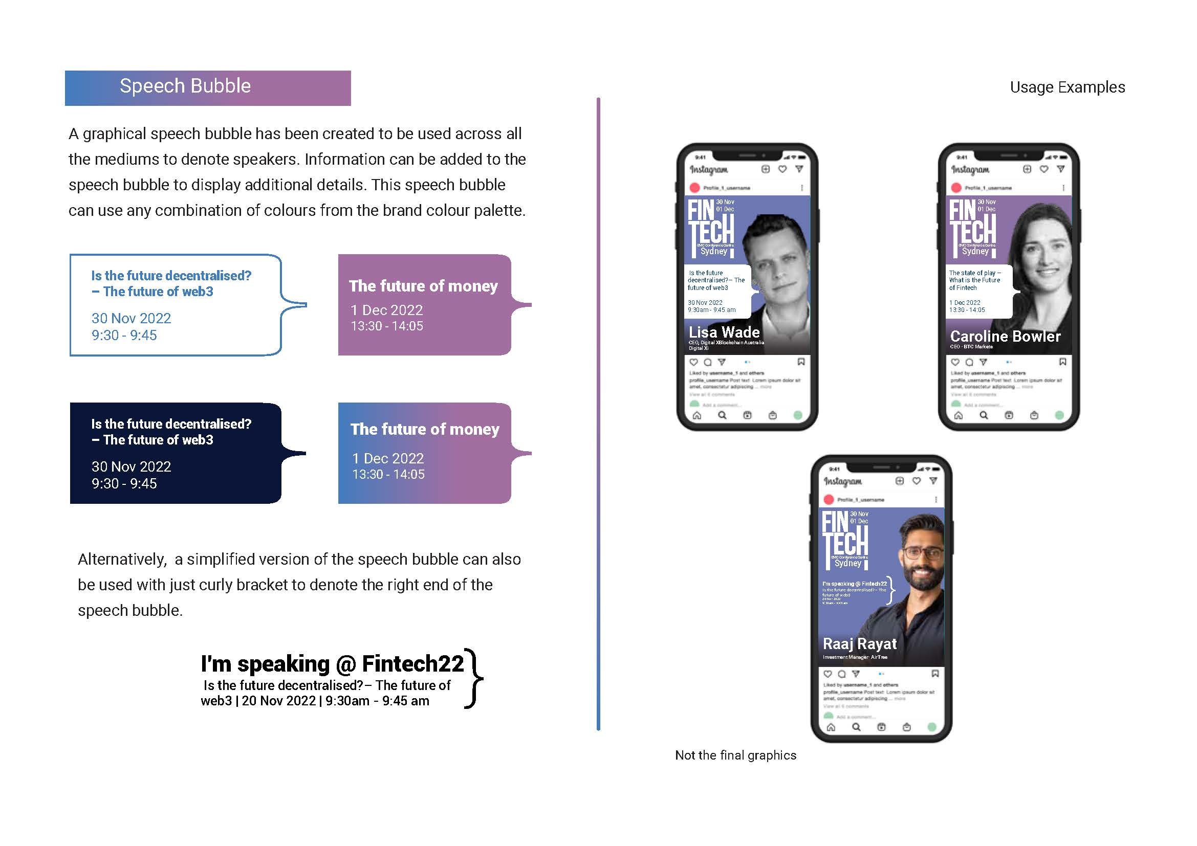
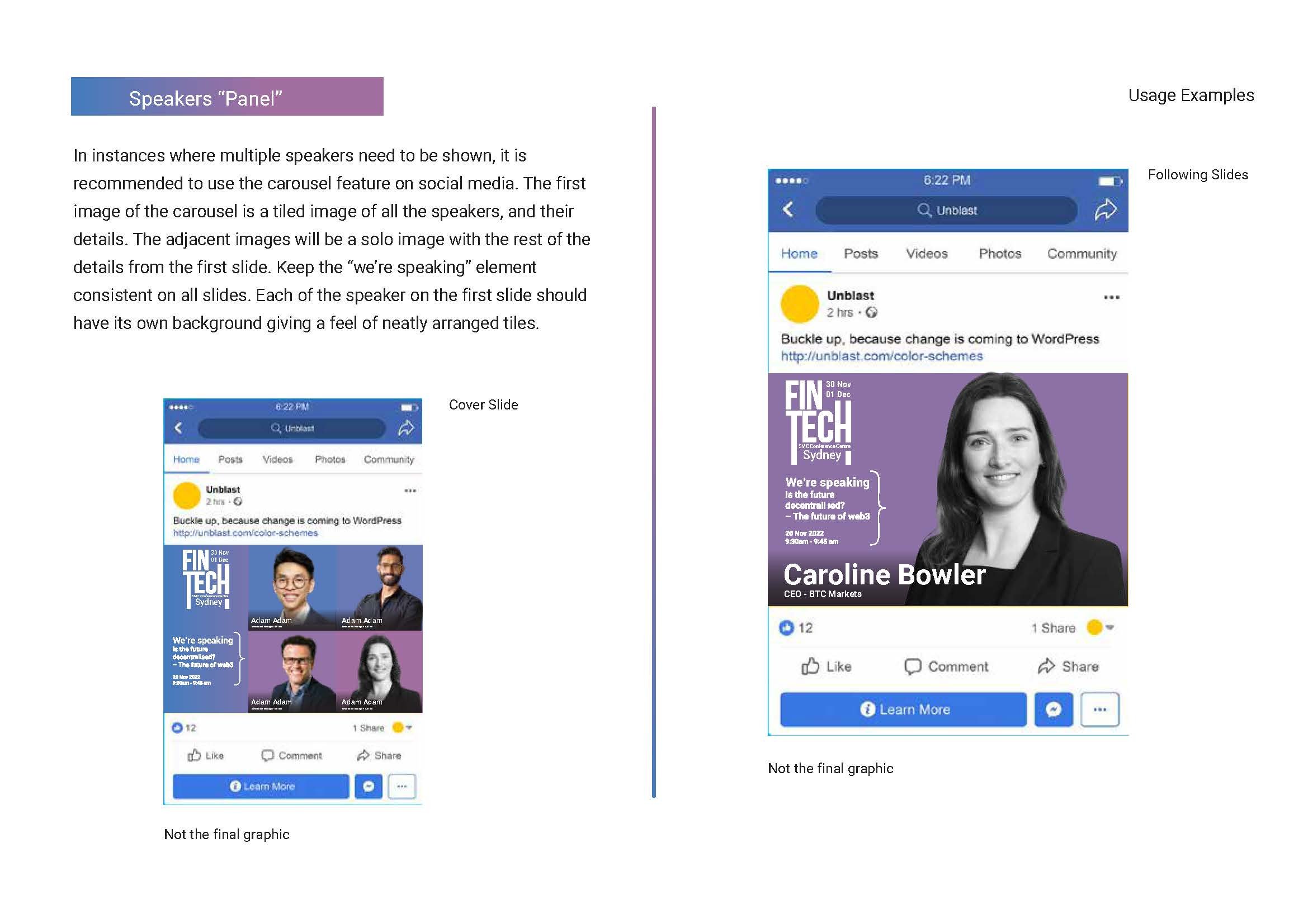
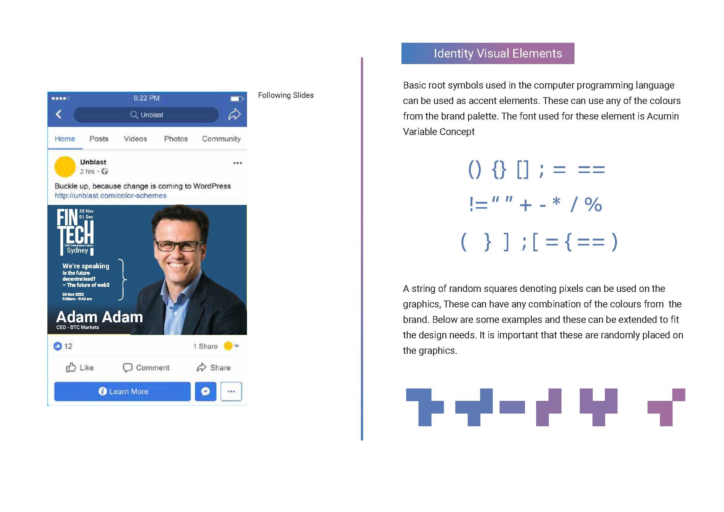
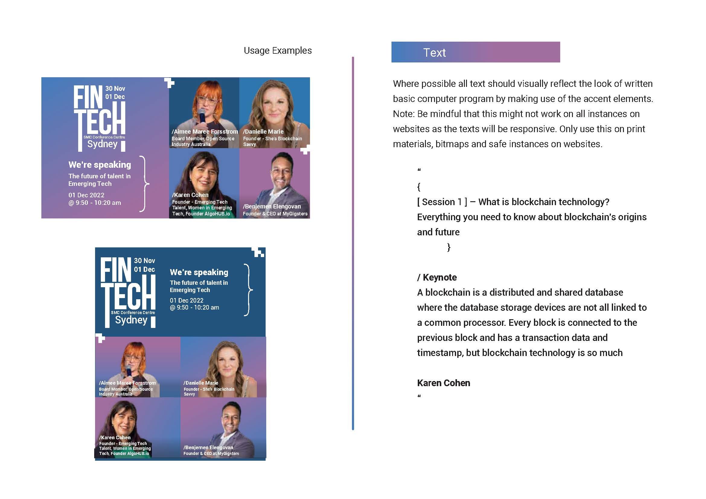
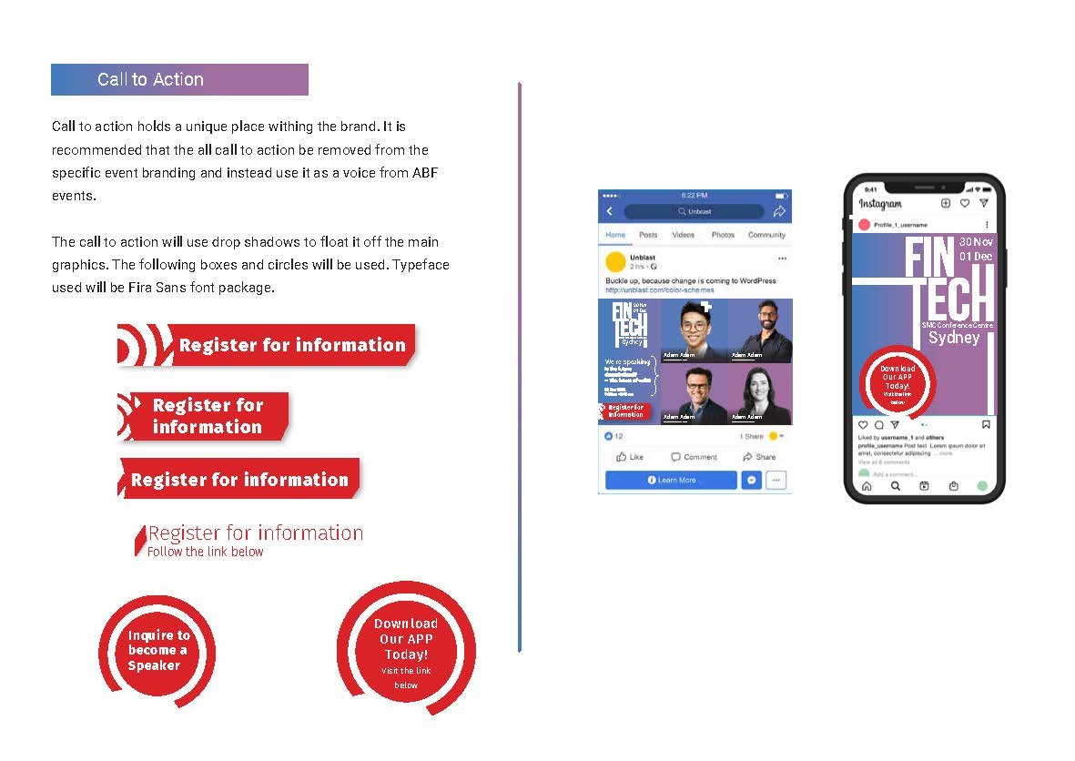
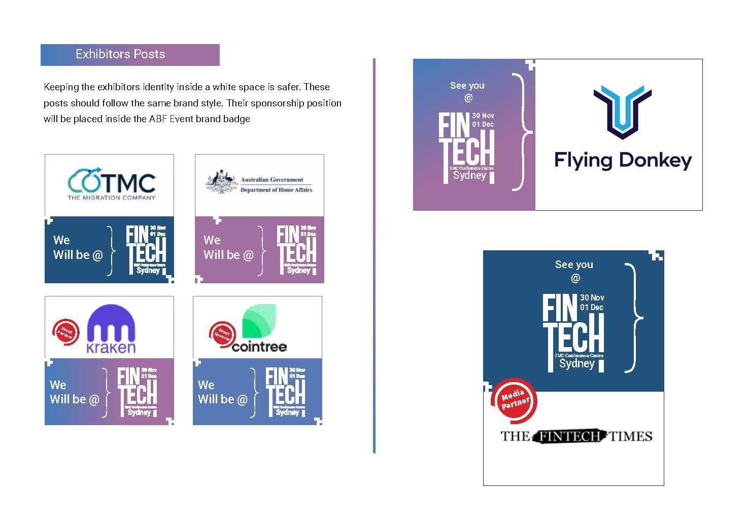
Solution
I wanted the brand and visual direction to portray ideas of technology and disruption which are key concepts celebrated within the fintech sector. As visual elements, I have used “Pixels” like graphical elements floating over the visuals. In addition, icons and symbols used in computer programming are used alongside the copy and on other visuals.
MY INITIAL SKETCHES AND BRIEFS
BRAND GUIDE
DIGITAL ASSETS
ROLE: Design and Motion


PRINT MAGAZINE
Role: Layout & Design


Promo Video for the Event
My Role: Editing and Motion
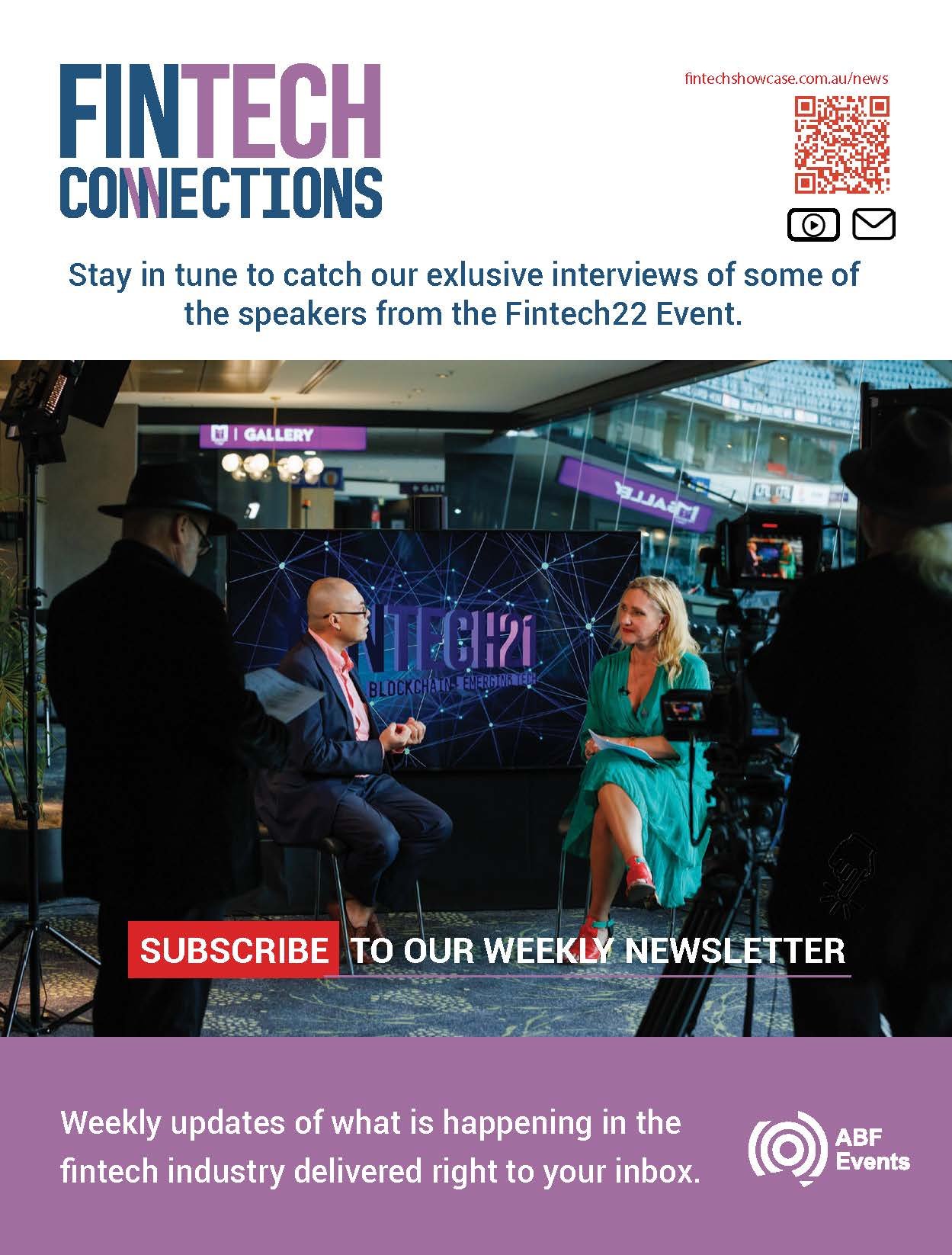
INTERVIEW VIDEO
Due to technical challenges and difficulties with setting up the space, I opted to shoot all the interviews in 4k on a static shot and digitally add various elements to the shot to dress it. Here is an excerpt from one of the interviews.
My Role: Videography, Editing and VFX
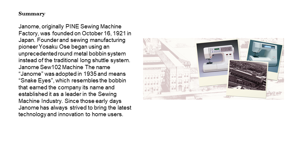
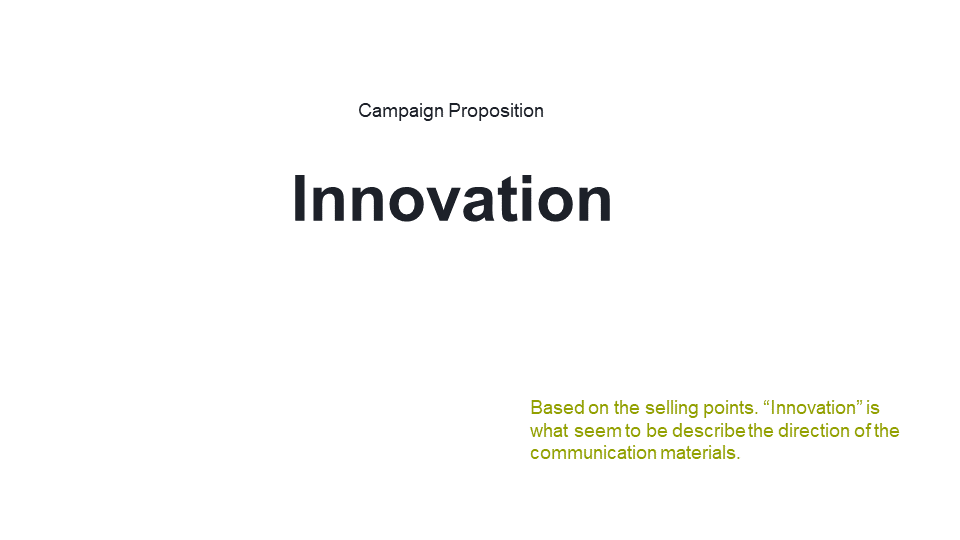
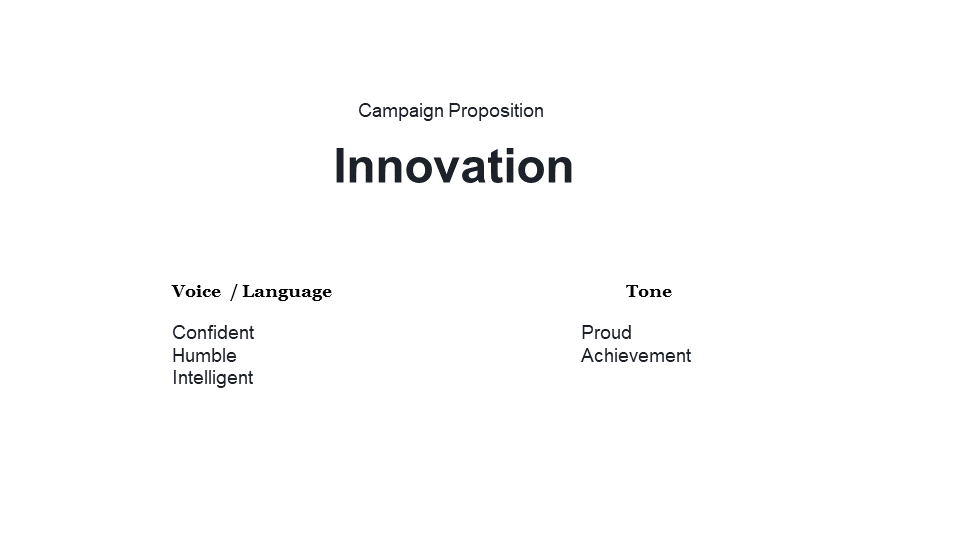
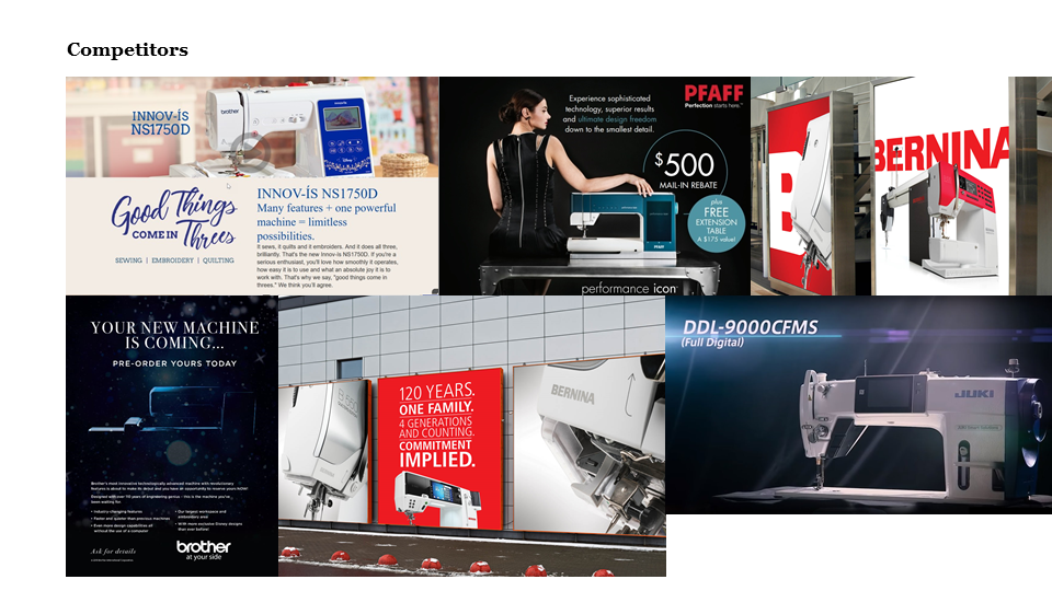
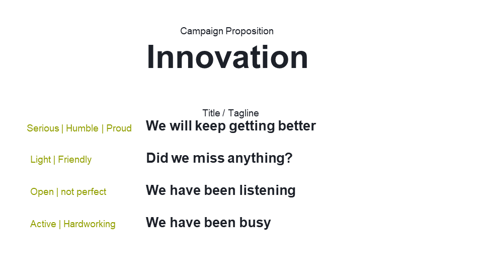
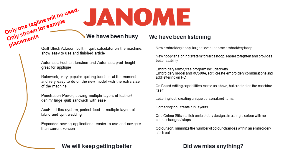
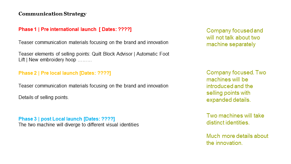
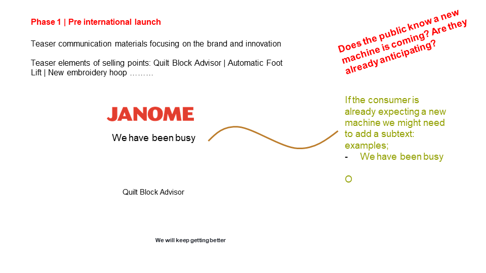
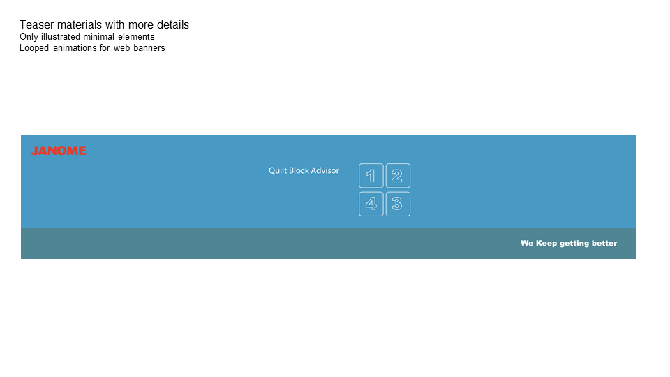
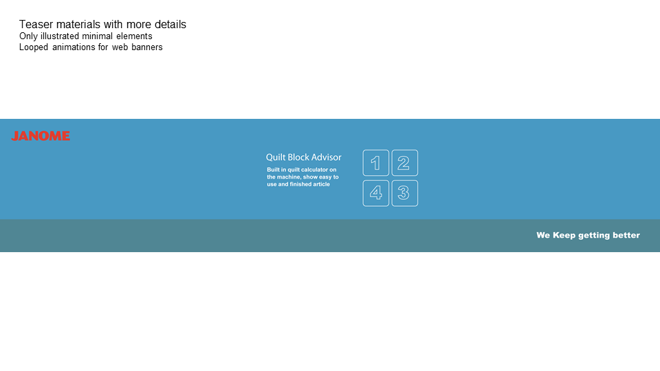
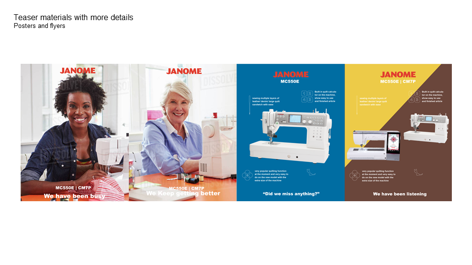
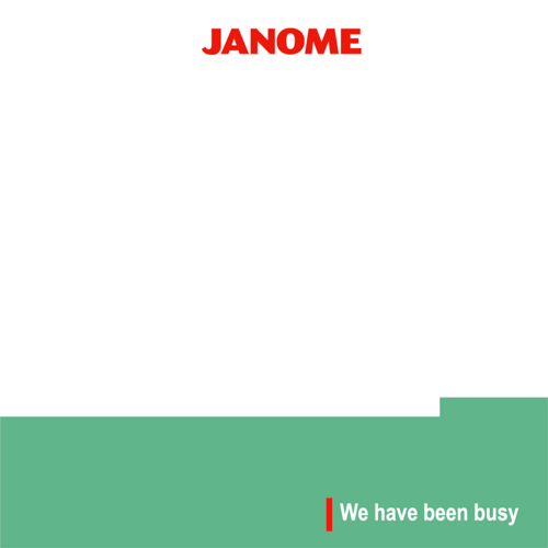
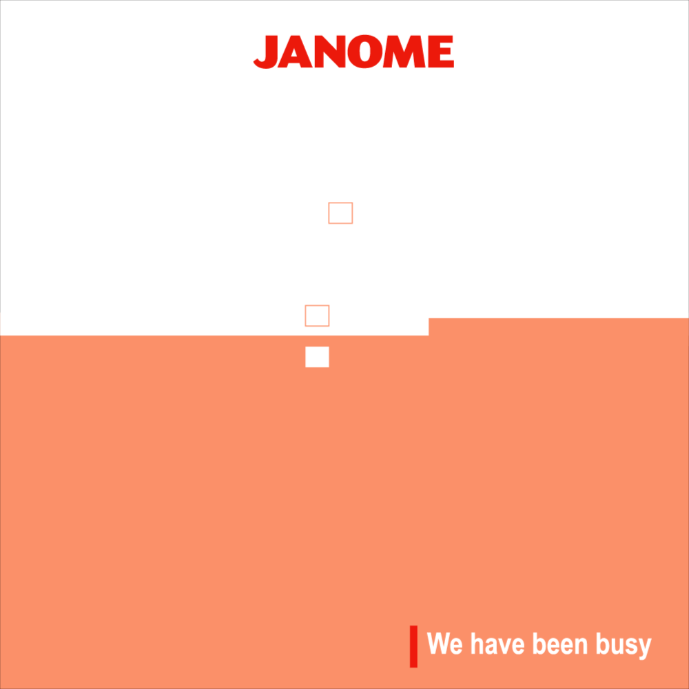
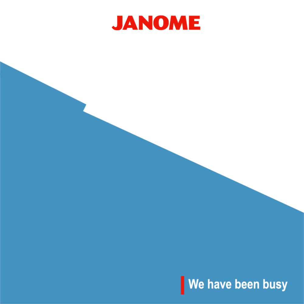
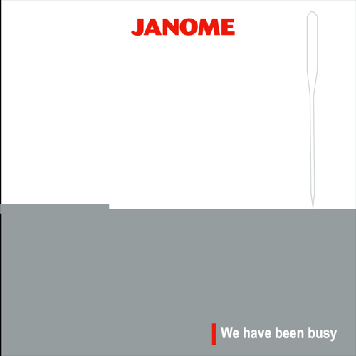
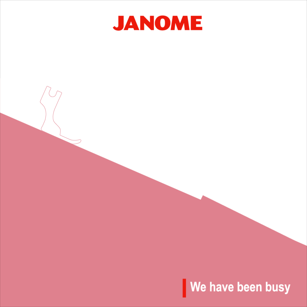
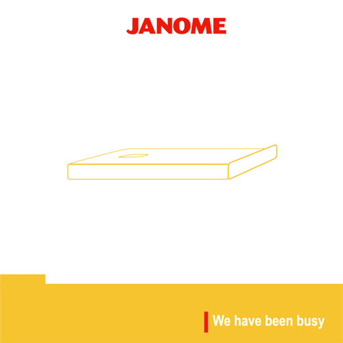
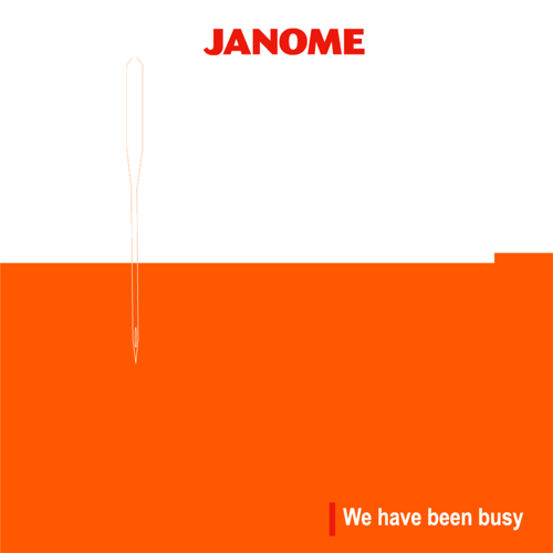
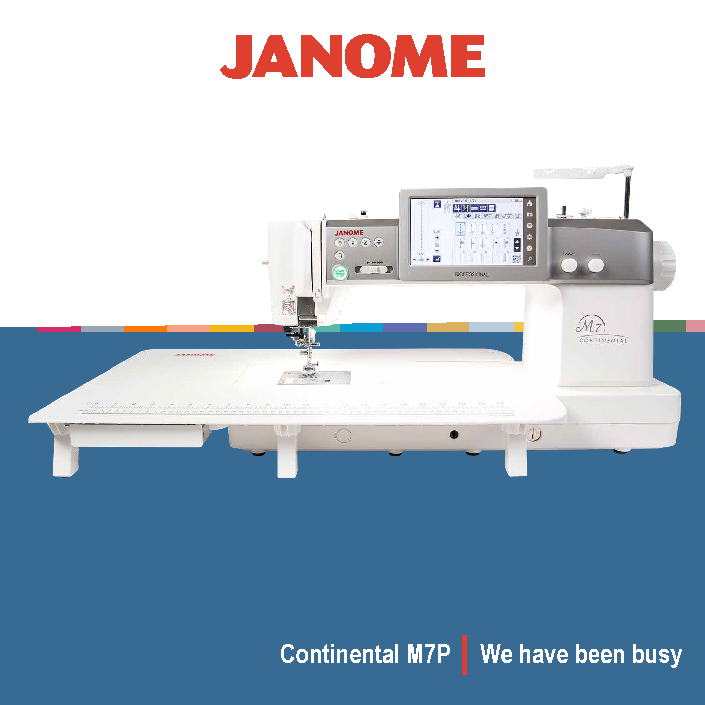
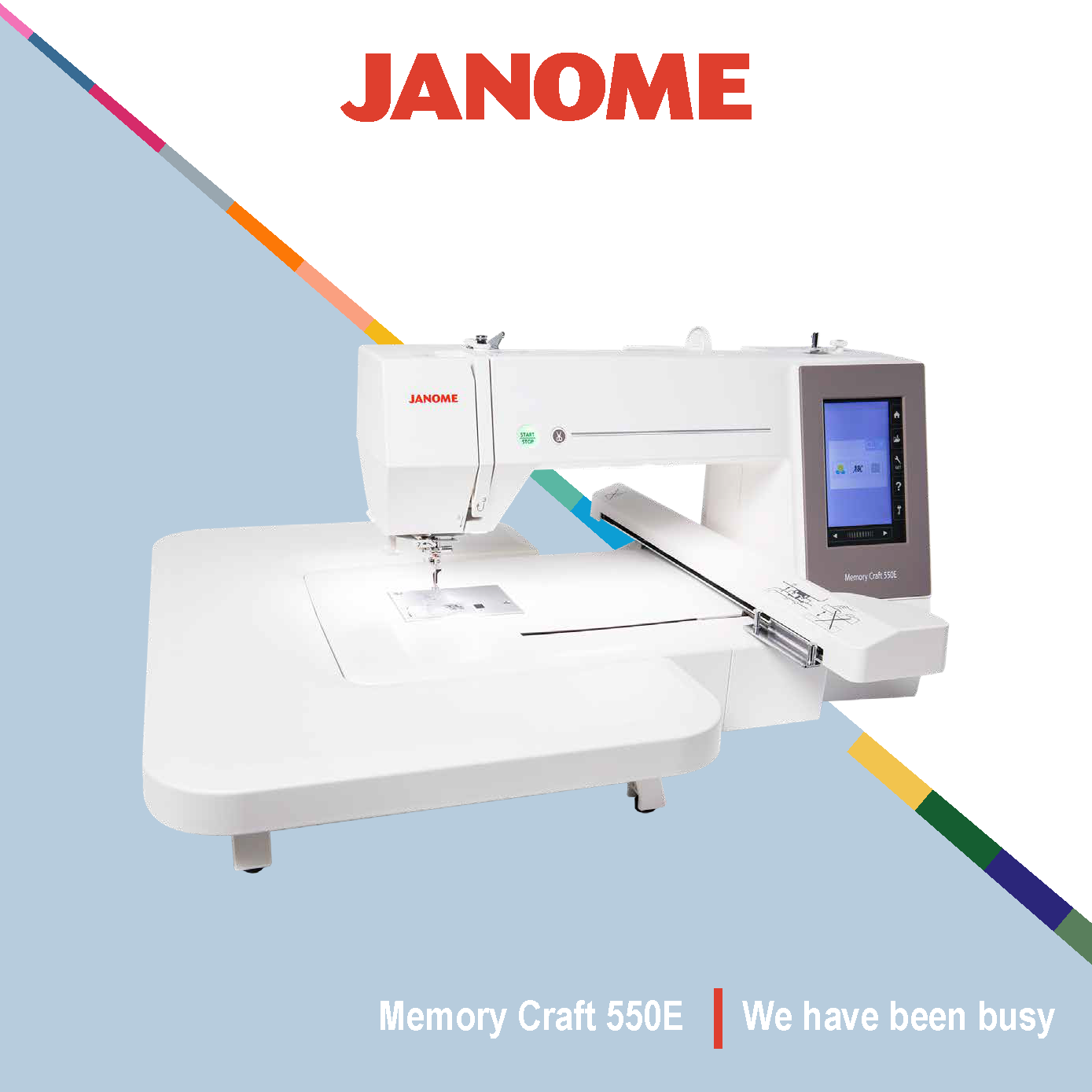
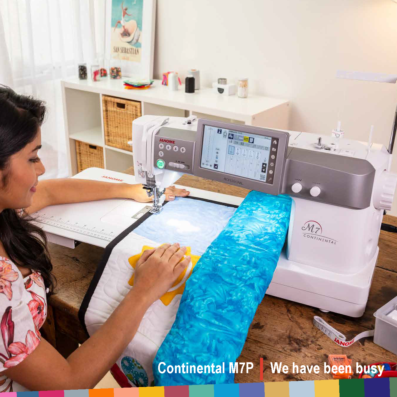
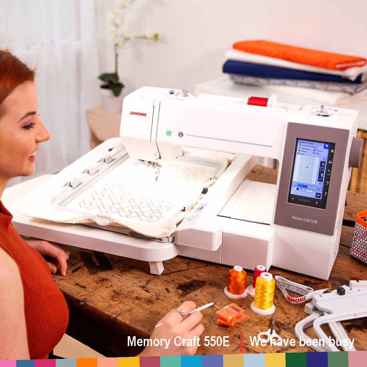
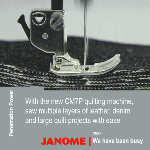
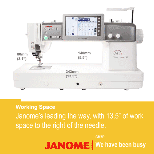
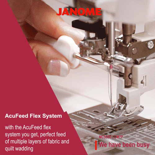
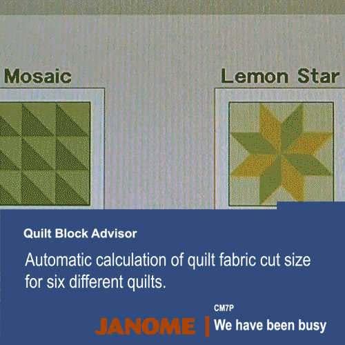
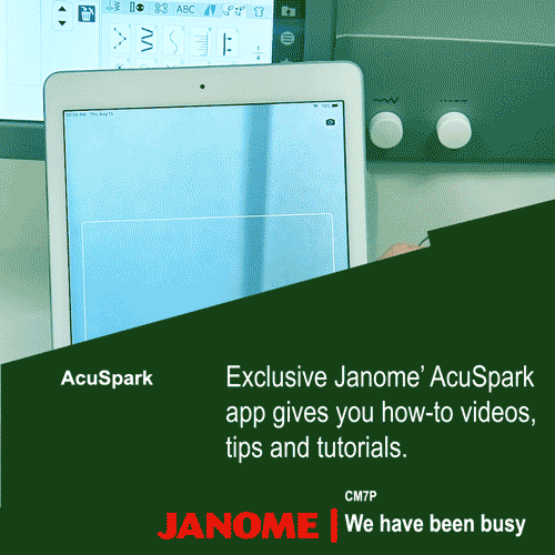
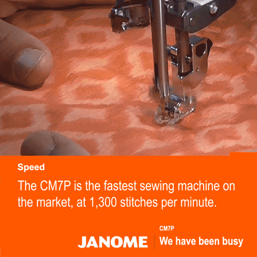
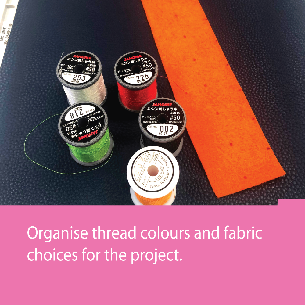
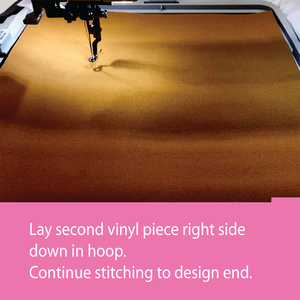
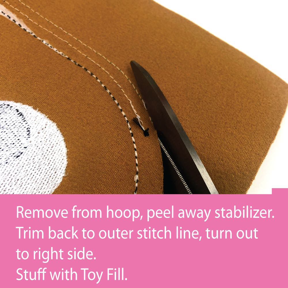
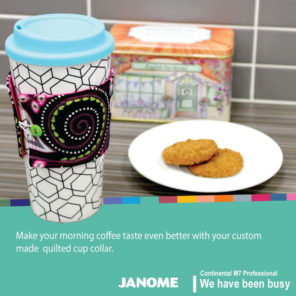
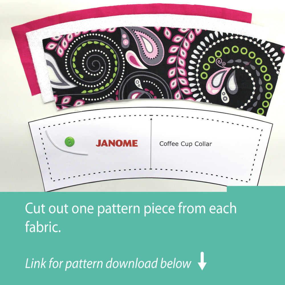
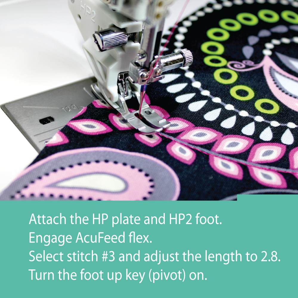
"We have been busy" | Janome
This is a product launching campaign that was created to promote two new machines. The strategy was to divide the campaign into three parts; Pre-launch, launch and post-launch and develop materials for these phases. My goal was to tease the users to anticipate new features. These same visuals are then used in the post-launch phase detailing the features.
My Role: Concept Development, Design and Motiongraphics
Position & Company: Graphic Designer, Janome Australia
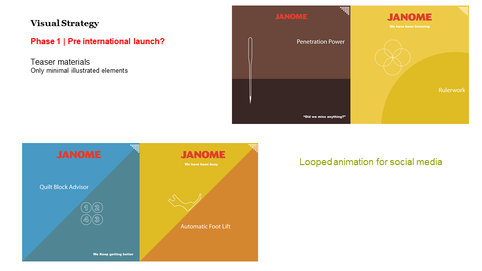
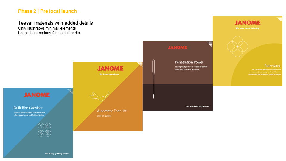
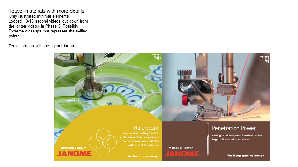
Teaser Motiongraphics assets
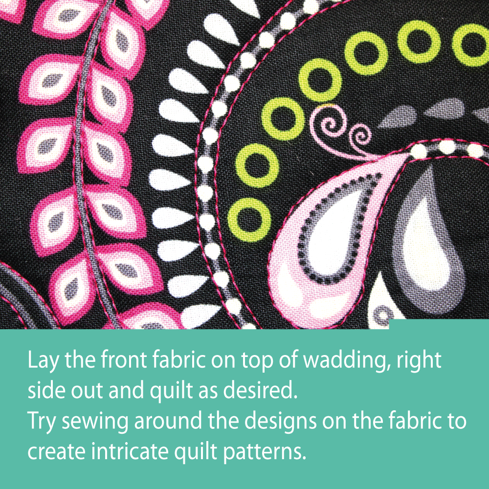
Right after the launch we created a very dynamic color palette to reflect on the diverse range of projects the consumer can work on with these machines. The colors were chosen from the most used treads that quilters and embroidery artists use. This pallet also became a visual identity element for these two machines.

Color pallet for the campaign
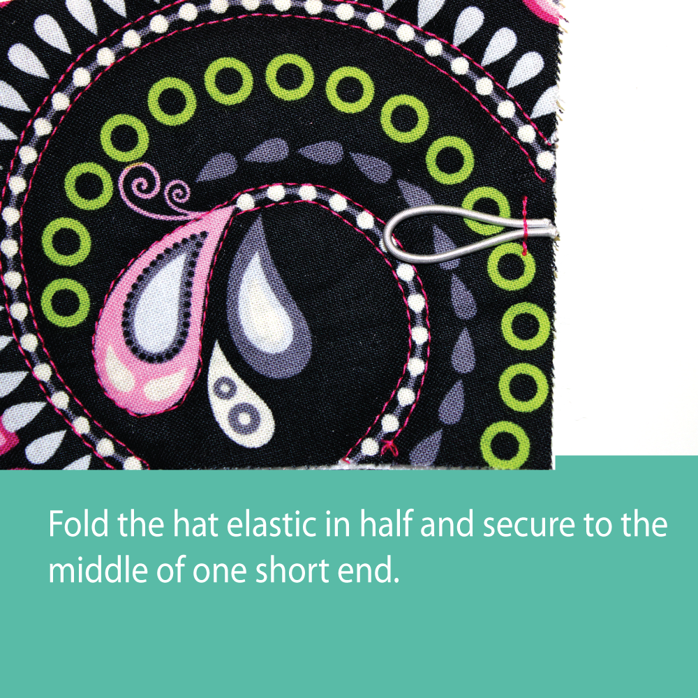
Post Launch assets
Specific information was revealed after the launch. These were also extensions of the selected teaser elements.
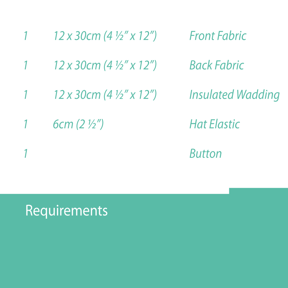
For the final phase, we developed small projects that users can create using the new machines.
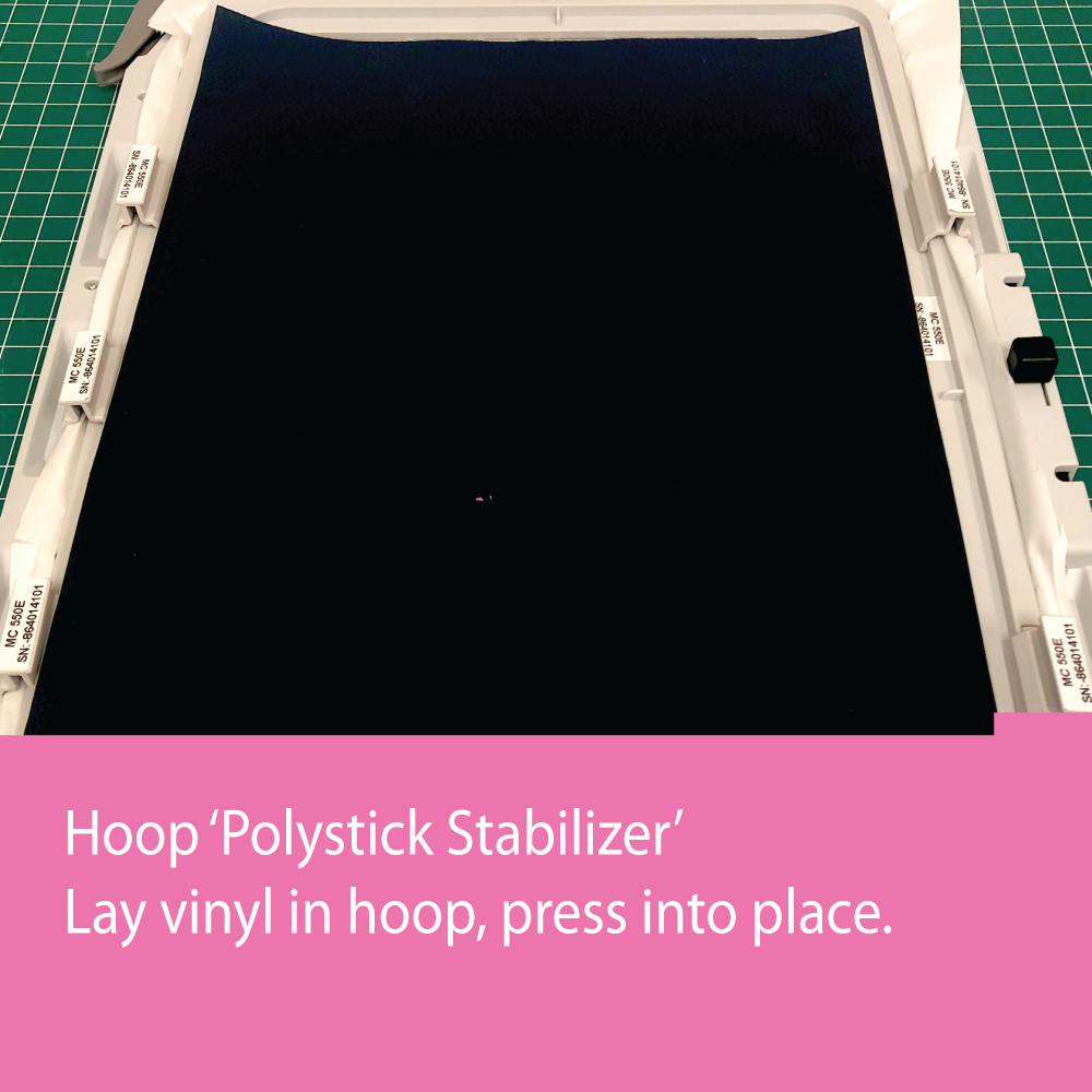
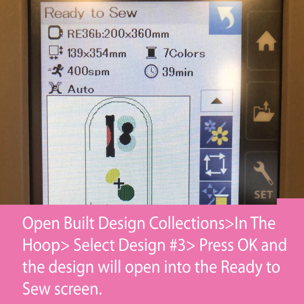
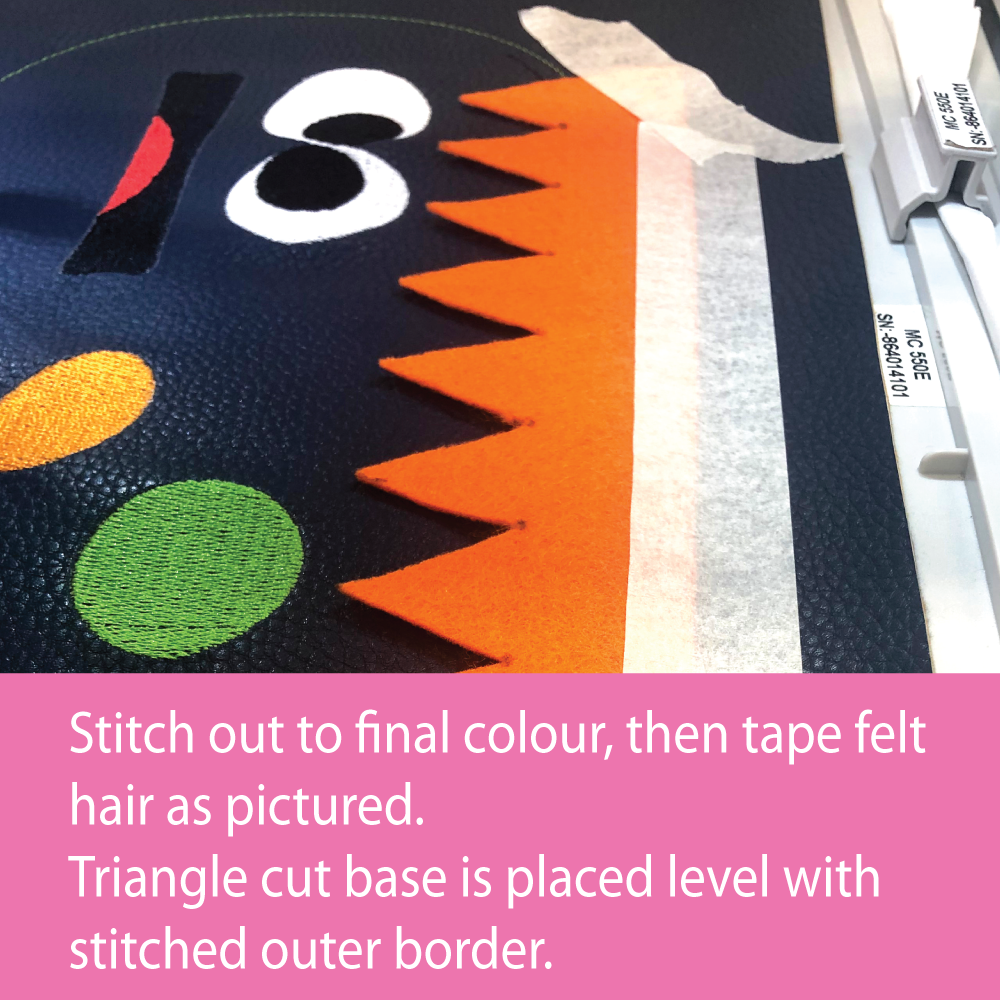

Rather than use the website we opted to use Facebook and Instagram carousel posts to show the projects.

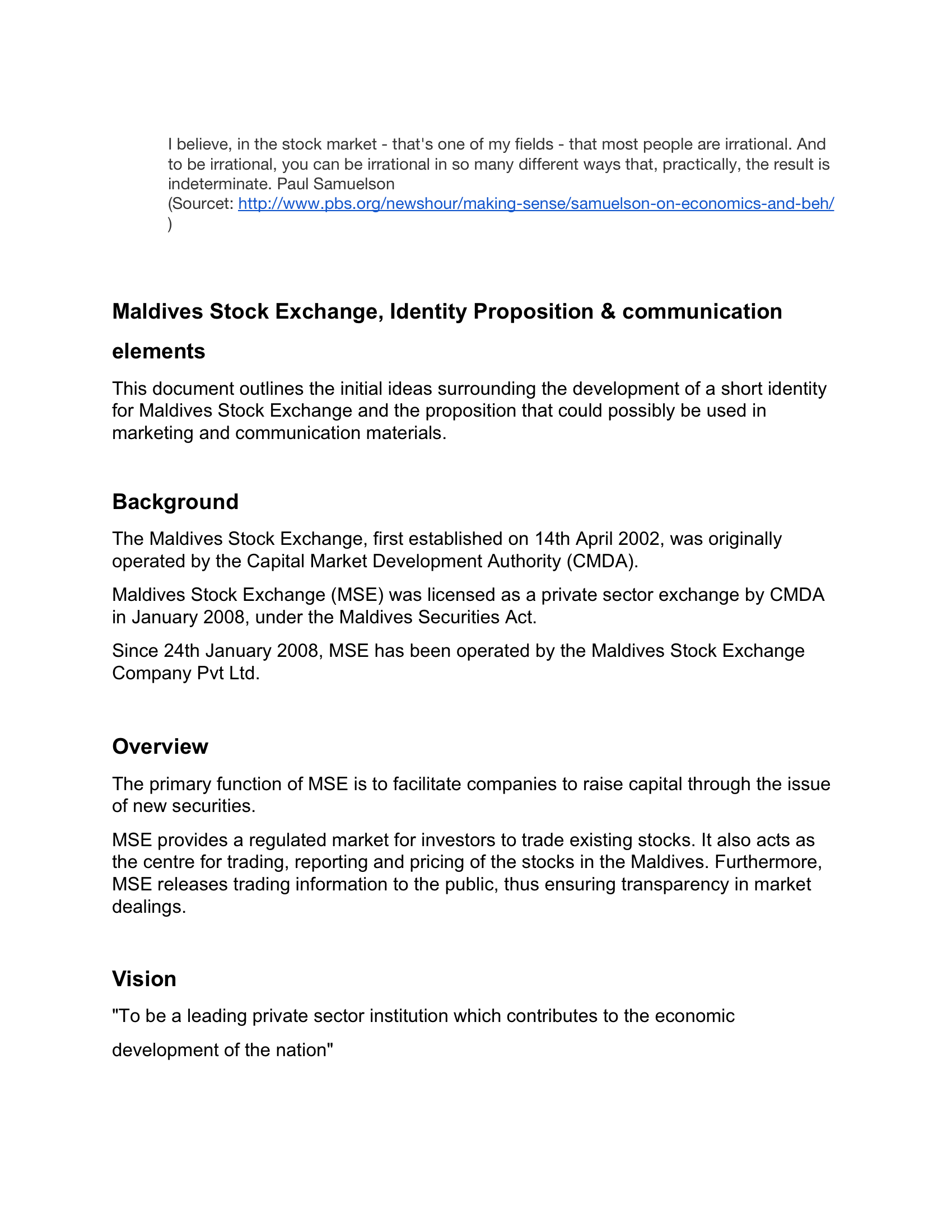
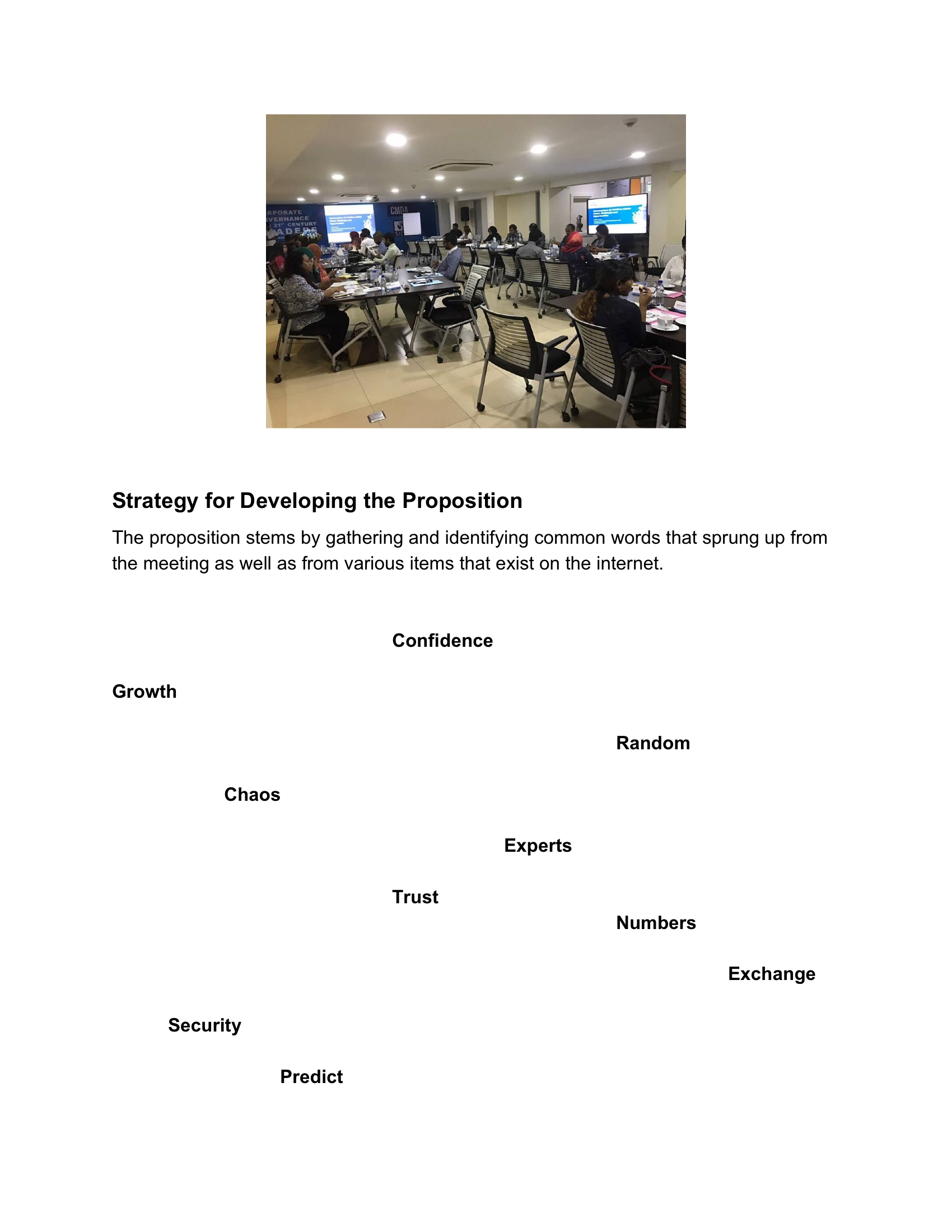
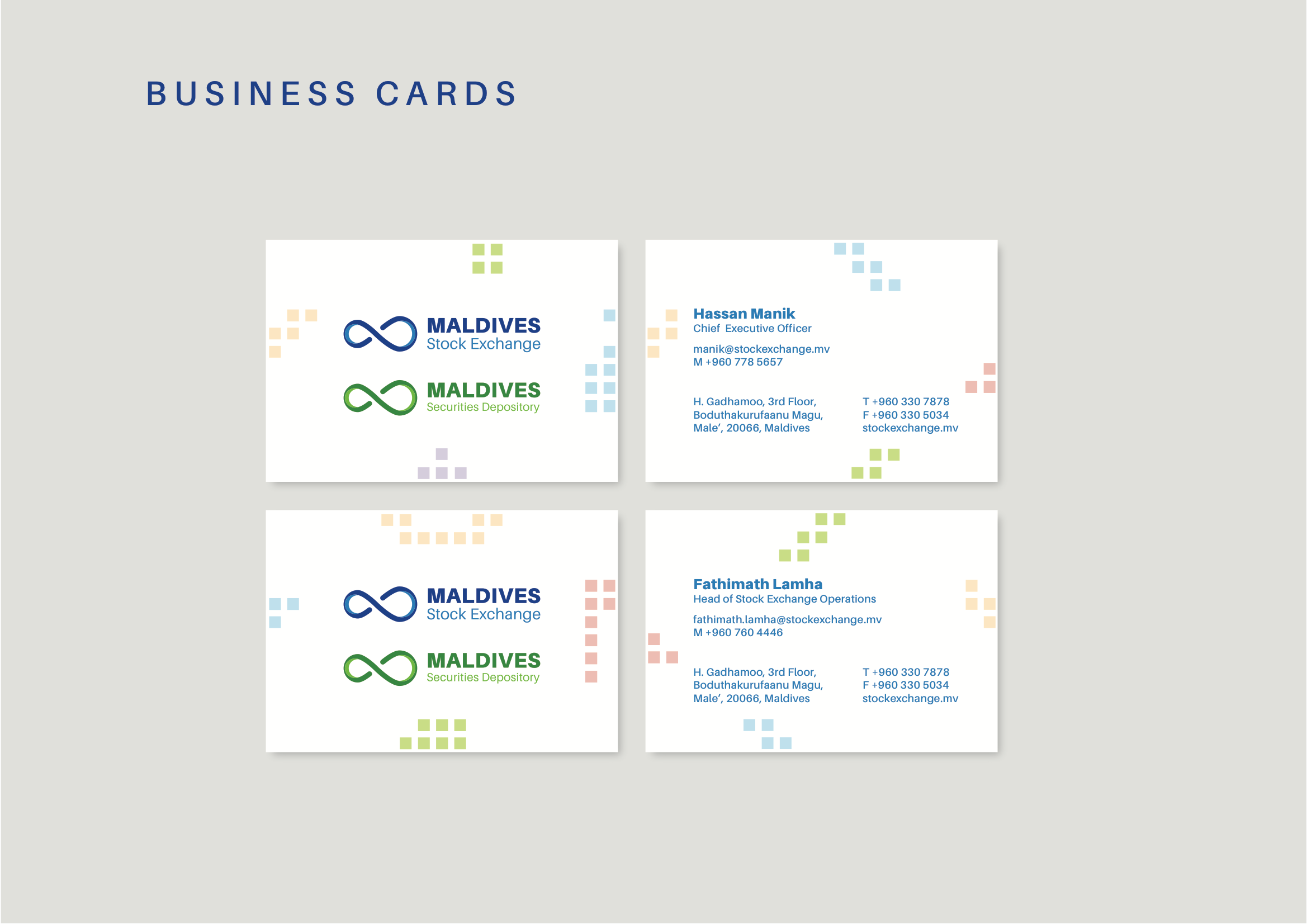
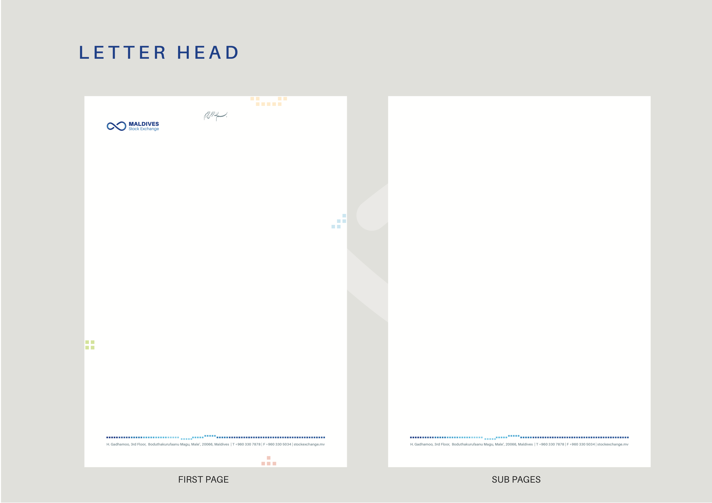
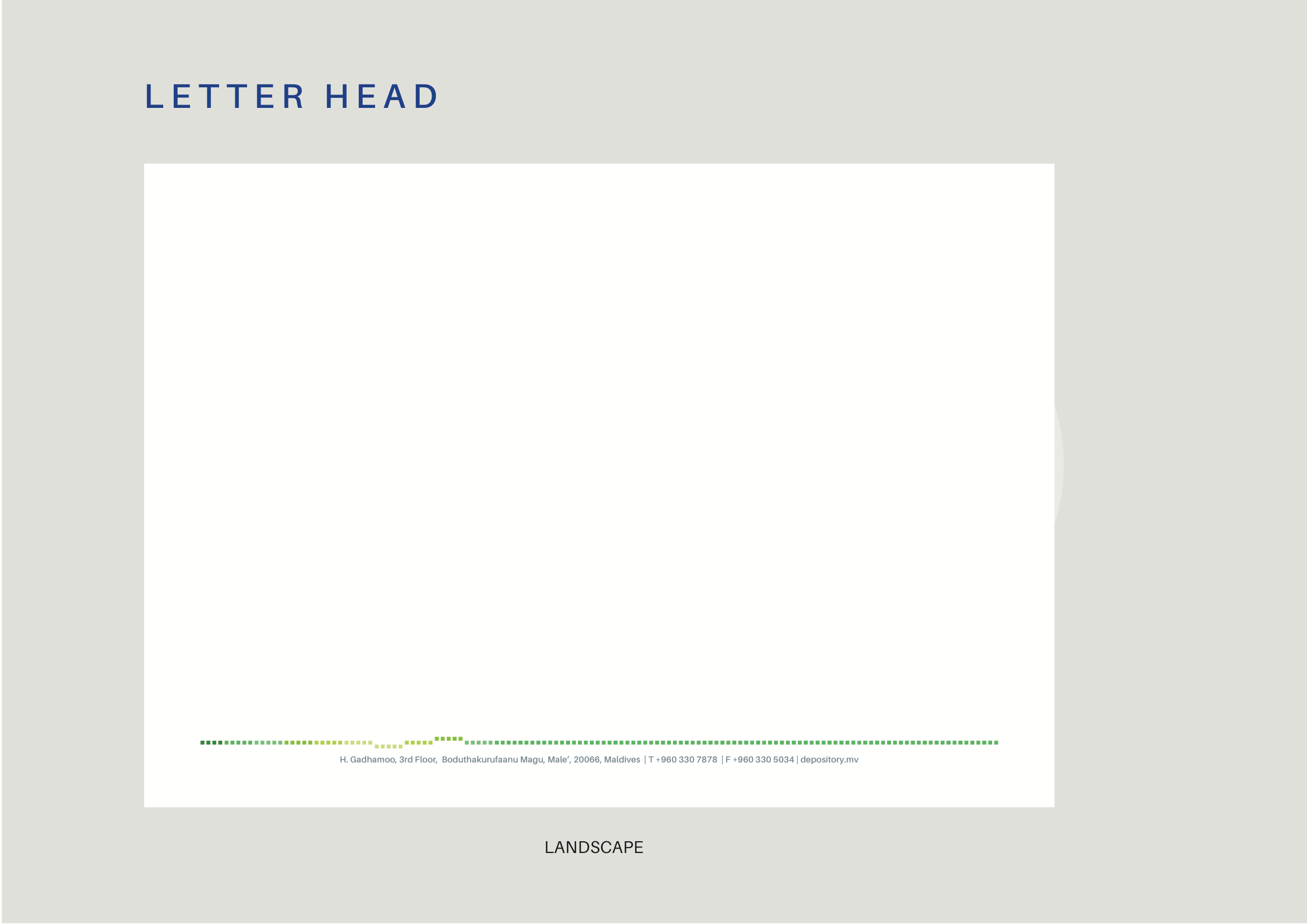
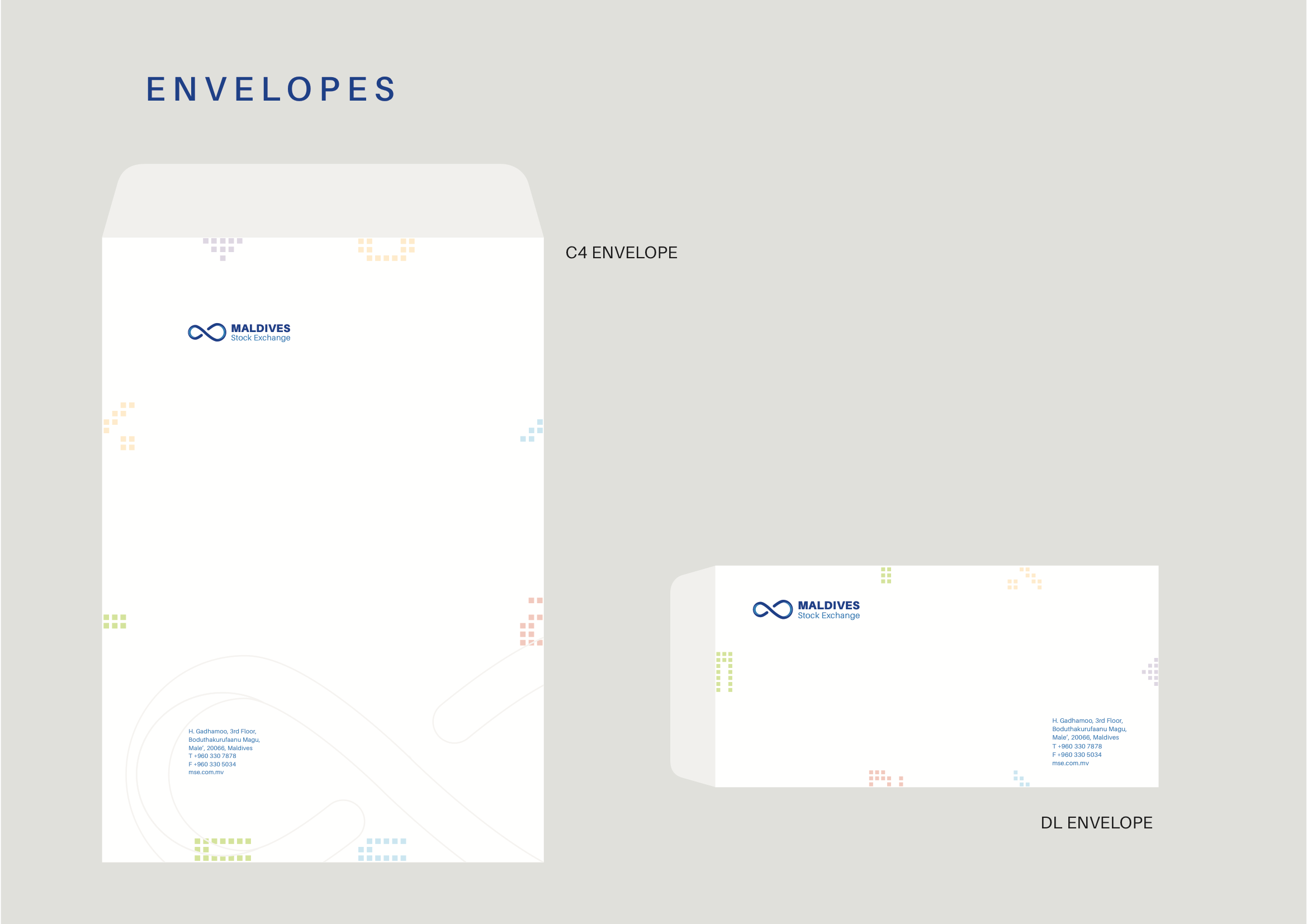
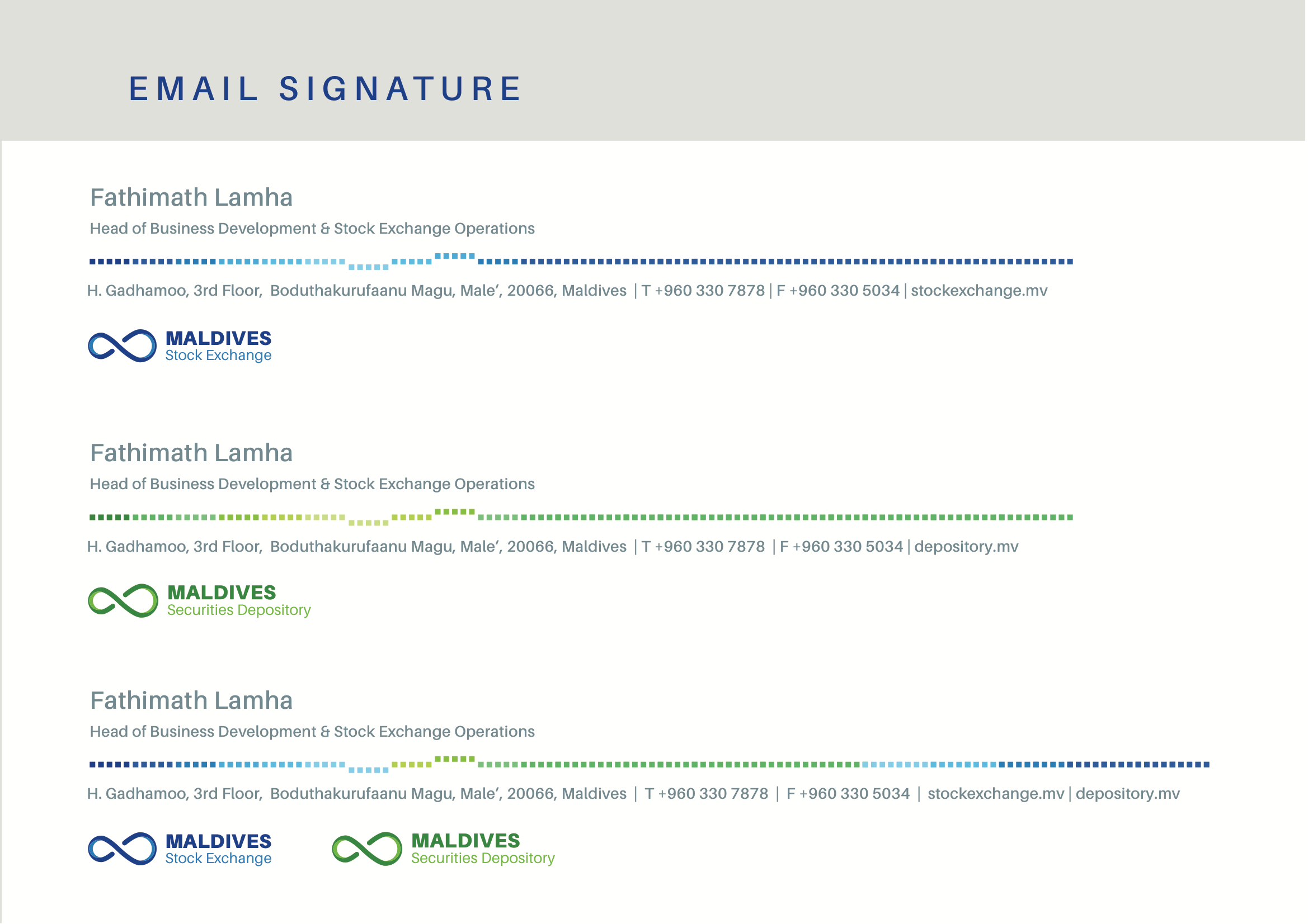
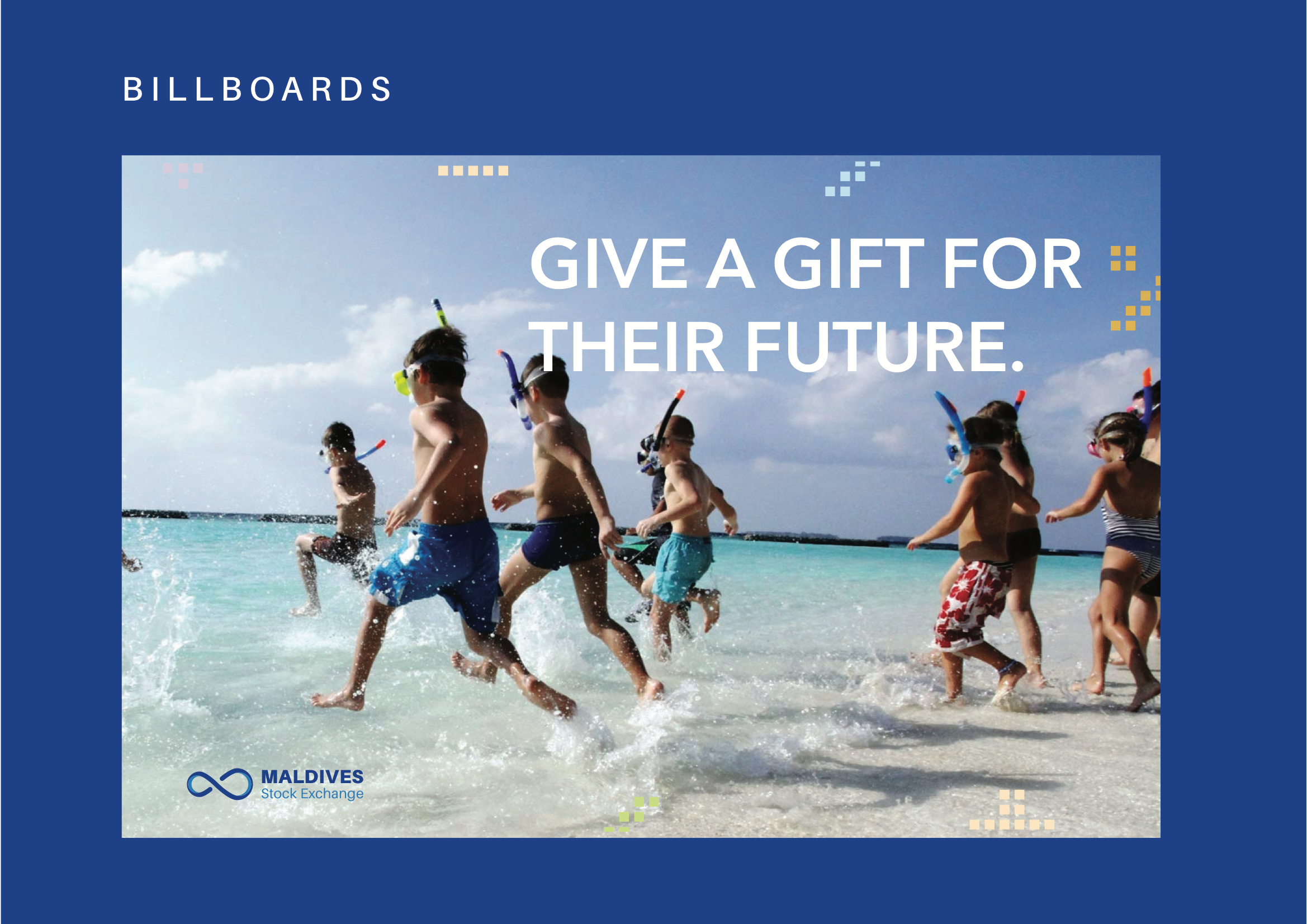
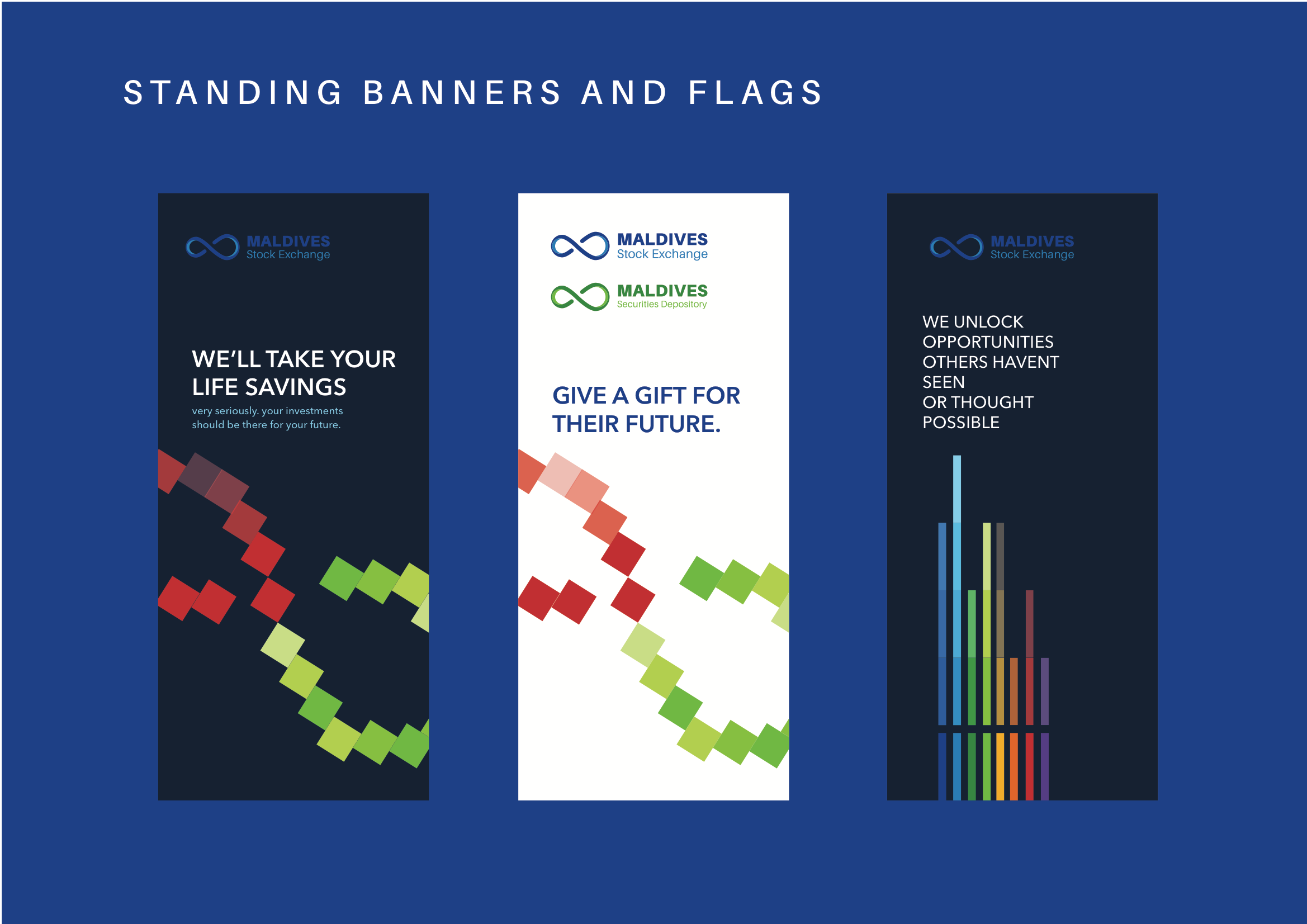
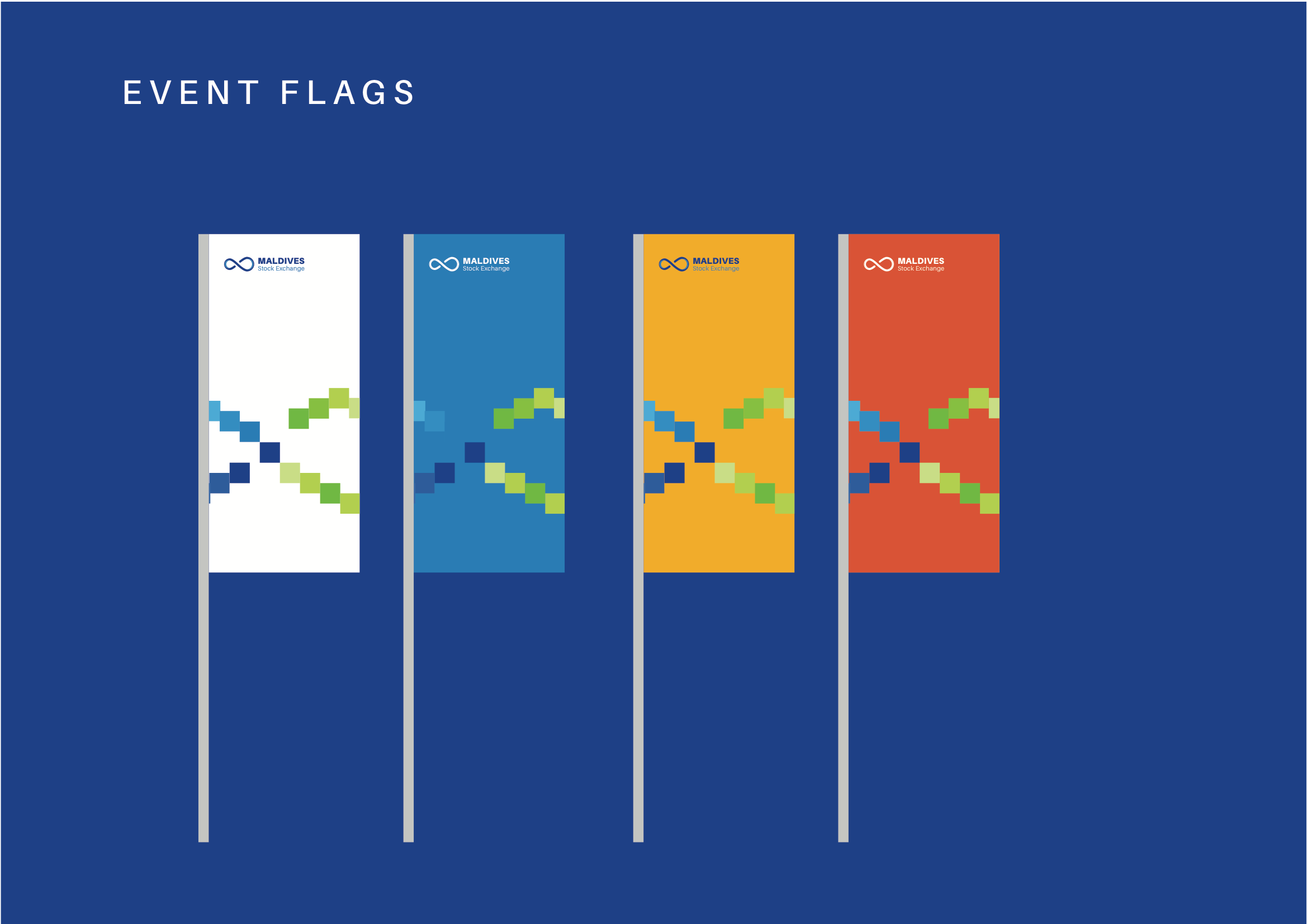
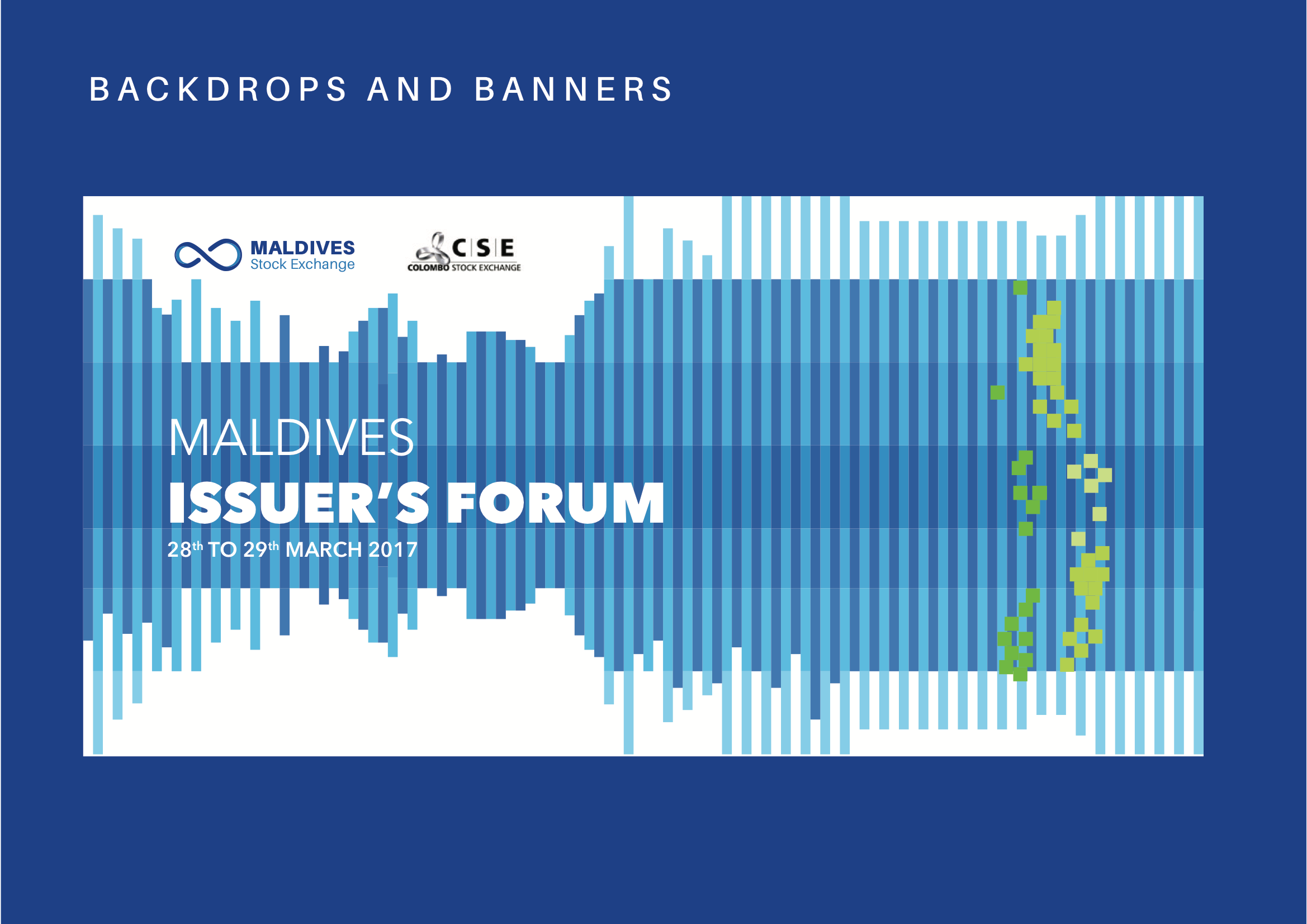
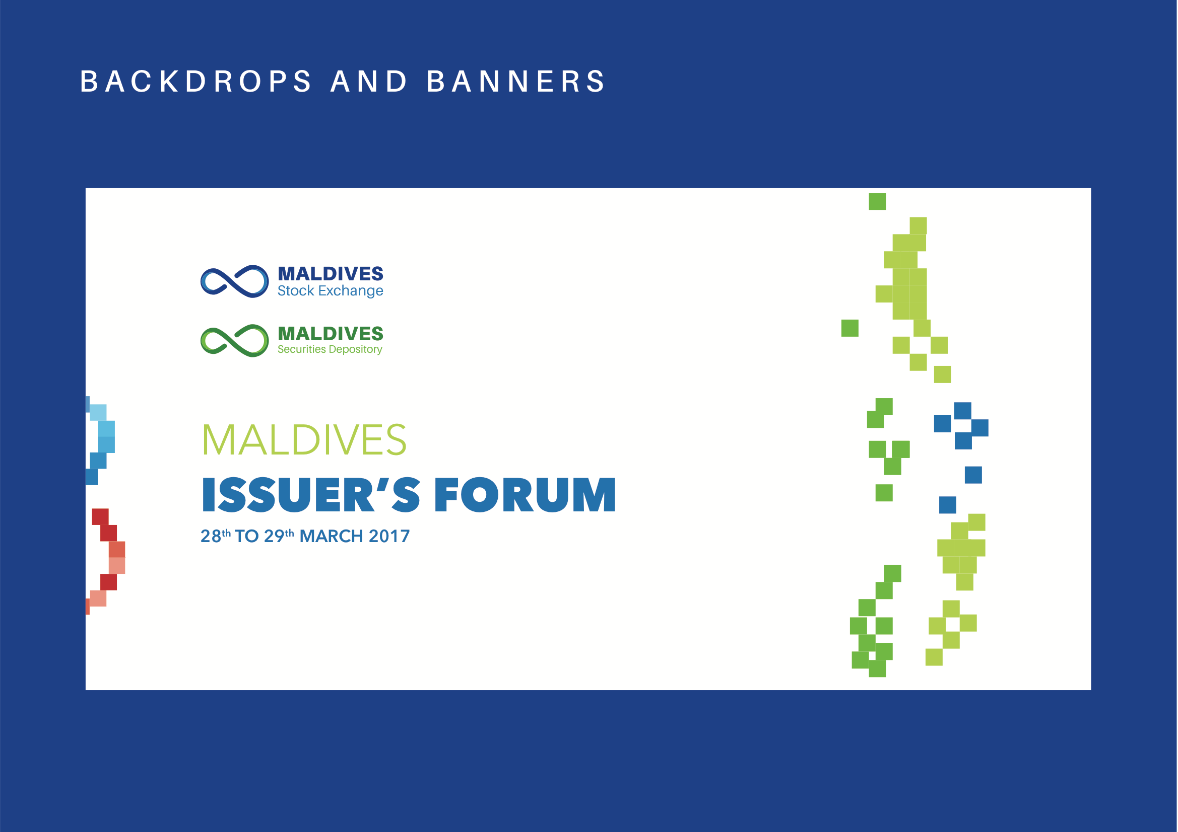
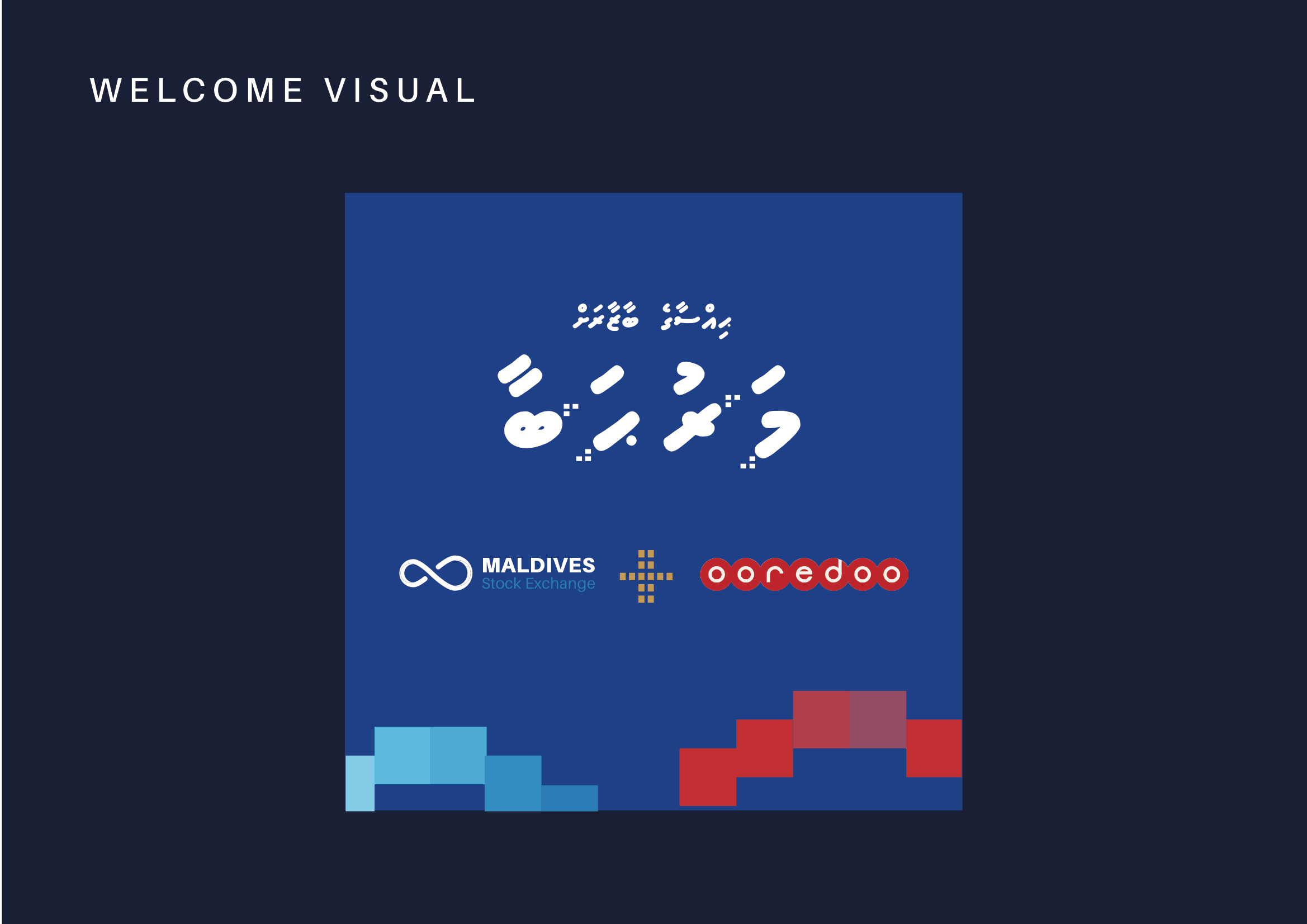
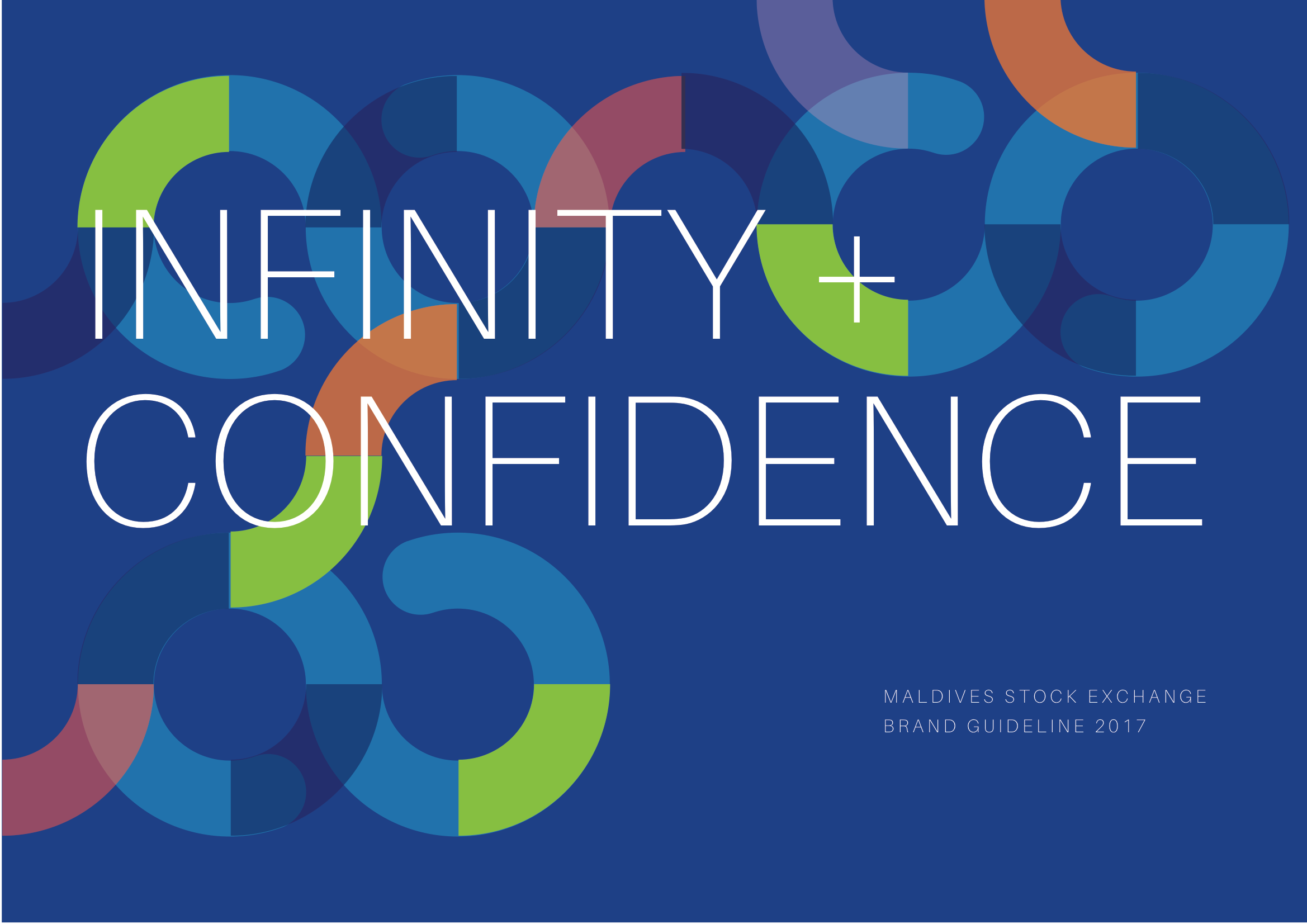
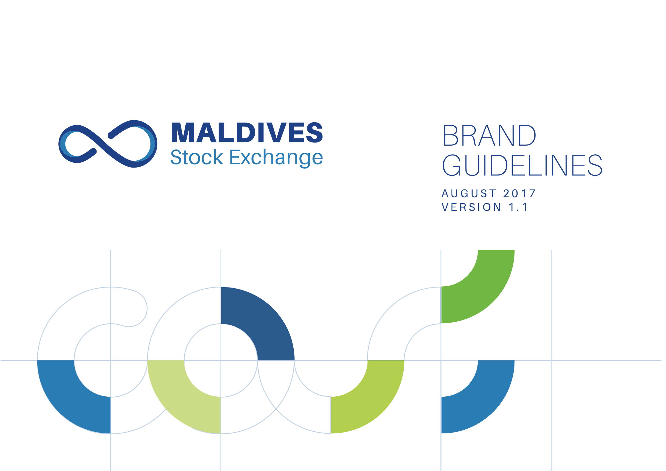
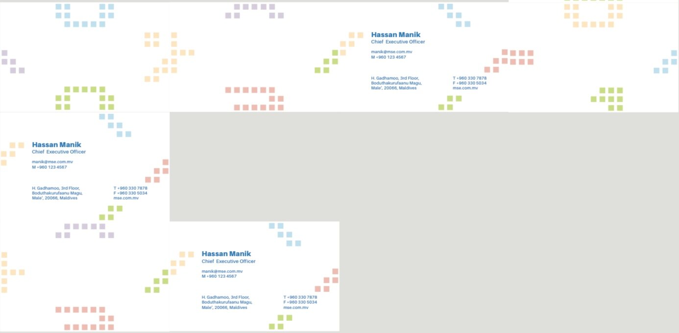
BRANDING | Maldives Stock Exchange

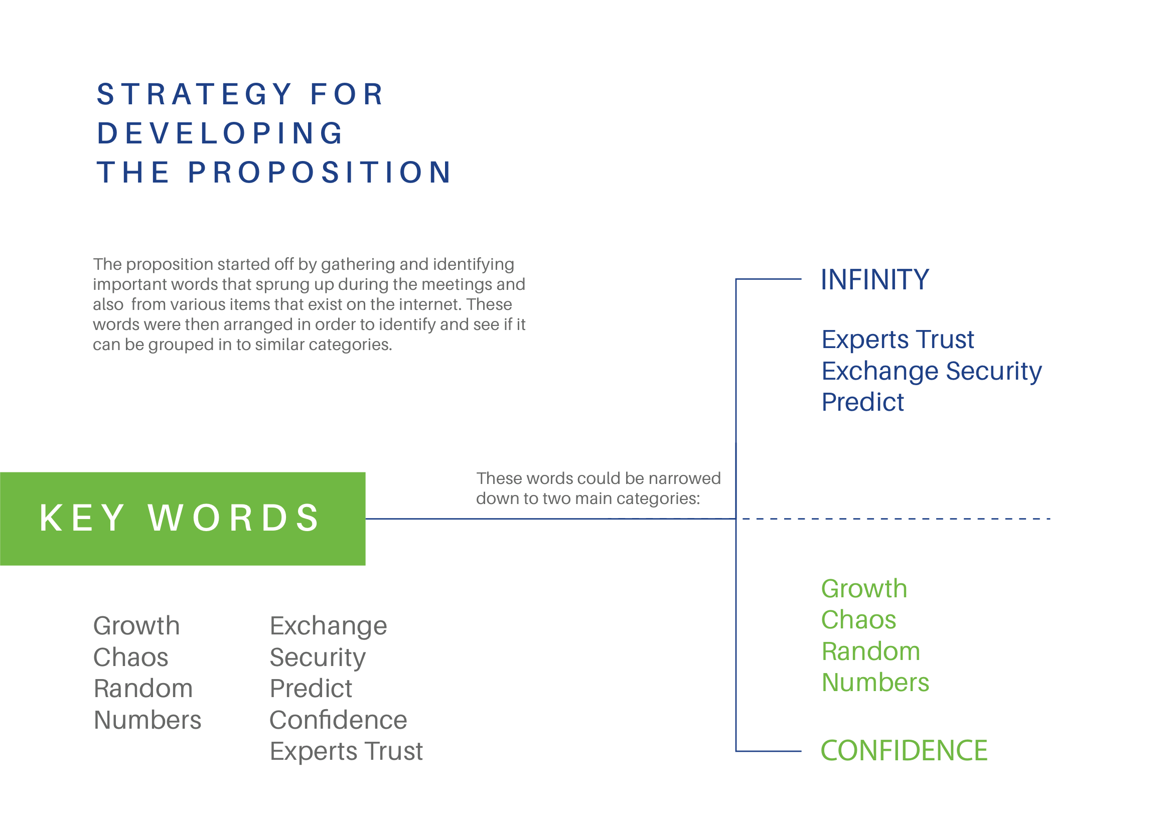
The Maldives Stock Exchange has been operating since 2008, making it a relatively recent concept compared to its counterparts in other developing nations.
My Role: Co-Brand Development & Creative Director
Designer and Art Directing: Ashward
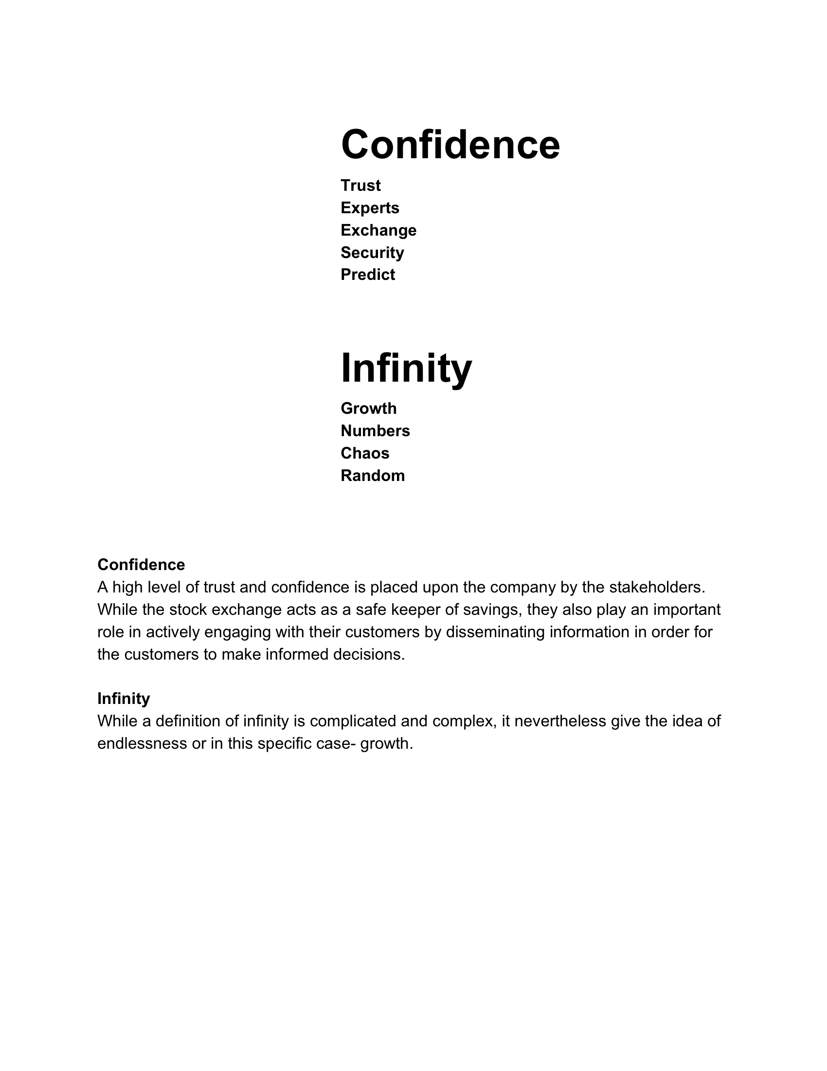
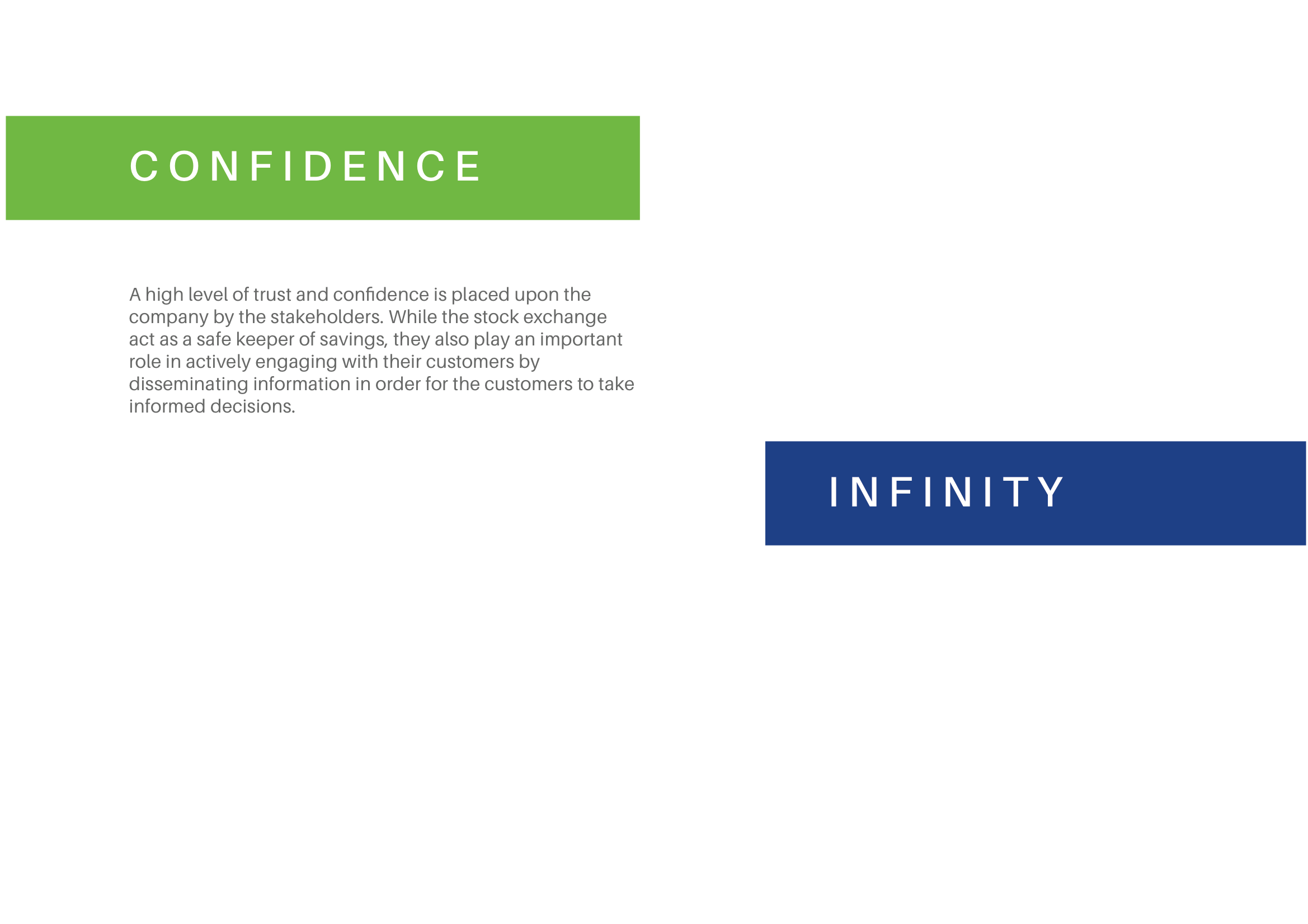
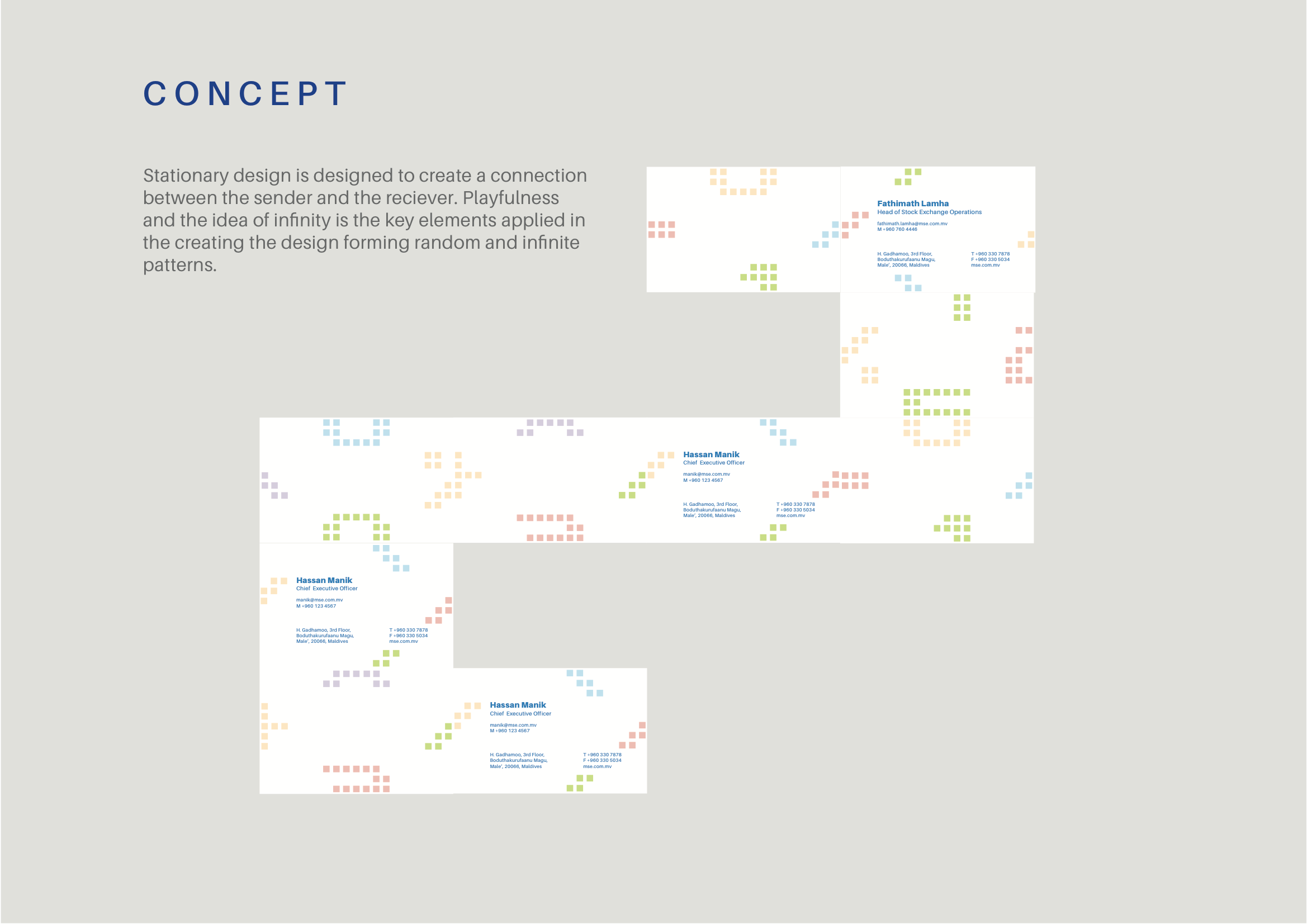
The client sought to rebrand with a focus on positioning themselves as a friendly and approachable institution. They also wanted their new branding to embody the core values of “Trust” and “Growth.”
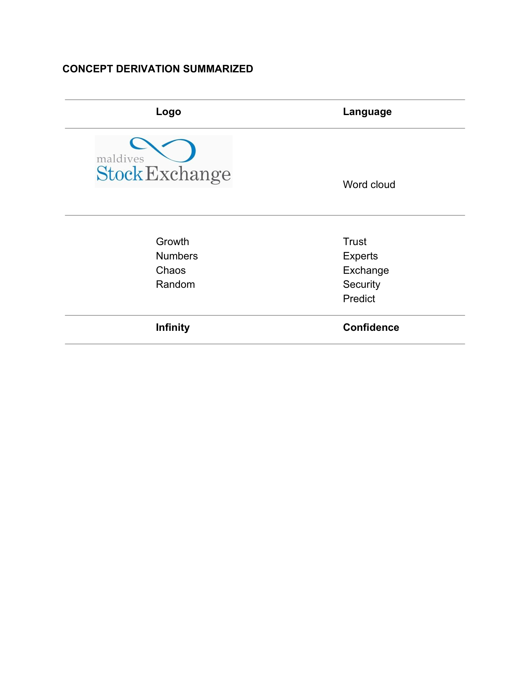
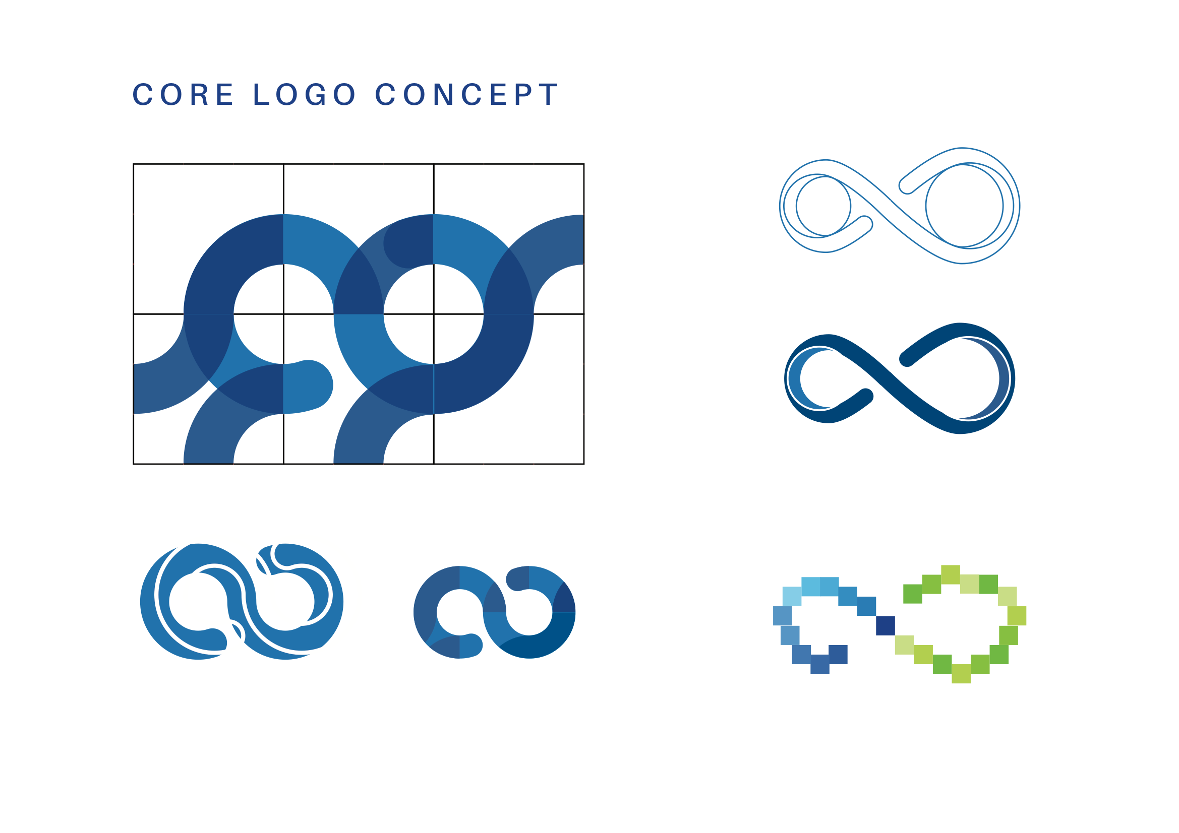
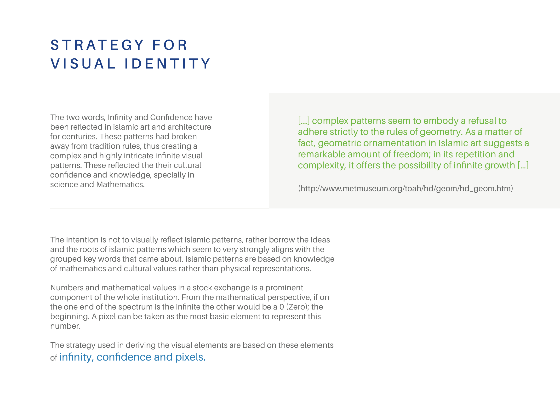
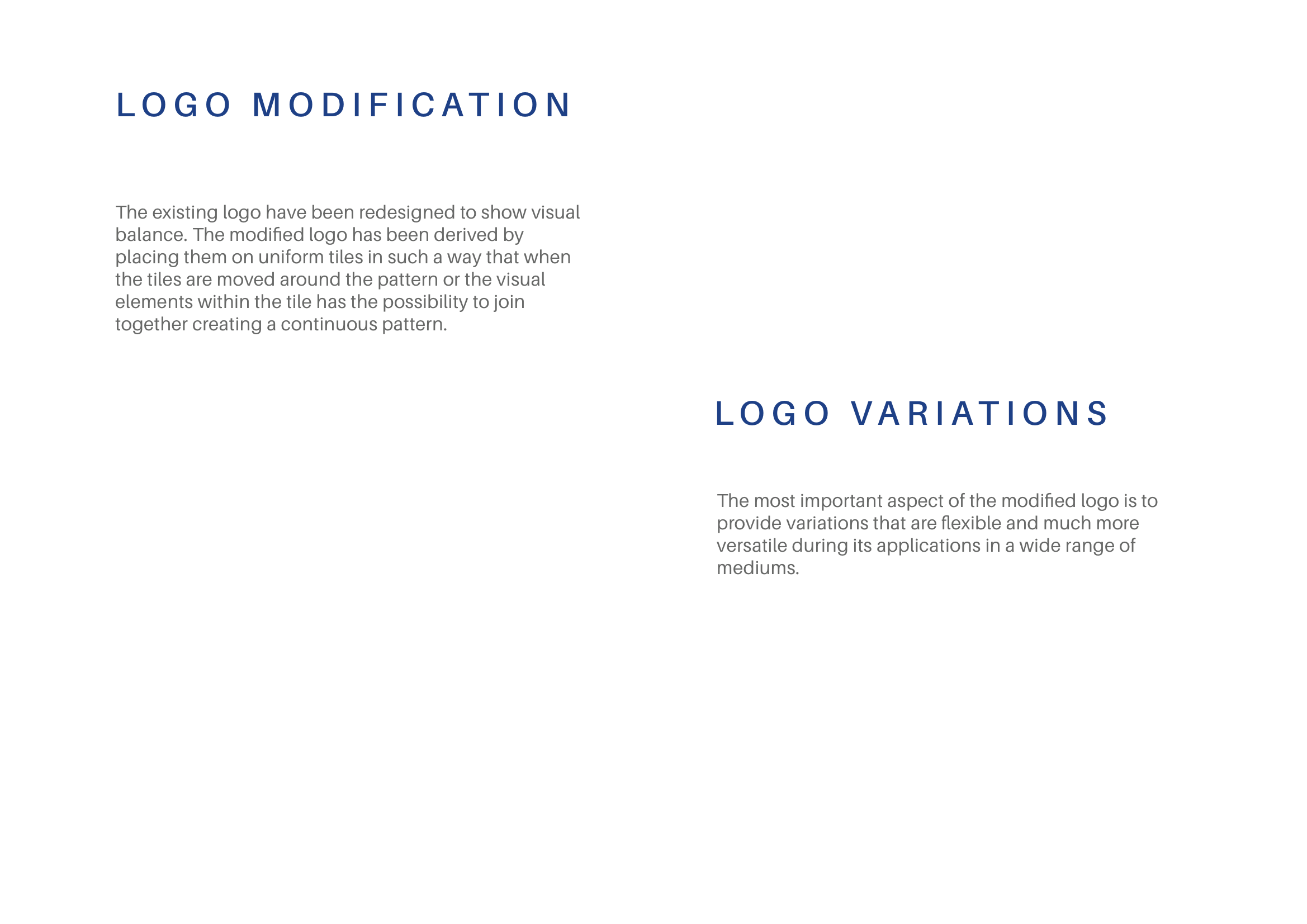
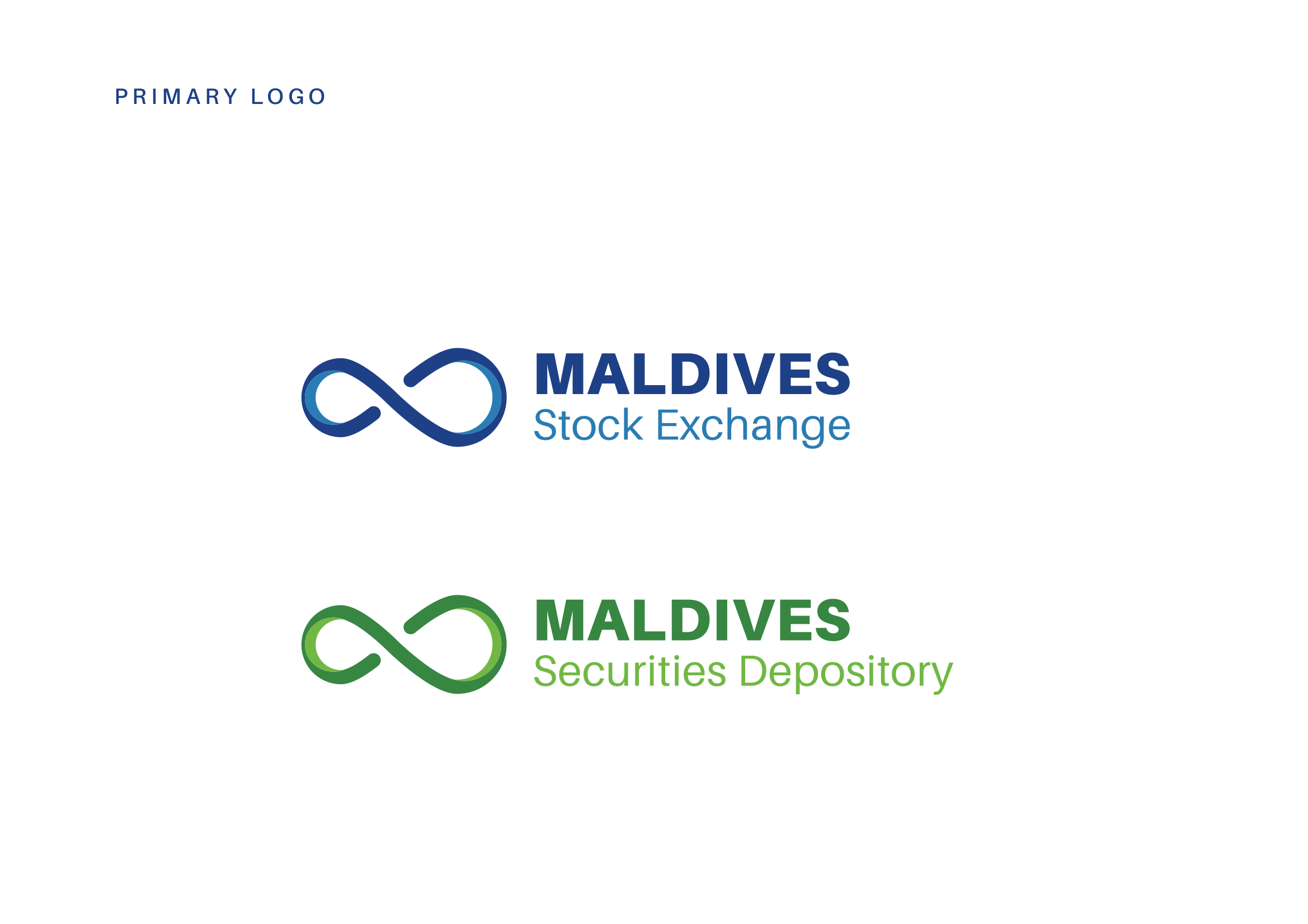
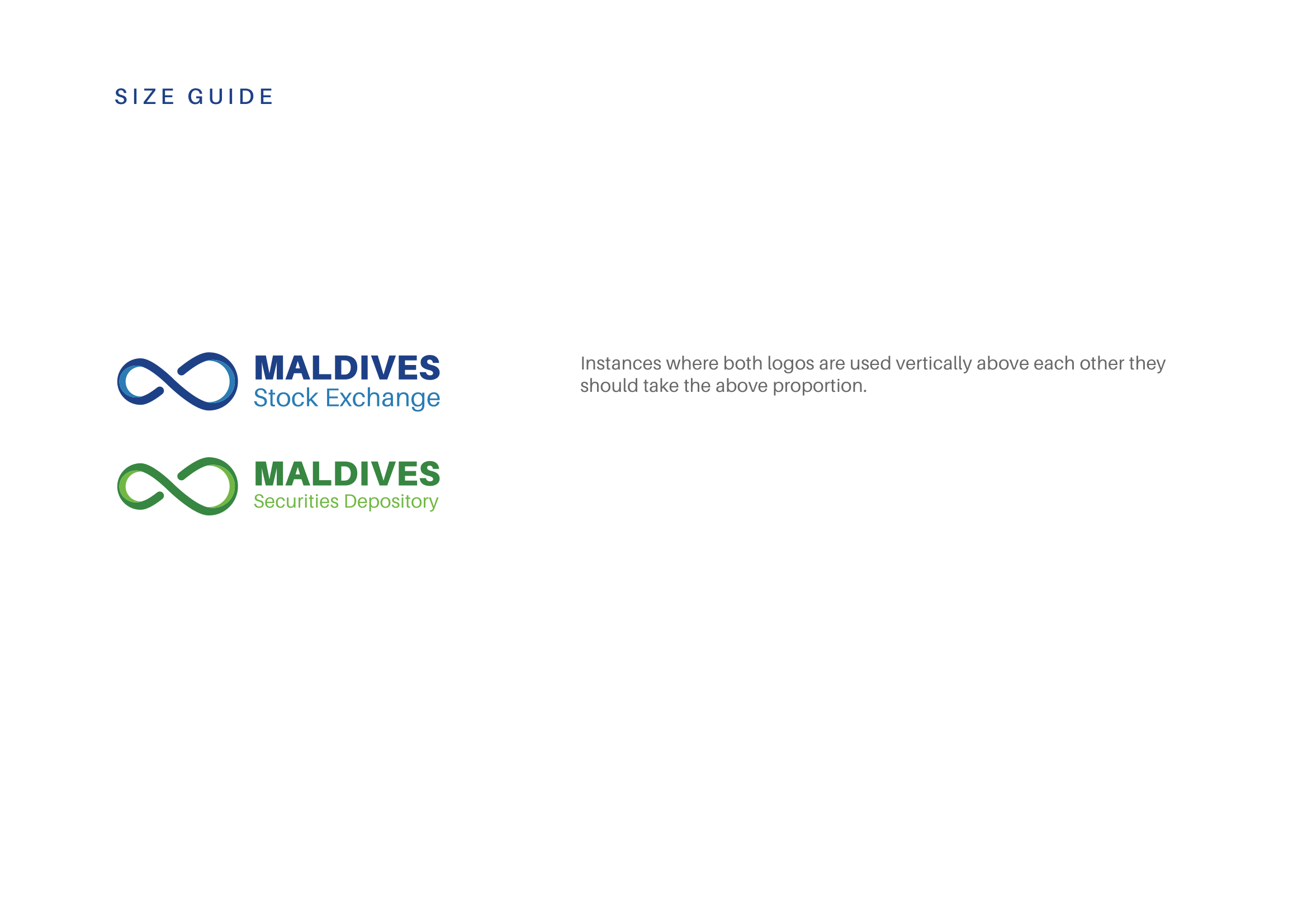
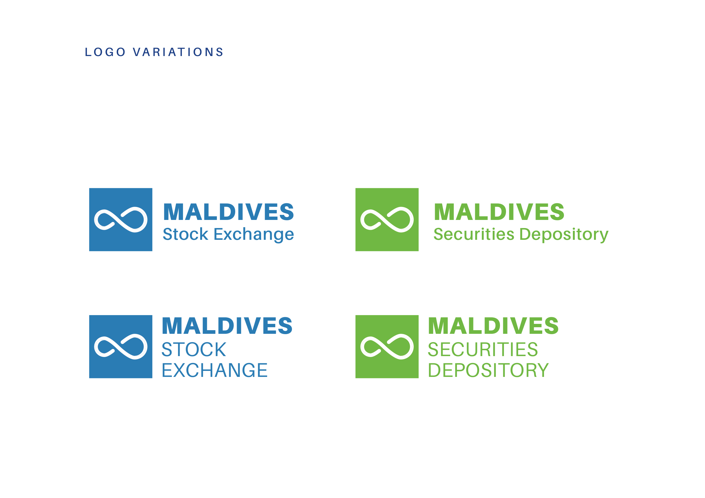
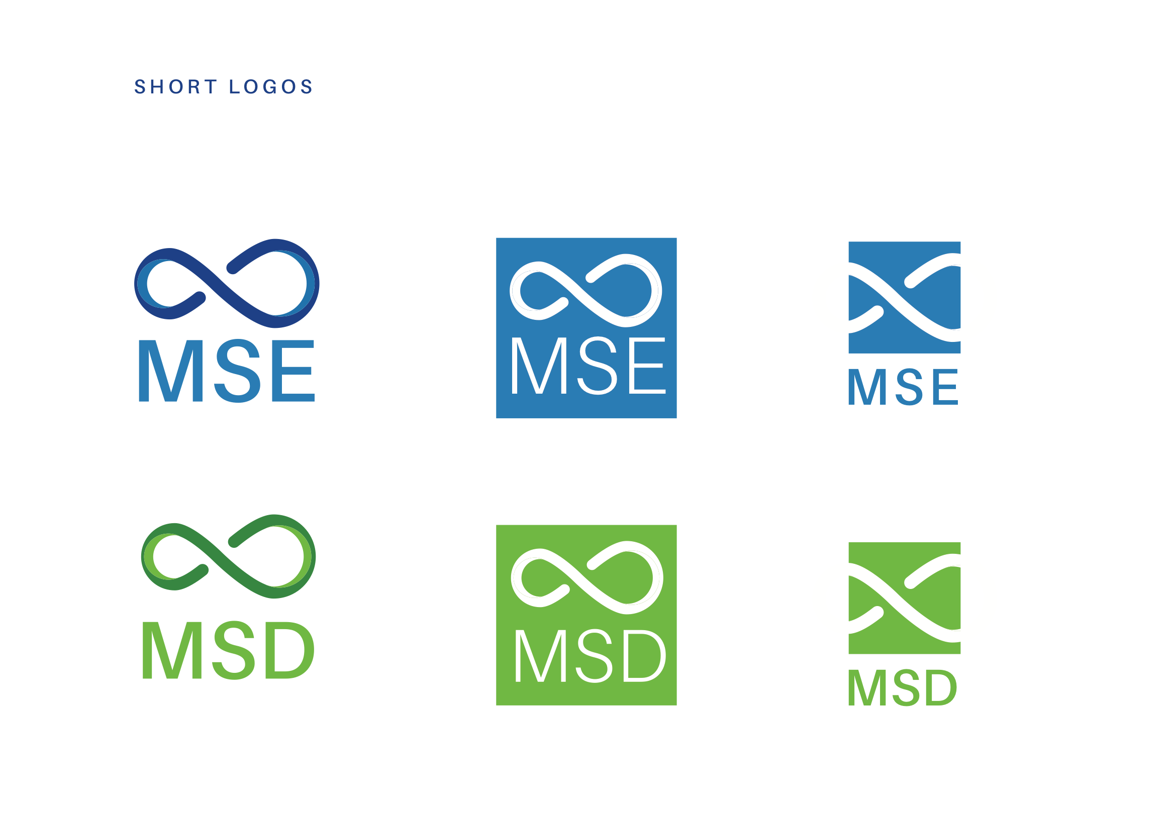
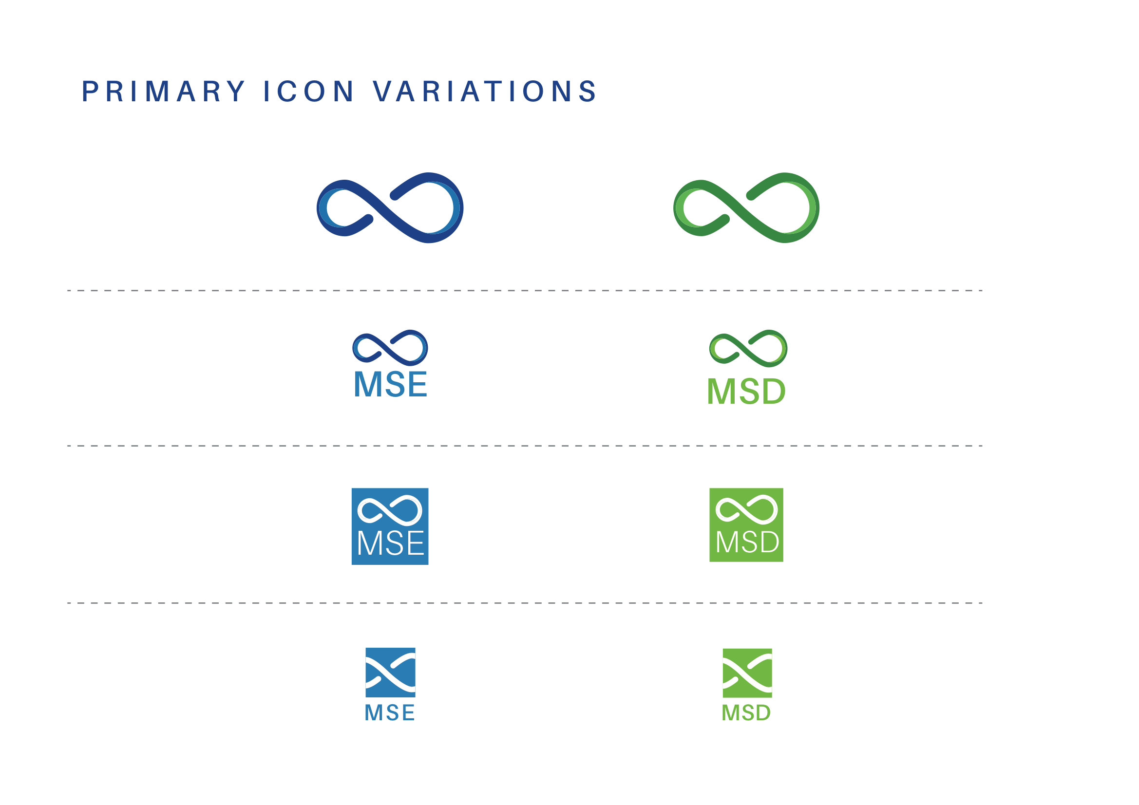
The existing logo featured a stylized infinity symbol, which the client wished to preserve as the foundation of the rebrand. Building on this, we developed a concept inspired by the themes of Confidence and Infinity—confidence in delivering positive returns and fostering the continuous growth of wealth. This approach allowed us to retain the essence of the original logo while aligning it with the client’s vision for a fresh and meaningful identity.
Research & Sketces
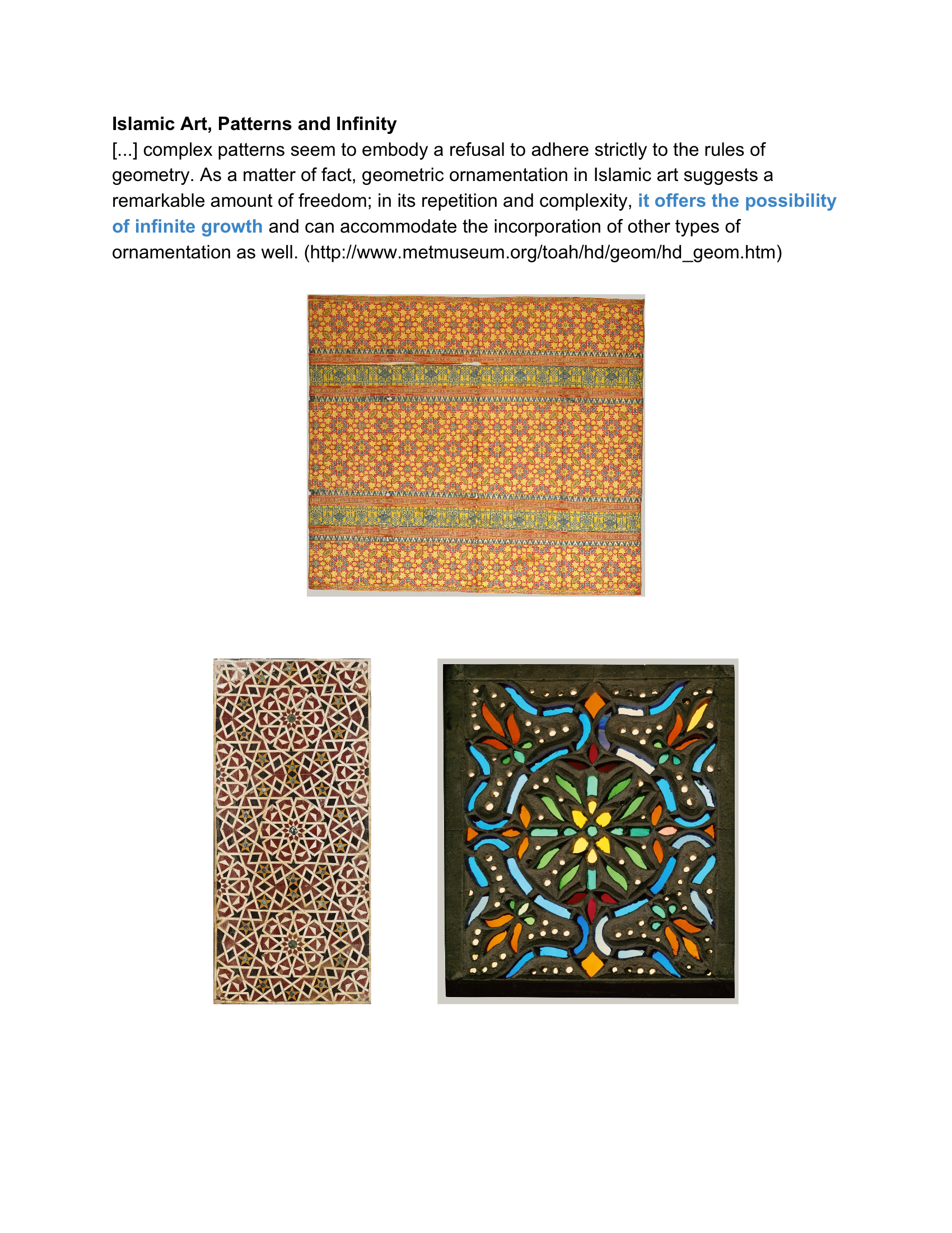
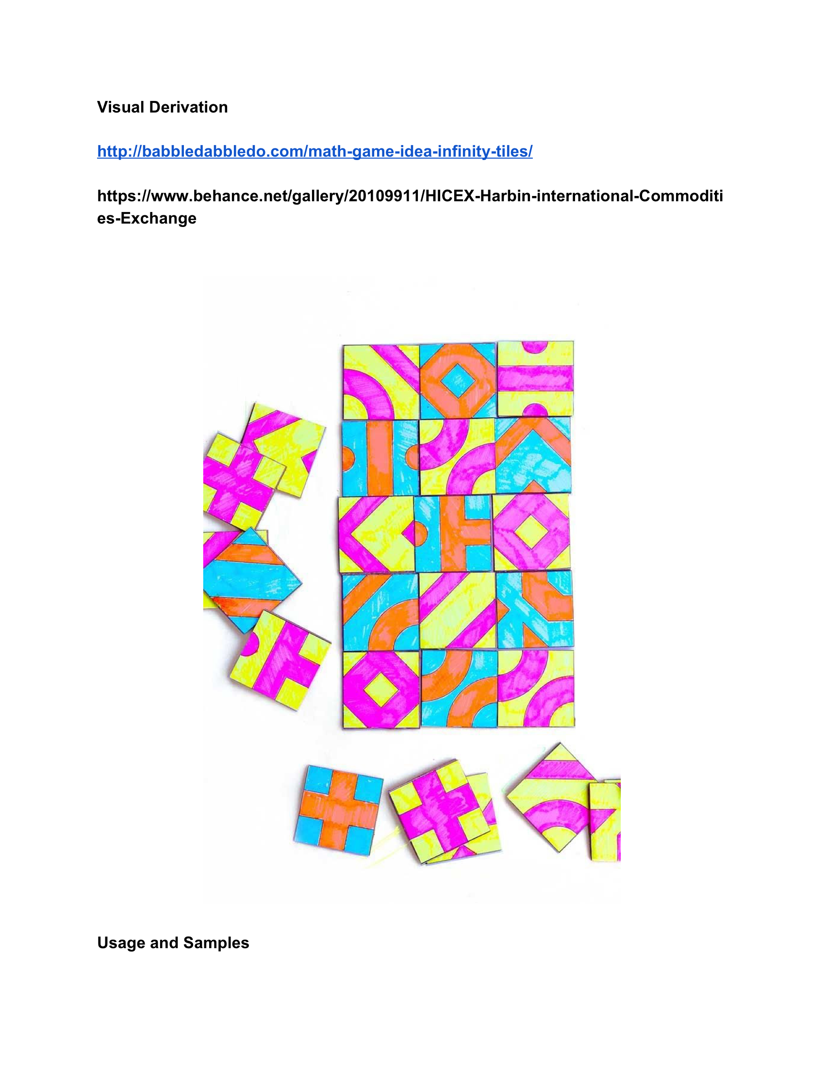
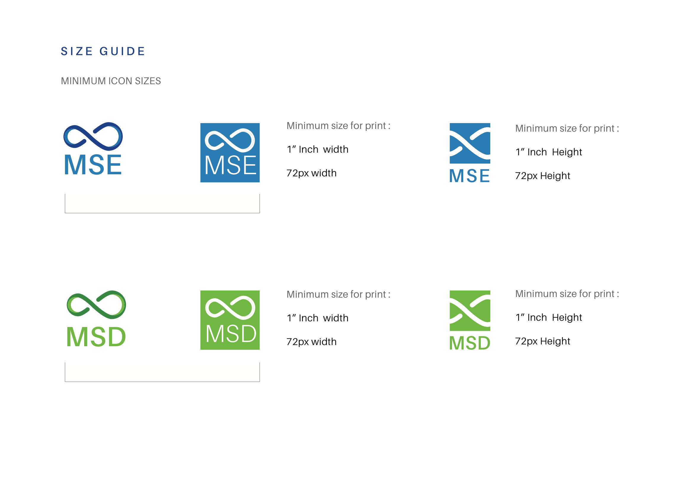
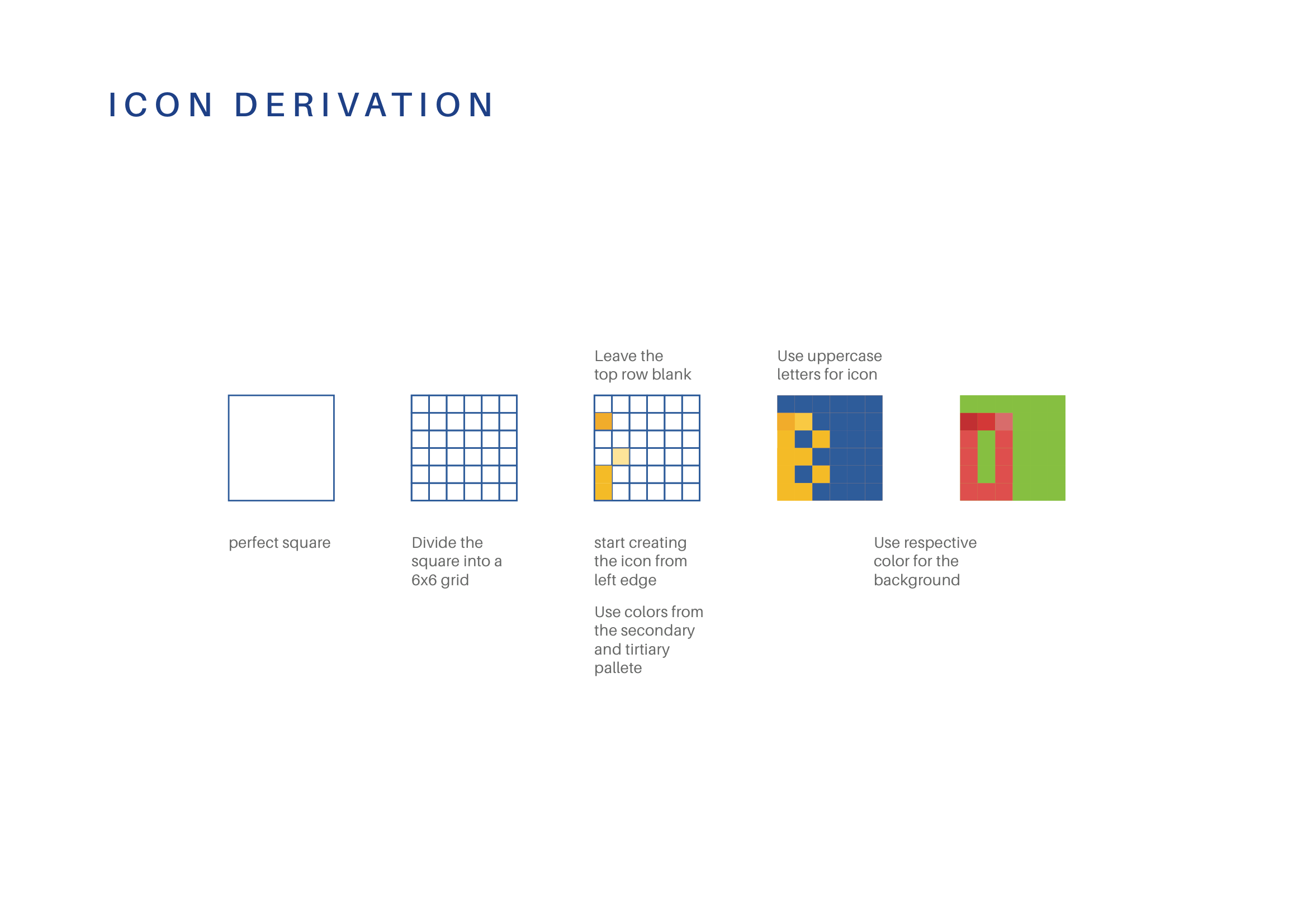
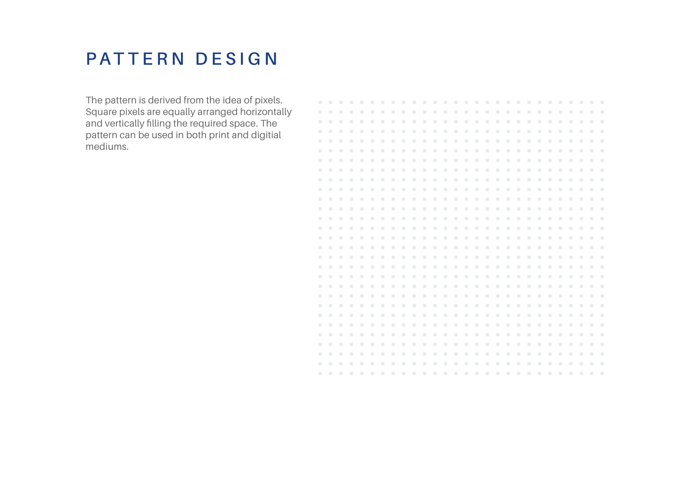
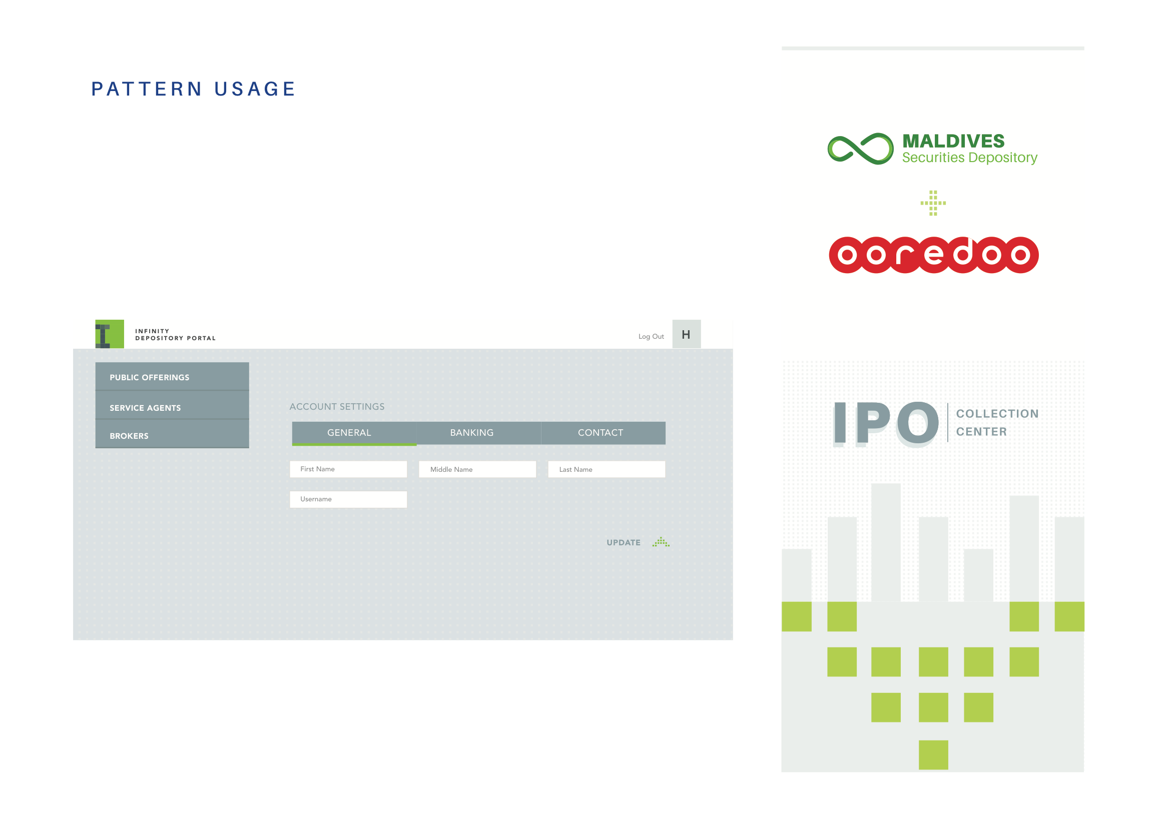
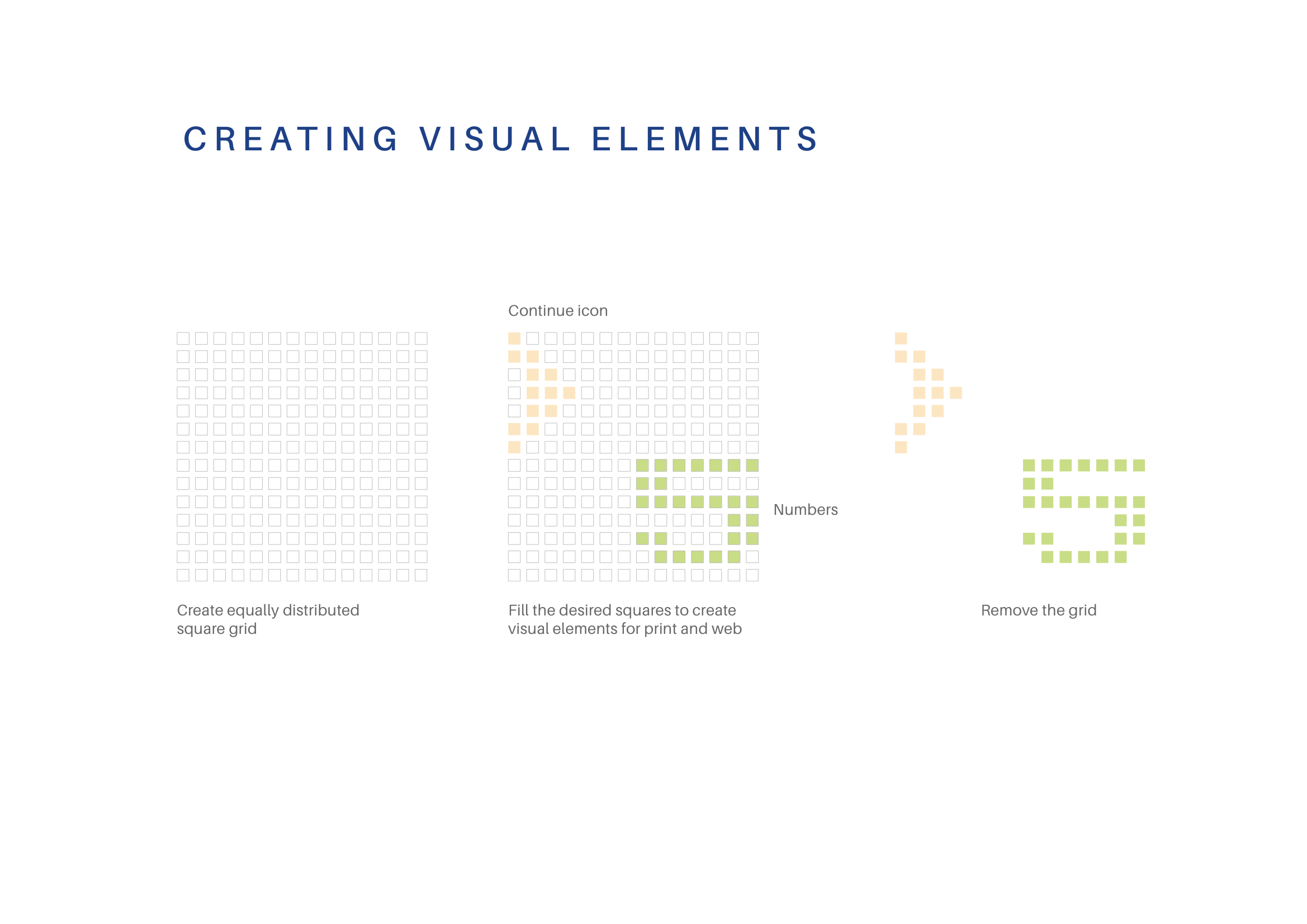
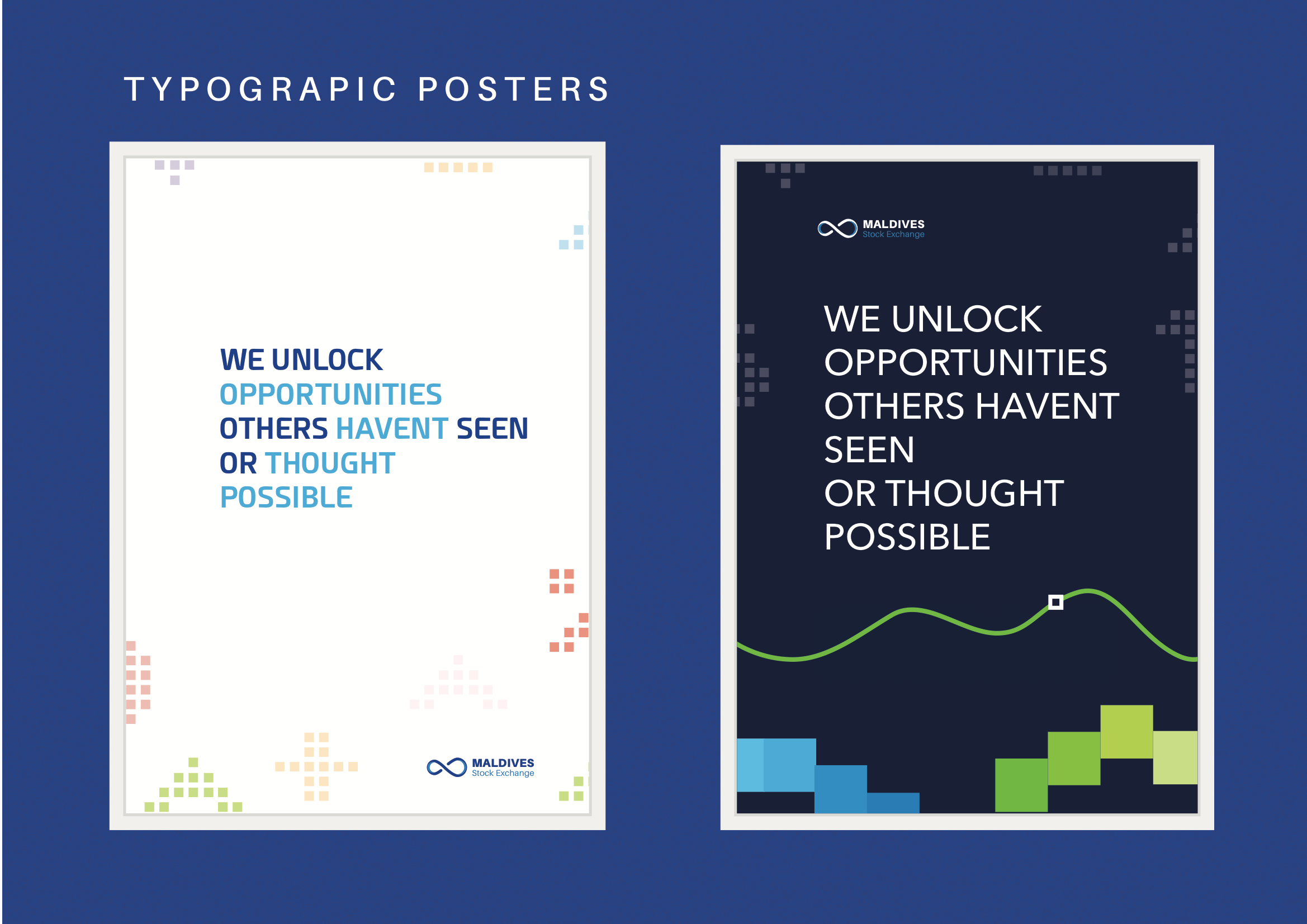
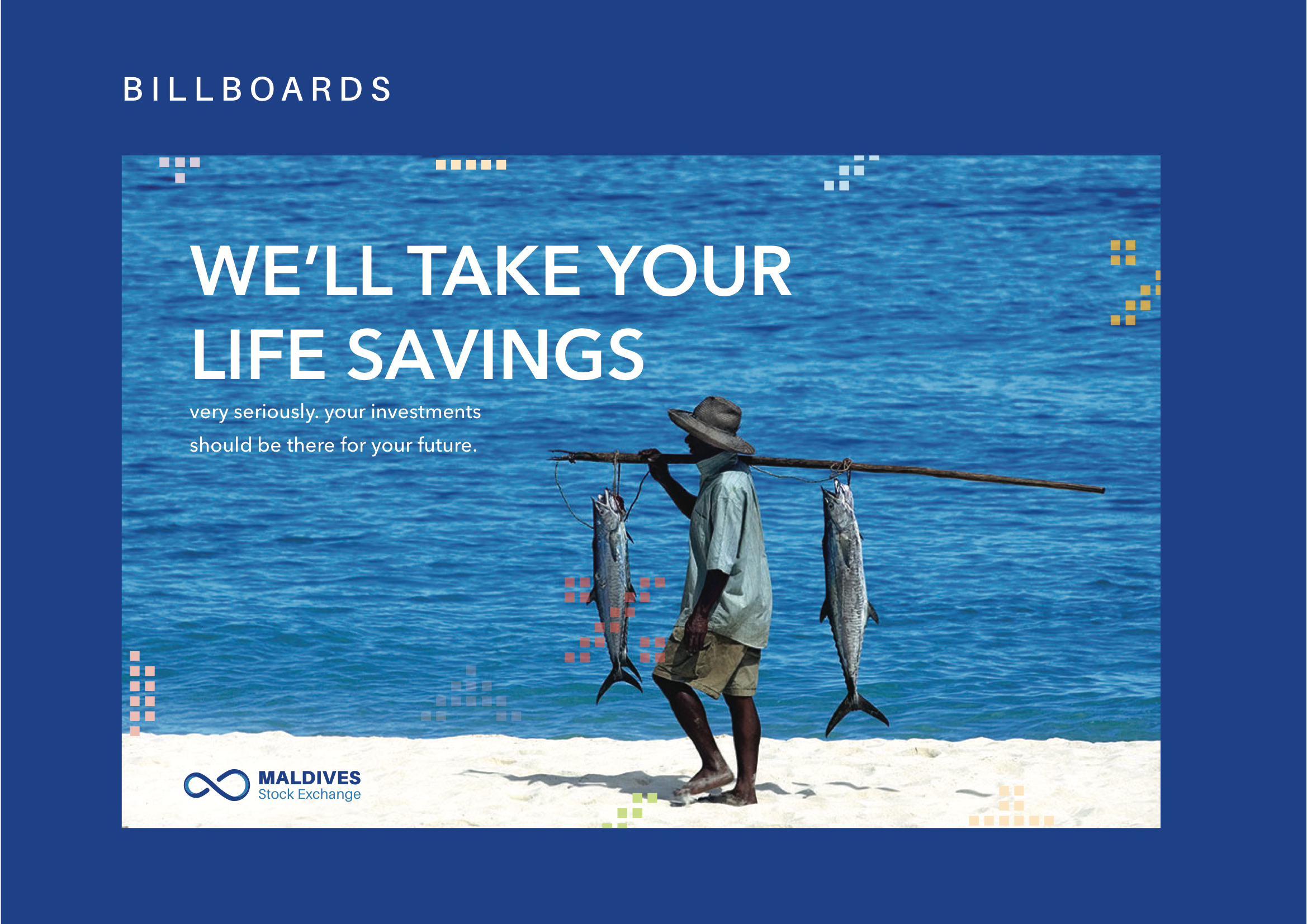
The root of the visual elements is a square, a representation of a digital pixel. This was inspired by the large digital screens we see in stock exchanges. This form of “led display element” is synonymous with much of the imagery that we see portrayed in financial institutions.
A pixel also represents a start of a larger image, synonymous with the initial investment and the idea of growth.
In addition, we designed the placement of the visuals in such a way that the patterns can potentially run seamlessly when they are placed adjacent to each other in whatever direction.
Excerpts from the brand guide


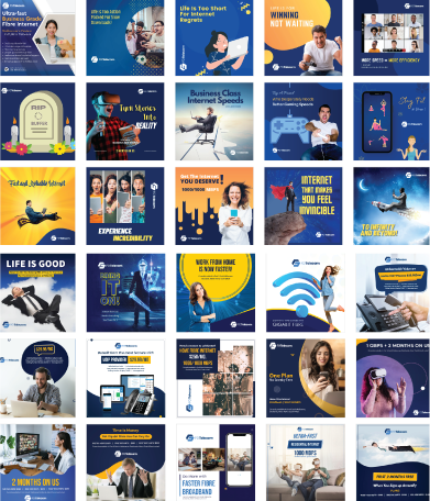
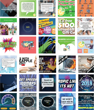
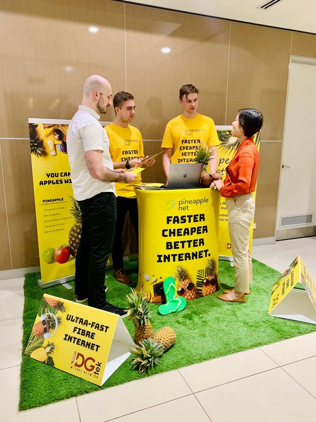
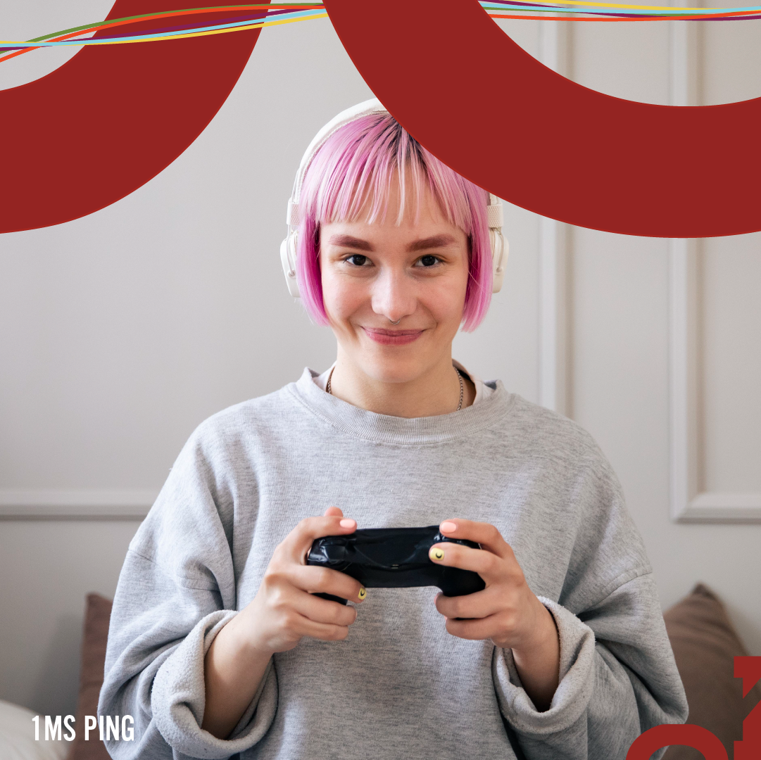
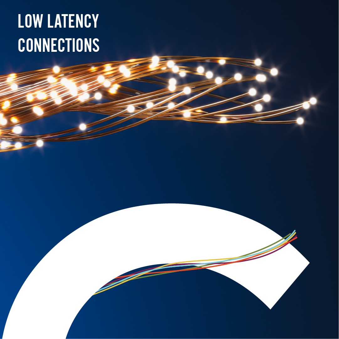
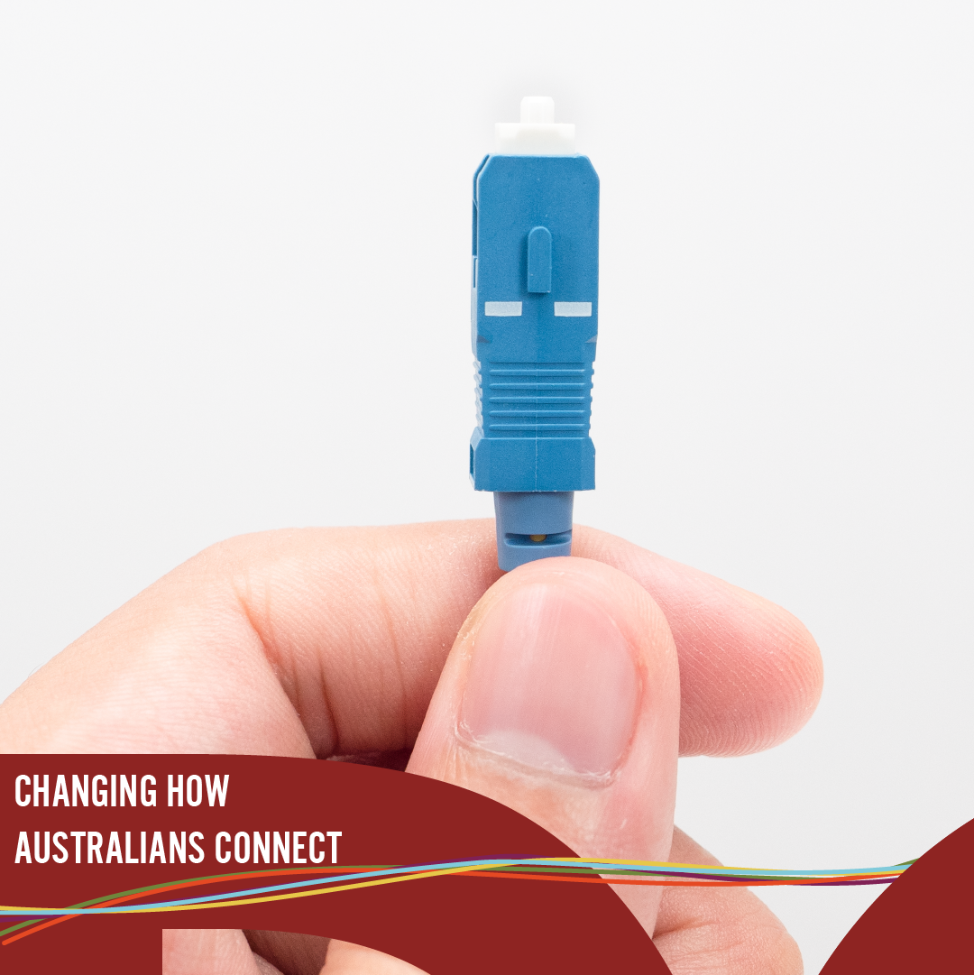
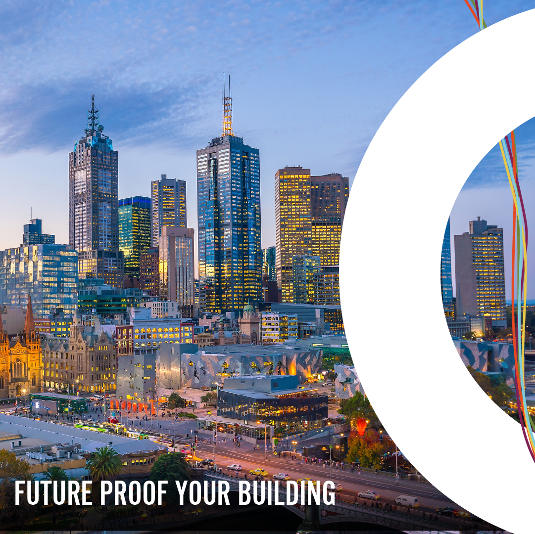
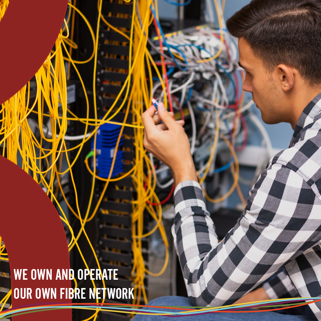
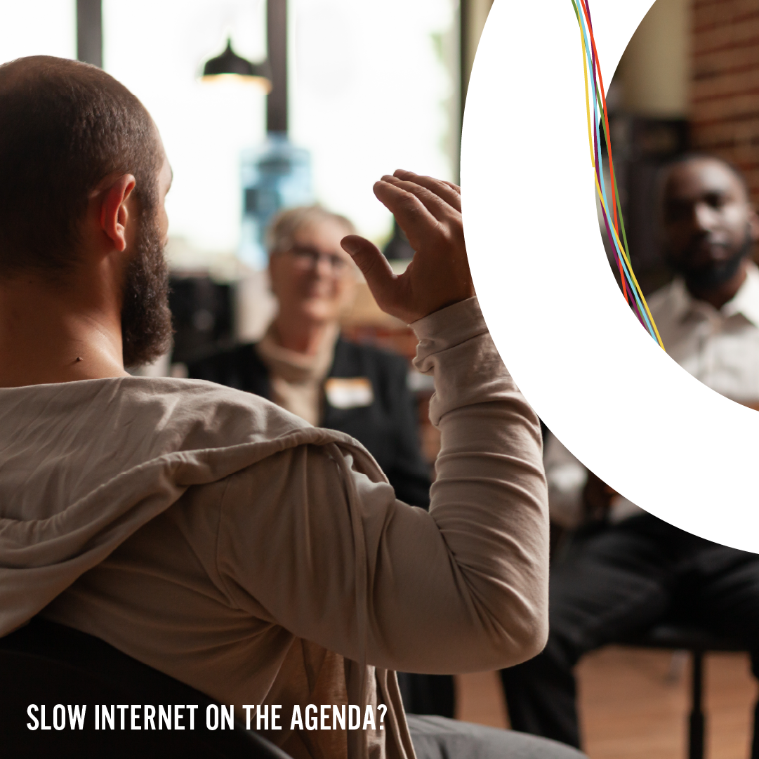
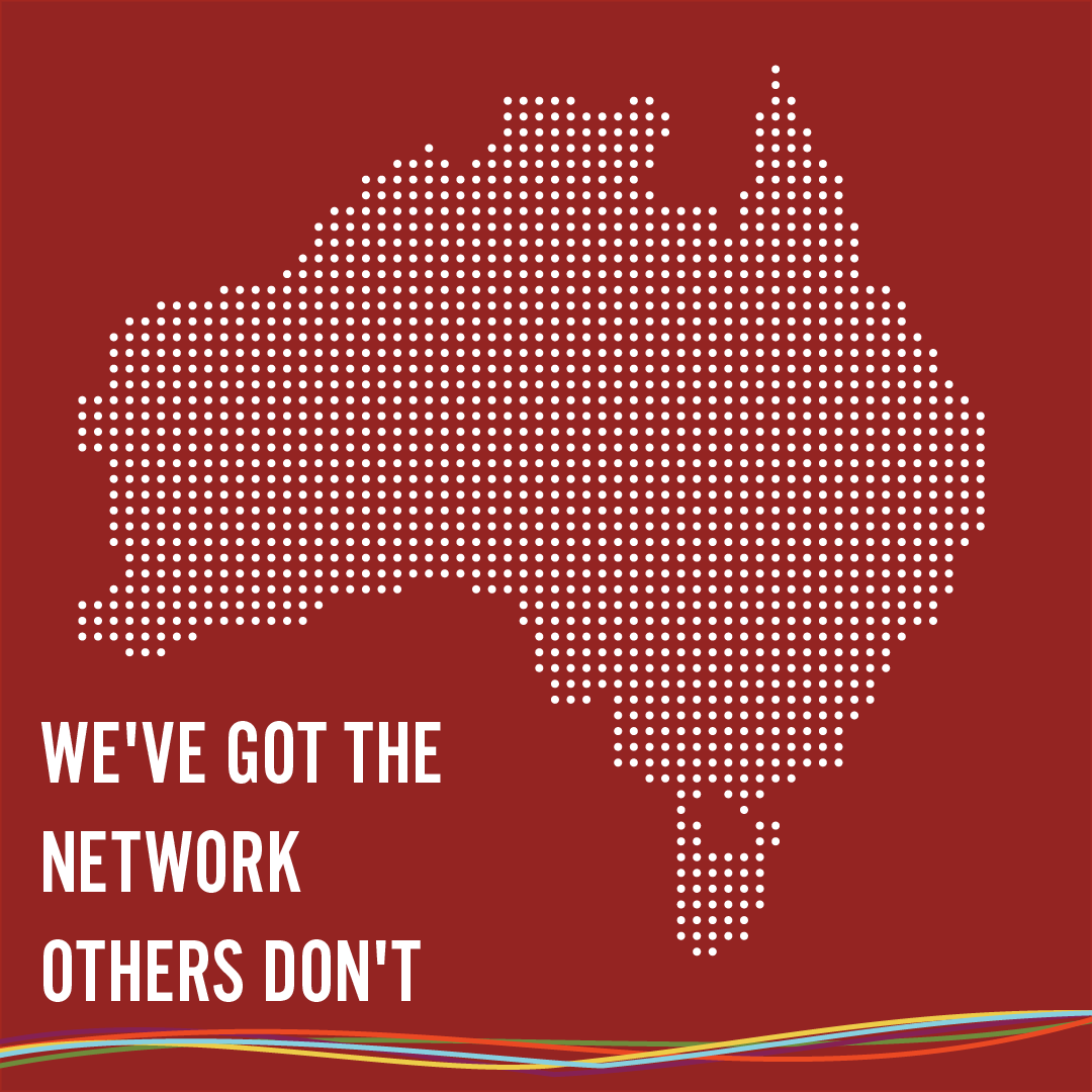
Visual Direction | DGtek, FG & Pineapple Net

DGtek is a company based in Melbourne that provides fibre internet for businesses and the public. They have three major brands; DGtek, Pineapple Net and FG Telcom
Their goal was to establish distinct visual identities for each of the brands that set them apart from each other and effectively communicated with their respective target audiences..
Role: Visual Direction, Design & Motiongraphics
Company: Digital Marketing Assistant, DGtek
This was the initial visual style that was used
The social media pages and other visuals for the three companies; DGtek, Pineapple Net and FG Telecom did not seem to have a cohesive brand story and a visual style. My goal was to establish a style for stills, videos and motiongraphic materials for each of these products..
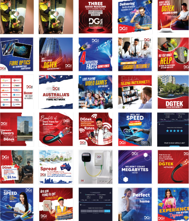
The colour palette and design elements were all derived from the already established logos.
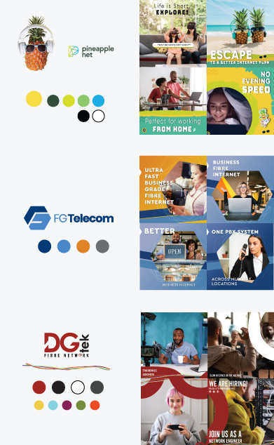
The curves of D and G were used as a visual element for DGtek visuals. This element will also be animated for moving images.


Pineapple net needed to be fun and youthful


As Pineapple Net was a technology firm, I believed it was important for their brand to demonstrate innovation and a futuristic digital presence. To achieve this, I opted to incorporate the parallax effect by creatively manipulating static images and merging them with motion
FG Telecom bored the hexagon on its logo as an element that will be used in the materials.


RESULTS
View fullsize
![]()
View fullsize
![]()
View fullsize
![]()
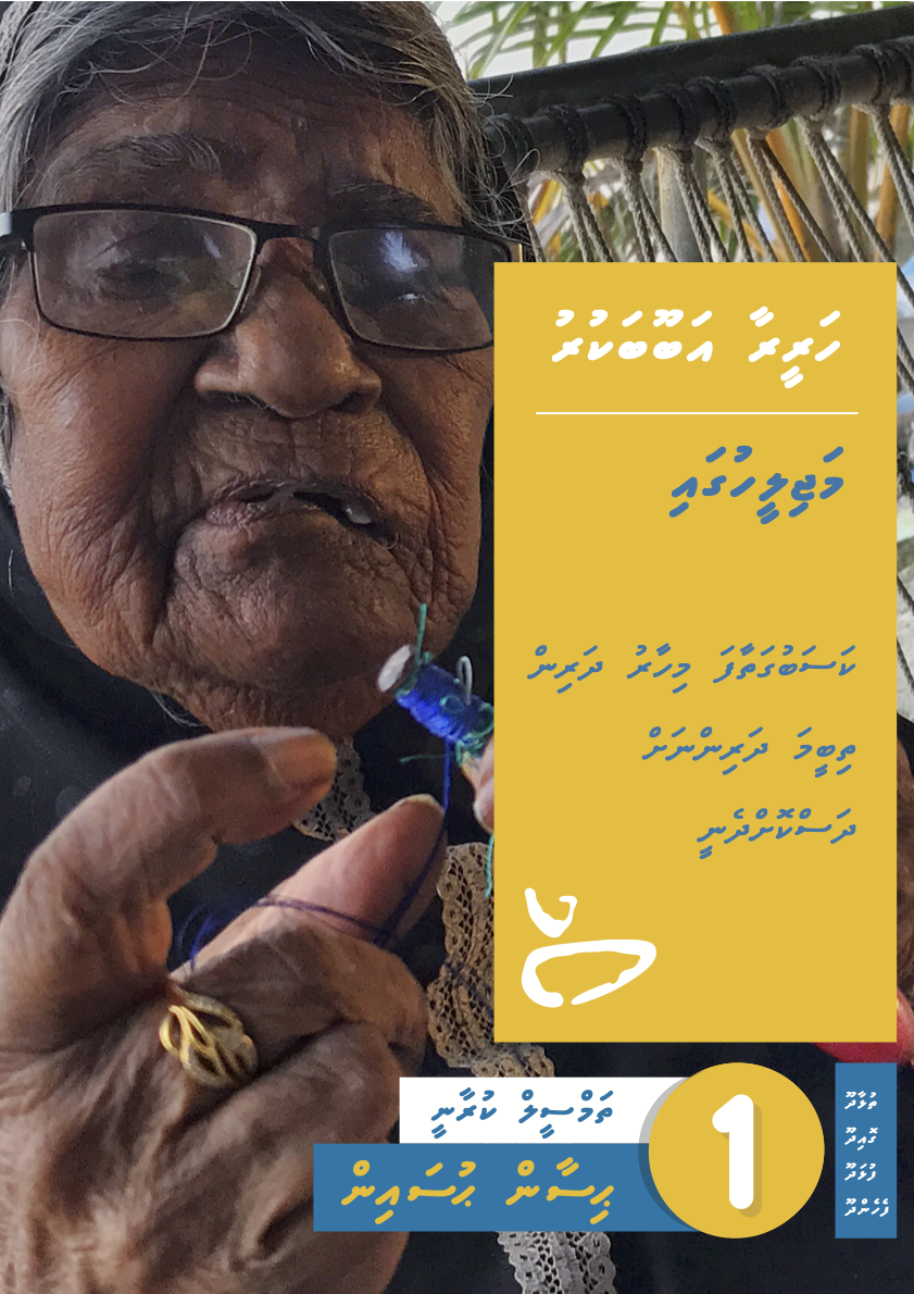
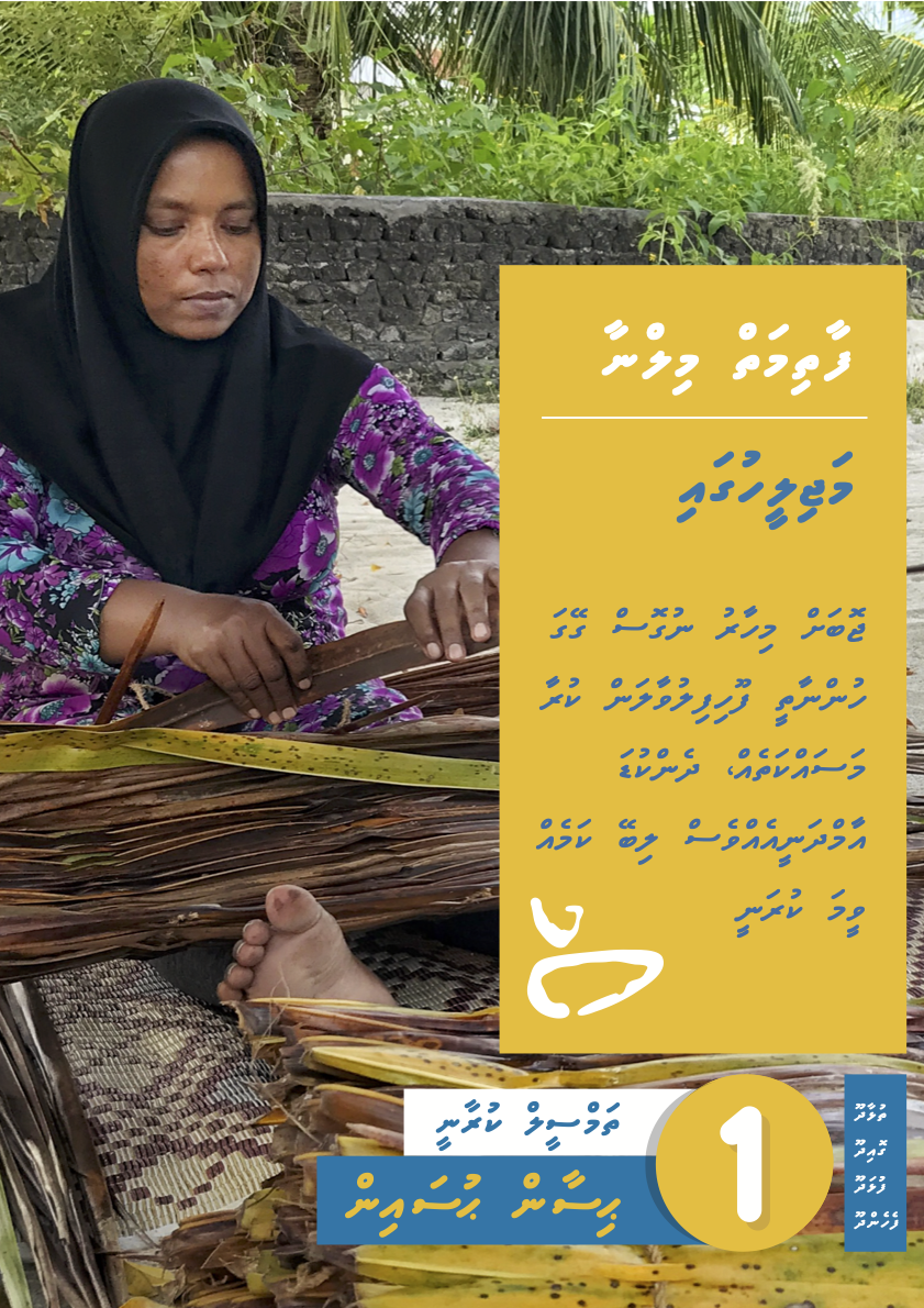
Integrated Waste Management Communication Campaign
The Ministry of Environment & Technology in the Maldives and World Band had partnered in establishing an integrated waste management system in various regions of the Maldives Islands. A communication campaign was needed to create awareness amongst the public on various aspects of the system.
My Role: Creative Director
Communication Consultant: Ali Saeed
Designer: Ashward | Motiongraphics: Imad (Dami) | Web: Haris & Inad (Code Fly)
Agency: Emmenge
Client: Ministry of Environment, Climate Change and Technology, Maldives
I collaborated both remotely and on-site with a creative team to develop and execute the campaign. Through our research, we discovered that traditional stock assets had minimal impact on the local population. To address this, we devised a strategy centred on empowering the residents of each island to create materials and share stories unique to their communities.
Our approach focused on establishing a platform that celebrated local perspectives and fostered community engagement. We proposed three key channels to bring this vision to life: a dedicated website, a physical newsletter, and kiosk-style noticeboards on the islands. These channels were designed to ensure accessibility and to amplify the authentic voices of each community.
Communication strategy & plan
The communication consultant, Ali Saeed was the lead in developing the plan.
Excerpts from the Visual Guide


We also proposed the use of children to deliver key messages on a national level. The periodic newsletters are developed and delivered by school children.
A structure on one of the islands converted to a kiosk where the newsletter is presented in printed form


National level videos have already been delivered
The lead in developing the strategy is the communication specialist Ali Saeed
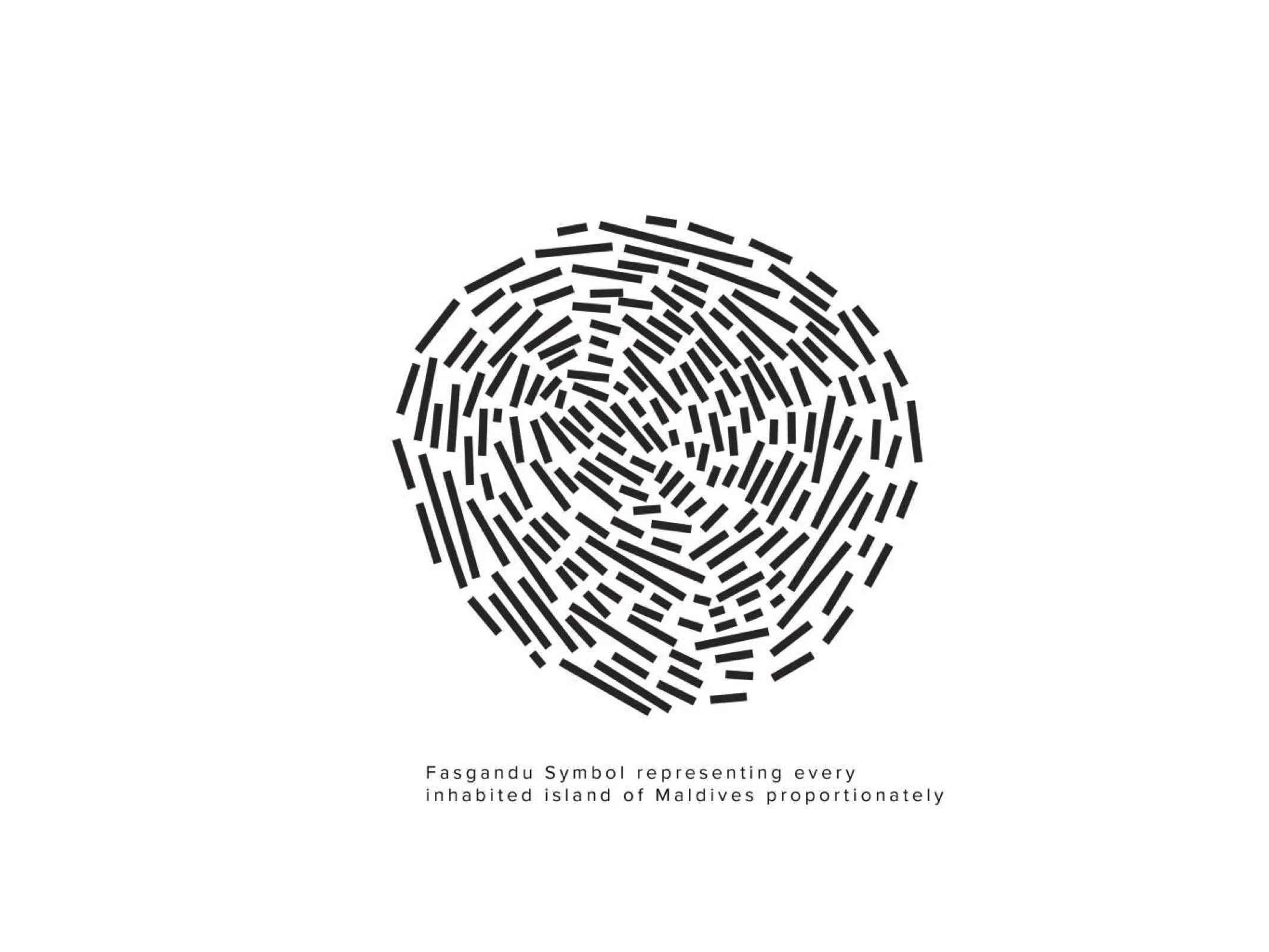
The government of the Maldives have made the Fasgandu campaign their national campaign for waste management. The strategy and the tools we have set will be rolled out to several islands in the coming months.
Branding & Communication for Urban Isle
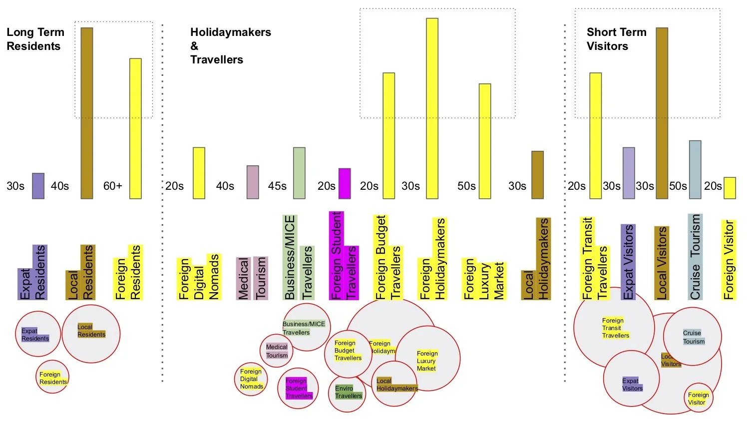
Urban Isle is a new tourist destination island that is being developed in the Maldives. The island is an artificial island built by reclamation of a shallow lagoon. This island will join another island that is becoming an urban hub.
I took the lead in developing the branding and communication strategy for this unique project. The island, entirely human-made, was constructed in the middle of the ocean—a remarkable feat that inspired the creative direction.
To reflect this ingenuity, I wanted the branding process to incorporate a physical, tactile element that mirrored the island’s creation. The logo became the starting point for this vision. Drawing inspiration from the Japanese art of Suminagashi, we used this traditional technique to create flowing patterns on water—an approach I found symbolic of the process of forming an island in the ocean. These patterns became the foundation of the brand’s identity, blending creativity with the essence of its story.
My role: Branding, Comms Strategy and Creative Director
Art Director & Key Design: Ashward
Designer: Sithna
Agency: Marcomms
Client: Urban Isle, Hulhumale Development Corporation.
Research


Visual Direction and Initial sketches
** Images used in the below document are borrowed from the internet. These are appropriated to show possible visual direction and are intended for internal use only.


Excerpts from the Brand guide


Miyaheli Branding | UNDP Maldives
Miyaheli is an initiative by UNDP in the Maldives, marking the first-ever Social Innovation Camp in the country. This event provides a platform for young people to brainstorm, collaborate, and develop innovative solutions to address challenges and improve their communities.
I was tasked with the responsibility of creating the branding and a communication direction for this event. Given its focus on youth, I aimed to design visuals that were vibrant, playful, and approachable—steering away from overly formal aesthetics. To capture the spirit of creativity and innovation, we incorporated a collage-like style into the visual elements. This approach symbolised the process of “making, creating, and building,” serving as a visual metaphor for the act of innovation itself.
The resulting branding underscored the event’s mission to empower the next generation of changemakers in the Maldives.
My Role: Branding & Creative Directing | Motiongraphics
Key Designer: Ashward
Agency: Emmenge
Client: UNDP Maldives

My Initial sketches


Printed posters


Short call for participants video
Animated Gifs


Highlights from the first camp
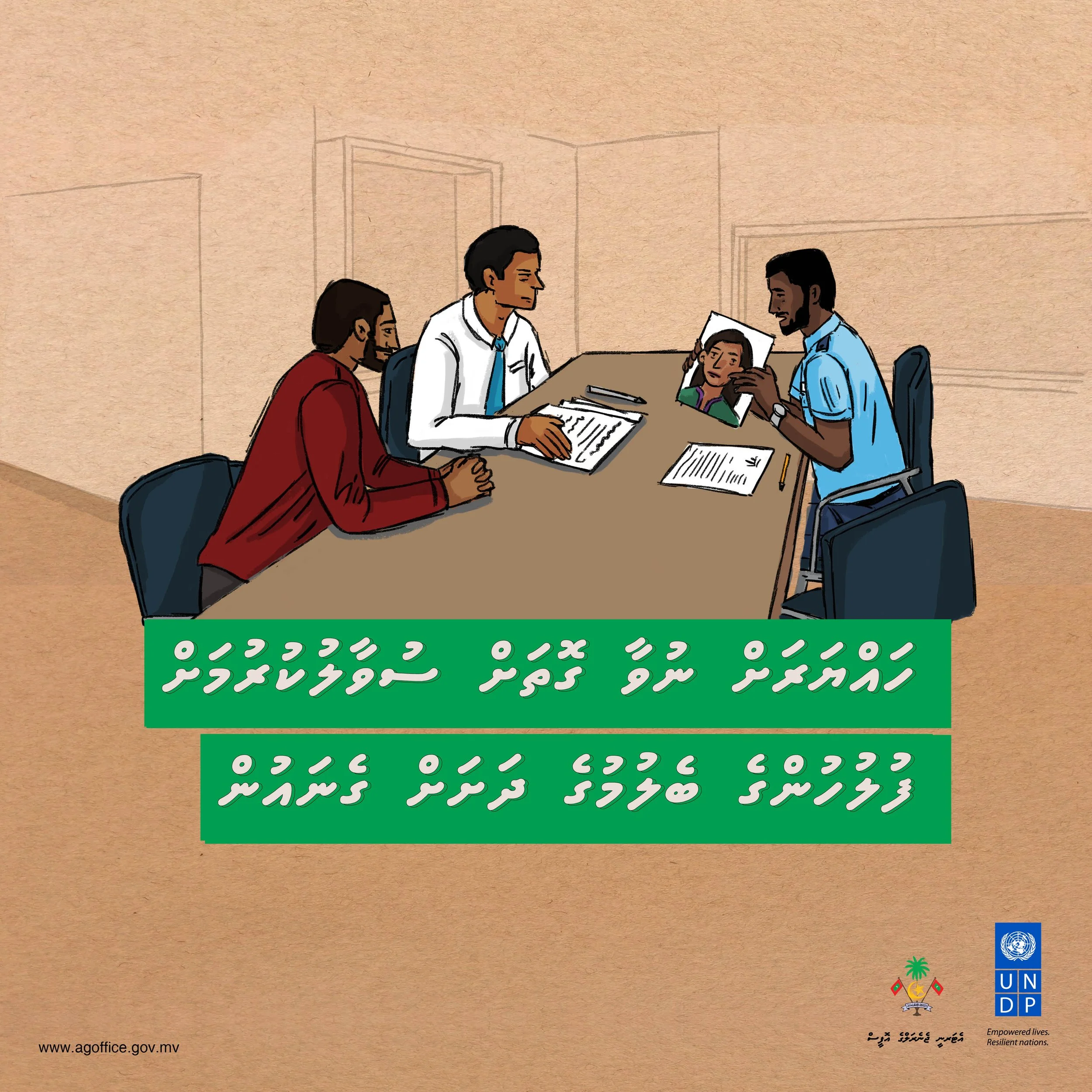
Criminal Procedures Act | Maldives Attorney General's Office
The Maldives Attorney General’s Office sought to develop a campaign aimed at raising awareness about the Criminal Procedures Act among the public, institutions, and other stakeholders. The goal was to ensure that all stakeholders clearly understood their rights, responsibilities, and the boundaries defined by the Act, fostering greater compliance and informed participation.
ROLE: Communication Strategy & Visual Direction/Creative Director/Art Director
Illustrations: Eman Rasheed | Motiongraphics: Ahmed Imad (Dami) | Layout Designers and Finished artists: Farhad & Dhahau | Additional designer: Ali Rishwan
Agency: Emmenge | Client: UNDP Maldives & Maldives Attorney Generals Office
The content that needed to be communicated was, unfortunately, dense and dry legal material, which posed a challenge in capturing the audience’s attention. To overcome this, I decided to adopt a visually engaging and stylized approach that would make the information more accessible and appealing. After careful consideration, we chose a “graphic novel” style, incorporating dynamic visuals, storytelling elements, and vibrant designs to bring the content to life. This creative approach allowed us to deliver the information effectively across various mediums, ensuring that it resonated with a diverse audience
Wall posters to be framed and hung on their office foyer
Illustrator: Eman Rasheed | Finished Artist: Farhad
![AG Office - Posters v7 [A2]_Page_1.jpg](https://images.squarespace-cdn.com/content/v1/5cb5be987a1fbd639229cc49/1677803257371-0ONA7Q6SMU86QBN1QRH9/AG+Office+-+Posters+v7+%5BA2%5D_Page_1.jpg)
![AG Office - Posters v7 [A2]_Page_3.jpg](https://images.squarespace-cdn.com/content/v1/5cb5be987a1fbd639229cc49/1677803256144-V1U7YOY2830NJPDV576A/AG+Office+-+Posters+v7+%5BA2%5D_Page_3.jpg)
![AG Office - Posters v7 [A2]_Page_2.jpg](https://images.squarespace-cdn.com/content/v1/5cb5be987a1fbd639229cc49/1677803256489-4PN1L80D6DA6DZ0ABHX0/AG+Office+-+Posters+v7+%5BA2%5D_Page_2.jpg)
![AG Office - Posters v7 [A2]_Page_4.jpg](https://images.squarespace-cdn.com/content/v1/5cb5be987a1fbd639229cc49/1677803255221-MLS6TNTLBCD52FKY3F7S/AG+Office+-+Posters+v7+%5BA2%5D_Page_4.jpg)
![AG Office - Posters v7 [A2]_Page_5.jpg](https://images.squarespace-cdn.com/content/v1/5cb5be987a1fbd639229cc49/1677803254961-MFALFE3XBSISZ0IIG8ST/AG+Office+-+Posters+v7+%5BA2%5D_Page_5.jpg)
TV spots using the illustrated style and motion.
Illustrations: Eman Rasheed. Motiongraphics: Inthi & Imad (Dami)
Print publication
Illustrations: Eman Rasheed. Layout and Design: Dhahau Naseem
Some of the web graphics
Illustrations: Eman Rasheed. Finished Art and Design: Farhad


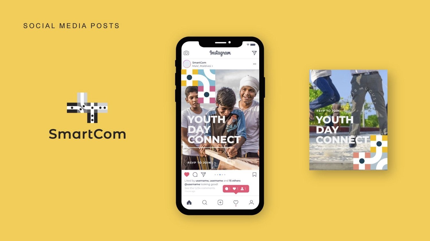
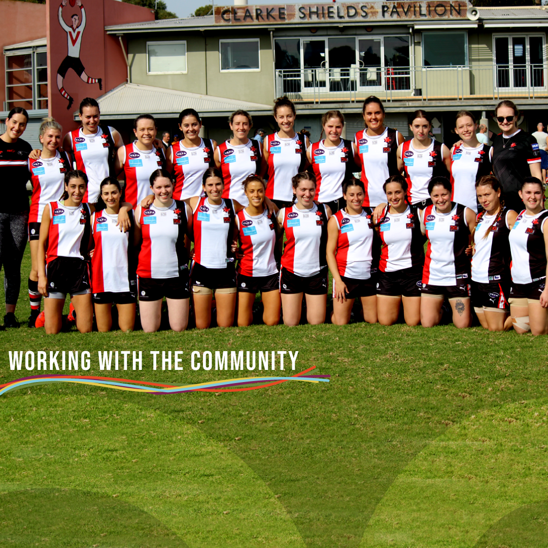
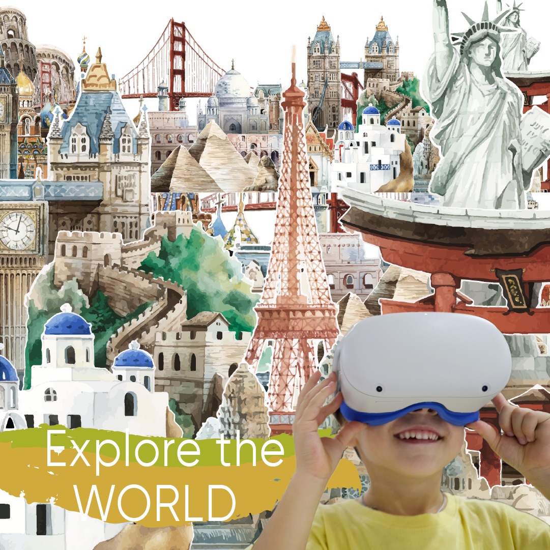
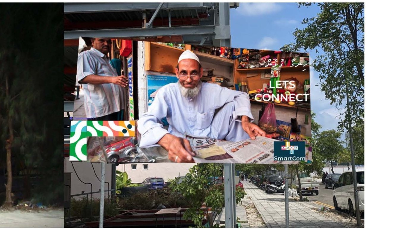
"Let's Connect" Campaign | SMARTCOM
“Let’s Connect” (ހިންގާ ގުޅެން) is the inaugural campaign created for SmartCom, designed as a brand awareness initiative to encourage users to engage with the company’s social media platforms.
I conceptualized and designed the templates for the digital assets, with the campaign centred on celebrating the everyday service providers who contribute to the city’s vibrancy. The idea was to connect with these individuals and their businesses, emphasizing the role SmartCom plays in fostering connections.
Billboards and printed materials featured QR codes, making it easy for users to access social media profiles and learn more about these local providers. The project reinforces the message that SmartCom is all about bringing people together and enabling meaningful connections.
My Role: Communication Strategy & Visual Direction
Agency: Marcomms
Client: Smartcom, Hulhumale Development Corporation


——————————
Political Campaign
Hisaan is running for the Baa atoll constituency in the Maldives. She represents one of the few female contestants.
The strategy for the campaign is to bring the constituents to the foreground in all the materials and share their stories rather than highlight the candidate.
ROLE: Communication Consultant & Creative Director
Art Director/Designer: Ashward
Cinematographer: Mohamed Shuau
Studio: Emmenge
She went on to win the seat


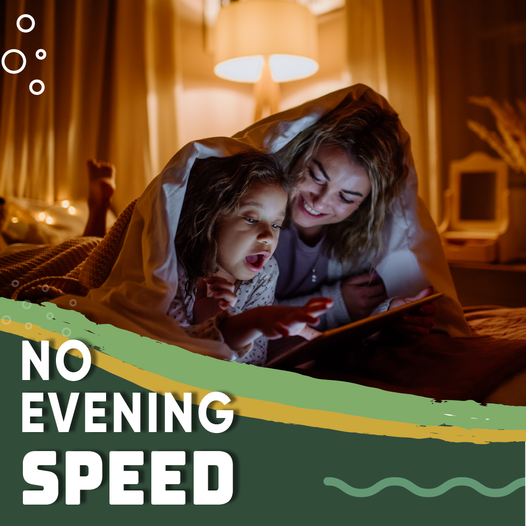
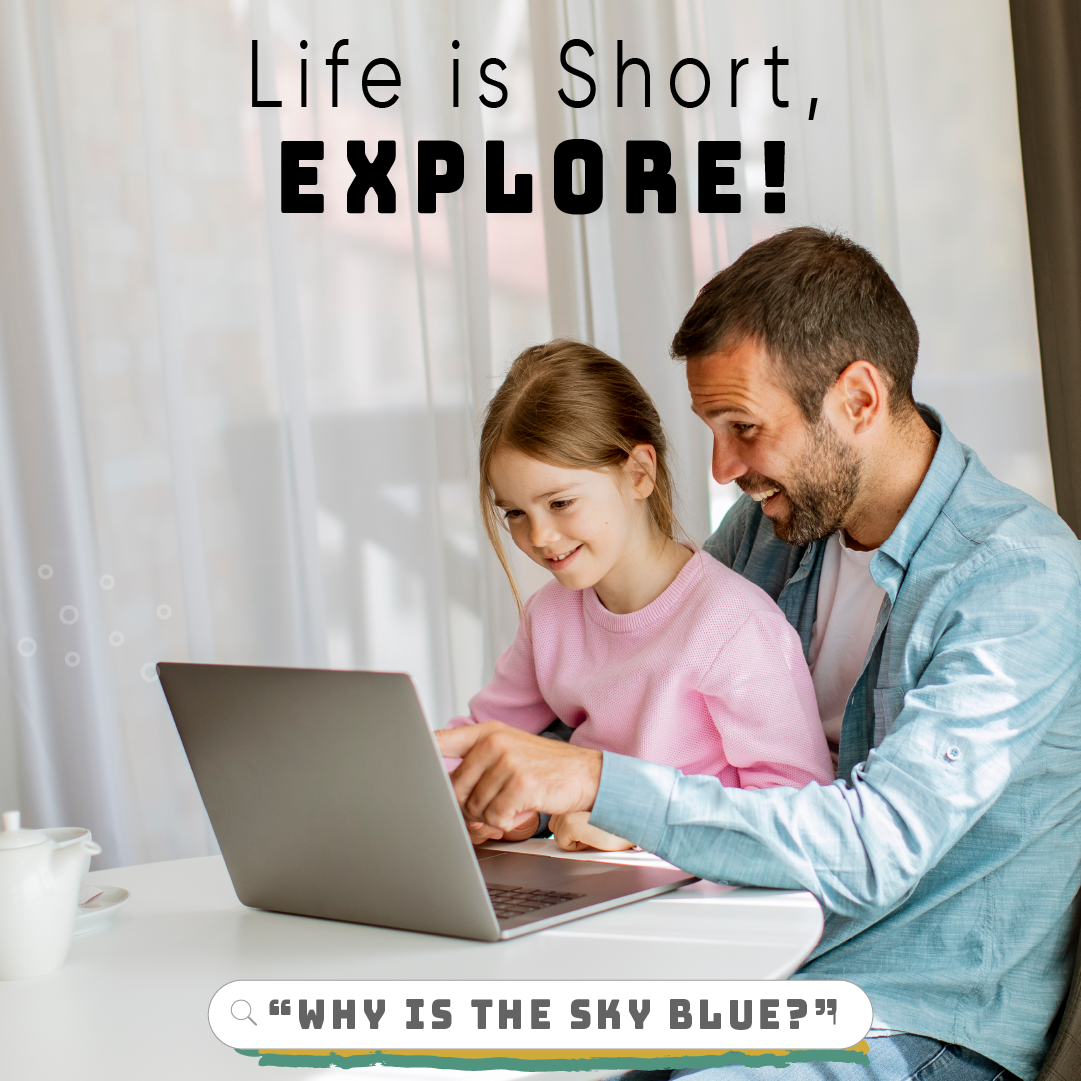
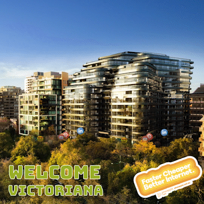
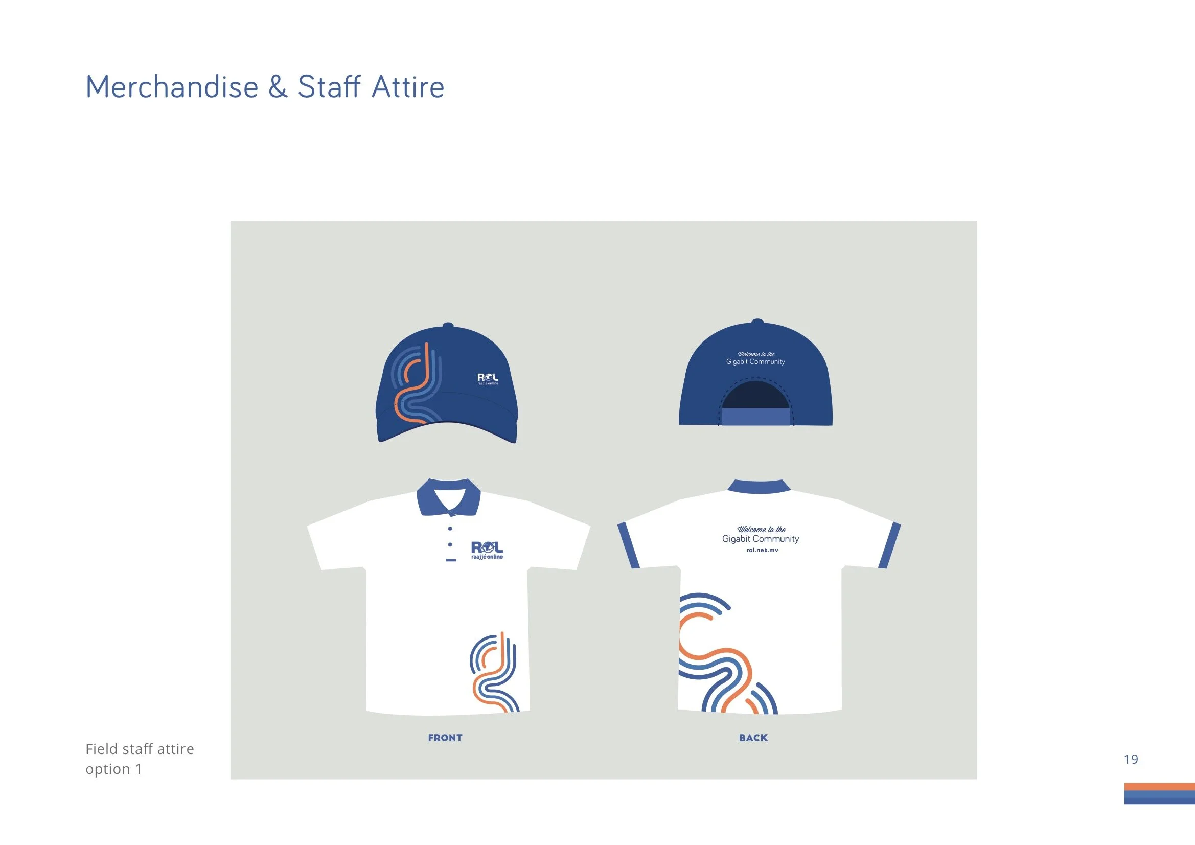
Raajje Online
ROL is one of the internet service provider in the Maldives. They had wanted to create a new product line called Gigafi.
The major competitors had already captured a large chunk of the professional and business market. Our approach was to target the youth and students.
We wanted to create an identity that reflected energy, speed, and connectivity through the visuals and the stories.
ROLE: Communication Consultant | Creative Director | Motiongraphics
Art DIrector & Primary Designer: Ashward
Studio: Marcoms


Final Brand Guide

New year greeting

The three colored lines became a defining identity element of the brand.


Art Director: Ismail Asward | Designers: Ismail Asward | Agency: Marcomms | Year: 2017
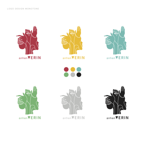
AnhenVerin
Anhen = Female | Verin=Leader in Dhivehi language. The language spoken in the Maldives
UNDP Maldives wanted to create a logo for their Women’s day. In our research we found that many of the logo designs were tenderized and logos around females were designed in a way that reinforced binary divisions.
We wanted to explore a logo that was gender neutral in the traditional sense. He logo is the starting point for the rest of identity development. We wanted to represent creativity/work, power and resistance
We also deliberately kept the words Anhen Verin joint together as AnhenVerin to reflect that they both exist symbiotic to each other. in the logo.
The letter V is a downward triangle a symbol of vagina in Sanskrit. This form of a triangle is also often depicted in graffiti in the Maldives.


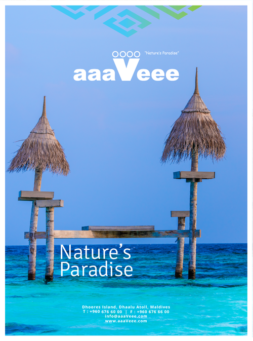
AAAVEEE
Aaaveee is a resort operated in the Maldives. Unlike most branded resorts in the Maldives, Aaaveee as a resort was developed mostly by locals using locally sourced materials. There are many interesting stories around how the island came in to being and the on going construction work that was taking place.
We wanted to create a brand that was based on these stories. We wanted to capture the stories of people working on the island. This is an experimental project in exploring how we could go in to a space and see/feel what was around there and explore an identity that could come in to being. .
We invited twelve artists from different diciplines to do a residency on the island that was was under construction. They were given th last of creating stories/art pieces about the place, the people and the historical stories. We collected these stories and the much of the initial branding was done based on the art works by the artists.
My role: Creative Director
Communication Consultant: Ali Saeed


![emmenge-vaahakahedhun [presentation] 2.png](https://images.squarespace-cdn.com/content/v1/5cb5be987a1fbd639229cc49/1582176408454-GSOIFRWHXNW64V3R4E37/emmenge-vaahakahedhun+%5Bpresentation%5D+2.png)
![emmenge-vaahakahedhun [presentation] 3.png](https://images.squarespace-cdn.com/content/v1/5cb5be987a1fbd639229cc49/1582176408770-X55OAT6JCPTRPVOV8Q8E/emmenge-vaahakahedhun+%5Bpresentation%5D+3.png)
![emmenge-vaahakahedhun [presentation] 4.png](https://images.squarespace-cdn.com/content/v1/5cb5be987a1fbd639229cc49/1582176413065-I4LQJ72VSOOE2MLHSBSN/emmenge-vaahakahedhun+%5Bpresentation%5D+4.png)
![emmenge-vaahakahedhun [presentation] 5.png](https://images.squarespace-cdn.com/content/v1/5cb5be987a1fbd639229cc49/1582176413362-HKI7IHLLQ2EVZ70G28T3/emmenge-vaahakahedhun+%5Bpresentation%5D+5.png)
![emmenge-vaahakahedhun [presentation] 6.png](https://images.squarespace-cdn.com/content/v1/5cb5be987a1fbd639229cc49/1582176418396-8N11J10YZWVDQZONGJ20/emmenge-vaahakahedhun+%5Bpresentation%5D+6.png)
![emmenge-vaahakahedhun [presentation] 7.png](https://images.squarespace-cdn.com/content/v1/5cb5be987a1fbd639229cc49/1582176418689-P2GJILMZ161VF7G0F4R8/emmenge-vaahakahedhun+%5Bpresentation%5D+7.png)
![emmenge-vaahakahedhun [presentation] 8.png](https://images.squarespace-cdn.com/content/v1/5cb5be987a1fbd639229cc49/1582176423830-VYYYIF2OUT27RM50UGZ9/emmenge-vaahakahedhun+%5Bpresentation%5D+8.png)
![emmenge-vaahakahedhun [presentation] 9.png](https://images.squarespace-cdn.com/content/v1/5cb5be987a1fbd639229cc49/1582176423830-1D9847VSPRFUQYO250IJ/emmenge-vaahakahedhun+%5Bpresentation%5D+9.png)
![emmenge-vaahakahedhun [presentation] 10.png](https://images.squarespace-cdn.com/content/v1/5cb5be987a1fbd639229cc49/1582176429047-G9B0GFQKV0KMNKAJV268/emmenge-vaahakahedhun+%5Bpresentation%5D+10.png)
![emmenge-vaahakahedhun [presentation] 11.png](https://images.squarespace-cdn.com/content/v1/5cb5be987a1fbd639229cc49/1582176429046-SBU3VK058E915ZIJTG4Y/emmenge-vaahakahedhun+%5Bpresentation%5D+11.png)
![emmenge-vaahakahedhun [presentation] 12.png](https://images.squarespace-cdn.com/content/v1/5cb5be987a1fbd639229cc49/1582176431773-BEL6IGTZ6T0QNR4N8URL/emmenge-vaahakahedhun+%5Bpresentation%5D+12.png)
![emmenge-vaahakahedhun [presentation] 13.png](https://images.squarespace-cdn.com/content/v1/5cb5be987a1fbd639229cc49/1582176433325-5V1ICO988COHEO4YUMTX/emmenge-vaahakahedhun+%5Bpresentation%5D+13.png)
![emmenge-vaahakahedhun [presentation].png](https://images.squarespace-cdn.com/content/v1/5cb5be987a1fbd639229cc49/1582176433940-D60HEQI3S89D8VR33H09/emmenge-vaahakahedhun+%5Bpresentation%5D.png)
One of the key identity element was a grid pattern that was used in many of the Maldivian traditional art, including furnitures and wood works.


Youth Leadership Program
Youth Leadership program is an annual youth leadership camp that is held in the Maldives, by the UNDP Maldives.
We wanted to create identity and communication materials to reflect youthfulness and energy. A large color palette and faceted elements were used throughout the visuals.
We wanted the logo to represent construction or the feel of something in the making, almost like kids playing with bricks or a toy.


