• Multimedia | Branding | +
  • In progress
  • Selected Art
  • About
  • Contact

Fazail Lutfi

  • Multimedia | Branding | +
  • In progress
  • Selected Art
  • About
  • Contact

Interview Videos | FINTECH22

Australia Business Forum is a company that organises events for the business community. One of their flagship events is a Fintech event held in Sydney and Melbourne. My task was to create a visual direction and develop the design materials for the 2023 event. The logo was already developed and had been used in previous years.

My Role: Visual Direction, Design, Video & Motion
Position & Company: Multimedia Specialist, ABF Events

<< EXPLORE THE PROCESS >>

Due to technical challenges with setting up the space, I opted to shoot all the interviews in 4k on a static shot and digitally add various elements to the shot to dress it. Here is an excerpt from one of the interviews.

Role: Videography, Editing & VFX

<< EXPLORE THE PROCESS >>

categories: motion&graphics
Friday 01.20.23
Posted by fazail lutfi
 

BRANDING | Maldives Stock Exchange

The Maldives Stock Exchange has been operating since 2008, making it a relatively recent concept compared to its counterparts in other developing nations.

My Role: Co-Brand Development & Creative Director
Designer and Art Directing: Ashward

The client sought to rebrand with a focus on positioning themselves as a friendly and approachable institution. They also wanted their new branding to embody the core values of “Trust” and “Growth.”

The existing logo featured a stylized infinity symbol, which the client wished to preserve as the foundation of the rebrand. Building on this, we developed a concept inspired by the themes of Confidence and Infinity—confidence in delivering positive returns and fostering the continuous growth of wealth. This approach allowed us to retain the essence of the original logo while aligning it with the client’s vision for a fresh and meaningful identity.


Research & Sketces

Mse Creative brief and Identity-2 2.png Mse Creative brief and Identity-2 3.png Mse Creative brief and Identity-2 4.png Mse Creative brief and Identity-2 5.png Mse Creative brief and Identity-2 6.png Mse Creative brief and Identity-2 7.png Mse Creative brief and Identity-2 8.png Mse Creative brief and Identity-2 9.png Mse Creative brief and Identity-2.png

The root of the visual elements is a square, a representation of a digital pixel. This was inspired by the large digital screens we see in stock exchanges. This form of “led display element” is synonymous with much of the imagery that we see portrayed in financial institutions.

A pixel also represents a start of a larger image, synonymous with the initial investment and the idea of growth.

In addition, we designed the placement of the visuals in such a way that the patterns can potentially run seamlessly when they are placed adjacent to each other in whatever direction.


Excerpts from the brand guide

MSE_Brandguidelines_Aug17_V1_1 2.png
MSE_Brandguidelines_Aug17_V1_1 3.png
MSE_Brandguidelines_Aug17_V1_1 4.png
MSE_Brandguidelines_Aug17_V1_1 5.png
MSE_Brandguidelines_Aug17_V1_1 6.png
MSE_Brandguidelines_Aug17_V1_1 7.png
MSE_Brandguidelines_Aug17_V1_1 8.png
MSE_Brandguidelines_Aug17_V1_1 9.png
MSE_Brandguidelines_Aug17_V1_1 10.png
MSE_Brandguidelines_Aug17_V1_1 11.png
MSE_Brandguidelines_Aug17_V1_1 12.png
MSE_Brandguidelines_Aug17_V1_1 13.png
MSE_Brandguidelines_Aug17_V1_1 14.png
MSE_Brandguidelines_Aug17_V1_1 15.png
MSE_Brandguidelines_Aug17_V1_1 16.png
MSE_Brandguidelines_Aug17_V1_1 17.png
MSE_Brandguidelines_Aug17_V1_1 18.png
MSE_Brandguidelines_Aug17_V1_1 19.png
MSE_Brandguidelines_Aug17_V1_1 20.png
MSE_Brandguidelines_Aug17_V1_1 21.png
MSE_Brandguidelines_Aug17_V1_1 22.png
MSE_Brandguidelines_Aug17_V1_1 23.png
MSE_Brandguidelines_Aug17_V1_1 24.png
MSE_Brandguidelines_Aug17_V1_1 25.png
MSE_Brandguidelines_Aug17_V1_1 26.png
MSE_Brandguidelines_Aug17_V1_1 27.png
MSE_Brandguidelines_Aug17_V1_1 28.png
MSE_Brandguidelines_Aug17_V1_1 29.png
MSE_Brandguidelines_Aug17_V1_1 30.png
MSE_Brandguidelines_Aug17_V1_1 31.png
MSE_Brandguidelines_Aug17_V1_1 32.png
MSE_Brandguidelines_Aug17_V1_1 33.png
MSE_Brandguidelines_Aug17_V1_1 34.png
MSE_Brandguidelines_Aug17_V1_1 35.png
MSE_Brandguidelines_Aug17_V1_1 36.png
MSE_Brandguidelines_Aug17_V1_1 37.png
MSE_Brandguidelines_Aug17_V1_1 38.png
MSE_Brandguidelines_Aug17_V1_1 39.png
MSE_Brandguidelines_Aug17_V1_1 40.png
MSE_Brandguidelines_Aug17_V1_1 41.png
MSE_Brandguidelines_Aug17_V1_1 42.png
MSE_Brandguidelines_Aug17_V1_1 43.png
MSE_Brandguidelines_Aug17_V1_1 44.png
MSE_Brandguidelines_Aug17_V1_1 45.png
MSE_Brandguidelines_Aug17_V1_1 46.png
MSE_Brandguidelines_Aug17_V1_1 47.png
MSE_Brandguidelines_Aug17_V1_1 48.png
MSE_Brandguidelines_Aug17_V1_1 49.png
MSE_Brandguidelines_Aug17_V1_1 50.png
MSE_Brandguidelines_Aug17_V1_1 51.png
MSE_Brandguidelines_Aug17_V1_1 52.png
MSE_Brandguidelines_Aug17_V1_1.png

MSE_Brandguidelines_Aug17_V1_1+37.jpg Screen Shot 2020-02-20 at 2.23.16 PM.png

categories: communication
Thursday 01.19.23
Posted by fazail lutfi
 

2D Animation | The Girl, the Boy and the Red Balloon

I have been experimenting with AI image-generation techniques. I have been developing the background images completely from elements generated through AI, specifically the DALL e-2 by OpenAI. While they are imperfect, there is immense potential, especially when combined or manipulated with human-generated content (The potential lies in figuring out how to create a synergy between AI and human creativity). Once all the frames are done, these will be used as the base layer of the animation. I am also looking at Gen-1 by runway research for developing and animating the character. I am waiting to see if they would give me early access. I will also use beatoven.ai to generate all the music. This whole project will be an experiment on AI generated content.

Read more

categories: motion&graphics, inprogress
Sunday 01.15.23
Posted by fazail lutfi
 

Visual Direction | DGtek, FG & Pineapple Net

DGtek is a company based in Melbourne that provides fibre internet for businesses and the public. They have three major brands; DGtek, Pineapple Net and FG Telcom

Their goal was to establish distinct visual identities for each of the brands that set them apart from each other and effectively communicated with their respective target audiences..

Role: Visual Direction, Design & Motiongraphics
Company: Digital Marketing Assistant, DGtek

This was the initial visual style that was used
The social media pages and other visuals for the three companies; DGtek, Pineapple Net and FG Telecom did not seem to have a cohesive brand story and a visual style. My goal was to establish a style for stills, videos and motiongraphic materials for each of these products..

dg1.png
DG2.png
dg3.png

The colour palette and design elements were all derived from the already established logos.

275566861_4828657057181979_1290302920129720580_n.jpg
dg4.png

The curves of D and G were used as a visual element for DGtek visuals. This element will also be animated for moving images.

Artboard 1 copy 2.png
Artboard 1 copy 3.png
Artboard 1 copy 5.png
low latency.png
changing how australia connect.png
future proof building.png
we own and operate .png
Artboard 1 copy 7.png
Artboard 1 copy 8.png
Artboard 1.png
future proof building.png
Artboard 1 copy.png
ajax_team.png
launtel.png
Artboard 1 copy 2.png Artboard 1 copy 3.png Artboard 1 copy 5.png low latency.png changing how australia connect.png future proof building.png we own and operate .png Artboard 1 copy 7.png Artboard 1 copy 8.png Artboard 1.png future proof building.png Artboard 1 copy.png ajax_team.png launtel.png
 

Pineapple net needed to be fun and youthful

no evening speed.png
life is short explore.png
low latency.png
jeremy.png
explore the world_1.png
Enjoy your movie night.png
best decision ever.png
victoriana_high_1_1.gif
explore.png
Discover with pineapple.png
bestdecision.png
Artboard 1 copy.png
easter.png
gigabit speed.png
no evening speed.png life is short explore.png low latency.png jeremy.png explore the world_1.png Enjoy your movie night.png best decision ever.png victoriana_high_1_1.gif explore.png Discover with pineapple.png bestdecision.png Artboard 1 copy.png easter.png gigabit speed.png

As Pineapple Net was a technology firm, I believed it was important for their brand to demonstrate innovation and a futuristic digital presence. To achieve this, I opted to incorporate the parallax effect by creatively manipulating static images and merging them with motion


FG Telecom bored the hexagon on its logo as an element that will be used in the materials.

better.png
internet let business grow.png
direct cloud connectivity.png
better business internet.png
review1.png
ultra+fast+fibre.jpg
local support.png
reliable inernet.png
better business.png
ultrafast business.png
business internet works.png
99.85.png
future proof.png
business fiber internet.png
better.png internet let business grow.png direct cloud connectivity.png better business internet.png review1.png ultra+fast+fibre.jpg local support.png reliable inernet.png better business.png ultrafast business.png business internet works.png 99.85.png future proof.png business fiber internet.png

RESULTS

View fullsize
DGtek
View fullsize
Pineapple Net
View fullsize
FG Telecom
categories: communication
Tuesday 01.10.23
Posted by fazail lutfi
 

Integrated Waste Management Communication Campaign

The Ministry of Environment & Technology in the Maldives and World Band had partnered in establishing an integrated waste management system in various regions of the Maldives Islands. A communication campaign was needed to create awareness amongst the public on various aspects of the system.

My Role: Creative Director
Communication Consultant: Ali Saeed
Designer: Ashward | Motiongraphics: Imad (Dami) | Web: Haris & Inad (Code Fly)
Agency: Emmenge
Client: Ministry of Environment, Climate Change and Technology, Maldives

I collaborated both remotely and on-site with a creative team to develop and execute the campaign. Through our research, we discovered that traditional stock assets had minimal impact on the local population. To address this, we devised a strategy centred on empowering the residents of each island to create materials and share stories unique to their communities.

Our approach focused on establishing a platform that celebrated local perspectives and fostered community engagement. We proposed three key channels to bring this vision to life: a dedicated website, a physical newsletter, and kiosk-style noticeboards on the islands. These channels were designed to ensure accessibility and to amplify the authentic voices of each community.


Communication strategy & plan

The communication consultant, Ali Saeed was the lead in developing the plan.

Excerpts from the Visual Guide

Communication Plan_waste_WB.jpg
Communication Plan_waste_WB87.jpg
Communication Plan_waste_WB67.jpg
Communication Plan_waste_WB54.jpg
Communication Plan_waste_WB43.jpg
Communication Plan_waste_WB23.jpg
Communication Plan_waste_WB44.jpg
Communication Plan_waste_WB11.jpg
Communication Plan_waste_WB22.jpg
Communication Plan_waste_WB33.jpg
Communication Plan_waste_WB88.jpg
Communication Plan_waste_WB7.jpg
Communication Plan_waste_WB.jpg
Communication Plan_waste_WB10.jpg
Communication Plan_waste_WB.jpg Communication Plan_waste_WB87.jpg Communication Plan_waste_WB67.jpg Communication Plan_waste_WB54.jpg Communication Plan_waste_WB43.jpg Communication Plan_waste_WB23.jpg Communication Plan_waste_WB44.jpg Communication Plan_waste_WB11.jpg Communication Plan_waste_WB22.jpg Communication Plan_waste_WB33.jpg Communication Plan_waste_WB88.jpg Communication Plan_waste_WB7.jpg Communication Plan_waste_WB.jpg Communication Plan_waste_WB10.jpg

We also proposed the use of children to deliver key messages on a national level. The periodic newsletters are developed and delivered by school children.

A structure on one of the islands converted to a kiosk where the newsletter is presented in printed form

WhatsApp Image 2023-03-18 at 2.44.46 PM.jpeg
WhatsApp Image 2023-03-18 at 2.44.49 PM.jpeg
WhatsApp Image 2023-03-18 at 10.25.43 PM.jpeg
WhatsApp Image 2023-03-18 at 10.25.44 PM.jpeg

National level videos have already been delivered

The lead in developing the strategy is the communication specialist Ali Saeed

The government of the Maldives have made the Fasgandu campaign their national campaign for waste management. The strategy and the tools we have set will be rolled out to several islands in the coming months.

tags: exploring
categories: communication
Sunday 01.01.23
Posted by fazail lutfi
 

Branding & Communication for Urban Isle

Urban Isle is a new tourist destination island that is being developed in the Maldives. The island is an artificial island built by reclamation of a shallow lagoon. This island will join another island that is becoming an urban hub.

I took the lead in developing the branding and communication strategy for this unique project. The island, entirely human-made, was constructed in the middle of the ocean—a remarkable feat that inspired the creative direction.

To reflect this ingenuity, I wanted the branding process to incorporate a physical, tactile element that mirrored the island’s creation. The logo became the starting point for this vision. Drawing inspiration from the Japanese art of Suminagashi, we used this traditional technique to create flowing patterns on water—an approach I found symbolic of the process of forming an island in the ocean. These patterns became the foundation of the brand’s identity, blending creativity with the essence of its story.

My role: Branding, Comms Strategy and Creative Director
Art Director & Key Design: Ashward
Designer: Sithna
Agency: Marcomms
Client: Urban Isle, Hulhumale Development Corporation.

Research

urban11.jpg
urban2.jpg
urban3.jpg
urban4.jpg
urban5.jpg
urban6.jpg
urban7.jpg
urban11.jpg urban2.jpg urban3.jpg urban4.jpg urban5.jpg urban6.jpg urban7.jpg

Visual Direction and Initial sketches

** Images used in the below document are borrowed from the internet. These are appropriated to show possible visual direction and are intended for internal use only.

u3.jpg
u4.jpg
u5.jpg
u6.jpg
u7.jpg
u8.jpg
u9.jpg
u11.jpg
u12.jpg
u13.jpg
ui1.jpg
ui2.jpg
u3.jpg u4.jpg u5.jpg u6.jpg u7.jpg u8.jpg u9.jpg u11.jpg u12.jpg u13.jpg ui1.jpg ui2.jpg

Excerpts from the Brand guide

Urbanisle_Userguide_PRINT-39999.jpg
Urbanisle_Userguide_PRINT-399.jpg
Urbanisle_Userguide_PRINT-39.jpg
Urbanisle_Userguide_PRINT-37.jpg
Urbanisle_Userguide_PRINT-36.jpg
Urbanisle_Userguide_PRINT-35.jpg
Urbanisle_Userguide_PRINT-34.jpg
Urbanisle_Userguide_PRINT-33.jpg
Urbanisle_Userguide_PRINT-32.jpg
Urbanisle_Userguide_PRINT-31.jpg
urban_web1.jpg
tags: exploring
categories: communication
Monday 11.28.22
Posted by fazail lutfi
 

- In-store catalog for Janome -

The design for an A4 , 8 page in-store mailer is almost complete and printed. I have kept the design minimal with the images and copy as the center of attention.

ROLE: Design & Layout

1.png 2.png 3.png 4.png 5.png 6.png 5b.png 8.png
1.jpg
categories: design, recent, motion&graphics
Tuesday 01.21.20
Posted by fazail lutfi
 

2D Character Animations

I have been exploring 2D character animations recently. I still need a lot of work to get this right. However, this seems to have a lot of potential as an additional tool.

Read more

tags: exploring
categories: inprogress
Friday 01.10.20
Posted by fazail lutfi
 

Women Participation & Empowerment

Flyer design around the idea of female participation in leadership roles.

women_flyer_finaV1_printready2.jpg women_flyer_finaV1_printready.jpg
categories: design, motion&graphics
Friday 12.20.19
Posted by fazail lutfi
 

Miyaheli Branding | UNDP Maldives

Miyaheli is an initiative by UNDP in the Maldives, marking the first-ever Social Innovation Camp in the country. This event provides a platform for young people to brainstorm, collaborate, and develop innovative solutions to address challenges and improve their communities.

I was tasked with the responsibility of creating the branding and a communication direction for this event. Given its focus on youth, I aimed to design visuals that were vibrant, playful, and approachable—steering away from overly formal aesthetics. To capture the spirit of creativity and innovation, we incorporated a collage-like style into the visual elements. This approach symbolised the process of “making, creating, and building,” serving as a visual metaphor for the act of innovation itself.

The resulting branding underscored the event’s mission to empower the next generation of changemakers in the Maldives.

My Role: Branding & Creative Directing | Motiongraphics
Key Designer: Ashward
Agency: Emmenge
Client: UNDP Maldives

My Initial sketches

Miyaheli17 main poster concept 5.png Miyaheli17 main poster concept 4.png Miyaheli17 main poster concept 3.png Miyaheli17 main poster concept 2.png Miyaheli17 main poster concept.png

Printed posters

Generalposter4.png
GeneralPoster.png
General Poster3.png
Generalposter2.png
miyaheli_poster1_draft1.jpg

Short call for participants video

Animated Gifs

miyaheli2018_gears.gif
miyaheli2018_flying_high.gif
1.gif
2.gif
3.gif
4.gif
5.gif
6.gif
7.gif

Highlights from the first camp


categories: communication
Thursday 12.05.19
Posted by fazail lutfi
 

Criminal Procedures Act | Maldives Attorney General's Office

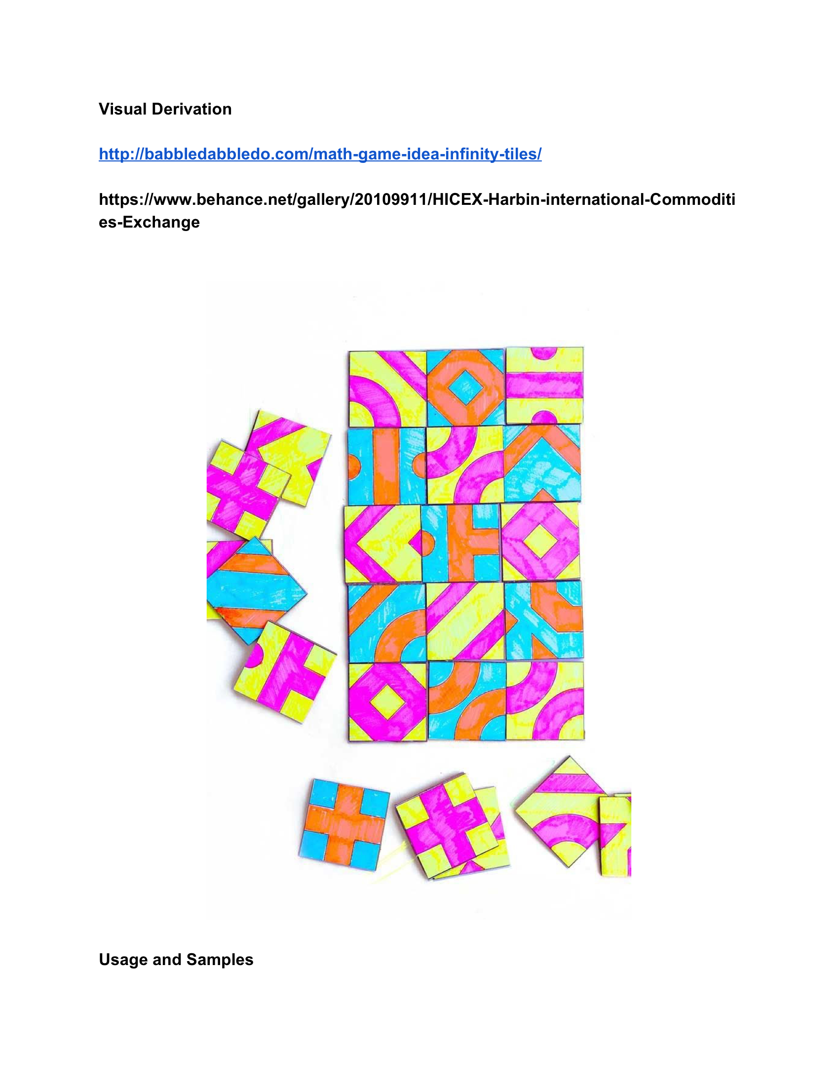
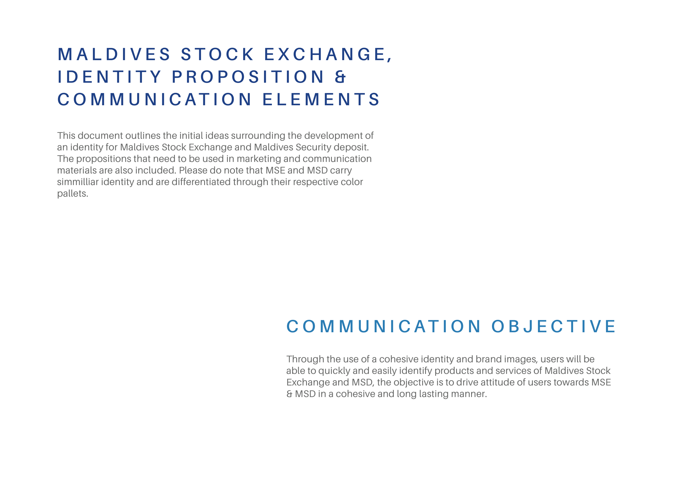
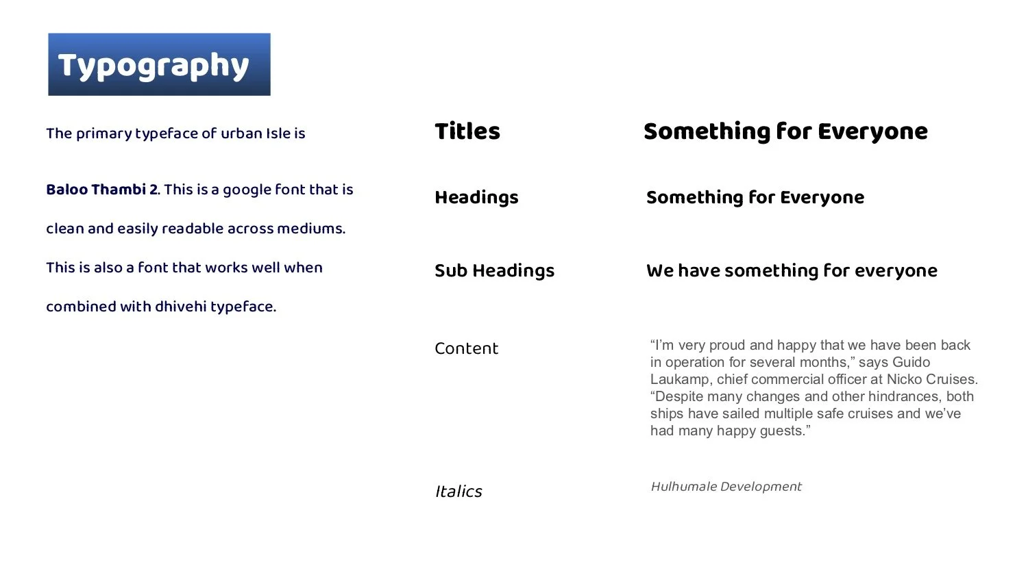
The Maldives Attorney General’s Office sought to develop a campaign aimed at raising awareness about the Criminal Procedures Act among the public, institutions, and other stakeholders. The goal was to ensure that all stakeholders clearly understood their rights, responsibilities, and the boundaries defined by the Act, fostering greater compliance and informed participation.

ROLE: Communication Strategy & Visual Direction/Creative Director/Art Director
Illustrations: Eman Rasheed | Motiongraphics: Ahmed Imad (Dami) | Layout Designers and Finished artists: Farhad & Dhahau | Additional designer: Ali Rishwan
Agency: Emmenge | Client: UNDP Maldives & Maldives Attorney Generals Office

The content that needed to be communicated was, unfortunately, dense and dry legal material, which posed a challenge in capturing the audience’s attention. To overcome this, I decided to adopt a visually engaging and stylized approach that would make the information more accessible and appealing. After careful consideration, we chose a “graphic novel” style, incorporating dynamic visuals, storytelling elements, and vibrant designs to bring the content to life. This creative approach allowed us to deliver the information effectively across various mediums, ensuring that it resonated with a diverse audience

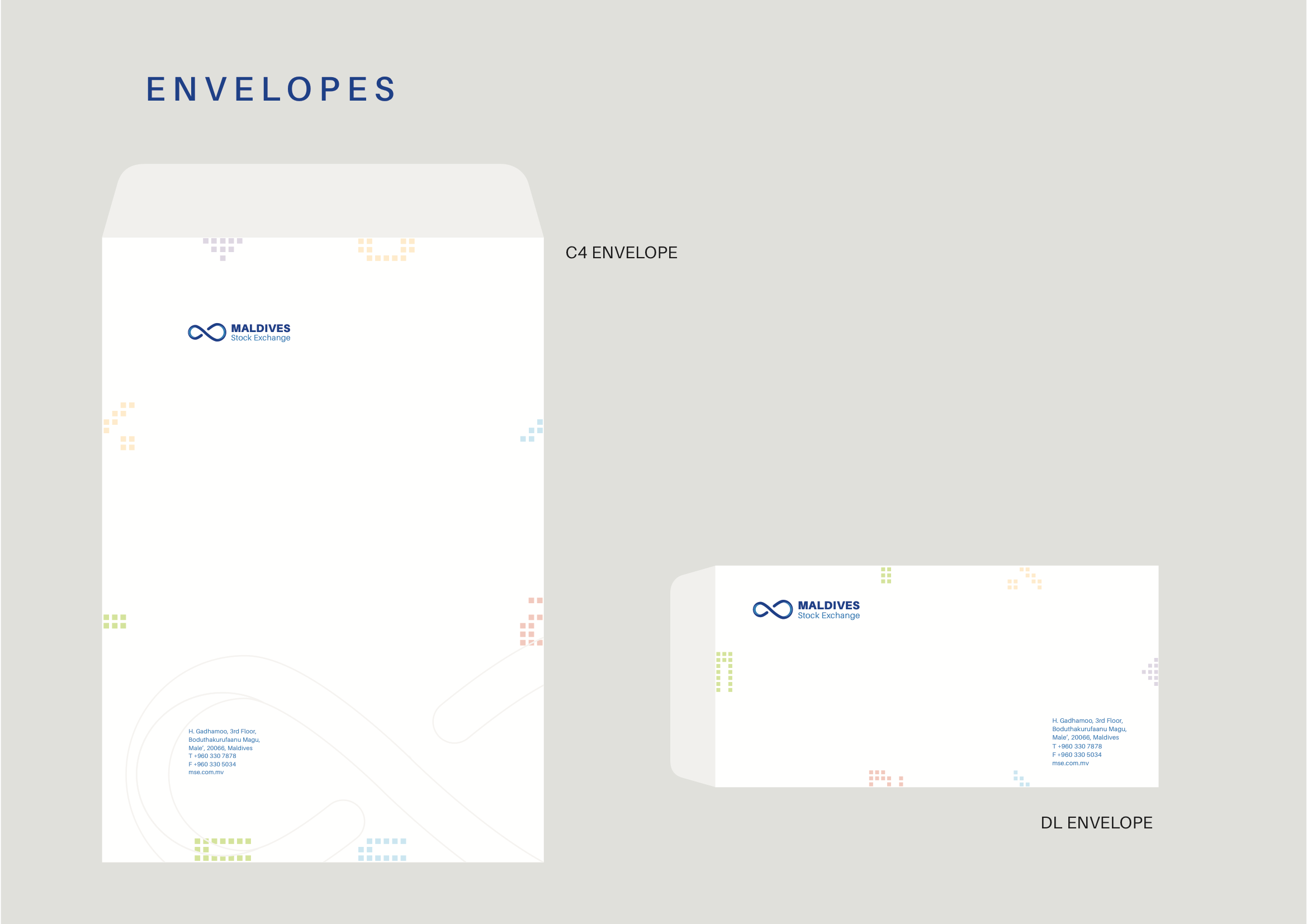
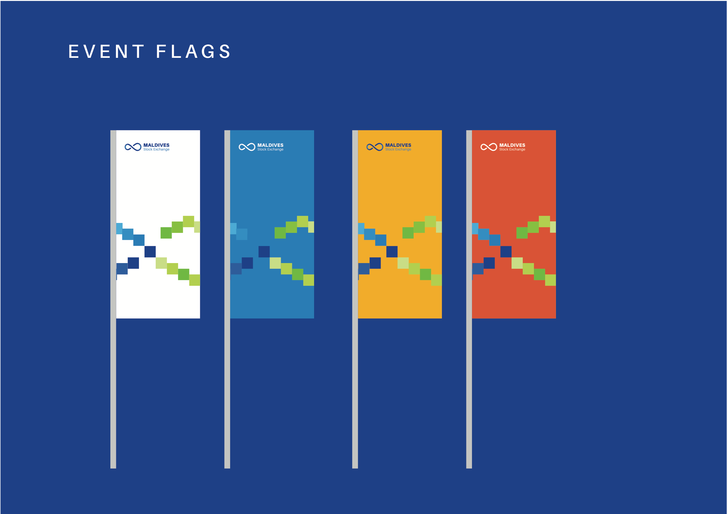
Wall posters to be framed and hung on their office foyer
Illustrator: Eman Rasheed | Finished Artist: Farhad

AG Office - Posters v7 [A2]_Page_1.jpg AG Office - Posters v7 [A2]_Page_3.jpg AG Office - Posters v7 [A2]_Page_2.jpg AG Office - Posters v7 [A2]_Page_4.jpg AG Office - Posters v7 [A2]_Page_5.jpg

TV spots using the illustrated style and motion.
Illustrations: Eman Rasheed. Motiongraphics: Inthi & Imad (Dami)


Print publication
Illustrations: Eman Rasheed. Layout and Design: Dhahau Naseem


Some of the web graphics
Illustrations: Eman Rasheed. Finished Art and Design: Farhad

AG Office - Socialmedia BG-youtube.jpg AG Office - Socialmedia BG-Instagram.jpg AG Office - Socialmedia BG3.jpg AG Office - Socialmedia BG2.jpg AG Office - Socialmedia BG5.jpg AG Office - Socialmedia BG.jpg AG Office - Socialmedia BG4.jpg
categories: communication
Monday 12.02.19
Posted by fazail lutfi
 

In-store Mailer | Janome

The designs for the in-store mailer for New Zealand and Australian stores.

My Role: Design and Layout

1_Page_1.png 1_Page_2.png
categories: recent, design, motion&graphics
Saturday 11.30.19
Posted by fazail lutfi
 

"Let's Connect" Campaign | SMARTCOM

“Let’s Connect” (ހިންގާ ގުޅެން) is the inaugural campaign created for SmartCom, designed as a brand awareness initiative to encourage users to engage with the company’s social media platforms.

I conceptualized and designed the templates for the digital assets, with the campaign centred on celebrating the everyday service providers who contribute to the city’s vibrancy. The idea was to connect with these individuals and their businesses, emphasizing the role SmartCom plays in fostering connections.

Billboards and printed materials featured QR codes, making it easy for users to access social media profiles and learn more about these local providers. The project reinforces the message that SmartCom is all about bringing people together and enabling meaningful connections.

My Role: Communication Strategy & Visual Direction
Agency: Marcomms
Client: Smartcom, Hulhumale Development Corporation

SmartCom - Visibility Campaign_Page_08.jpg
SmartCom - Visibility Campaign_Page_09.jpg
SmartCom - Visibility Campaign_Page_07.jpg
SmartCom - Visibility Campaign_Page_06.jpg
SmartCom+-+Visibility+Campaign_Page_05.jpg
SmartCom - Visibility Campaign_Page_04.jpg
SmartCom - Visibility Campaign_Page_02.jpg
SmartCom - Visibility Campaign_Page_01.jpg
SmartCom - Visibility Campaign_Page_08.jpg SmartCom - Visibility Campaign_Page_09.jpg SmartCom - Visibility Campaign_Page_07.jpg SmartCom - Visibility Campaign_Page_06.jpg SmartCom+-+Visibility+Campaign_Page_05.jpg SmartCom - Visibility Campaign_Page_04.jpg SmartCom - Visibility Campaign_Page_02.jpg SmartCom - Visibility Campaign_Page_01.jpg

——————————

categories: communication
Sunday 10.13.19
Posted by fazail lutfi
 

Fintech22 Promo Video

Australia Business Forum is a company that organises events for the business community. One of their flagship events is a Fintech event held in Sydney and Melbourne. My task was to create a visual direction and develop the design materials for the 2023 event. The logo was already developed and had been used in previous years.

My Role: Visual Direction, Design, Video & Motion
Position & Company: Multimedia Specialist, ABF Events

——————————

categories: video
Tuesday 01.01.19
Posted by fazail lutfi
 

Political Campaign

Hisaan is running for the Baa atoll constituency in the Maldives. She represents one of the few female contestants.

The strategy for the campaign is to bring the constituents to the foreground in all the materials and share their stories rather than highlight the candidate.

ROLE: Communication Consultant & Creative Director
Art Director/Designer: Ashward
Cinematographer: Mohamed Shuau
Studio: Emmenge

  • She went on to win the seat

HisaanGraphicPoster_Final_A2_PrintReady.png
Hisaan_MainBackdrop_16x8Feet_printReady.png
Hisan_a3_posters_Masverikan.png Hisan_a3_posters_Kasab.png Hisan_a3_posters_Thedhuivadaan.png Hisan_a3_posters_Vadaan.png Hisan_a3_posters_Dhanduhehdhun.png Hisan_a3_posters_Fangiviun.png
categories: communication
Monday 12.31.18
Posted by fazail lutfi
 

He said Euphoria

Visual Poem | 16mm film | New York

Read more

categories: video
Saturday 12.01.18
Posted by fazail lutfi
 

Three Journeys with UNDP

A short story around the work UNDP is doing in the Maldives.

Director: Fazail Lutfi | Writing: Aecha Adam | Edit: Fazail Lutfi, Mohamed Shuau | Cinemetagrapher: Mohamed Shuau, Mushid Mohamed, Ismi | Motiongraphics: Dami | Agency: Emmenge | Client: UNDP Maldives | Format: HD | Country: Maldives

tags: highlight
categories: video
Wednesday 11.21.18
Posted by fazail lutfi
 

The Atoll Ecosystem Conservation Project

In 2004, the Atoll Ecosystem Conservation (AEC) project was initiated to try to conserve the environment in and around the Baa Atoll, supported by the United Nations Development Programme (UNDP) and financed by the Global Environment Facility (GEF). The ultimate aim was that the project would become a model of conservation for all atolls in the Maldives.

Directed & Co-Written by Fazail Lutfi | Co-Written by Ifham Niyaz | Camera by Mohamed Khayyam Adam | Edited by Ahmed Saeed | Developed and Produced mooinc

categories: video
Thursday 11.01.18
Posted by fazail lutfi
 

Dream of a Dying Artist

Visual Poem | Digital Video | Johannesburg, South Africa

Read more

categories: video
Tuesday 10.02.18
Posted by fazail lutfi
 

Film Factory (Copy)

Experimental Film | 16mm film | Regina, Canada

Read more

categories: video, art
Friday 06.01.18
Posted by fazail lutfi
 
Newer / Older